Healthcare Marketing Agency Landing Page Template
Prescribe is an editorial-style landing page template built for healthcare marketing agencies that need to project authority and earn high-value B2B consultations. It combines a monochrome steel design system, a logo wall of forty-plus client organizations, escalating case study columns, and a fixed bottom call to action bar to move qualified prospects toward a strategy briefing booking.
by Rocket studio
Quick summary
Prescribe is a single-page, click-through landing page template designed for healthcare marketing agencies operating at the enterprise level. The template uses a heavyweight editorial magazine aesthetic, a silent logo wall, and asymmetric case study layouts to establish professional credibility before any prospect reads a single pitch line. Every section earns the next scroll.
Who this template is for
This landing page is built for agencies and consultancies that sell healthcare marketing services to sophisticated buyers. The design and messaging structure reflect the expectations of decision-makers who read industry reports, not consumer blogs.
- CMOs at regional health systems losing patient volume to urgent care chains and telehealth services
- Marketing directors at Series B healthtech companies who need pipeline from their next healthcare marketing campaigns
- Practice managers at specialty medical practices who are ready to move beyond referral-only growth
What problem this template solves
Healthcare professionals and healthcare providers face a specific credibility problem online. Their prospective clients, particularly those holding budget authority inside health systems, will not convert from a page that looks like a generic agency template. The bar for trust is higher in the healthcare industry than in almost any other vertical.
This landing page solves the authority gap that keeps healthcare digital marketing agencies from converting senior buyers.
- A page without visible proof of scale looks unqualified to CMOs comparing multiple vendors
- Generic landing page designs fail to communicate the compliance-aware, patient centric thinking that healthcare marketing demands
- Agencies without a clear call to action architecture lose warm prospects who land but never book
What you get with this template
This template delivers a complete, production-ready landing page architecture. Every section is purpose-built for the healthcare marketing agency context, from the opening headline through the closing call to action block.
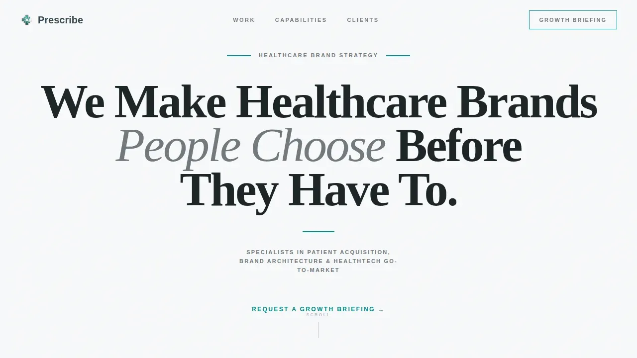
- A giant centered serif hero with a teal rule and small caps subhead, designed to project authority without a single image
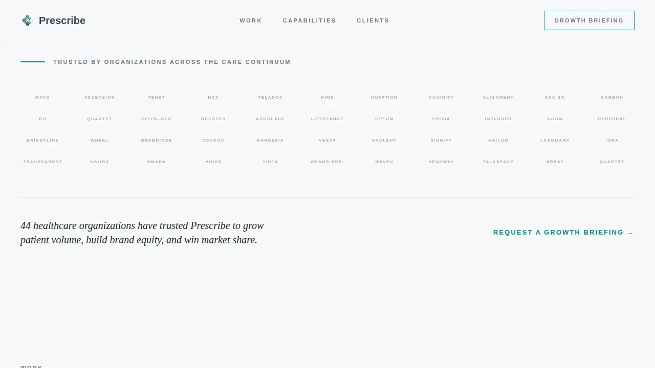
- A silent logo wall grid showing forty-plus healthcare organizations in desaturated steel gray, designed to prove scale instantly
- Asymmetric editorial case study columns that escalate from regional clinic to national health system to initial public offering-stage healthtech, with oversized stats, narrative paragraphs, and CMO pull quotes that break the grid
Feature list
This landing page template includes the following built-in components and structural elements.
Giant Centered Hero Headline
The hero section opens with enormous serif type tracked tight across eighty percent of the viewport. There is no image, no video, and no gradient. A thin teal rule sits beneath the headline, followed by a single-line small caps subhead. This layout communicates professional credibility through restraint, not decoration, and establishes visual hierarchy from the first second a visitor arrives.
Logo Wall Authority Grid
Immediately below the hero, a silent grid of forty-plus healthcare logos renders in desaturated surgical steel gray. There are no hover effects and no animations. The sheer mass of recognized healthcare providers and healthcare organizations creates social proof before any case study is read. This section functions as the first trust building element on the page, allowing users to assess agency scale in seconds.
Escalating Editorial Case Studies
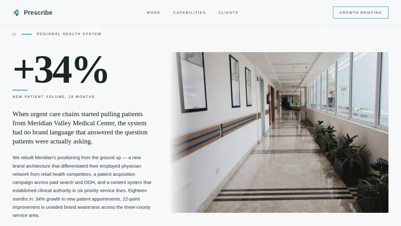
Three case study blocks are laid out in asymmetric editorial columns. Each case study presents a bold stat in oversized type on the left and a tight narrative paragraph on the right, with a clinical photograph bleeding off one edge. The sequence escalates deliberately: regional clinic, national health system, initial public offering-stage healthtech. This structure proves that the agency handles healthcare services at every scale and directly addresses the pain points of each buyer type in the target audience.
CMO Pull Quote Breaks
Between case studies, pull quotes from client CMOs break the editorial grid like editor's notes in a heavyweight journal. These patient testimonials and client voices add a human layer of validation. They reinforce patient trust and build trust with senior buyers who respond to peer-level social proof rather than generic endorsements.
Tiered Call to Action Architecture
The call to action appears three times across the landing page. First as a teal text link beneath the logo wall. Then as a fixed bottom bar that activates after the visitor scrolls past the second case study. Finally as a full-width closing block. This structure provides clear calls to action at every stage of the reader's decision process, without overwhelming visitors with aggressive repeated prompts.
Fixed Bottom Bar Activation
The fixed bottom call to action bar activates only after a defined scroll depth, specifically after the second case study section. This behavior ensures the clear call to action appears only once the visitor has absorbed sufficient proof. The bar maintains seamless functionality across the reading experience and keeps the primary conversion path visible without disrupting the editorial layout.
Page sections overview
| Section | Purpose |
|---|---|
| Hero Headline Block | Establish authority with giant centered serif type, teal rule, and small caps subhead |
| Logo Wall Grid | Prove scale through forty-plus desaturated healthcare organization logos |
| Case Study One | Regional clinic success story with oversized stat and clinical photograph |
| Case Study Two | National health system case study escalating audience confidence |
| Case Study Three | IPO-stage healthtech editorial column proving top-altitude capability |
| CMO Pull Quote | Break-grid testimonial from a client executive reinforcing peer credibility |
| Fixed Bottom Bar | Scroll-activated call to action bar appearing after case study two |
| Closing call to action Block | Full-width single-sentence conversion block directing users to strategy booking |
| Footer | Minimal developer-style footer with essential links and legal information |
Design & branding system
The visual identity follows an Editorial Magazine theme built on a Monochrome Steel color system. The palette reads like a stainless-steel instrument tray under halogen light: precise, cold, and entirely competent. Generous whitespace handles the structural work that color does on lesser pages.
- Colors include sterile white (#F8F9FA) for backgrounds, charcoal scrub gray (#36454F) for body text, surgical steel (#71797E) for section dividers and hairlines, and clinical teal (#008B8B) reserved exclusively for links, call to action elements, and pull-quote rules
- Typography pairs Fraunces serif for headlines with Manrope for body text and user interface elements, creating a clear distinction between editorial authority and functional readability
- Section dividers use fine steel-gray hairlines and the design process relies on whitespace rather than decorative elements, ensuring user friendly navigation and a consistent visual hierarchy throughout the page
Mobile & speed optimization
Although this template is desktop-first, designed for CMOs reading on a laptop during transit, it includes a mobile fallback that maintains the editorial integrity of the layout. Mobile optimization ensures the landing page remains functional and credible on mobile devices without compromising its heavyweight journal aesthetic.
- Responsive design adapts the asymmetric editorial columns into single-column stacks on smaller screens, preserving readability and mobile responsiveness without breaking the layout logic
- The fixed bottom call to action bar maintains its scroll-activated behavior on mobile devices, supporting mobile accessibility for prospects who switch between desktop and phone during their research process
- Low animation settings, with only subtle fade-in on scroll for case studies, keep the page lightweight and fast-loading across device types, directly supporting mobile optimization goals
How this template helps you convert
This landing page is structured as a deliberate argument. It does not ask for conversion immediately. It earns the click by layering proof in a specific sequence, then presenting clear calls to action only after that proof has landed.
- The logo wall delivers instant scale credibility to website visitors who arrive skeptical, using trust building elements that require no reading and no time investment, so the visitor's confidence is established before the first paragraph of body copy
- The escalating case studies build depth by showing the agency's ability to handle medical practices, regional health systems, and IPO-stage healthtech companies in sequence, with oversized stats and CMO pull quotes that guide patients and healthcare professionals toward a confident decision
- The tiered call to action architecture, moving from a teal text link to a fixed bottom bar to a full-width closing block, creates clear calls to action at three natural decision points, directing users to the strategy consultation booking page without a form on the landing page itself, which reduces friction and increases qualified click-through
Other information about this template
This section covers additional context about how the Prescribe template fits into broader healthcare digital marketing practice and the standards that high-performing healthcare landing pages must meet.
Healthcare landing pages require careful attention to regulatory compliance. Healthcare marketing must adhere to strict regulatory compliance, including Health Insurance Portability and Accountability Act (HIPAA) and General Data Protection Regulation (GDPR) guidelines. Compliance considerations in healthcare marketing include ensuring that all claims are substantiated and that content is accurate and non-misleading. Compliance requirements also extend to data security: healthcare digital marketing must incorporate privacy notices and secure data handling practices. This template's design supports those compliance considerations through its restrained, fact-based layout and its omission of aggressive sales language.
Patient testimonials are a proven trust mechanism. Patient testimonials build credibility and reduce anxiety about medical procedures on healthcare landing pages. The CMO pull quote sections in this template serve a similar function for B2B buyers, providing peer-level social proof. Success stories framed around specific outcomes help healthcare professionals make informed decisions about which agency partner to choose.
The landing page architecture also reflects best practices for healthcare landing pages more broadly. A simple and intuitive design is crucial to avoid overwhelming visitors and to guide them effectively through the content. The minimalist layout here enhances readability and keeps website visitors focused on the conversion goal. Healthcare landing pages should provide clear calls to action that are prominent and encourage users to take the desired action, and this template delivers those clear calls at multiple scroll depths.
Patient engagement and patient education are increasingly important in healthcare digital marketing. Educational content builds trust and positions healthcare providers as authoritative sources. The case study format in this template functions as educational content for prospective agency clients, demonstrating how healthcare digital marketing campaigns produce measurable outcomes, including improvements in patient satisfaction scores and key performance indicators such as new patient volume and appointment booking rates.
The landing page supports a diverse audience of senior buyers across healthcare services verticals. It is built to direct users from awareness through to consultation request without requiring a form submission, streamlining workflows for both the agency and the prospective client. Effective healthcare digital marketing connects providers with potential patients and connects agencies with potential clients through online channels, and this template serves that connection function at the agency-to-client level.
From a broader digital marketing strategy perspective, effective strategies in healthcare include search engine optimization, content marketing, paid ad campaigns, and social media engagement. This landing page is designed to perform well across those inbound traffic sources. It maintains consistent design and messaging with the ad campaigns and marketing materials that drive users to the page, satisfying a core standard for high-converting healthcare landing pages.
Medical information presented on this page is handled through case study narrative rather than direct medical content claims, which keeps the agency's messaging clear and accurate. Medical certifications, awards, and affiliation badges shown in the logo wall and credibility sections function as trust signals that healthcare professionals expect to see. The overall design reflects a professional body of work rather than a promotional brochure, which is exactly the register that senior healthcare providers respond to.
- This template is classified as a click-through landing page, meaning there is no form on the page itself; the call to action carries the visitor to a separate qualifying intake
- The prescribe authoritative healthcare marketing agency landing page template is built on a static-first architecture using server components for all non-interactive sections
- Effective landing page templates tailored for healthcare marketing balance aesthetic professionalism with HIPAA compliance and user friendly design, and this template is structured to meet that balance
- Google Analytics and other tracking tools can be connected during the build process to monitor key performance indicators such as scroll depth, call to action click rate, and appointment booking conversions
- Mental health resources and telehealth services are among the healthcare services verticals this template is suited to represent, given its flexible case study and logo wall structure
- The footer follows a minimal developer-style pattern with essential links and no decorative elements, reinforcing the editorial aesthetic through to the final pixel

Theme
Editorial Magazine
Creative direction
Logo Wall Authority
Color system
Monochrome Steel
Style
Editorial/Magazine
Direction
Click-Through
Page Sections
Giant Centered Hero with Teal Rule
Silent Logo Wall Authority Grid
Escalating Asymmetric Case Studies
CMO Pull Quote Grid Breaks
Tiered Call to Action Architecture
Minimal Developer-style Footer
Related questions
Who is this landing page template designed for?
Does this template include a contact form?
Can I customize the logo wall and case studies for my own agency?
Is this template suited to healthcare services beyond hospital systems?
How does the fixed bottom call to action bar work?



