Obesity Care Booking Website Template
Prescribe is a comparison table landing page built for obesity telehealth practices. It guides time-pressed adults through a structured FAQ experience, answering every hesitation before asking for a commitment. The template features inline comparison tables, a three-step booking scheduler, an insurance carrier lookup, and a clean Medical Clarity design built mobile-first for users on the go.
by Rocket studio
Quick summary
Prescribe is a single-page booking template designed for obesity telehealth services. It opens with a continuous line art header, walks visitors through three FAQ-anchored sections, and resolves every answered objection into a comparison table. The page ends at an inline scheduler that turns a hesitant browser into a booked patient in three steps.
Who this template is for
This template is built for telehealth practices that focus on obesity medicine. It speaks directly to board-certified physicians and clinic teams who need a patient-facing page that earns trust before it asks for anything.
- Obesity medicine telehealth startups that want to differentiate from direct-to-consumer medication mills
- Independent or group practices offering physician-led, evidence-based weight care via video visits
- Healthcare marketers who need a conversion-focused page that addresses real patient hesitations up front
What problem this template solves
Adults with a body mass index above 30 have usually tried multiple approaches already. They arrive skeptical, short on time, and quick to leave a page that feels like another sales pitch. This template closes that trust gap before the visitor reaches a call to action.
- It addresses the three most common objections (treatment scope, insurance coverage, and past failures) with structured answers and side-by-side comparison tables
- It reduces drop-off by letting hesitant visitors check insurance eligibility without leaving the page
- It removes friction at the booking step with a guided three-step inline scheduler
What you get with this template
The template ships as a complete, single-page layout that covers every stage of the patient decision journey. Each section is intentional and purpose-built for this specific care category.
- A responsive SVG line art header with a headline block and dual call-to-action buttons
- Three FAQ-driven content sections, each resolving into a styled comparison table
- A three-step inline scheduler (state selection, visit type, date and time) and a secondary insurance carrier lookup path
Feature list
This template packs a focused set of interactive and visual components, all grounded in the brief and ready to support a real telehealth booking flow.
FAQ-Anchored Comparison Tables
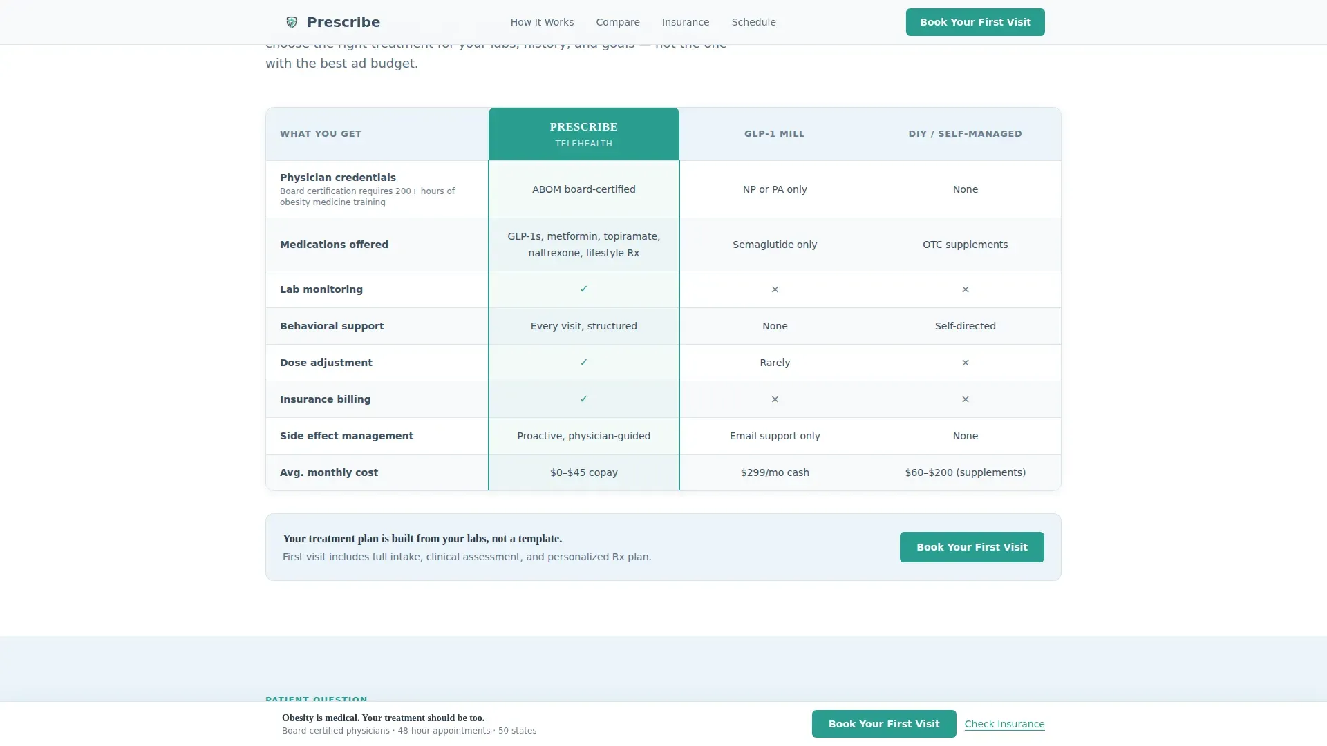
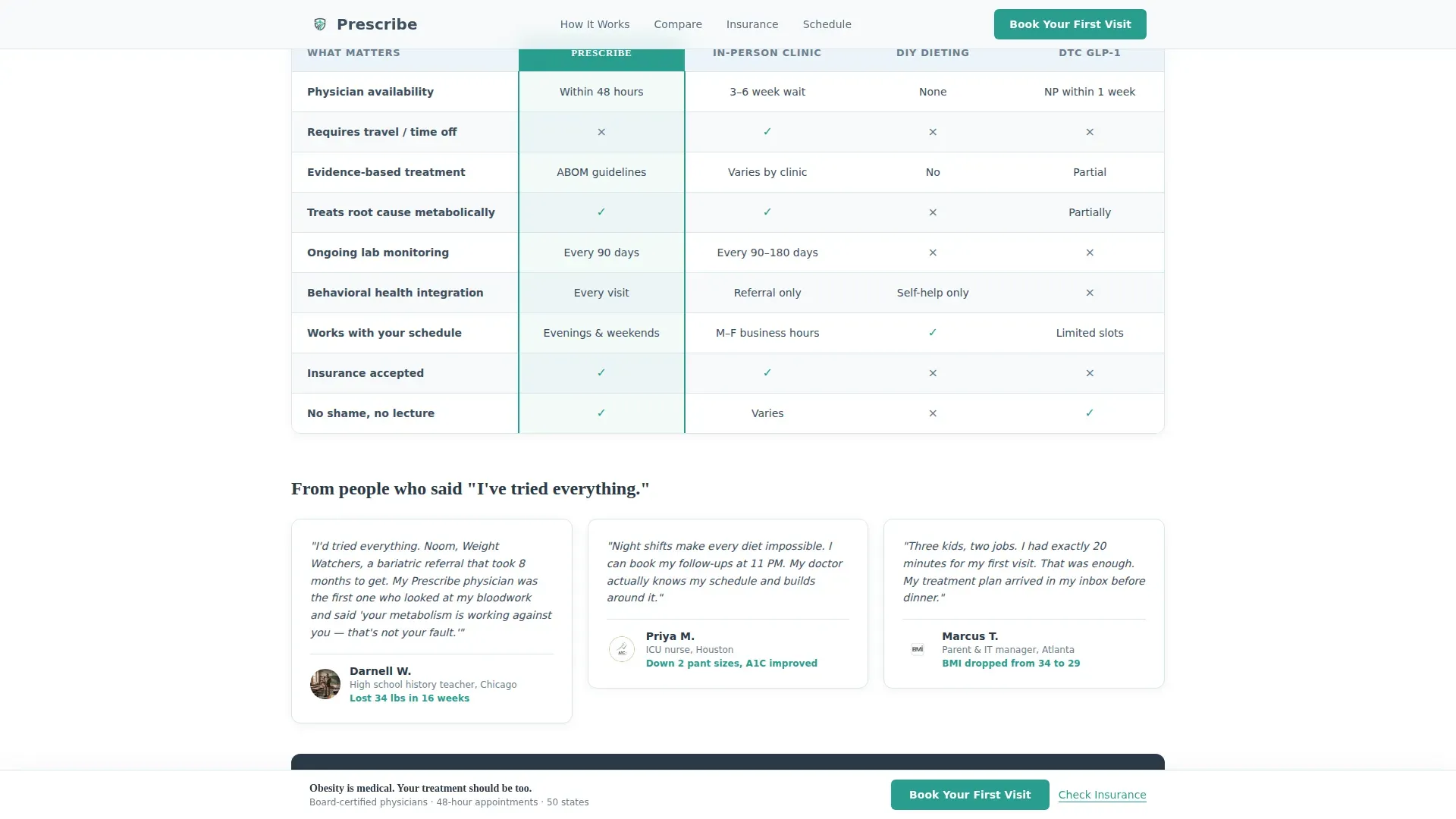
Each major scroll section opens with a real patient question in bold type. The answer unfolds beneath it and resolves into a comparison table. Tables pit the telehealth service against in-person clinics, do-it-yourself dieting approaches, and direct-to-consumer medication providers across criteria like physician credentials, lab monitoring, behavioral support, and cost transparency.
Three-Step Inline Scheduler
The booking flow lives on the page without any redirect. Visitors choose their state of residence, select a 20-minute or 40-minute initial consultation, then pick from a live calendar. This reduces drop-off between intent and commitment.
Insurance Carrier Lookup
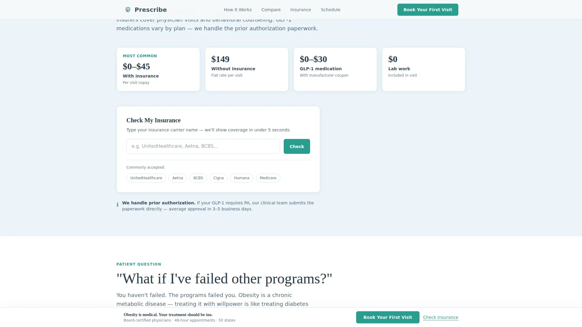
A secondary call-to-action labeled "Check My Insurance" sits beside each primary booking button. It opens a quick carrier lookup that resolves in under five seconds and feeds directly into the scheduler. It gives hesitant visitors a low-commitment entry point.
Responsive SVG Line Art Header
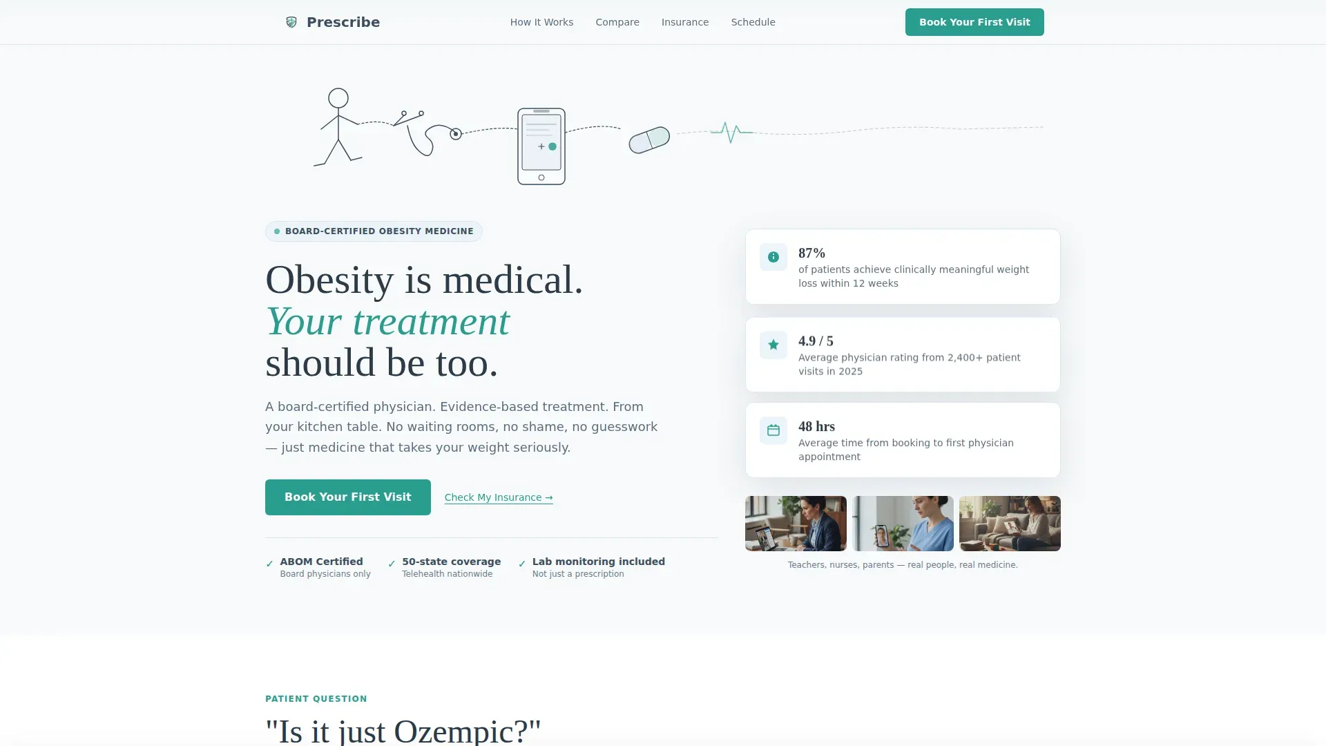
A single continuous thin-stroke illustration traces a human silhouette mid-step, a stethoscope, a smartphone, and a medication capsule, all connected by one unbroken line. The teal accent pulses gently at the phone screen. Below it, a serif headline sets the medical tone immediately.
Sticky Booking Bar
After the second FAQ section, a sticky bottom bar appears and persists as the visitor continues scrolling. It carries the primary "Book Your First Visit" call to action, keeping the conversion path visible without interrupting the reading flow.
Credential and Social Proof Callouts
The template includes placement for credential badges, board certification callouts, and patient outcome statistics. These elements build clinical authority without cluttering the layout.
Page sections overview
| Section | Purpose |
|---|---|
| Hero with line art | Establish medical tone and present dual calls to action |
| FAQ one: treatment scope | Address "Is it just Ozempic?" with a comparison table |
| FAQ two: insurance coverage | Explain cost transparency and surface the carrier lookup |
| FAQ three: past attempts | Address "What if I've failed?" with a full clinic comparison |
| Inline booking scheduler | Convert intent into a booked consultation in three steps |
| Footer row | Provide a clean single-row close with navigation and legal links |
Design & branding system
The visual theme is called Medical Clarity. It feels like a bright, freshly organized exam room: no clutter, no noise, just honest information in natural light. Every color in the palette has a specific job.
- Clinical slate (#3D4F5F) handles primary text and table headers; soft sky (#A8C6DF) fills section backgrounds and progress indicators; clean white (#F7F9FB) surfaces cards and open space
- Teal (#2A9D8F) is reserved exclusively for calls to action and interactive highlights, making every clickable element instantly recognizable
- Typography pairs Fraunces serif for headlines (giving the page clinical authority) with DM Sans for body text and interface elements (keeping everything approachable and easy to read)
Mobile & speed optimization
This template is built mobile-first by design. The target visitors are time-constrained adults checking their phones during a lunch break or between shifts, so every layout decision prioritizes small-screen clarity.
- Static content sections use server-rendered components to keep initial load lean; interactive elements like the scheduler and insurance lookup load as client components
- Scroll reveal animations and the SVG line draw are set to medium intensity, giving the page energy without slowing it down on low-bandwidth connections
How this template helps you convert
The conversion logic is sequential and deliberate. Every element earns the next click before asking for it.
- The FAQ structure answers the three biggest barriers (treatment breadth, cost, and past failure) before any booking prompt appears, so the visitor arrives at the scheduler already informed and less resistant
- The dual-path call to action (book directly or check insurance first) captures both ready-to-go visitors and hesitant ones, widening the funnel without diluting the primary goal
- The sticky booking bar and the inline three-step scheduler reduce the distance between decision and commitment to the smallest possible number of taps
Other information about this template
This template is designed specifically for the United States market. Dates display in MM/DD/YYYY format, pricing is shown in US dollars, and all copy defaults to American English.
- The page is localized for USA-based telehealth practices and is not pre-configured for international regulatory contexts
- The comparison tables are editable, so your team can update competitor columns, criteria rows, and outcome claims to reflect your actual service offering
- Animation intensity is set to medium: the SVG line draw plays on load, scroll reveals activate as sections enter view, and the teal pulse on the phone screen in the header runs as a subtle loop
Theme
Medical Clarity
Creative direction
FAQ-Driven
Color system
Slate & Sky
Style
Comparison Table
Direction
Booking/Scheduling
Page Sections
Faq-anchored Comparison Tables
Three-step Inline Scheduler
Insurance Carrier Lookup
Responsive SVG Line Art Header
Sticky Bottom Booking Bar
Credential and Social Proof Blocks
Related questions
What kind of practice is this template built for?
Can I edit the comparison table content?
Does the template include the scheduler, or do I build that separately?
Is this a multi-page template or a single landing page?
How does the insurance lookup work in the template?



