REO Property Preservation Landing Page Template
Preserve is a full-width landing page template built for foreclosure and REO property preservation companies. It opens with an interactive before-and-after slider, flows through three scroll-triggered case studies, and drives leads through a five-step portfolio assessment quiz. The design uses a navy, white, and brass palette that signals competence to asset managers, servicer VPs, and REO brokers.
by Rocket studio
Quick summary
Preserve is a single-page template designed for REO (Real Estate Owned) and foreclosure property preservation companies. It opens with a full-viewport before-and-after slider, walks visitors through three escalating case studies, and converts them with a five-step assessment quiz. The design communicates institutional authority from the first interaction.
Who this template is for
This template is built for property preservation companies that serve institutional clients. If your buyers expect proof before they commit, this layout delivers it.
- Asset managers at regional banks managing large defaulted property portfolios
- Servicer vice presidents needing monthly inspection photos that satisfy government-agency audit requirements
- REO (Real Estate Owned) brokers racing to get listings photo-ready before broker price opinion deadlines
What problem this template solves
Most property preservation websites look like contractor directories. They list services, add a contact form, and stop there. That approach fails with institutional buyers who evaluate vendors the way they evaluate balance sheets.
- Visitors from banks and servicers need proof of process, not just a service menu
- REO brokers and asset managers need to see complex, high-stakes properties handled, not just simple cleanouts
- Generic lead forms waste time; qualified buyers need a path that surfaces portfolio size, property type, and compliance framework before the first call
What you get with this template
You get a structured, high-impact landing page that earns trust through visual evidence and guided qualification. Every section has a job, and no section wastes the visitor's attention.
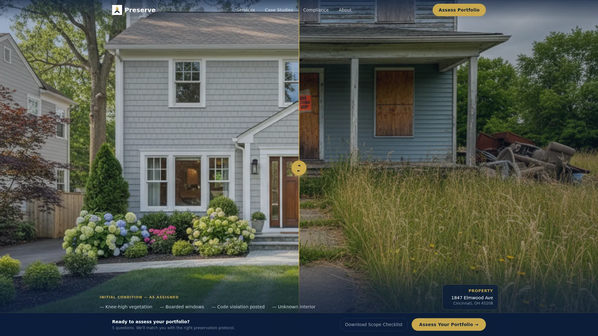
- A full-viewport before-and-after slider with a draggable brass handle and contextual scope-of-work overlays
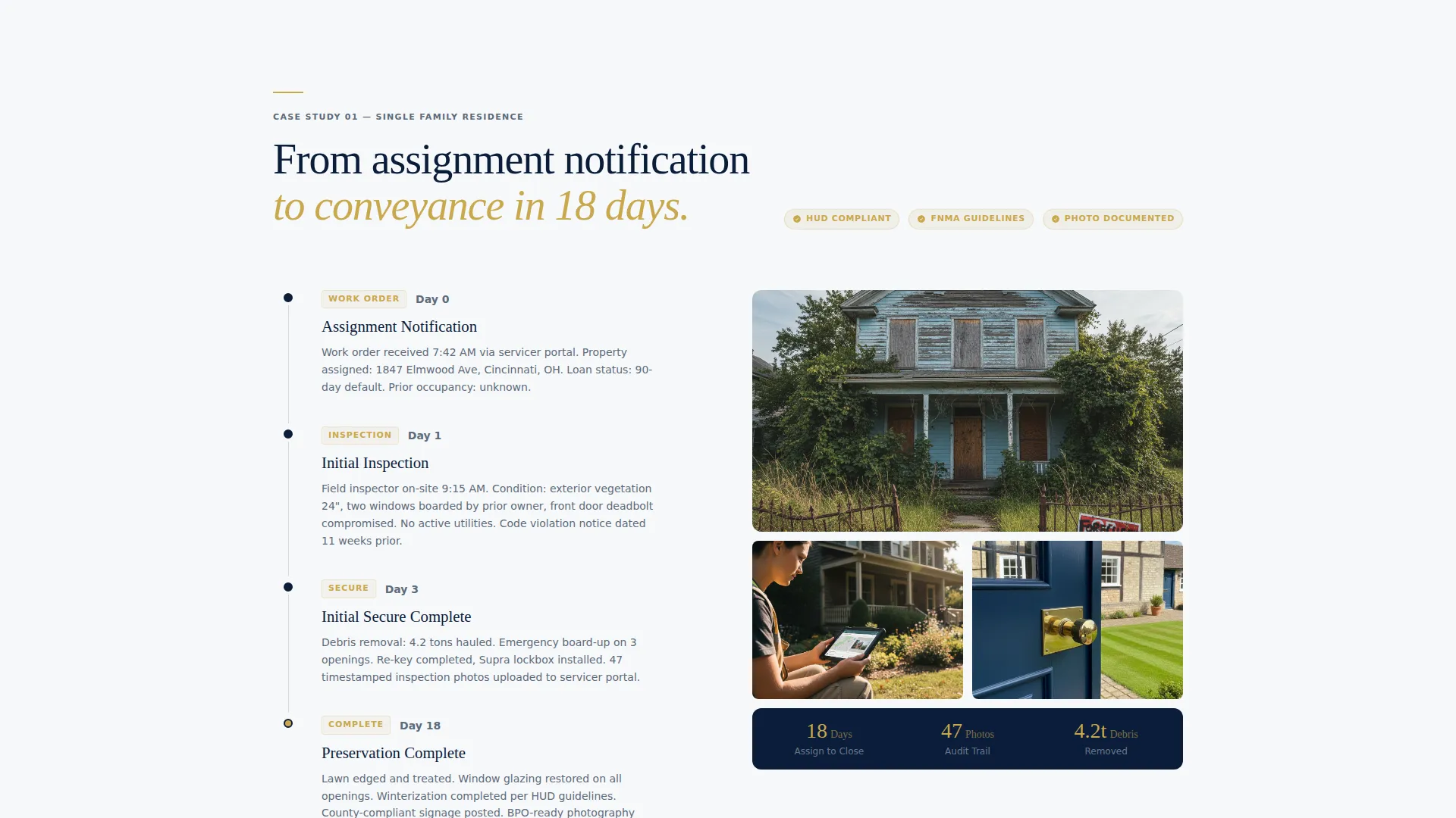
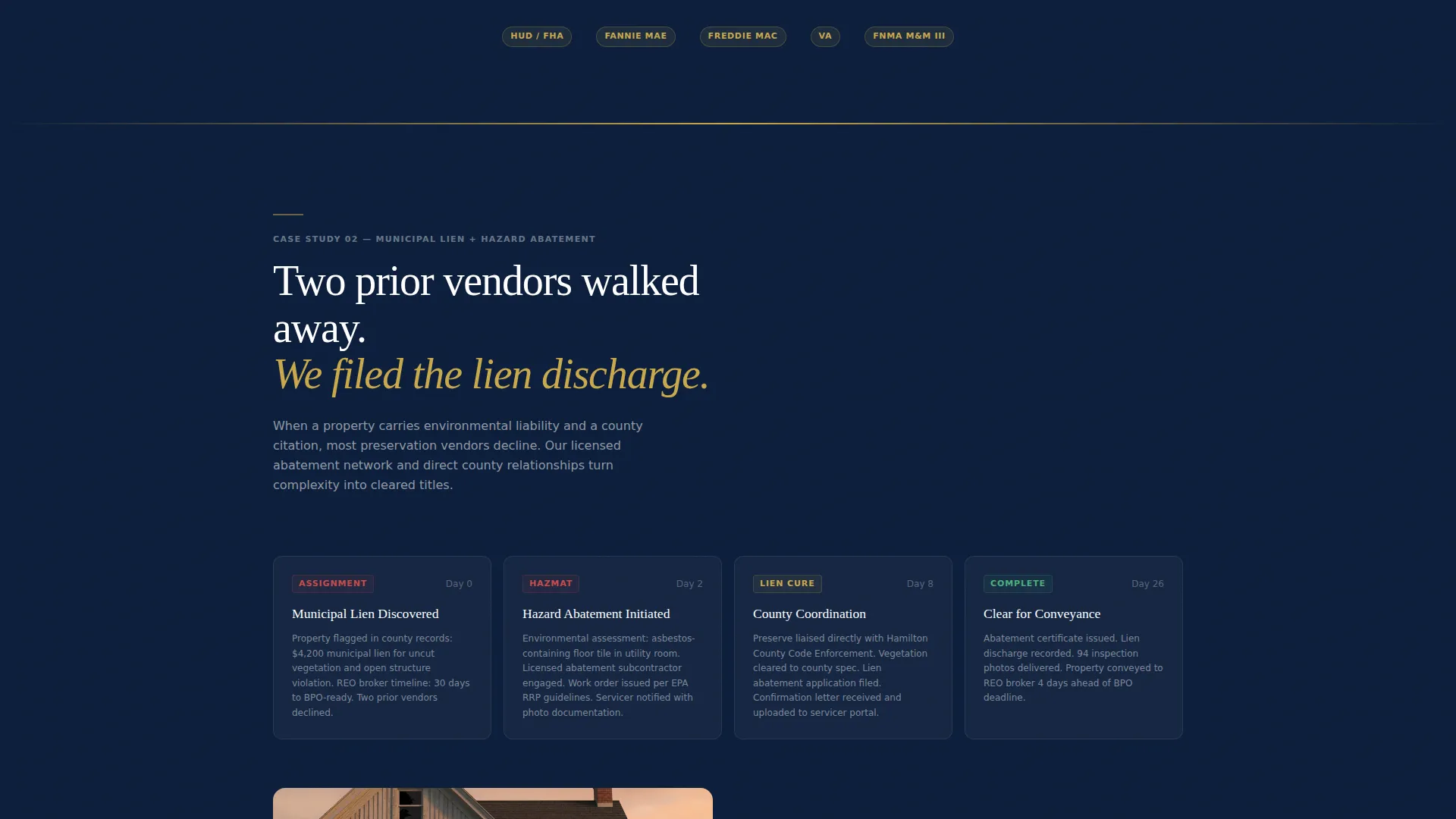
- Three scroll-triggered case studies covering routine preservation, municipal lien and hazard abatement, and multi-unit squatter remediation
- A five-step portfolio assessment quiz that qualifies leads by portfolio size, property type, pain point, and investor or agency guidelines followed
- A secondary email-capture path offering a downloadable preservation scope checklist for visitors not yet ready to book a call
Feature list
This section covers the core built-in components that make Preserve different from a standard service page.
Full-Viewport Before-and-After Slider
A draggable vertical brass line splits the hero image between a distressed property and its preserved state. Address details and scope-of-work data appear in a minimal overlay that updates as the visitor drags. There is no headline until the visitor interacts, so the transformation earns the words.
Scroll-Triggered Case Study Narrative
Three full-width case study blocks each follow a single property from assignment notification through final conveyance. Work order details, inspection photography, scope approvals, and completed preservation shots appear in sequence as the visitor scrolls. Each transition is triggered by scroll position, compressing the timeline visually.
Five-Step Portfolio Assessment Quiz
The primary call to action opens a full-screen five-step assessment. Steps collect portfolio size, property types, current pain point, investor or agency guidelines followed, and contact details. Each step is a single question on a navy panel with brass progress dots, keeping the experience focused and fast.
Fixed Brass-Accented Conversion Bar
After the first case study, a persistent bar anchors the primary call to action to the viewport. It stays visible as the visitor scrolls through proof-of-work content, keeping the conversion path accessible without interrupting the narrative.
Secondary Lead Capture Path
A separate email-capture prompt offers a downloadable preservation scope checklist. This gives visitors who are researching but not ready to commit a low-friction entry point. The checklist demonstrates inspection protocol depth without requiring a full conversation.
Navy Authority Design System
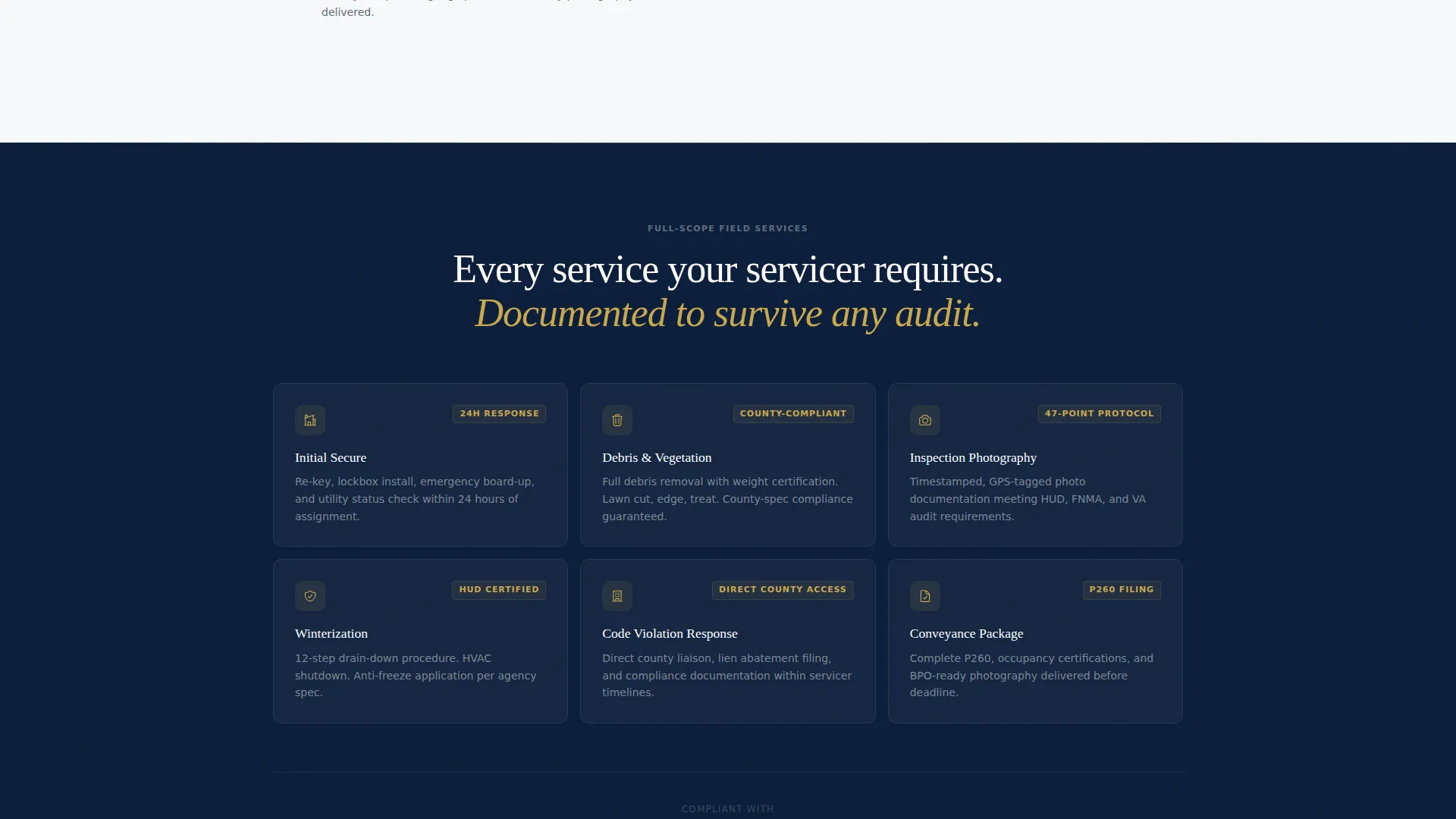
The color palette uses deep command navy, pressed-shirt white, steel gray, and a single polished brass accent. The result reads like the lobby of a private equity firm: no visual clutter, every surface signaling that a competent team is in charge.
Page sections overview
| Section | Purpose |
|---|---|
| Before/After Slider Hero | Opens with visual proof of transformation before any headline |
| Scope-of-Work Overlay | Displays assignment details tied to slider position |
| Case Study One | Documents routine preservation from work order to conveyance |
| Case Study Two | Covers municipal lien, hazard abatement, and compliance steps |
| Case Study Three | Shows multi-unit squatter remediation and utility restoration |
| Fixed Conversion Bar | Anchors the portfolio assessment call to action after the first case study |
| Portfolio Assessment Quiz | Qualifies leads across five focused steps |
| Checklist Capture Path | Offers a scope checklist PDF for lower-commitment visitors |
Design & branding system
The visual identity follows a Luxe Minimal theme built on a Navy Authority color system. Every color choice has a defined role, and the palette stays disciplined throughout the page.
- Deep command navy (#0B1D3A) covers hero sections and structural dividers, establishing authority on first load
- Pressed-shirt white (#F7F8FA) fills content panels, keeping body copy clean and easy to read
- Steel gray (#5C6B7A) handles body text and secondary labels, reducing visual weight without losing clarity
- Polished brass (#C9A84C) is reserved exclusively for calls to action, progress indicators, and interactive hover states
Mobile & speed optimization
The template is structured for a smooth experience across screen sizes. The immersive full-width components are designed to adapt without losing their visual impact on smaller viewports.
- The before-and-after slider adjusts to touch input, allowing mobile visitors to drag the brass handle with a finger
- The five-step assessment quiz fills the full screen on each step, keeping the experience legible and tap-friendly on phones and tablets
How this template helps you convert
The page does not ask for trust before earning it. Every component is sequenced to move a skeptical institutional buyer toward a qualified conversation.
- The before-and-after slider triggers curiosity before any text appears, drawing the visitor into the proof of work before asking them to read anything
- The three case studies escalate in complexity, building confidence that your company handles the hardest assignments without flinching, which is exactly what asset managers and servicer VPs need to see before they hand over a portfolio
- The fixed conversion bar and dual lead paths keep qualified buyers moving forward at their own pace, whether they are ready to book a call or just beginning their vendor evaluation
Other information about this template
Preserve is a strong fit for companies positioning themselves as institutional-grade vendors in the foreclosure property management space. The template's narrative structure and qualification flow are designed around the vocabulary and evaluation criteria of the REO industry.
- The quiz step that asks which guidelines a buyer follows covers the major investor and agency frameworks commonly referenced in preservation vendor evaluations
- The preservation scope checklist download serves as a trust-building asset for early-stage visitors who are comparing vendors across a shortlist
- The template is built on a single-page layout, so all sections live in one continuous scroll experience without requiring additional pages or subdomains
- The case study structure can be updated to reflect your own completed assignments, making the proof-of-work content directly relevant to your actual service history
Theme
Corporate Precision
Creative direction
Gallery Walk
Color system
Dark Emerald
Style
Card Grid (Modular)
Direction
Lead Generation
Page Sections
Full-viewport Before-and-after Slider
Scroll-triggered Case Study Narrative
Five-step Portfolio Assessment Quiz
Fixed Brass-accented Conversion Bar
Secondary Checklist Lead Capture
Navy Authority Design System
Related questions
Who is this landing page template designed for?
What is the five-step portfolio assessment quiz?
Is there a lower-commitment option for visitors not ready to book a call?
Does the before-and-after slider work on mobile devices?
Can I adapt the case studies to reflect my own completed assignments?



