Taxidermist Review Comparison Landing Page Template
Preserve is a single-page comparison and review landing page built for hunters researching taxidermists. It stacks real case studies side by side in structured comparison tables, gates a full download guide behind a simple email form, and invites visitors to submit their own reviews. The result is a trusted, authoritative resource that earns confidence before it ever asks for anything.
by Rocket studio
Quick summary
Preserve is a content-led landing page that brings taxidermist reviews together in one honest, scannable destination. Three ungated case studies walk hunters through harvest details, mount decisions, and final verdicts. A gated download and a peer review submission form extend the value further, turning a single page into a living reference guide for anyone who wants their trophy done right.
Who this template is for
This template is built for anyone publishing authoritative content in the taxidermy niche. It suits resource site owners, hunting community writers, and outfitter networks who want to help hunters make smarter mount decisions.
- Independent hunting content creators who compile taxidermist reviews and comparison guides
- Outfitters and lodge operators building a trusted resource for clients choosing between local and regional taxidermists
- Niche site builders targeting hunters who mount big game, waterfowl, fish, or exotic species
What problem this template solves
Hunters rarely have a neutral, structured place to compare taxidermists side by side. Most shop websites only show their own best work, and word-of-mouth reviews are scattered across forums and social groups. This page gathers real specifics into one scannable resource.
- No single place existed to compare turnaround times, form choices, and pricing fairness across multiple taxidermists at once
- Hunters with personal-best harvests had no reliable peer-review format to guide their mount decision
- Resource creators lacked a page structure that could demonstrate value before asking for an email
What you get with this template
You get a fully structured single-page layout organized around comparison tables, narrative case studies, and two distinct conversion paths. Every section is ready to populate with real review data.
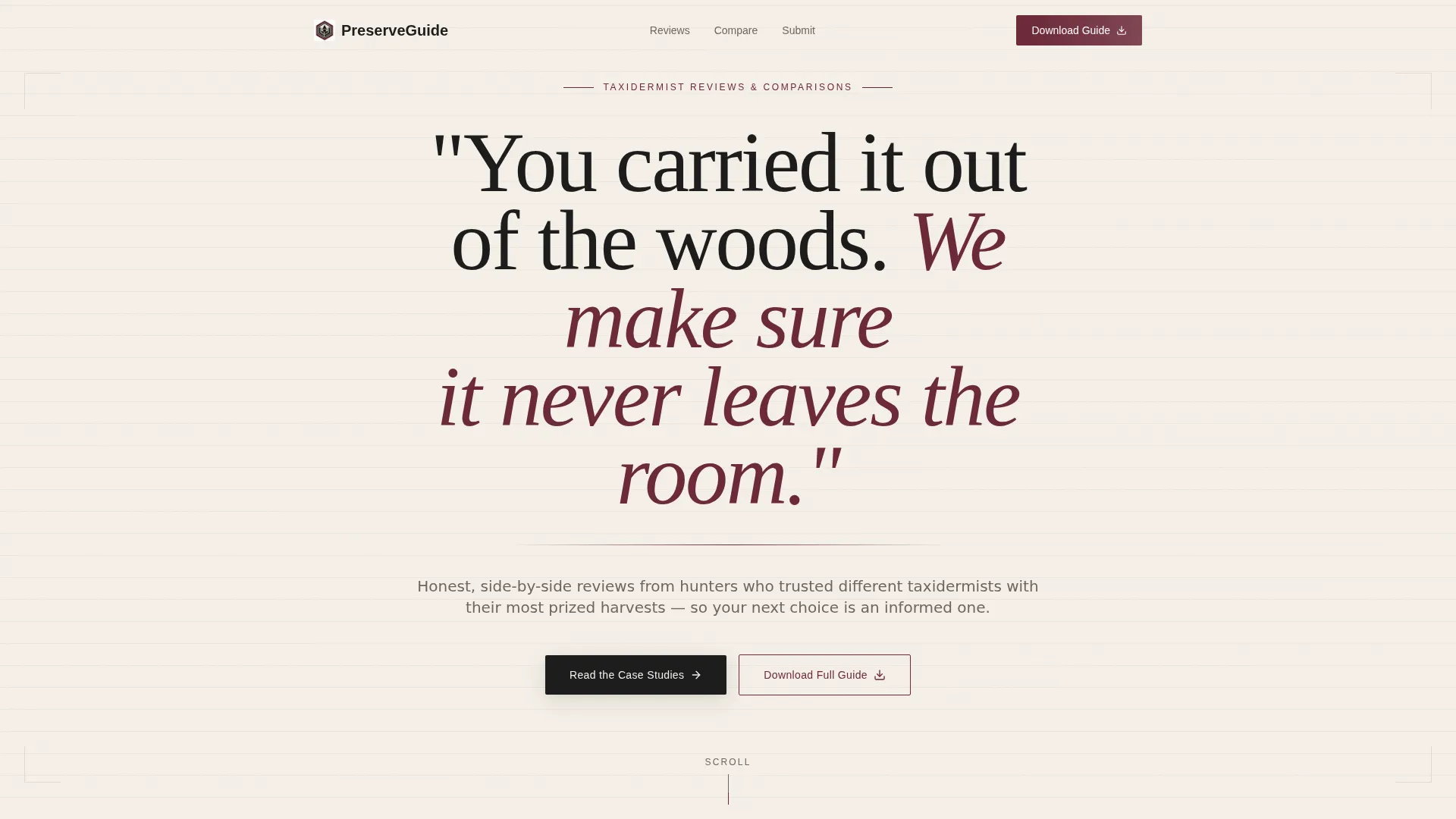
- A manifesto-style header with oversized serif typography and a burgundy rule that sets a serious, authoritative tone
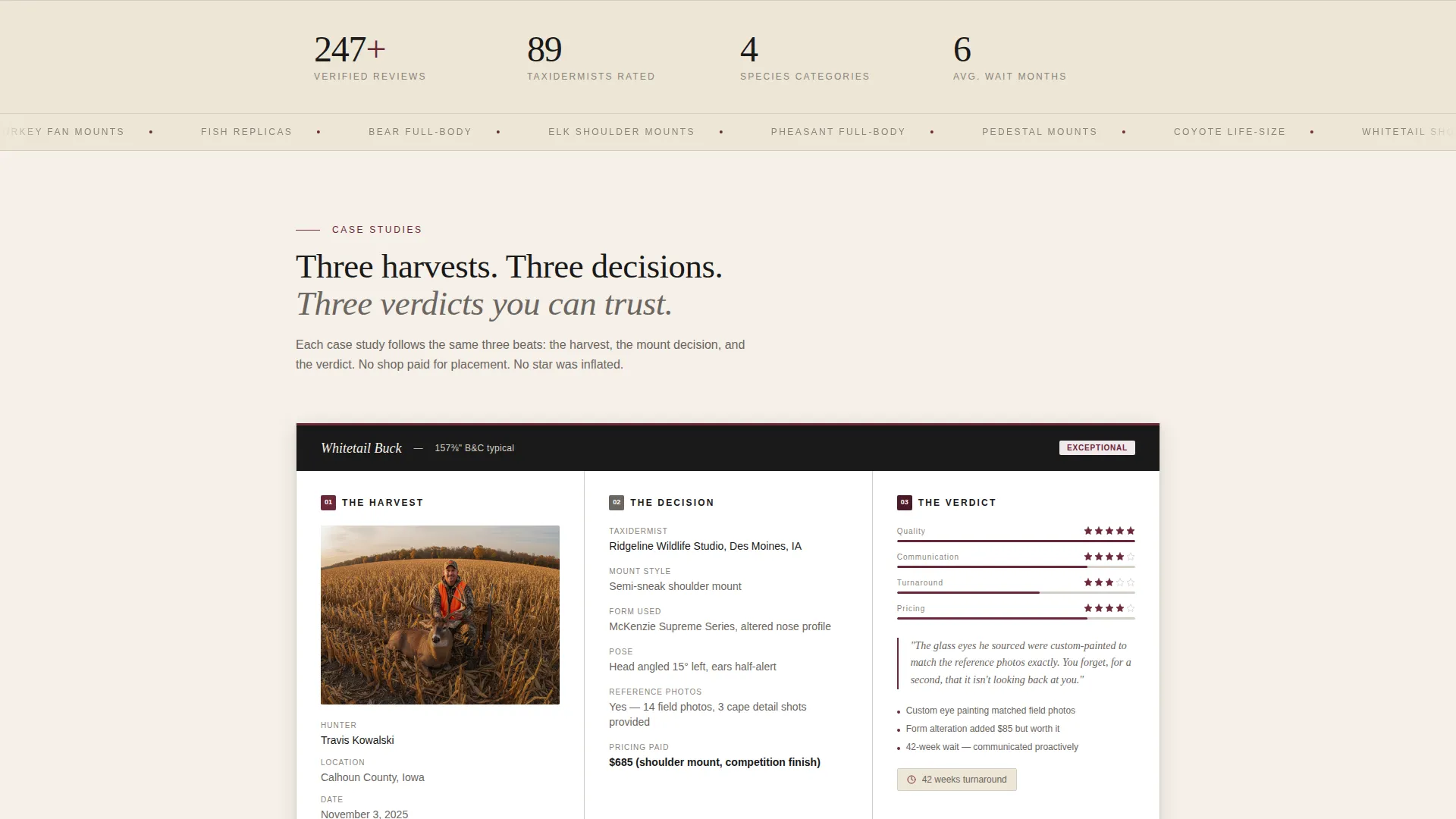
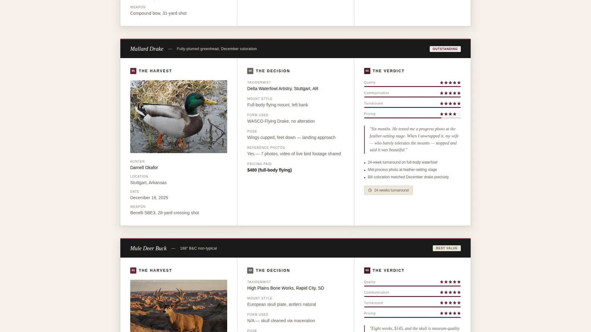
- Three visible, ungated case study sections built in a three-beat narrative format: harvest, mount decision, and verdict
- A gated download form with an email field and species-type checkboxes, plus a secondary peer review submission form
Feature list
This template includes the following built-in features grounded in its brief.
Manifesto Header with Typographic Focus
The header opens with a single line of oversized serif type on aged parchment. A thin burgundy rule separates the headline from a calm subhead naming the page's purpose. No image competes, keeping attention on the words and the promise they make.
Three-Beat Case Study Sections
Each ungated case study follows the same three-part structure: harvest context, mount decision details, and a scored verdict. This rhythm builds familiarity and trust as the visitor scrolls, making the gated download feel like a natural next step.
Side-by-Side Comparison Tables
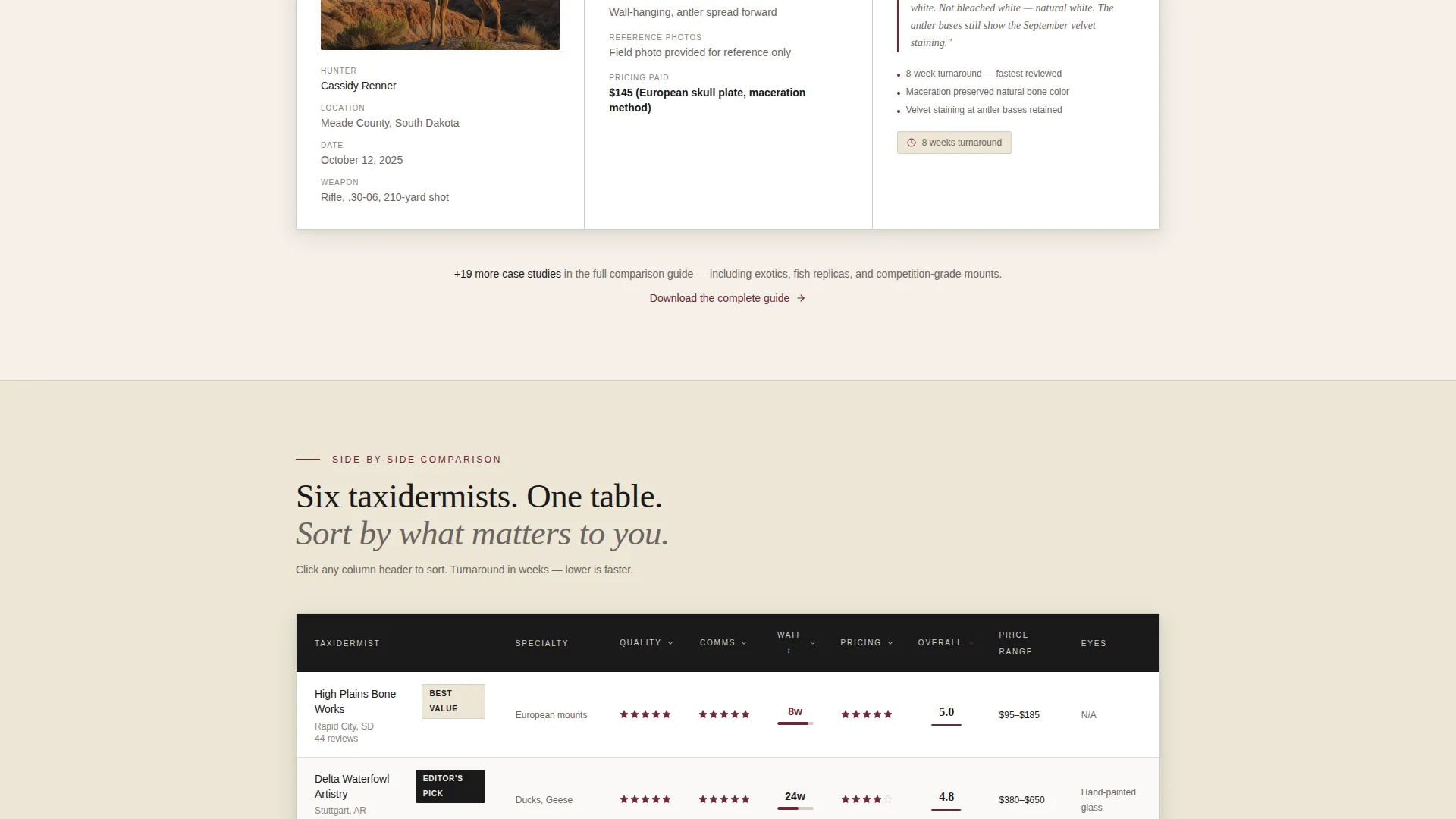
Comparison table rows let visitors scan across multiple taxidermists at once. Rows surface specific details like turnaround weeks, form type, eye finish, and communication quality, giving hunters exactly the data they need to evaluate their options.
Gated Download Form
The primary conversion point gates a full comparison guide behind a single email field and a species-type checkbox group covering big game, waterfowl, fish, and exotics. The low-friction ask is placed only after three full case studies have already delivered value.
Peer Review Submission Form
A secondary form invites visitors to submit their own taxidermist review. Fields capture taxidermist name, species mounted, turnaround weeks, and a one-to-five rating across four scored categories, growing the resource over time with structured peer input.
Ink and Paper Visual System
The color palette uses aged parchment, fountain-pen black, ledger-line gray, and field-journal burgundy. Together they produce a leather-bound journal aesthetic that feels deliberate, durable, and aligned with the hunting audience this page serves.
Page sections overview
| Section | Purpose |
|---|---|
| Manifesto Header | Opens with a bold serif headline and burgundy rule to anchor the page's authority |
| Page Purpose Subhead | Names the resource clearly so visitors know immediately what this page offers |
| Case Study One | First ungated hunter story covering harvest, mount decision, and scored verdict |
| Case Study Two | Second ungated narrative with a different species and taxidermist comparison |
| Case Study Three | Third ungated story completing the visible value before the conversion ask |
| Comparison Table Block | Rows of taxidermist data scanned side by side across key evaluation criteria |
| Gated Download Form | Email capture with species checkboxes gating the full comparison guide |
| Submit Your Review | Structured peer submission form collecting ratings across four scored categories |
Design & branding system
The visual identity follows a Service Utility theme with an Ink and Paper color system. Every design choice reinforces the feeling of a carefully kept hunting journal rather than a digital product.
- Color palette: aged parchment (#F5F0E8) as the base, fountain-pen black (#1A1A1A) for body text, ledger-line gray (#D4CFC6) for table rules and dividers, and field-journal burgundy (#6B2737) for ratings, highlights, and interactive accents
- Typography leads with oversized serif display type in the header and clean body text throughout, creating a contrast between editorial authority and readable utility
- No hero image competes with the header type; the page earns visual presence through deliberate spacing, ink-toned color, and structured table layouts
Mobile & speed optimization
The page layout is designed to translate cleanly to smaller screens. The comparison table structure and form components are arranged for comfortable vertical scrolling on mobile devices.
- Comparison table rows are structured for horizontal scroll or column prioritization on narrow viewports, so hunters reviewing on a phone can still scan key data
- Form inputs for the gated download and the peer review submission are sized and spaced for easy touch interaction without requiring zoom or precise tapping
How this template helps you convert
Value is front-loaded so every visitor reaches the conversion point already trusting the resource. The page is designed to move people forward through two complementary paths.
- The three ungated case studies create investment before the ask, making the gated download feel like the natural continuation of something the visitor is already reading rather than a cold exchange
- The secondary peer review form gives visitors who are not ready to download a lower-commitment action, keeping them engaged and contributing to the resource's long-term authority
Other information about this template
This template is part of the Preserve series, designed specifically for the taxidermist online presence niche within professional services. A few additional details worth noting before you build with it.
- The case-study narrative format is drawn from a Case Study Narrative creative direction, meaning the page structure is optimized for editorial credibility rather than promotional claims
- The species checkbox group in the download form covers big game, waterfowl, fish, and exotics, making it relevant across the full range of North American hunting categories
- The page functions as a Content and Resource destination, meaning it is suited to organic discovery, hunting community sharing, and outfitter referral traffic
- The template is classified under the Professional Services category with a Taxidermist Online Presence subcategory, making it a strong fit for anyone building niche authority in this space
Theme
Educational Guide
Creative direction
Expert Panel
Color system
Monochrome Steel
Style
Zigzag/Alternating
Direction
Click-Through
Page Sections
Manifesto Header with Typographic Focus
Three-beat Ungated Case Studies
Side-by-side Comparison Tables
Gated Download Capture Form
Peer Review Submission Form
Ink and Paper Color System
Related questions
Can I add more case studies beyond the three included?
Is the comparison table fixed, or can I change the criteria rows?
What happens after someone submits the peer review form?
Does the gated download require a specific file format?
Who is the typical audience for this type of resource page?



