Bold Brutalist Fitness PR Agency Landing Page Template
Press is a bold brutalist landing page template built for fitness PR agencies. It uses an asymmetric 60/40 grid, a gallery walk layout, and a striking ink-and-paper color system to present client case studies, earned media results, and a three-step B2B inquiry form. It is designed to win high-value partnerships with supplement brands, gym franchises, and athlete-entrepreneurs.
by Rocket studio
Quick summary
Press is a single-page fitness PR agency landing page template built on a bold brutalist aesthetic. The asymmetric 60/40 grid drives a gallery walk experience through client case studies, earned media proof, and a progressive inquiry form. It is purpose-built for B2B partnership conversion with direct-to-consumer supplement founders, gym franchise marketing leads, and athlete-entrepreneurs.
Who this template is for
This template is built for fitness PR agencies and performance marketing firms that want their landing page to do real selling. It speaks directly to an audience that values results over aesthetics and proof over promises.
- Fitness PR agencies positioning for B2B retainer clients
- Direct-to-consumer supplement founders and gym franchise marketing teams evaluating PR partners
- Athlete-entrepreneurs and brand builders who need a publicist fluent in both press cycles and performance culture
What problem this template solves
Most agency landing pages ask visitors to trust a brand before showing them a reason to. This template flips that order. It leads with proof and builds conviction room by room before asking for a single form field.
- Fitness PR agencies lose high-value leads when their site looks generic and fails to communicate industry authority
- Supplement founders and gym franchise CMOs need to see outlet logos, hard metrics, and real campaign results before they will engage
- A standard portfolio layout does not create the stop-and-read urgency that a B2B fitness PR pitch requires
What you get with this template
You get a complete, single-page layout structured around editorial proof and progressive conversion. Every section is designed to move a skeptical B2B buyer closer to the inquiry form.
- A full asymmetric 60/40 grid layout with alternating gallery rooms, each holding one client case study
- A three-step progressive inquiry form and a secondary gated download path for cooler leads
- A bold brutalist visual identity using the ink-and-paper color system with a searing highlight red reserved for calls to action
Feature list
This template includes a focused set of layout and conversion components drawn directly from the design brief.
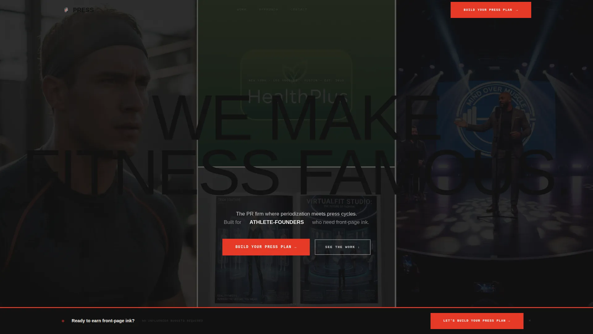
Giant Viewport Headline with Reveal Animation
The header opens with an ultra-condensed, all-caps grotesque headline scaled to fill the full viewport edge to edge. After a two-second hold, the headline splits like torn paper to reveal a grid of earned media placements, including magazine covers, podcast screenshots, and television segment stills sliding into position behind the fracture.
Asymmetric 60/40 Gallery Grid
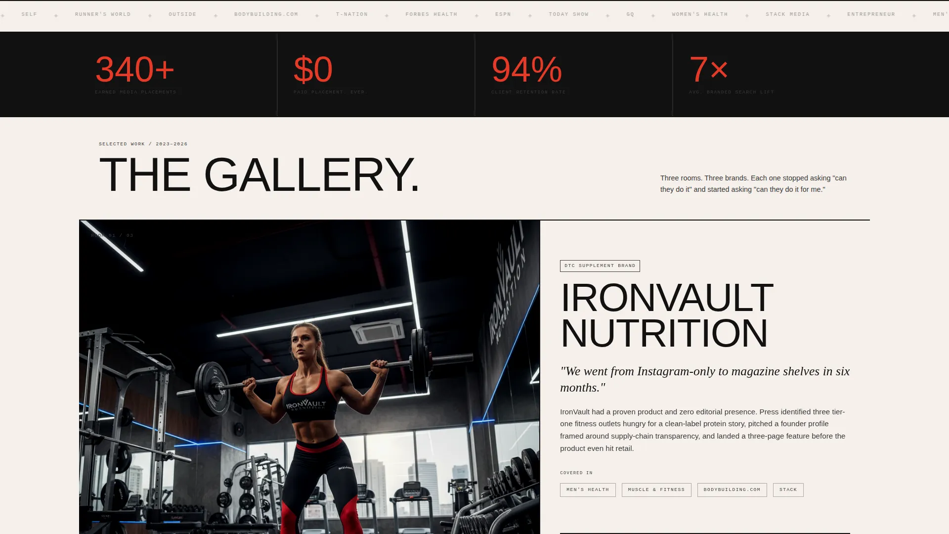
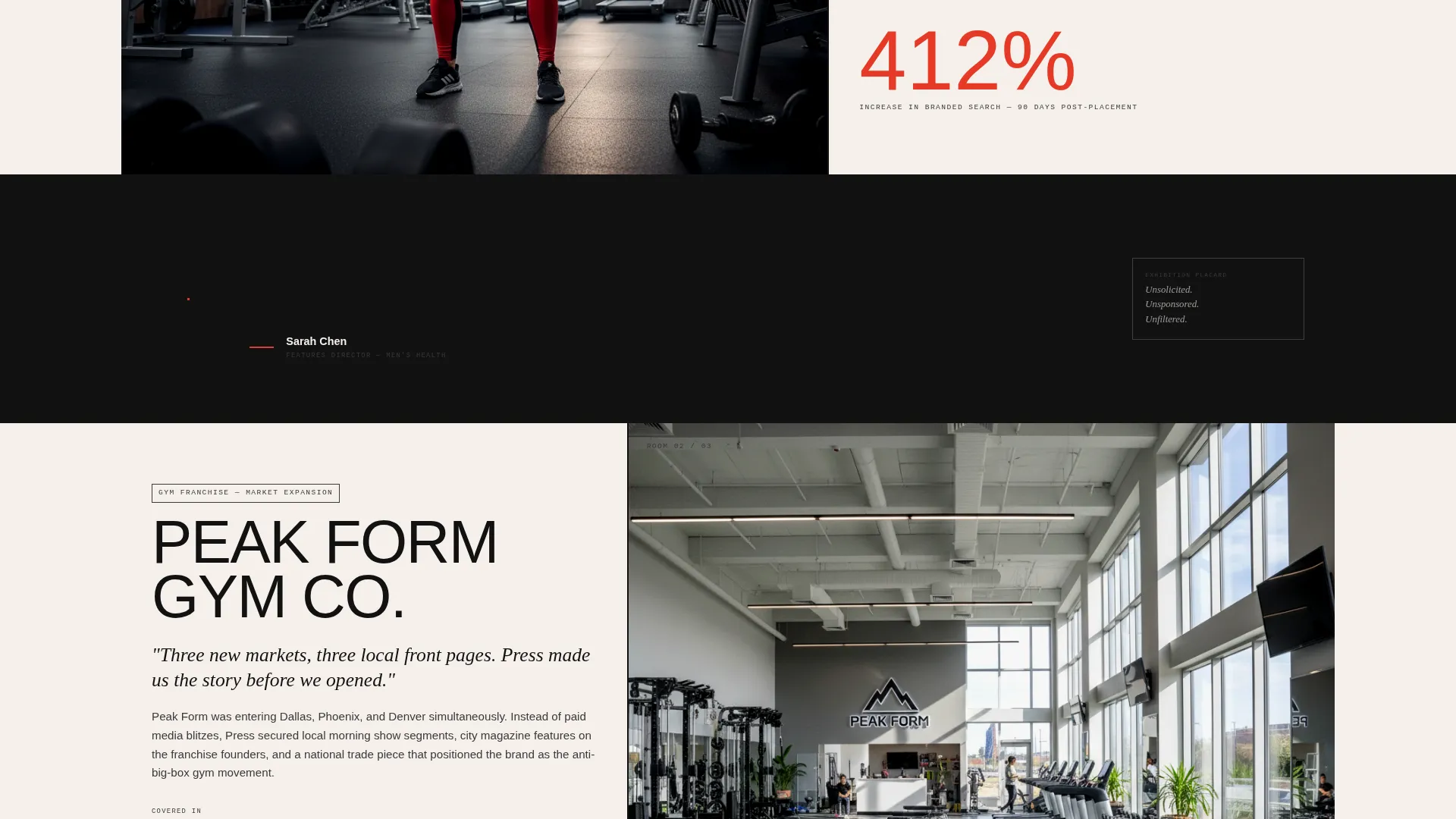
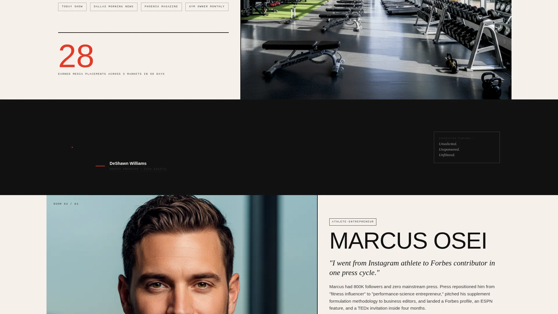
Each scroll section acts as a discrete gallery room inside a 60/40 column split. The 60-column carries a large editorial-style campaign image while the 40-column stacks the brand name, outlet logos, and a single oversized metric in highlight red. Rooms alternate sides to create a zigzag rhythm that mimics walking through a physical exhibition.
Pull-Quote Dividers
Stark black full-width dividers separate gallery rooms. Each divider carries an italic serif pull-quote from an editor or producer, functioning as exhibition placards that provide social proof between case studies.
Three-Step Progressive Inquiry Form
The primary call to action uses a three-step sequence. Step one captures brand name and website. Step two offers a checkbox grid of campaign goals such as product launch, founder profile, crisis repositioning, and event amplification. Step three collects name, role, and preferred contact method.
Fixed Bottom Call-to-Action Bar
After the second gallery room, a fixed bottom bar appears with the primary call to action. It stays visible as the visitor scrolls, providing a persistent conversion path without interrupting the gallery experience.
Gated Secondary Lead Capture
A secondary conversion path offers a downloadable report gated behind an email-only form. This captures cooler leads who are not ready to book a call but want to engage with the agency's editorial perspective.
Page sections overview
| Section | Purpose |
|---|---|
| Viewport headline reveal | Opens with full-bleed headline and tears apart to show earned media proof |
| Gallery room one | First client case study in 60/40 asymmetric grid with metric and outlet logos |
| Pull-quote divider one | Editorial social proof from a named editor or producer between rooms |
| Gallery room two | Second case study, image side alternated, with oversized red performance metric |
| Fixed call to action bar | Persistent bottom bar with primary inquiry call to action activates after room two |
| Pull-quote divider two | Second exhibition placard with producer or press contact quote |
| Gallery room three | Third case study continuing the zigzag rhythm and proof accumulation |
| Progressive inquiry form | Three-step B2B contact sequence collecting brand details, goals, and contact info |
| Gated report download | Secondary email capture offering the fitness media landscape report |
| Full-width call to action close | Closing section repeating the primary call to action at full width |
Design & branding system
The visual identity is built on a bold brutalist theme using an ink-and-paper color palette. Every color decision has a structural role, and nothing is decorative.
- Newsprint off-white (#F5F0EB) fills the 60-column background and gives the layout breathing room; dense editorial black (#111111) dominates type, borders, and structural dividers; smudged graphite (#3A3A3A) anchors secondary text and supporting labels
- A single searing highlight red (#E63926) is reserved exclusively for links, hover states, the fixed call to action bar, and the oversized performance metrics inside gallery rooms
- Typography uses an ultra-condensed all-caps grotesque face for headlines and an italic serif for pull-quote dividers, creating contrast between raw editorial energy and considered exhibition calm
Mobile & speed optimization
The template is designed to translate the brutalist grid experience cleanly across screen sizes. The structural logic of each gallery room is preserved as the layout adapts.
- The asymmetric 60/40 grid reflows for smaller screens so case study images and metric stacks remain readable without losing the editorial hierarchy
- Pull-quote dividers and the fixed call to action bar are built to work within mobile viewport constraints, keeping the conversion path visible throughout the scroll
How this template helps you convert
The page is structured as a deliberate conviction arc. Each room earns the next click before the form ever appears.
- The viewport headline and earned media reveal establish authority in the first seconds of the visit, removing doubt before the visitor has scrolled a single pixel
- The gallery walk builds case-by-case proof with real outlet logos and hard metrics, shifting the buyer's internal question from "can they do it" to "can they do it for me"
- The three-step progressive form and the gated report download offer two distinct paths to engagement, capturing both ready buyers and research-stage leads in the same page flow
Other information about this template
This template is part of the Portfolio and Agency category under the Fitness Marketing and Agency subcategory. It is specifically positioned for the fitness PR agency niche and carries an intersection match that aligns the bold brutalist theme, gallery walk creative direction, ink-and-paper color system, asymmetric grid template style, and partnership and B2B landing-page direction into a single cohesive build.
- The template style is classified as Asymmetric Grid (60/40) with a Bold Brutalist theme and a Gallery Walk creative direction
- The header concept is Giant Headline Centered, and the landing-page direction is Partnership and B2B conversion
- The color system is Ink and Paper, combining newsprint off-white, editorial black, smudged graphite, and highlight red as a structural palette rather than a decorative one
Theme
Bold Brutalist
Creative direction
Gallery Walk
Color system
Ink & Paper
Style
Asymmetric Grid (60/40)
Direction
Partnership/B2B
Page Sections
Viewport Headline with Torn-paper Reveal
Asymmetric 60/40 Case Study Grid
Pull-quote Editorial Dividers
Three-step Progressive Inquiry Form
Persistent Fixed Call to Action Bar
Gated Report Lead Capture
Related questions
Who is this landing page template designed for?
Can I show multiple client case studies with this template?
How does the three-step inquiry form work?
What is the secondary lead capture option?
Is this template built for a single service offer or multiple?



