Local Brick & Mortar Business Booking Website Template
Press is a single-page landing page template built for dry cleaners and garment care businesses. It uses a seasonal gallery format, an interactive detail panel system, and a sticky booking call-to-action to guide visitors from curiosity to confirmed pickup. The Playful Geometric visual identity and Cloud Canvas color palette make every section feel as crisp and inviting as a freshly pressed shirt.
by Rocket studio
Quick summary
Press is a gallery and detail landing page template designed for dry cleaners. It walks visitors through a seasonal scroll of garment photography, expands each item into a service detail panel, and pushes every interaction toward a single frictionless action: booking a pickup. The result is a polished, purposeful page that earns trust before asking for a tap.
Who this template is for
This template is built for local dry cleaning and garment care businesses that want an online presence that actually converts. It suits owners who serve a mix of everyday and special-occasion clients and who want their page to feel premium without being cold or complicated.
- Dry cleaners targeting young professionals, busy parents, and bridal clients
- Local garment care shops offering seasonal or specialty cleaning services
- Small business owners who need a booking-focused landing page with zero form friction
What problem this template solves
Most dry cleaner websites feel like digital brochures. They list services in plain text, offer a phone number, and leave the visitor to figure out the rest. Press solves the gap between a great local reputation and a page that actually moves people to act.
- Visitors leave without booking because the path to action is unclear or buried
- Generic layouts fail to communicate the care and craft behind specialty garment services
- No visual storytelling means seasonal services like wedding gown preservation go unnoticed
What you get with this template
You get a complete single-page layout built around garment photography, seasonal scroll sections, and a sticky call-to-action that stays with the visitor throughout. Every visual and structural decision points toward one outcome: a confirmed pickup booking.
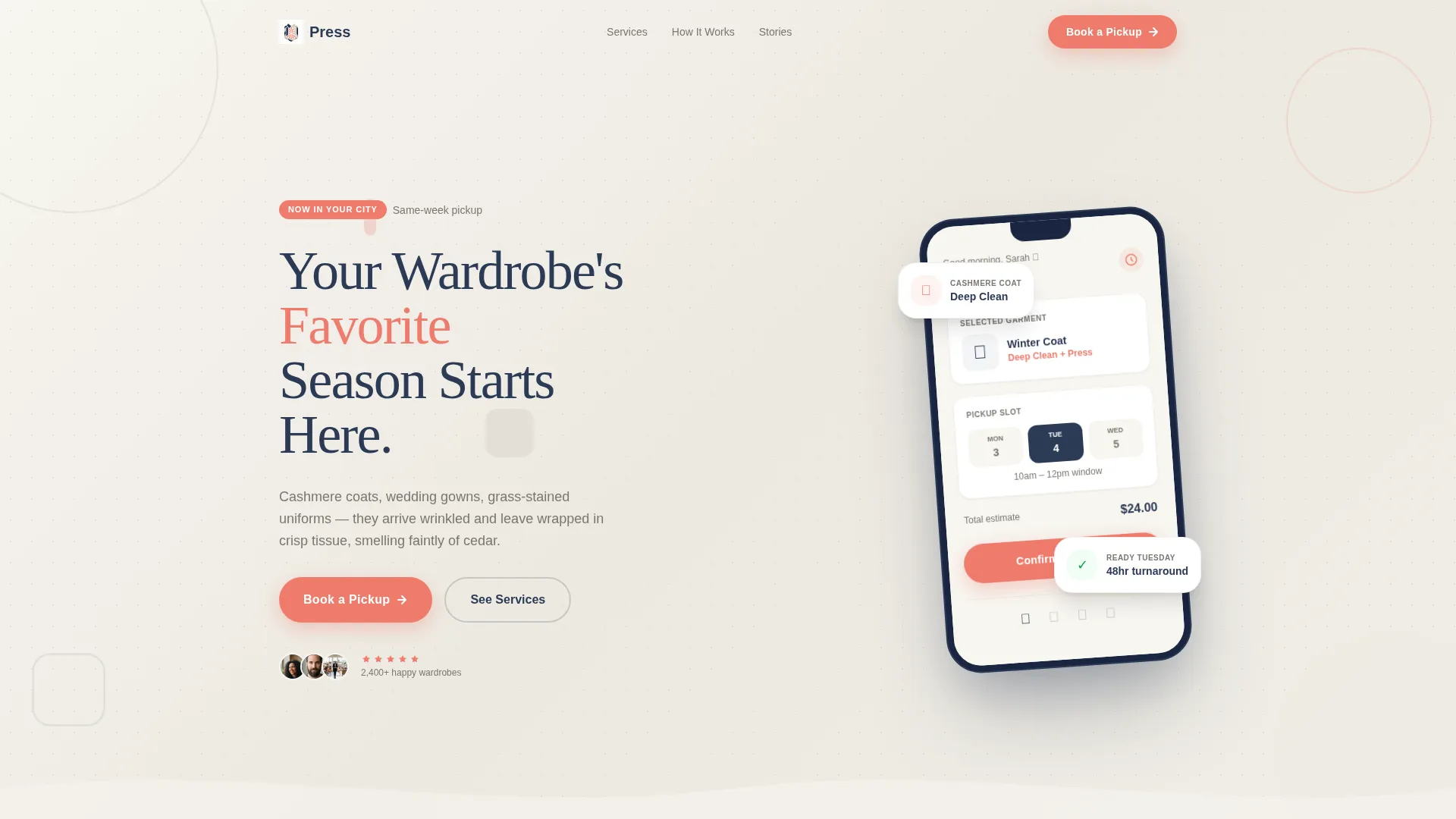
- A device mockup header with a live booking interface preview and headline
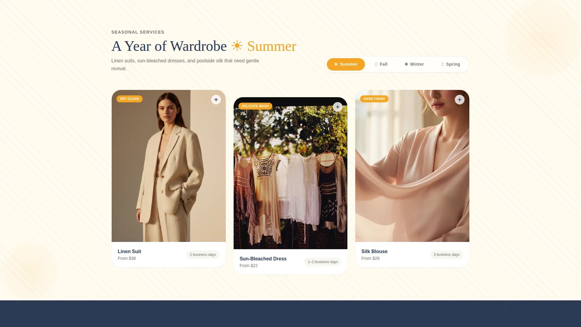
- Four seasonal gallery rows, each expandable into a full service detail panel
- A sticky coral booking button and secondary pricing call-to-action inside each detail panel
Feature list
A paragraph introduces the feature set: every component in this template is purpose-built for a local service business that sells trust and convenience in equal measure. The features below reflect what the template delivers directly from the source brief.
Seasonal Scroll Gallery
The page is divided into four seasonal chapters: summer, fall, winter, and spring. Each chapter presents a gallery row of garment photography matched to that time of year, from linen suits to velvet holiday dresses to wedding gowns. The scroll feels like flipping through a well-dressed calendar.
Expandable Service Detail Panels
Clicking any gallery item opens a detail panel showing the specific cleaning process, estimated turnaround time, and a before-and-after fabric close-up. This lets visitors understand exactly what happens to their garment before they commit to a booking.
Device Mockup Header
The header features a phone screen angled over a cloud-white background, displaying the shop's booking interface mid-action. A headline sits beside it, and the primary "Book a Pickup" call-to-action appears here first, making the booking intent clear from the very first moment on the page.
Sticky Booking Call-to-Action
A coral "Book a Pickup" button follows the visitor as they scroll through every seasonal section. It stays visible without being intrusive, so the path to action is always one tap away regardless of how deep into the page the visitor has scrolled.
Context-Aware Pricing Links
Each detail panel includes a secondary call-to-action labeled "See Pricing for This Service." When clicked, it carries the visitor to a dedicated scheduling page with the relevant garment type pre-selected. This reduces decision friction and keeps the booking flow connected to what the visitor was just looking at.
Shifting Geometric Color Motifs
The geometric background patterns shift palette slightly with each seasonal section. Summer sections use warmer corals, while winter sections lean into deeper navies. This keeps the page visually dynamic without requiring a redesign and reinforces the seasonal storytelling direction.
Page sections overview
| Section | Purpose |
|---|---|
| Device Mockup Header | Introduces booking interface and primary call-to-action |
| Summer Gallery Row | Showcases linen and warm-weather garment services |
| Fall Gallery Row | Highlights wool, outerwear, and muddy-kit cleaning |
| Winter Gallery Row | Features velvet, holiday wear, and salt-stained boot care |
| Spring Gallery Row | Presents wedding gowns, blazers, and seasonal refresh services |
| Seasonal Detail Panels | Expands each garment into process, timing, and before-and-after view |
| Sticky Booking Button | Keeps primary call-to-action visible throughout the full scroll |
Design & branding system
The visual identity follows a Playful Geometric theme using the Cloud Canvas color system. The palette feels like a freshly folded stack of linens on a marble counter: airy and clean, with a playful pop of color where it matters most. Geometric shapes, including circles, rounded triangles, and offset grids, tile across section backgrounds like the repeating patterns on a laundry ticket.
- Core palette: laundry white (#F7F5F0), warm gray (#D4CFC6), pressed-crease navy (#2B3A55), and hanger-tag coral (#EF7B6C) reserved for buttons, badges, and interactive elements
- Seasonal palette shifts: coral tones warm up for summer sections, navy deepens for winter sections, keeping the scroll visually varied
- Geometric motifs repeat across backgrounds to create texture without clutter, grounding the playful identity in a clean, structured layout
Mobile & speed optimization
The template is designed with a single-page, scroll-driven structure that naturally suits smaller screens. The sticky booking button, device mockup header, and expandable detail panels are all built to work within a touch-first browsing context.
- The sticky coral call-to-action remains accessible on mobile without covering content, keeping the tap path clear at every scroll depth
- Seasonal gallery rows are laid out to reflow cleanly on narrower viewports, preserving the visual chapter structure on phones and tablets
- The device mockup header scales proportionally, keeping the booking interface preview legible and the headline readable on all screen sizes
How this template helps you convert
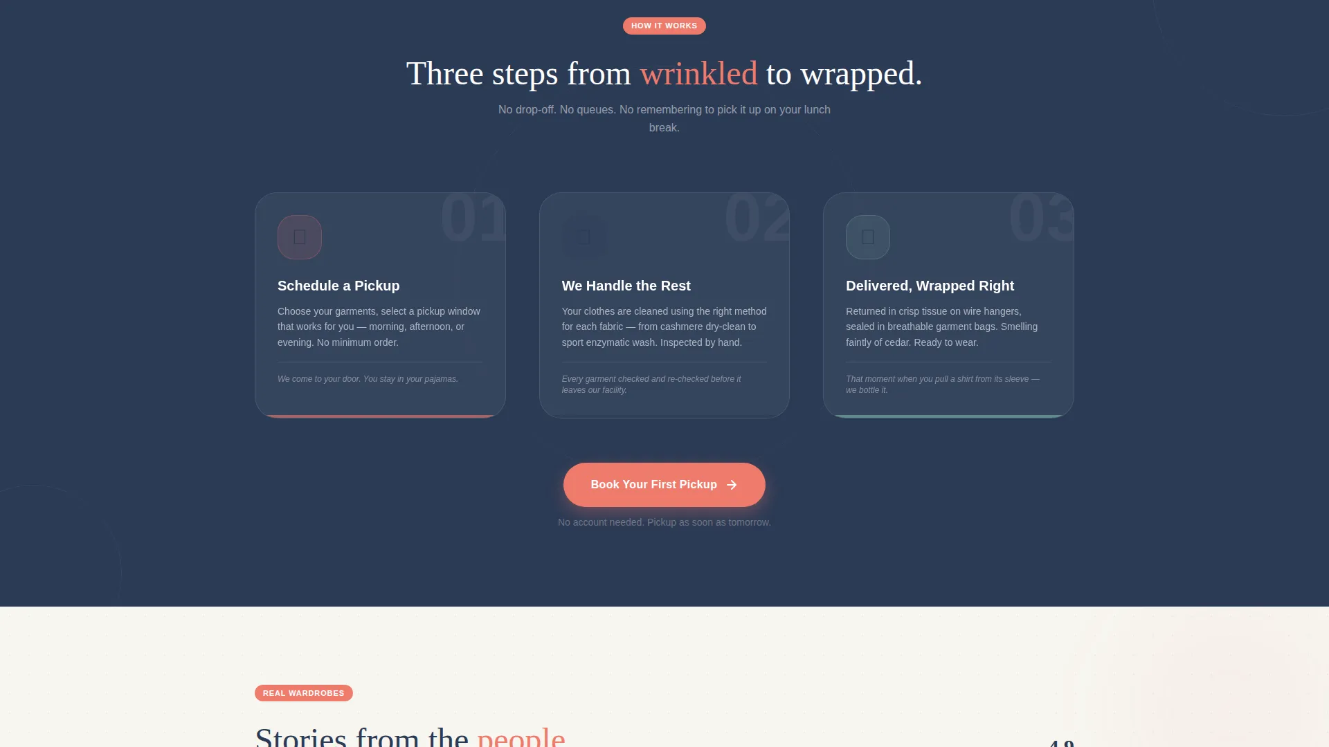
The entire layout is built around a single conversion goal: getting a visitor to tap "Book a Pickup" with confidence. Every structural decision reduces the number of steps between landing on the page and taking action.
- The device mockup header places a booking interaction in front of the visitor immediately, framing the experience as action-first rather than information-first.
- The sticky call-to-action button eliminates the need to scroll back to the top, so the booking prompt is never more than a tap away regardless of where the visitor is on the page.
- The context-aware pricing links in each detail panel carry garment-type context into the scheduling flow, so visitors arrive at the next step already oriented and ready to confirm.
Other information about this template
This template is categorized under Retail and E-Commerce for local brick-and-mortar businesses. It is designed as a single-page landing page, not a multi-page website, so all content and conversion flow lives within one scrollable experience. The template is well suited to businesses that rely on repeat seasonal clients and want their page to reflect the quality of their in-store service.
- The no-form design philosophy means the landing page itself captures zero input fields; all data collection happens on the linked scheduling page
- The template supports a gallery-plus-detail content model, making it straightforward to swap in new garment photography or update seasonal service descriptions as the calendar changes
- The Playful Geometric theme and Cloud Canvas palette are distinct enough to stand out in local search results and social shares, where most competitor pages default to plain white or stock-photo layouts
Theme
Neo-Retro
Creative direction
Unboxing Experience
Color system
Citrus Burst
Style
Masonry/Pinterest
Direction
Marketplace/Multi
Page Sections
Seasonal Scroll Gallery Chapters
Expandable Service Detail Panels
Device Mockup Header Section
Sticky Coral Booking Button
Context-aware Pricing Call-to-action
Shifting Geometric Background Motifs
Related questions
Does this template include a booking form on the landing page?
Can I update the garment photography for each seasonal section?
How does the context-aware pricing link work inside each detail panel?
Who is this landing page template designed for?
Can the Cloud Canvas color palette be customized to fit my existing brand?



