Commercial Printing Landing Page Template
Press is a single-column landing page template built for commercial printing operations. It guides visitors through a production-floor narrative, from prepress diagnostics to finishing details, using a dark Charcoal and Amber palette and terminal-style data callouts. A gated checklist download, substrate guides, and turnaround calculators make it a practical resource hub that earns trust before asking for an email.
by Rocket studio
Quick summary
Press is a single-column flow landing page template designed for commercial printing businesses. It moves visitors through a production narrative, prepress, press, and finishing, using a Data Command visual theme. The page combines technical credibility with a gated resource hub, turning a print-floor aesthetic into a lead-generating content experience.
Who this template is for
This template is built for commercial printing operations that serve high-volume, deadline-driven clients. It works best when your audience already understands production language and responds to specificity over polish.
- Trade show print vendors and wide-format production shops serving booth deadlines
- Franchise print service providers managing multi-location signage rollouts
- Commercial printers targeting agency production managers and procurement teams
What problem this template solves
Most print service landing pages look like brochures. They list equipment specs without context and ask for a quote before building any trust. The result is a high bounce rate from qualified buyers who needed proof before they were willing to engage.
- Visitors leave before reaching the call to action because the page offers no educational depth
- Print buyers with technical knowledge distrust vague claims and need substrate, ink, and turnaround specifics
- Resource-heavy buyers need a reason to share their email, not just a contact form
What you get with this template
You get a fully structured single-column landing page that organizes content like a production floor. Each scroll section maps to a production stage, deepening credibility as the visitor moves down the page.
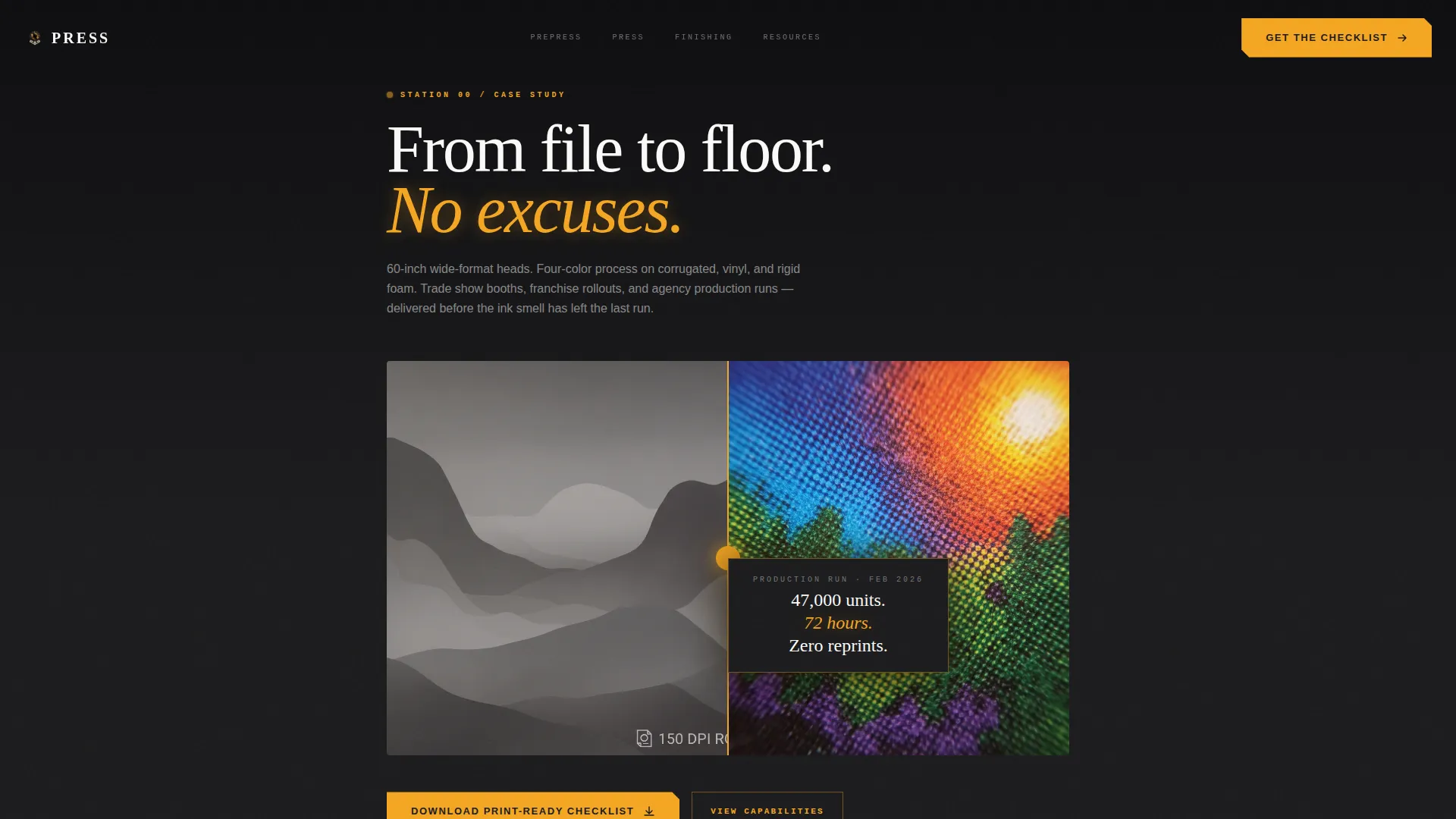
- A Case Study Before/After header with a hero stat callout and macro product photography direction
- Prepress, press, and finishing content stations with amber-highlighted terminal-style data readouts
- A gated checklist download with an email field and role selector, plus secondary resource cards for substrate guides, ICC profile packs, and turnaround calculators
Feature list
This template ships with a focused set of components matched to the production-floor narrative and content-hub conversion model.
Case Study Header with Stat Callout
The header is a split-frame Before/After composition. The left panel shows the original artwork file; the right shows the finished printed piece at macro distance. A single performance stat floats between the two frames, grounding the page in measurable output from the first scroll.
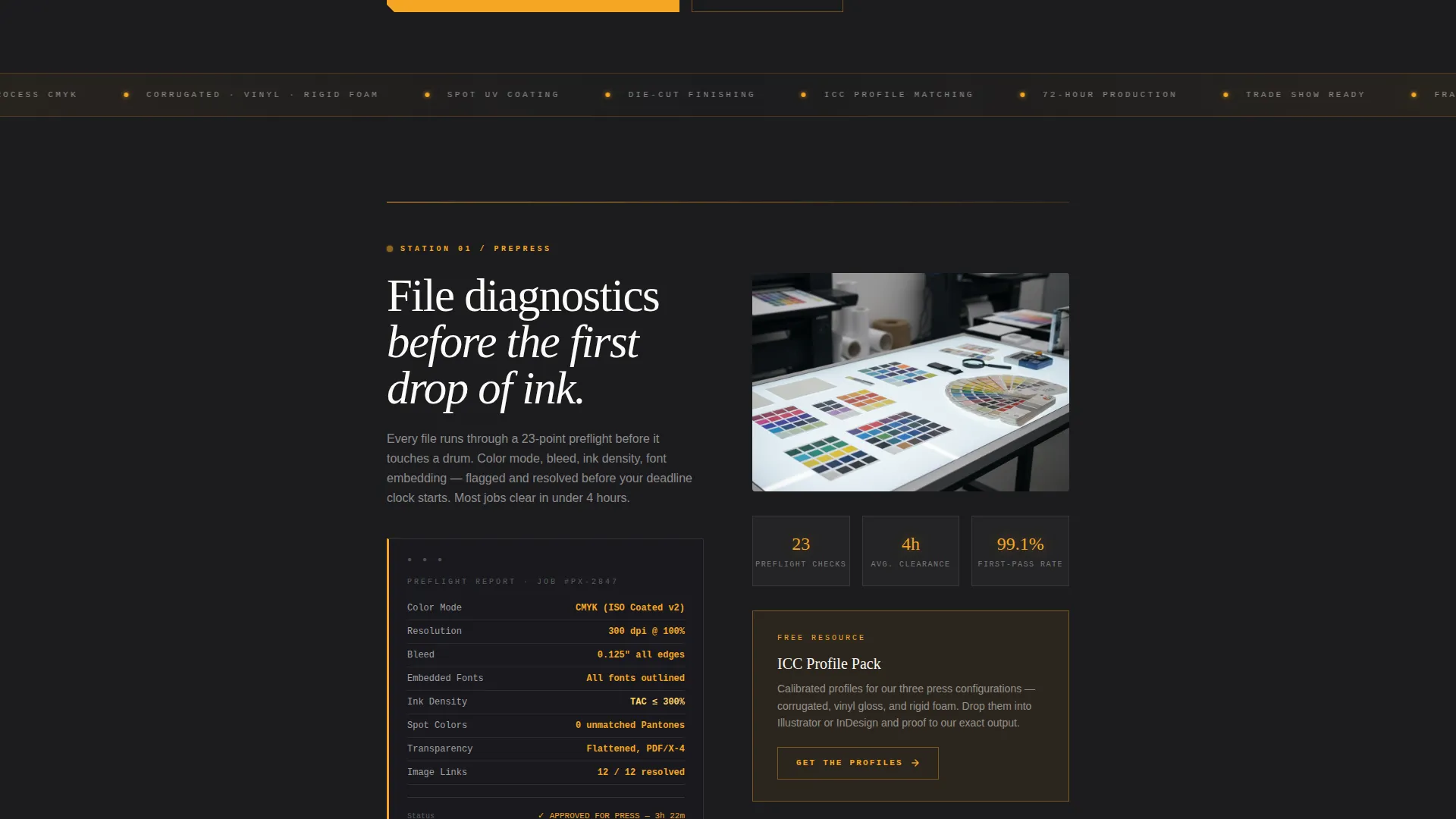
Terminal-Style Data Readouts
Amber-highlighted readout blocks surface throughout the prepress and press sections. They present ink coverage percentages, substrate specs, and color-matching data in a format that looks like engineering tolerances, reinforcing technical authority at every station.
Gated Resource Hub with Role Selector
The primary call to action gates a Print-Ready Checklist behind a single email field and a role selector with three options: designer, marketer, or procurement. This light qualification step keeps the lead form low-friction while collecting useful segmentation data.
Secondary Resource Cards
Below the primary gate, individual amber-outlined cards each surface a distinct resource: substrate comparison guides, ICC profile packs, and turnaround calculators. Every card carries its own "Get the Guide" button, letting visitors self-select the resource most relevant to their role.
Production Station Scroll Architecture
The page is divided into three named production stations: prepress, press, and finishing. Each station functions as a self-contained content section. Visitors encounter the relevant knowledge before any resource is offered, so the download request feels earned rather than premature.
Architectural Cross-Section Diagrams
The finishing station uses architectural cross-section diagram layouts to explain binding, coating, and fulfillment logistics. This visual format communicates process depth without requiring paragraphs of explanation.
Page sections overview
| Section | Purpose |
|---|---|
| Case Study Header | Open with proof via Before/After split frame and hero stat |
| Prepress Station | Present file diagnostics and color-matching data in terminal readouts |
| Press Station | Stack ink coverage percentages and substrate specs as engineering data |
| Finishing Station | Explain binding, coating, and fulfillment via cross-section diagrams |
| Primary Resource Gate | Capture email with checklist download and role selector |
| Secondary Resource Cards | Offer substrate guides, ICC packs, and turnaround calculators individually |
Design & branding system
The visual identity follows a Data Command theme built around a Charcoal and Amber color system. Every color choice references the physical environment of a commercial print floor operating at night.
- Deep press-room black (#1C1C1E) and roller-drum charcoal (#3A3A3C) dominate backgrounds and section dividers, with substrate white (#FAFAF8) used for body text and case study cards
- Machine-warning amber (#F5A623) fires on calls to action, hover states, and data callouts, creating a strong visual rhythm that pulls the eye toward interactive elements
- The single-column layout keeps reading flow linear and disciplined, mirroring the movement of sheets feeding through a press line
Mobile & speed optimization
The single-column layout is inherently well-suited to smaller screens. Content stacks in the same production-station order regardless of viewport, so the narrative flow stays intact on mobile devices.
- The linear scroll architecture eliminates complex grid reflow, keeping the production-station sequence legible on any screen width
- Amber call to action buttons and outlined resource cards maintain strong contrast against dark charcoal backgrounds, keeping interactive targets easy to identify on smaller displays
- The role selector and email field in the primary gate are designed as simple, touch-friendly form elements that do not require extra interaction steps
How this template helps you convert
The conversion strategy is built on trust before the ask. Every resource is positioned beneath the production station that justifies its value, so visitors understand what they are downloading before they are invited to do so.
- The Case Study Before/After header and the hero stat establish measurable credibility before any scroll, reducing the skepticism that causes qualified buyers to bounce early.
- The production-station architecture guides visitors through prepress, press, and finishing content, building technical authority that makes the gated checklist feel like a natural next step rather than an interruption.
- The secondary resource cards let visitors self-select additional guides based on their specific role or immediate need, creating multiple lower-commitment entry points beyond the primary gate.
Other information about this template
This template sits within the Manufacturing and Industrial category, specifically the Printing and Packaging subcategory, with a niche focus on commercial printing operations. It is designed to serve a technically literate audience that values precision language and production specificity.
- The template style is Single Column Flow, meaning all content is organized in one vertical sequence without sidebars or grid-based layouts
- The header concept is a Case Study Before/After, a format that works well for print businesses because it shows transformation in a single frame
- The landing page direction is Content and Resource hub, prioritizing education and downloadable assets over direct quote requests
- The creative direction is Spatial and Architectural, treating each scroll section as a distinct physical station rather than a generic content block
- The theme is Data Command, combining dark industrial aesthetics with precise data-forward typography and amber accent logic


Theme
Data Command
Creative direction
Spatial & Architectural
Color system
Charcoal & Amber
Style
Single Column Flow
Direction
Content/Resource
Page Sections
Case Study Before/after Header
Terminal-style Amber Data Readouts
Gated Checklist with Role Selector
Secondary Amber Resource Cards
Three-station Scroll Architecture
Architectural Cross-section Diagrams
Related questions
Who is this landing page template designed for?
What kind of content does this template support?
How does the Before/After header section work?
Do I need to replace the color system to match my brand?
Can this template work for a printer that handles multiple substrate types?


