Printmaker Portfolio Portfolio Website Template
Press is a single-page portfolio landing page built for independent printmakers. It uses a masonry grid layout, a monochrome steel color palette, and a bold typographic header to let the work speak first. A persistent inquiry panel captures leads from gallery curators, interior designers, and private collectors without interrupting the viewing experience.
by Rocket studio
Quick summary
Press is a striking one-page portfolio landing page for independent printmakers. It combines a masonry grid gallery, process photography breakpoints, and a quiet lead-capture panel into a single scrolling experience. The design is built around restraint: deep monochrome tones, a single red accent, and typography so confident it becomes its own visual statement.
Who this template is for
This template is designed for solo printmakers who want a professional online presence that matches the seriousness of their craft. It speaks directly to artists working in etching, linocut, monoprinting, and related techniques who sell limited-edition works.
- Independent printmakers selling original, limited-edition prints to collectors and galleries
- Studio artists who want to attract gallery curators, interior designers, and private buyers
- Printmakers ready to replace a generic portfolio with a purpose-built, lead-generating landing page
What problem this template solves
Most portfolio templates treat prints like photographs: flat thumbnails in a grid, stripped of context. A collector looking at edition 3 of 12 needs to feel the weight of that number. A curator sourcing emerging printmakers needs to understand process, not just output. Generic templates fail on both counts.
- They reduce handmade, tactile work to anonymous image tiles with no edition or technique context
- They offer no natural path from admiration to inquiry, leaving interested buyers without a clear next step
- They present the artist as invisible, hiding the studio story that makes limited-edition work worth collecting
What you get with this template
This template gives you a complete, scroll-driven portfolio landing page designed around how printmakers actually sell work. Every section is purposeful and specific to the printmaking context.
- A full-viewport typographic header, a staggered masonry print gallery with click-through detail views, and full-width process photography breakpoints
- A persistent "Inquire About a Print" pill button and a slide-in inquiry panel with fields tailored to collectors, curators, and commissioners
- A "Request a Studio Visit" secondary path with a date-range field and a project context textarea for curators and designers
Feature list
This landing page is built around features that serve printmakers specifically, not just visual artists in general. Every component earns its place.
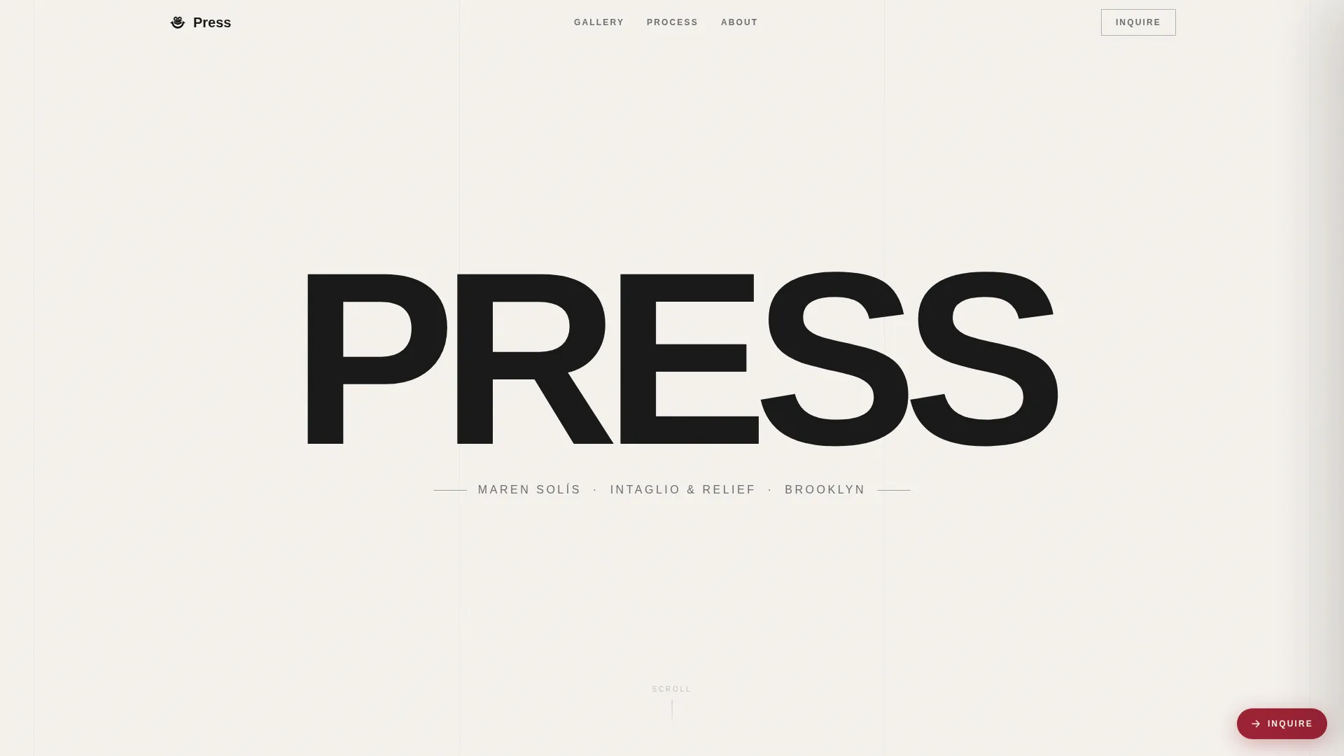
Full-Viewport Typographic Header
The word PRESS is set in an ultra-condensed grotesque typeface at maximum viewport width. Centered vertically and horizontally on a cotton rag white field, the letterforms become abstract shapes that echo the negative space of a woodblock. The artist's name, medium, and city appear below in a single pewter line.
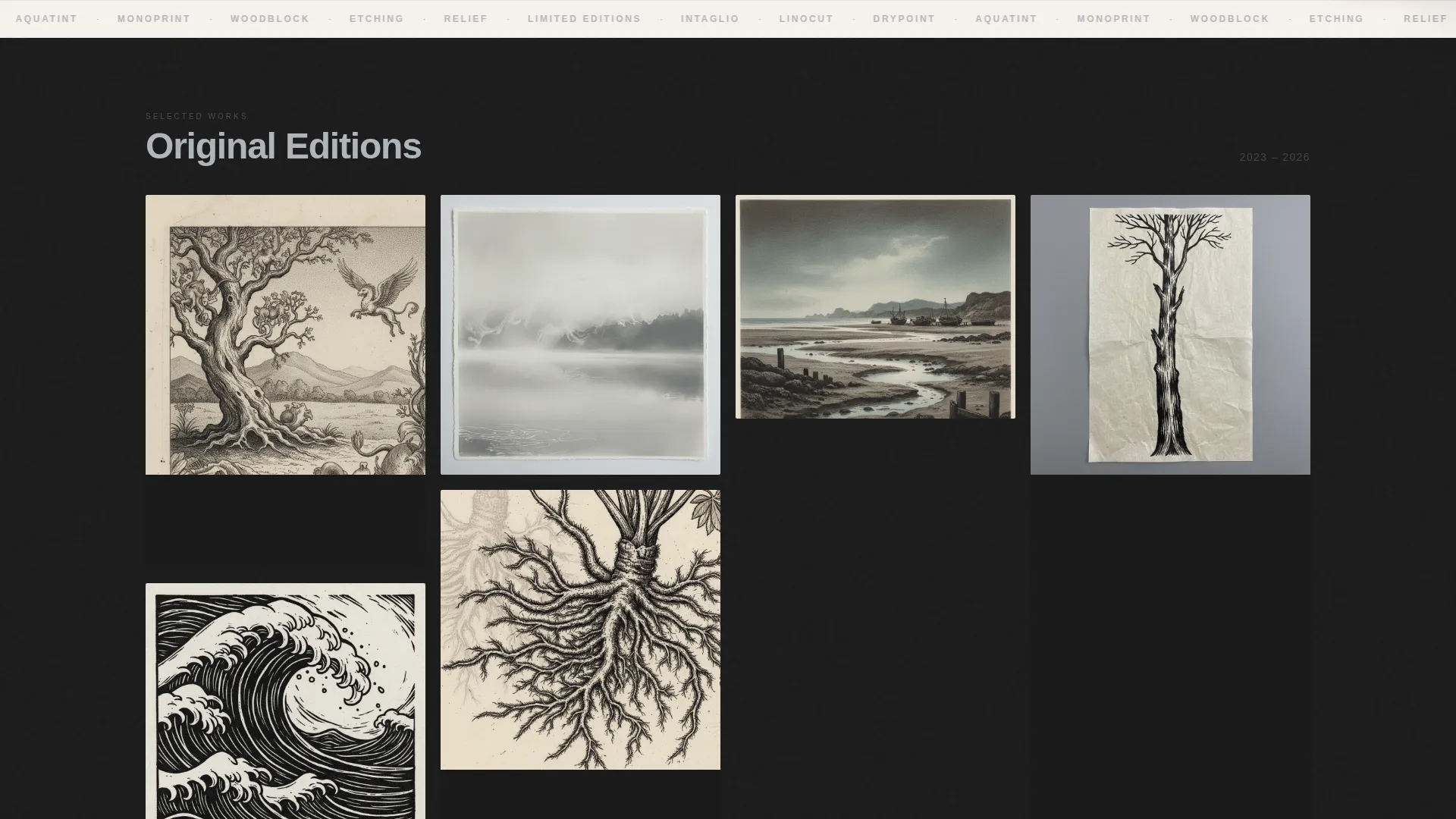
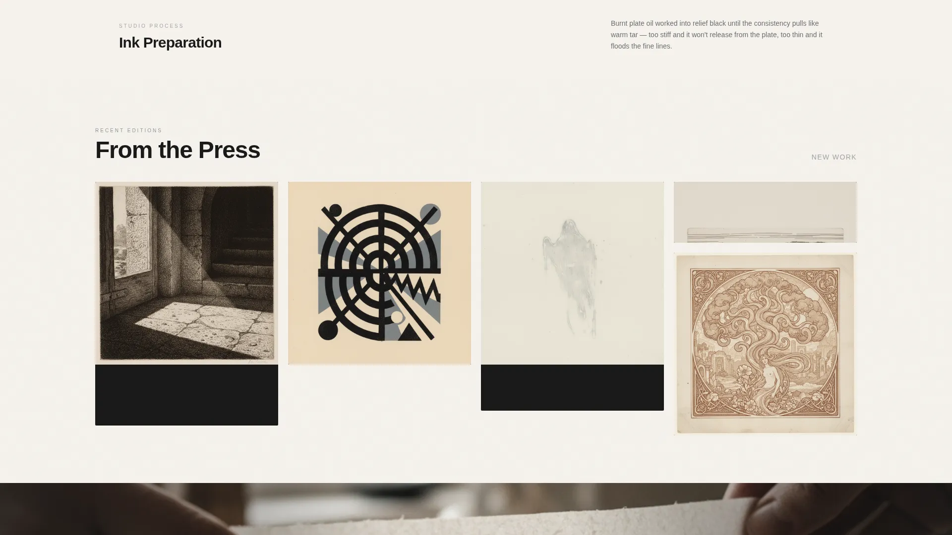
Staggered Masonry Gallery
Prints reveal themselves in staggered clusters as the visitor scrolls, mimicking the experience of turning a corner in a gallery. This paced reveal lets the work accumulate gradually rather than presenting everything at once.
Click-Through Print Detail View
Each print tile expands on click into a detail view showing paper texture at near-macro scale. Edition information, dimensions, and technique notes written in the artist's voice appear alongside the enlarged image.
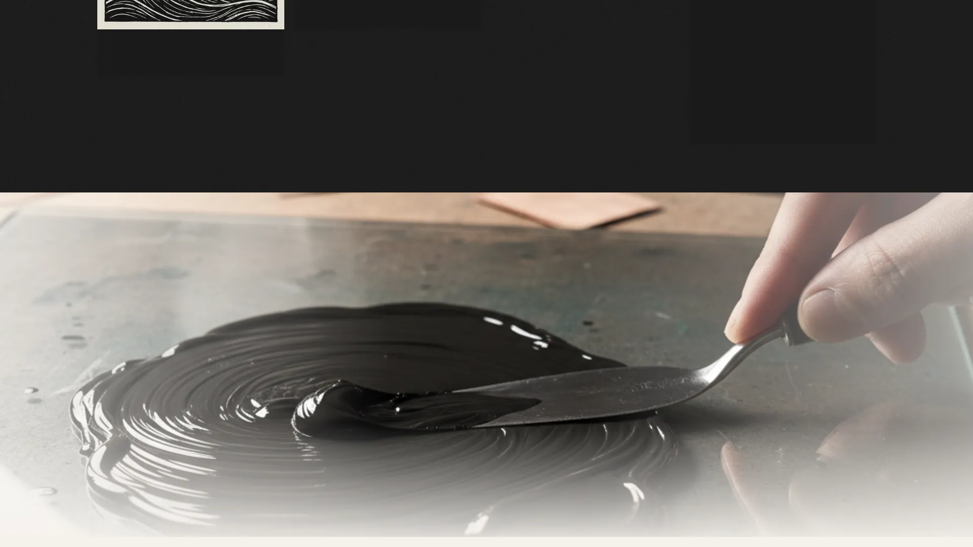
Full-Width Process Photography Breakpoints
Between gallery clusters, full-width sections display a single process photograph. Ink mixing, plate biting, and the moment of the pull are each given their own breathing space, grounding the finished work in its physical making.
Persistent Inquiry Panel
A fixed brayer red pill button labeled "Inquire About a Print" stays visible in the bottom-right corner throughout the scroll. Clicking opens a slide-in panel with fields for name, email, print selection from a dropdown, and intent: collecting, exhibiting, or commissioning.
Studio Visit Request Path
Curators and designers can choose "Request a Studio Visit" as a secondary option inside the inquiry panel. This path adds a date-range field and a textarea for project context, making it easy for professional buyers to communicate their needs upfront.
Page sections overview
| Section | Purpose |
|---|---|
| Typographic Hero Header | Establishes visual identity with bold, full-viewport type |
| Opening Print Cluster | Introduces the first group of prints in the masonry grid |
| First Process Break | Displays a full-width process photograph between gallery clusters |
| Second Print Cluster | Continues the gallery walk with a new staggered group of prints |
| Second Process Break | Shows another full-width studio moment to sustain narrative depth |
| Third Print Cluster | Closes the masonry gallery with the final group of prints |
| Persistent Inquiry Pill | Anchors the lead-capture call to action throughout the entire scroll |
| Slide-In Inquiry Panel | Collects collector and curator leads with a tailored form |
Design & branding system
The design language is built on a Monochrome Steel color system that feels like a freshly inked steel plate before it meets dampened paper. Every value is tonal and earned, with a single warm accent reserved for action only.
- Colors: forge black (#1A1A1A), burnished pewter (#6B6E72), plate-wipe gray (#B0B3B8), and cotton rag white (#F5F2ED) for all backgrounds and text; brayer red (#9B2335) used exclusively for hover states and the call-to-action button
- Typography: an ultra-condensed grotesque typeface at hero scale; body and caption text in pewter and plate-wipe gray tones, never competing with the artwork
- Backgrounds alternate between forge black and cotton rag white so each print cluster floats in its own distinct atmosphere
Mobile & speed optimization
The layout adapts to smaller screens without losing the sense of a gallery walk. The masonry grid reflows gracefully, and the persistent inquiry pill remains accessible throughout the scroll on all device sizes.
- The staggered reveal and click-through detail views are designed to work on touch devices as naturally as on desktop
- Full-width process photography sections maintain their visual impact on narrow viewports by scaling proportionally
- The slide-in inquiry panel opens cleanly on mobile, keeping form fields readable and tappable without horizontal scrolling
How this template helps you convert
The conversion strategy is built on patience. The page lets the work accumulate before it ever asks for anything. By the time a visitor has scrolled through the full gallery, the inquiry feels like a natural next step rather than an interruption.
- The staggered masonry reveal and process photography breakpoints build emotional investment across the scroll, so the visitor arrives at the inquiry panel already engaged rather than cold
- The persistent "Inquire About a Print" pill stays visible without demanding attention, lowering friction for buyers who are ready to act at any point in the scroll
- The dual inquiry paths, one for collectors and one for curators requesting a studio visit, match the specific intent of each buyer type, making the first message easier to send
Other information about this template
This template sits within the Portfolio and Agency category, specifically built for the printmaker portfolio niche. It is a single-page, section-led landing page rather than a multi-page website, which keeps the viewing experience focused and uninterrupted.
- The template style is Masonry and Pinterest-grid, using the Gallery Walk creative direction to pace the reveal of work
- The Lens and Frame theme and the Monochrome Steel color system are the visual foundations for the design
- The header concept is a Giant Headline Centered approach, where typography functions as a visual element rather than a purely informational one
- The landing page direction is Lead Generation, making every design decision point toward the inquiry panel
Theme
Lens & Frame
Creative direction
Gallery Walk
Color system
Monochrome Steel
Style
Masonry/Pinterest
Direction
Lead Generation
Page Sections
Full-viewport Typographic Header
Staggered Masonry Gallery Reveal
Click-through Print Detail View
Full-width Process Photography Breaks
Persistent Inquiry Pill Button
Dual-path Lead Capture Panel
Related questions
Can I update the print titles and edition details myself?
How does the inquiry panel work for different types of buyers?
Is this template suitable for printmakers who work in multiple techniques?
Do I need to provide my own photography?
Who is the intended audience for this landing page template?


