LGBTQ+-Owned Business Privacy Policy Website Template
Prism is a bento grid landing page template built for LGBTQ+-owned tech startups that offer privacy-first productivity tools. It converts free-tier users into paid customers through emotionally staged feature reveals, a sticky upgrade call to action, and a soft gradient visual identity that makes people feel seen, welcomed, and genuinely excited to unlock more.
by Rocket studio
Quick summary
Prism is a single-page upsell landing page template designed for a queer-founded, privacy-first productivity software brand. It uses a bento grid layout, a warm Cloud Canvas color system, and a scroll-reveal unboxing experience to guide existing free-tier users toward a paid upgrade. The page is built to make people feel the weight of what they are missing before asking them to act.
Who this template is for
This template is built for LGBTQ+-owned tech startups and creative software companies that need to convert existing free-tier users into paying customers. It speaks directly to organizations whose customers are busy, collaborative, and mission-driven. If your product serves creative teams, nonprofit communications groups, design agencies, or freelance collectives, this template gives you the foundation to connect with them on their terms.
- Design agencies and freelance collectives who manage multiple client projects at once and need tools that reflect their nonlinear, collaborative work style
- Nonprofit communications directors and small organizations running parallel campaigns who expect their workspace to match the pace and complexity of their efforts
- Team leads and managers at LGBTQ+-owned companies who want to offer team upgrade paths and speak to customers who care about values-aligned technology
What problem this template solves
Free-tier users already know your product. The challenge is helping them realize what they are leaving on the table. Most upsell pages dump a pricing table in front of the visitor and hope for the best. That approach ignores the emotional reality of how people feel about upgrading: cautious, unconvinced, or simply not yet ready. Prism solves this by staging features in order of emotional escalation, turning each locked capability into a felt absence rather than a listed line item.
- Visitors leave upgrade pages without converting because the value is stated, not experienced. Prism's bento reveal structure shows each feature in sequence so people feel its absence before they see its price.
- Teams lead busy, fragmented work lives across many projects. A generic pricing page does not speak to that reality. This template creates context around each feature so the upgrade decision feels obvious, not pressured.
- Organizations that care about identity and community need a page that reflects those values visually and editorially. Prism does that through its color system, copy structure, and pride-flag gradient detail.
What you get with this template
Prism gives you a complete, high-animation single-page layout ready to represent a privacy-first productivity brand. Every section is purpose-built. The visual identity is fully defined. The upgrade flow is staged and intentional. You are not assembling components from scratch; you are dropping into a production-ready creative foundation.
- A full bento grid layout with eight feature tiles that scroll-reveal in sequence, each with hover micro-animations and color shifts that create a sense of progressive discovery
- A sticky "Unlock Your Full Workspace" call to action bar that appears after the third tile enters view, plus an inline monthly versus annual pricing toggle and a standalone gift upgrade tile targeting team leads
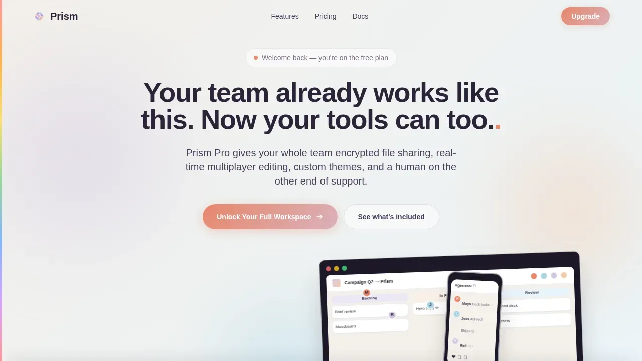
- A floating device mockup hero with a typewriter headline animation, an animated gradient halo cycling from lavender to peach to sky-blue, and live product interface screens showing a shared workspace, a kanban board mid-drag, and a chat thread
Feature list
This section details the key built-in components that give Prism its structure, personality, and conversion power. Each feature listed below is drawn directly from the template brief and reflects what you receive.
Bento Grid with Scroll-Reveal Tiles
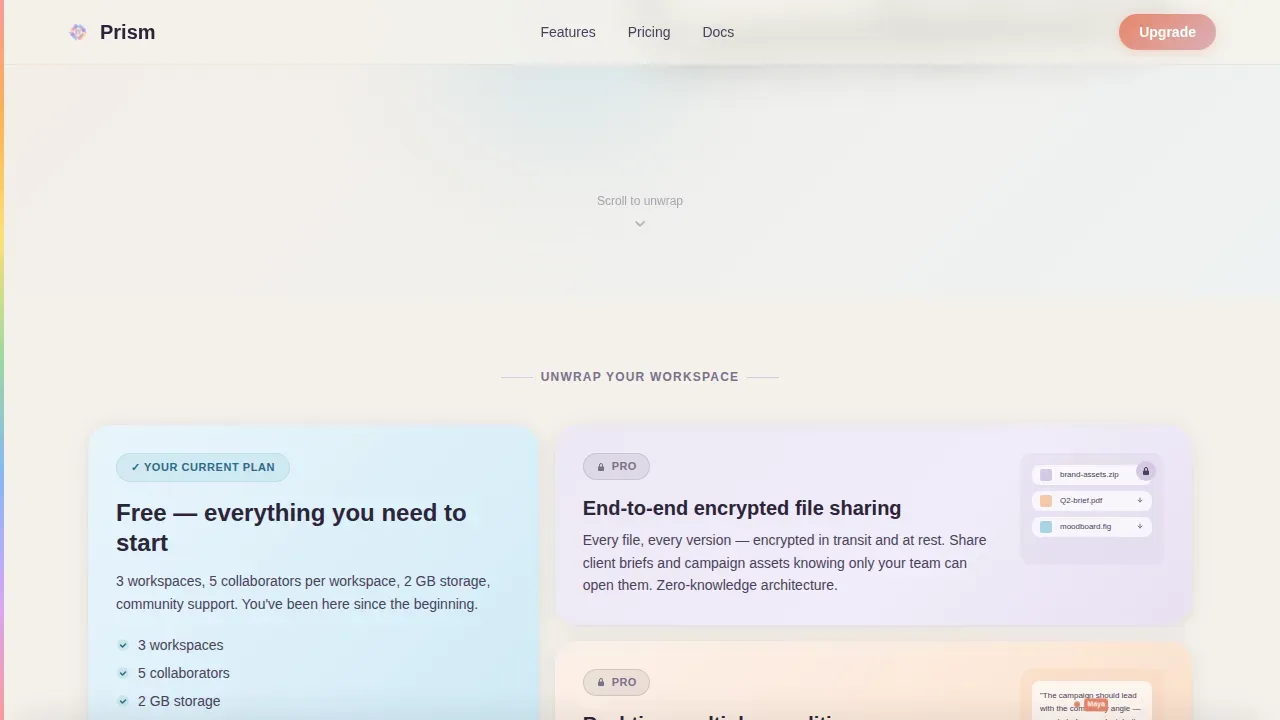
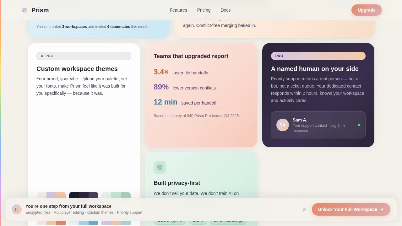
The core layout is an eight-tile bento grid. Each tile lifts into view on scroll like tissue paper being peeled from a box. The reveal sequence is intentional: it begins with the free plan and escalates through encrypted file sharing, real-time multiplayer editing, custom workspace themes, and priority support with a named human contact. Visitors journey through emotional escalation from curiosity to urgency without a single hard sell.
Typewriter Hero with Device Mockups
The header section features a floating laptop and phone arranged at a slight angle. The screens glow with real product interface details: colorful avatar cursors in a shared workspace, a kanban board mid-drag, and a chat thread with emoji reactions. Below the devices, the headline types itself letter by letter. A slow-moving gradient halo surrounds the mockups, shifting from lavender mist to sunrise peach to sky-blue across the animation cycle.
Sticky Upgrade Call to Action Bar
A persistent "Unlock Your Full Workspace" bar is pinned to the bottom of the viewport. It does not appear immediately. It triggers after the third bento tile scrolls into view, which means visitors have already absorbed three feature moments before the primary ask appears. This timing is deliberate. The template earns the click by building appetite first. The sticky bar stays visible as users continue scrolling, keeping the upgrade path within reach without interrupting the reveal experience.
Inline Pricing Toggle
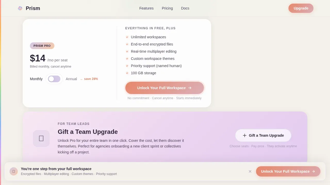
A monthly versus annual pricing comparison is embedded directly inside the page as a toggle interaction. Visitors can switch between billing cycles inline without leaving the page or opening a separate pricing view. This removes friction from the financial decision and keeps users focused on the value already presented through the bento tiles.
Gift a Team Upgrade Tile
A dedicated standalone tile near the bottom of the bento grid targets team leads specifically. It presents a secondary conversion path: gifting a team upgrade rather than upgrading for oneself. This tile addresses a real purchase behavior among managers and project leads in organizations where one person funds tools for an entire group. It broadens the template's conversion reach without cluttering the primary upgrade flow.
Pride Flag Edge Gradient
A subtle pride flag gradient traces the left edge of the full page. It is present throughout the scroll experience but never performative or heavy-handed. This design detail communicates identity and values alignment at a glance. It creates a sense of belonging for visitors who share those values, which helps with engagement and trust for communities that have historically been underserved by mainstream technology products.
Page sections overview
| Section | Purpose |
|---|---|
| Hero Device Mockup | Introduces the product through floating laptop and phone mockups with a typewriter headline and animated gradient halo |
| Free Plan Tile | Opens the bento grid with the core free plan, welcoming and low-pressure |
| Encrypted Sharing Tile | Reveals file-sharing capability as a locked upgrade feature, building awareness of what exists beyond the free tier |
| Multiplayer Editing Tile | Showcases real-time collaborative editing as a premium feature mid-grid |
| Workspace Themes Tile | Presents custom theme personalization as an emotionally appealing locked feature |
| Priority Support Tile | Highlights named-human priority support as a high-trust upgrade differentiator |
| Privacy Badge Tile | Reinforces the brand's privacy-first identity through a visual trust indicator embedded in the grid |
| Gift Upgrade Tile | Provides a secondary conversion path for team leads who want to gift a paid upgrade |
| Pricing Toggle Section | Lets visitors compare monthly and annual costs inline without leaving the page |
| Sticky Call to Action | Pins the primary upgrade prompt to the bottom viewport after the third tile scroll |
| Footer Pattern | Single-row linear footer closing the page cleanly |
Design & branding system
Prism's visual identity is built on the Cloud Canvas color system, which draws its palette from the natural world: warm cloud white, soft lavender, sunrise peach, and gentle sky-blue. Colors bleed into one another across bento tiles like watercolor spreading on wet paper. There are no hard edges. Every transition whispers rather than announces. The warm coral accent appears in interactive moments, giving hover states and call to action elements a grounded, confident warmth. Together, the palette feels like golden-hour light moving through a room.
- Typography pairs Plus Jakarta Sans for headings with DM Sans for body text, creating a contrast between structured confidence and readable warmth that suits a creative-professional audience
- Color tokens are managed through CSS custom properties, making the palette consistent and easy to adapt across every tile, gradient halo, and accent state throughout the page
- The pride flag edge gradient runs the full left side of the page, present but never distracting, acting as a quiet signal of the brand's identity and values rather than a decorative flourish
Mobile & speed optimization
Prism is desktop-first by design, which matches its primary audience of design professionals and team managers who work on large screens. The bento grid stacks responsively for mobile viewports so the sequential reveal logic still functions correctly on smaller devices. Intersection Observer drives the tile reveals, which means animations only trigger when tiles enter the visible area, keeping the scroll experience smooth regardless of content volume.
- Tile animations use CSS custom properties and scroll-triggered Intersection Observer logic so reveals are lightweight and do not require heavy JavaScript execution on each scroll event
- The sticky call to action bar and pricing toggle are both designed for touch and pointer interaction, so the page functions effectively when accessed from a phone or tablet by a visitor who arrived from an in-app prompt
How this template helps you convert
This template is built around one insight: people do not upgrade because they see a price. They upgrade because they feel the value they are missing. Every structural decision in Prism serves that idea. The bento reveal sequence, the sticky call to action timing, and the gift tile all exist to create the right emotional context before the financial ask arrives.
- The scroll-reveal bento grid stages features in order of emotional escalation. Visitors move from "that is a nice free plan" through increasing desire as each locked feature lifts into view. By the time the sticky call to action appears, the visitor has already experienced the gap between what they have and what they could have.
- The inline pricing toggle removes the friction of leaving the page to compare costs. Visitors can weigh monthly versus annual options immediately, in the same moment they are feeling motivated to upgrade, which keeps conversion momentum alive.
- The gift upgrade tile creates a second conversion entry point for team leads and managers who buy tools on behalf of groups. This expands the addressable audience on the same page without requiring a separate campaign or a new project.
Other information about this template
Prism is a strong foundation for any LGBTQ+-owned tech startup that wants to lead with values, privacy, and creative empathy without sacrificing conversion clarity. The template's philosophy is that the best upsell page does not feel like an upsell at all. It feels like a moment of realization. The structure, the color system, and the reveal logic all serve that single idea.
Across the world, organizations and communities building inclusive technology face shared challenges: how do you speak authentically to your customers while also moving them toward a financial decision? Prism's design and editorial structure answer that question by letting the product's own identity do the convincing. The page reflects values first and pricing second.
The history of inclusive design in technology is still being written. Women, LGBTQ individuals, and other underrepresented groups have long pushed for tools and services that reflect their life and their work reality, not a sanitized corporate version of it. Prism gives that effort a visual and structural foundation. Companies that prioritize this kind of representation tend to see stronger connection with their customers and higher trust across their communities.
The PRISM framework, as it exists in project selection contexts, offers useful parallels for how this template was structured. Just as the framework encourages tying projects to the identity of the organization and choosing efforts with a fast cycle-time for benefits realization, this template aligns its upgrade flow with the brand's core identity and stages value delivery quickly so visitors realize the benefit within seconds of arriving. The framework also recommends using existing metrics rather than creating new ones, which aligns with the template's use of embedded usage stats inside bento tiles rather than invented social proof.
From a security standpoint, tech startups that build privacy-first products understand that security needs to be integrated early and continuously, not bolted on later. This template's editorial tone reflects that same discipline: privacy is a foundation, not a feature footnote. Automation is key to scalable security in tech environments, and this template's animation logic mirrors that principle by using lightweight, automated Intersection Observer triggers rather than manual scroll handlers.
LGBTQ representation in technology can enhance innovation and creativity within teams. Diverse teams are more likely to understand and meet the needs of a diverse customer base. Companies that prioritize this representation often see improved culture and morale. Employee Resource Groups (ERGs) can foster a sense of belonging among LGBTQ employees, and landing pages that reflect that same belonging extend it outward to customers too.
No-code and low-code tools have changed the relationship between idea and execution for product managers, solopreneurs, and small organizations. These tools allow for rapid development and reduce the time from idea to live application. This template fits naturally into that ecosystem: it is ready to use without requiring deep development knowledge, which means teams can focus their resources on strategy and customers rather than on build time.
- This template is localized for English, United States Dollar pricing, and United States date formatting
- The footer uses a linear single-row pattern, keeping the close of the page clean and uncluttered
- Social proof is embedded within individual bento tiles as usage statistics and trust indicators rather than as a separate testimonials section
- Bill Gates and the philanthropy world have helped draw attention to how technology, science, and resources can address global challenges including climate change, which has sharpened public understanding of the power that mission-driven organizations hold. That same understanding applies to startups that lead with purpose: customers respond to companies that know why they exist. Microsoft and others have demonstrated that a clear philosophy at the foundation of a product creates lasting customer loyalty across countries and communities.
- The template supports USD pricing out of the box and is ready for teams operating in a single-currency, English-language context without requiring localization development
Theme
Soft Gradient
Creative direction
Unboxing Experience
Color system
Cloud Canvas
Style
Bento Grid
Direction
Upsell/Upgrade
Page Sections
Bento Grid Scroll-reveal Layout
Floating Device Mockup Hero
Sticky Upgrade Call to Action Bar
Inline Monthly Versus. Annual Pricing Toggle
Gift a Team Upgrade Tile
Cloud Canvas Color System and Pride Edge Gradient
Related questions
Who is the primary audience for this template?
Can team leads use this template to gift upgrades to their teams?
How does the scroll-reveal bento grid work?
Does this template include a pricing comparison tool?
Is this template suitable for values-driven or mission-led tech startups?



