Tech Product Design Landing Page Template
The Skeletal Tech Glass Manifesto Product Designer Landing Page Template is a single-page portfolio built for senior product designers who want to convert hiring managers and founders into booked calls. It combines viewport-filling manifesto typography, frosted glass user interface panels, and scroll-linked animations to present conviction before credentials, earning every click through philosophy rather than a traditional work listing.
by Rocket studio
Quick summary
This template gives product designers a high-impact landing page that leads with belief, not biography. Oversized manifesto statements fill each viewport, dissolving to reveal case study artifacts that prove each claim. The Tech Glass visual system, electric indigo accents, and scroll-depth call-to-action mechanics make the page feel intentional at every position, right down to the frosted pill button that brightens on hover.
Who this template is for
This template is built for senior product designers who want their portfolio to do more than list projects. It suits designers ready to position themselves as a rare, opinionated hire rather than a generalist applicant.
- Product designers targeting design director or hiring manager audiences at growth-stage companies
- Independent designers or solo practitioners who need one focused page to earn a conversation
- Experienced practitioners who want to replace a long-scroll portfolio website with something more deliberate and direct
What problem this template solves
Most portfolio websites feel like archives. They bury conviction under chronological work listings, forcing a busy hiring manager to do the interpretive work. The result is a poor first impression, and 80% of consumers have reported leaving a website because of a poor experience that failed to communicate value quickly.
- Visitors scan portfolios in seconds; a fragmented layout loses them before the work lands
- A standard grid portfolio gives no sense of design philosophy, only output
- Traditional layouts put visuals before information flow, reversing the order that builds trust
What you get with this template
You get a fully designed storybook-style landing page that structures conviction first and evidence second. Every scroll position is intentional, and every user interface section earns its place on screen.
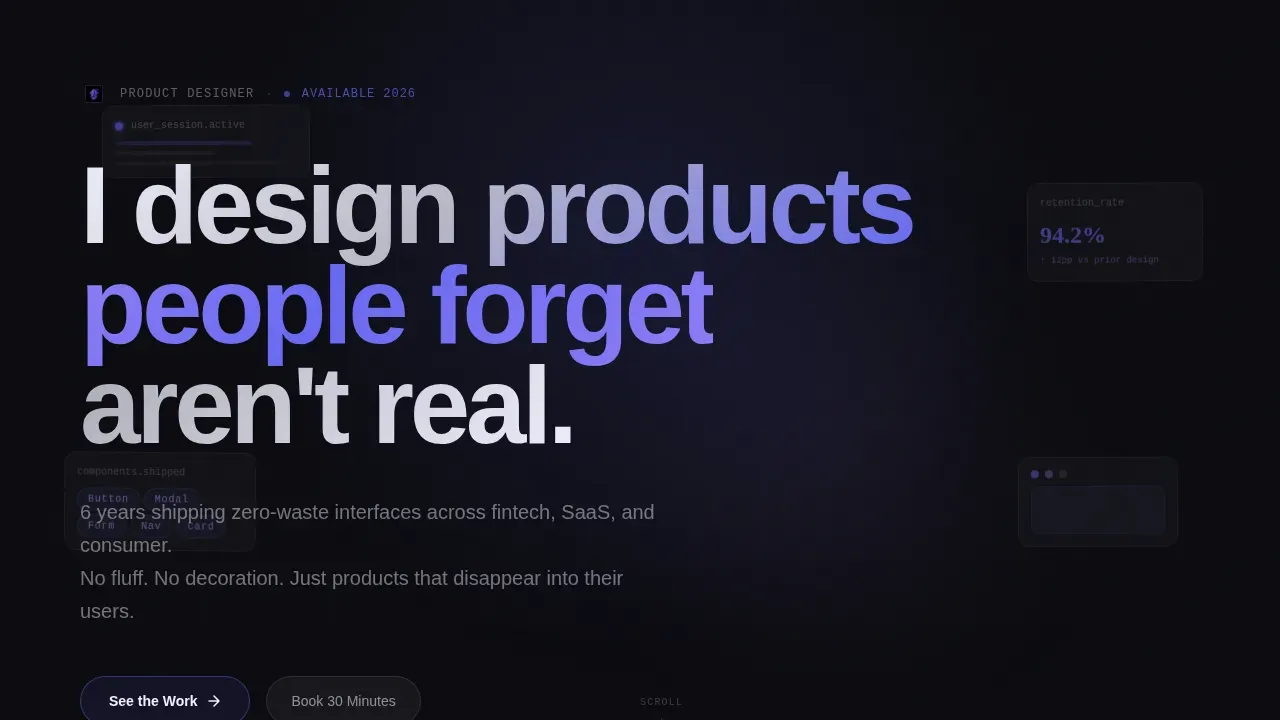
- A hero section with viewport-filling manifesto typography and drifting user interface fragments behind frosted glass panels
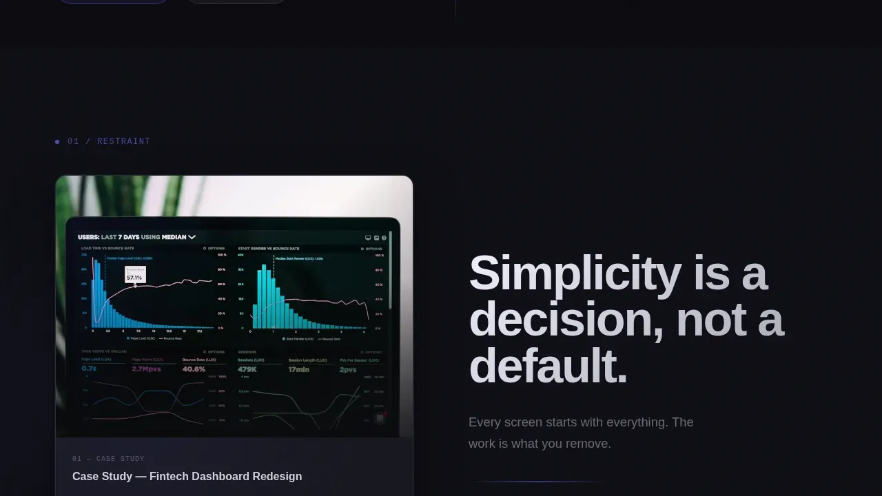
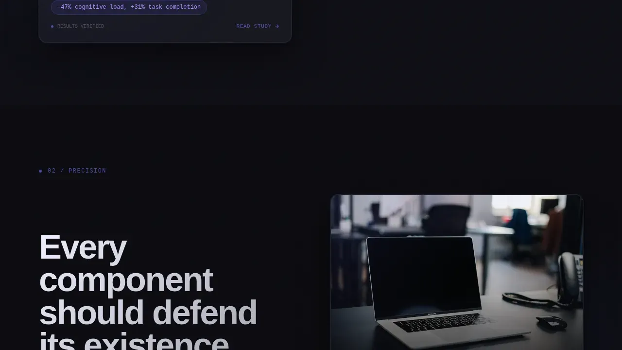
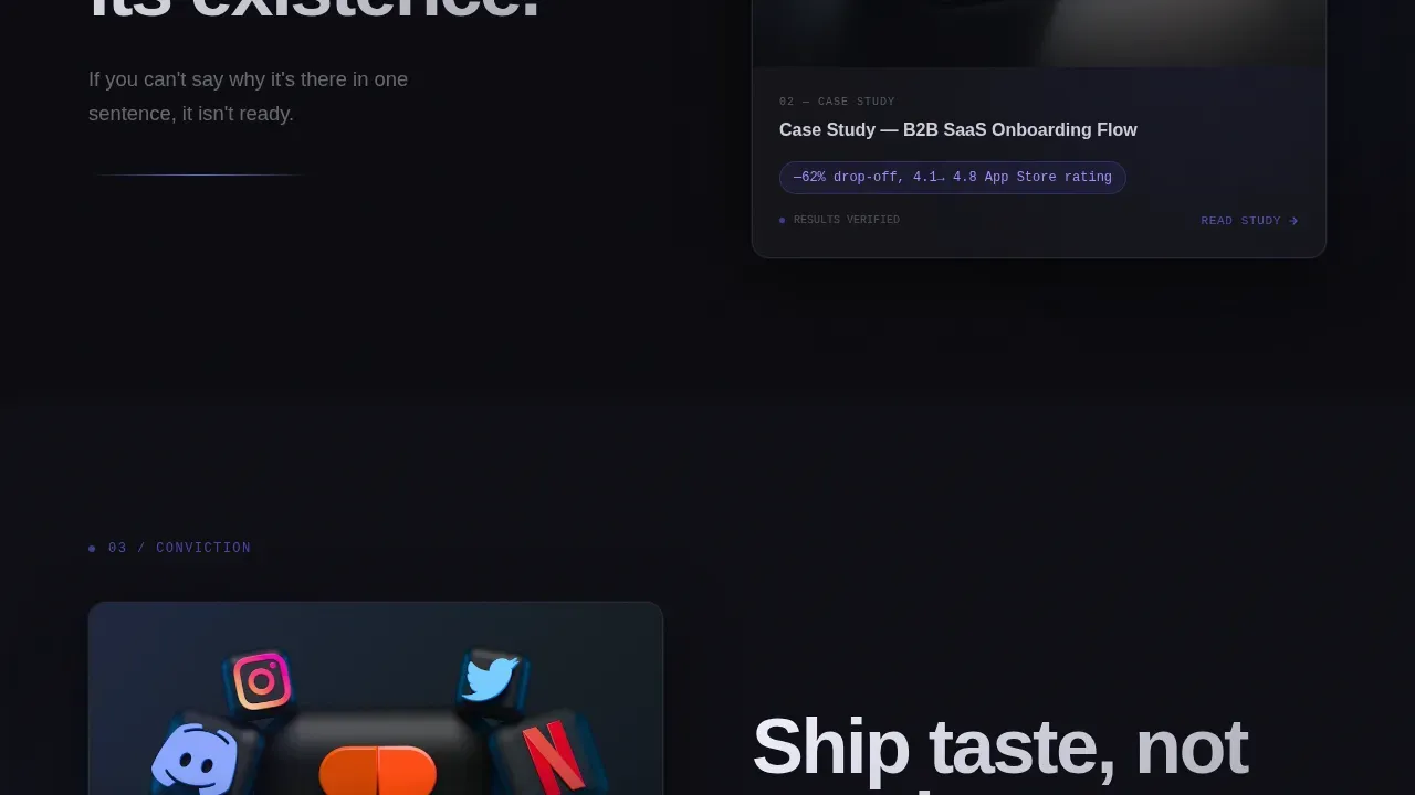
- Three manifesto beat sections, each pairing a design belief with a case study artifact reveal
- A work preview section with frosted glass case study cards, a primary call-to-action button, and a scroll-depth floating bottom bar with a secondary call to action
Feature list
This landing page template ships with a tightly scoped set of design-led features. Each one is grounded directly in the brief and built to serve the click-through goal.
Manifesto-Driven Hero Section
The hero sets a single oversized typographic statement across eighty percent of the viewport in Plus Jakarta Sans. Behind the type, a slow-moving montage of product user interface fragments drifts through frosted glass panels, creating atmospheric depth without distracting decoration. The layout focuses on information flow before visuals, following proven landing page strategy.
Scroll-Linked Manifesto Beats
Three full-viewport belief statements follow the hero in a rhythm of conviction then evidence. Each statement dissolves to reveal a single case study artifact. Scroll-linked blur animations and staggered reveals are driven by CSS scroll-timeline and IntersectionObserver for GPU-only transforms, keeping the motion precise and deliberate.
Frosted Glass user interface Panel System
The glass morphism landing aesthetic runs through every panel on the page. Frosted glass overlays use a layered transparency approach rather than shadow, creating depth consistent with the Tech Glass theme. This glass morphism landing treatment is particularly effective for tech-related portfolios because it conveys innovation and modernity without visual noise.
Dual Call-to-Action Architecture
The primary "See the Work" call-to-action appears as a frosted glass pill button with an indigo border after the third manifesto beat. A secondary "Book 30 Minutes" bar floats into a fixed bottom position after fifty percent scroll depth. Both calls to action are placed to match the moment conviction is built, not front-loaded before trust is earned.
Electric Indigo Color and Typography System
The full design set uses void black (#0B0B0F), electric indigo (#6366F1), and phosphor lilac (#A78BFA) across every element. Plus Jakarta Sans handles display type while JetBrains Mono covers labels and code-style details. Hover states activate phosphor lilac glow, and every accent color is earned by interaction rather than used as static decoration.
Work Preview with Case Study Cards
After the manifesto beats, frosted glass case study cards present work in a structured preview format. Project metrics are embedded directly in the artifacts, and company logos appear as context rather than testimonials. The section gives visitors enough information to decide whether to click through to a detailed case study.
Page sections overview
| Section | Purpose |
|---|---|
| Hero Manifesto | Fill viewport with typographic conviction and drifting user interface fragments |
| Manifesto Beat 1 | Pair "Simplicity is a decision" belief with a case study artifact |
| Manifesto Beat 2 | Pair "Every component defends its existence" belief with artifact |
| Manifesto Beat 3 | Pair "Ship taste, not trends" belief with artifact and primary call to action |
| Work Preview Cards | Show frosted glass case study cards with embedded project metrics |
| Floating Bottom Bar | Surface secondary call to action after fifty percent scroll depth |
| Minimal Footer | Close the page with a Superhuman-style minimal footer pattern |
Design & branding system
The visual identity runs on a Tech Glass framework where every layer is either transparent, glowing, or both. Depth comes from layered transparency rather than drop shadows, keeping the interface clean and luminous across every browser window.
- Void black (#0B0B0F) as the base, electric indigo (#6366F1) as the primary accent, and phosphor lilac (#A78BFA) for hover and micro-interaction states
- Plus Jakarta Sans for all display-weight headings, JetBrains Mono for label and code-style user interface text
- Frosted glass panels built with background blur and low-opacity white overlays, creating the signature glass morphism effect without heavy rendering cost
Mobile & speed optimization
The template is designed desktop-first, reflecting how hiring managers typically access portfolio pages on a laptop or large-screen device. Mobile polish is included so the page holds up when a visitor checks it on a smaller screen or different device.
- Scroll animations use CSS scroll-timeline and GPU-only transforms, avoiding layout-triggering properties that slow down the browser
- IntersectionObserver drives staggered reveal timing, so elements animate only when they enter the viewport in any browser
- The floating bottom bar and frosted glass panels are set to reflow cleanly for mobile viewports without losing the visual hierarchy
How this template helps you convert
The entire page is structured to build conviction progressively and then make the next step feel obvious. Good landing page strategy keeps action-oriented calls to action prominent and the information flow logical, and this template follows that principle precisely.
- The manifesto beat sequence earns trust by leading with philosophy, so that by the time the primary "See the Work" button appears, the visitor already believes they have found someone rare and feels compelled to click
- The scroll-depth floating bar deploys the "Book 30 Minutes" call to action only after enough conviction has built, reducing friction and matching the call to action to the user's readiness
- The work preview section closes the loop by giving visitors concrete evidence through case study cards, so the final click feels like confirmation rather than a leap of faith
Other information about this template
This template is one of the more distinct entries in the product designer portfolio space. A few additional details are worth checking before you decide it is the right fit.
- The template is a single landing page, not a multi-page website, so it is best suited for designers who want one focused entry point that directs visitors to external case studies or a booking link
- The layout prioritizes information flow before visuals, a principle aligned with the idea that the flow of information on a landing page matters more than decorative elements alone
- Skeleton screens in user experience design are loading placeholders that enhance perceived speed; this template's use of the "skeletal" design philosophy draws on a similar principle of showing structure before detail
- The "Glass Box" design concept shifts away from opaque interfaces toward those that visualize internal logic, and the frosted glass user interface system here reflects that same transparency-first thinking
- The Skeletal Tech Glass Manifesto Product Designer Landing Page Template can be customized to reflect individual branding preferences, swap in your own case study artifacts, and update the manifesto lines to match your own design voice
- The page is localized for English-language audiences and the United States market, though the visual system and layout adapt well to other contexts with text changes
- Checking that your chosen booking link or case study destination is live before publishing will ensure visitors who click the calls to action reach working pages
Theme
Tech Glass
Creative direction
Manifesto
Color system
Electric Indigo
Style
Storybook/Full-Page
Direction
Click-Through
Page Sections
Manifesto-driven Hero with Type Overlay
Three Scroll-linked Manifesto Beats
Glass Morphism User Interface Panel System
Dual Call-to-action Architecture
Electric Indigo Color and Typography System
Work Preview with Frosted Case Study Cards
Related questions
How quickly can this template be customized?
Can this template match our brand identity?
Is this template usable on mobile devices?



