Pristine — Authorized Water Softener Landing Page Template
Soften is a single-page landing page template built for Seattle-area water softener services. It uses a split-screen layout, data-led header stats, and a transparent process narrative to educate homeowners before asking for the booking. The design pairs deep navy authority tones with action-orange calls to action, guiding visitors from problem awareness straight to scheduling a free water test.
by Rocket studio
Quick summary
Soften is a split-screen landing page template designed for local water softener and water treatment services. It opens with stark hardness data to grab attention, walks visitors through the service process in plain language, and closes with a focused three-field booking form. The result is a page that earns trust before it asks for anything.
Who this template is for
This template is built for service businesses that need to educate skeptical homeowners before asking for a commitment. It suits operators in mid-size Pacific Northwest markets where hard water is a measurable, documented problem.
- Water softener and water treatment service providers targeting residential clients
- Plumbing crews offering free diagnostic tests as a lead-generation tool
- Property managers and maintenance services handling recurring hard water complaints across multiple units
What problem this template solves
Most home service landing pages lead with a price or a phone number. Visitors who do not yet understand their problem scroll past both. Soften solves this by front-loading education so that by the time the visitor reaches the form, they already understand why they need the service.
- Homeowners do not connect chalky faucet rings or error codes on tankless heaters to water hardness
- Generic service pages create price anxiety before building any trust or context
- Visitors leave before booking because the disruption and complexity of installation feel unknown
What you get with this template
You get a fully structured single-page layout that handles the entire conversion journey from problem awareness to scheduled appointment. Every section has a defined job, and the visual system keeps the focus sharp throughout.
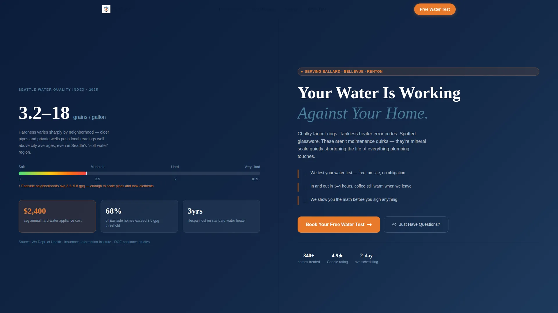
- A stats-driven header with a live-styled hardness counter and animated mineral-buildup gauge
- Three transparent-process split sections that dissolve cost, disruption, and complexity objections in sequence
- A sequential three-field booking form with zip code confirmation, a visual calendar picker, and contact details
Feature list
This template is organized around a clear educational flow. Each feature serves a specific moment in the visitor's decision journey.
Stats and Metrics Header Panel
The header opens with Seattle's documented average water hardness displayed as a live-styled counter reading 17.1 grains per gallon. An animated gauge fills from green to red to visualize mineral buildup severity. Three supporting data callouts cover annual hard water damage costs, the percentage of local homes above the hardness threshold, and the lifespan years lost on a standard water heater. No stock photography appears here, only numbers stark enough to make a homeowner pause.
Split-Screen Process Sections
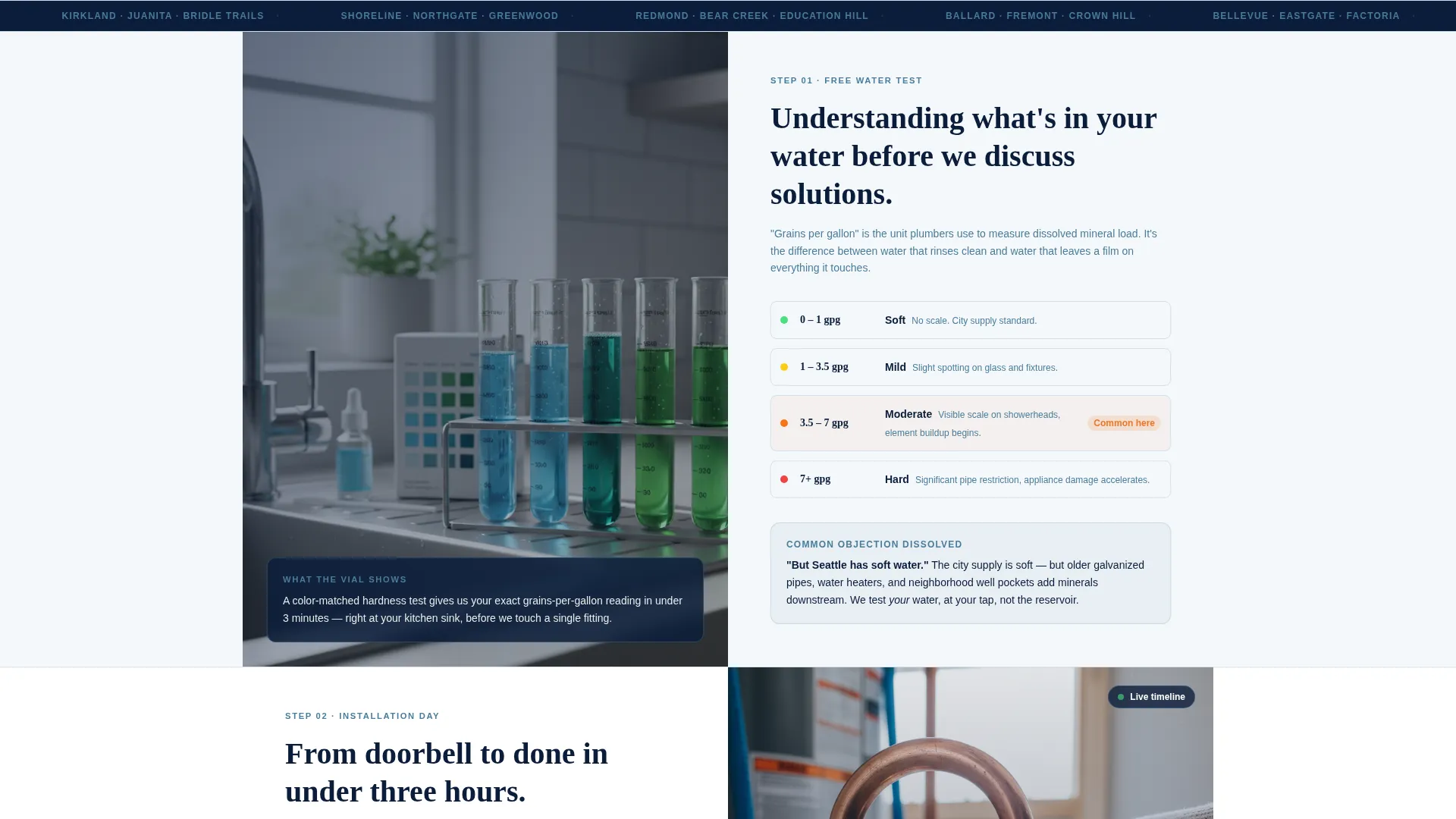
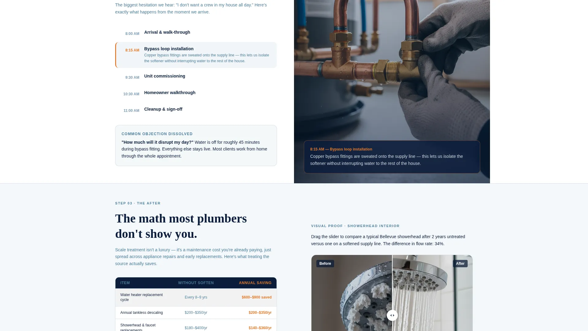
Three sequential split sections each divide the screen 50/50 between what the technician does and what the homeowner learns. The first covers the free water test with a photo of the vial kit beside a kitchen sink and a plain-language explanation of grains per gallon. The second shows installation day with close-up copper fitting work and a step-by-step timeline from arrival to cleanup. The third presents a before-and-after showerhead interior photo alongside annual savings math.
Objection-Dissolving Narrative Flow
Each split section is structured to address one specific homeowner objection. Cost is handled in the savings section. Disruption is handled in the installation timeline. Complexity is handled in the water test explanation. By the time a visitor reaches the booking form, the three most common barriers have already been answered in plain language.
Sequential Three-Field Booking Form
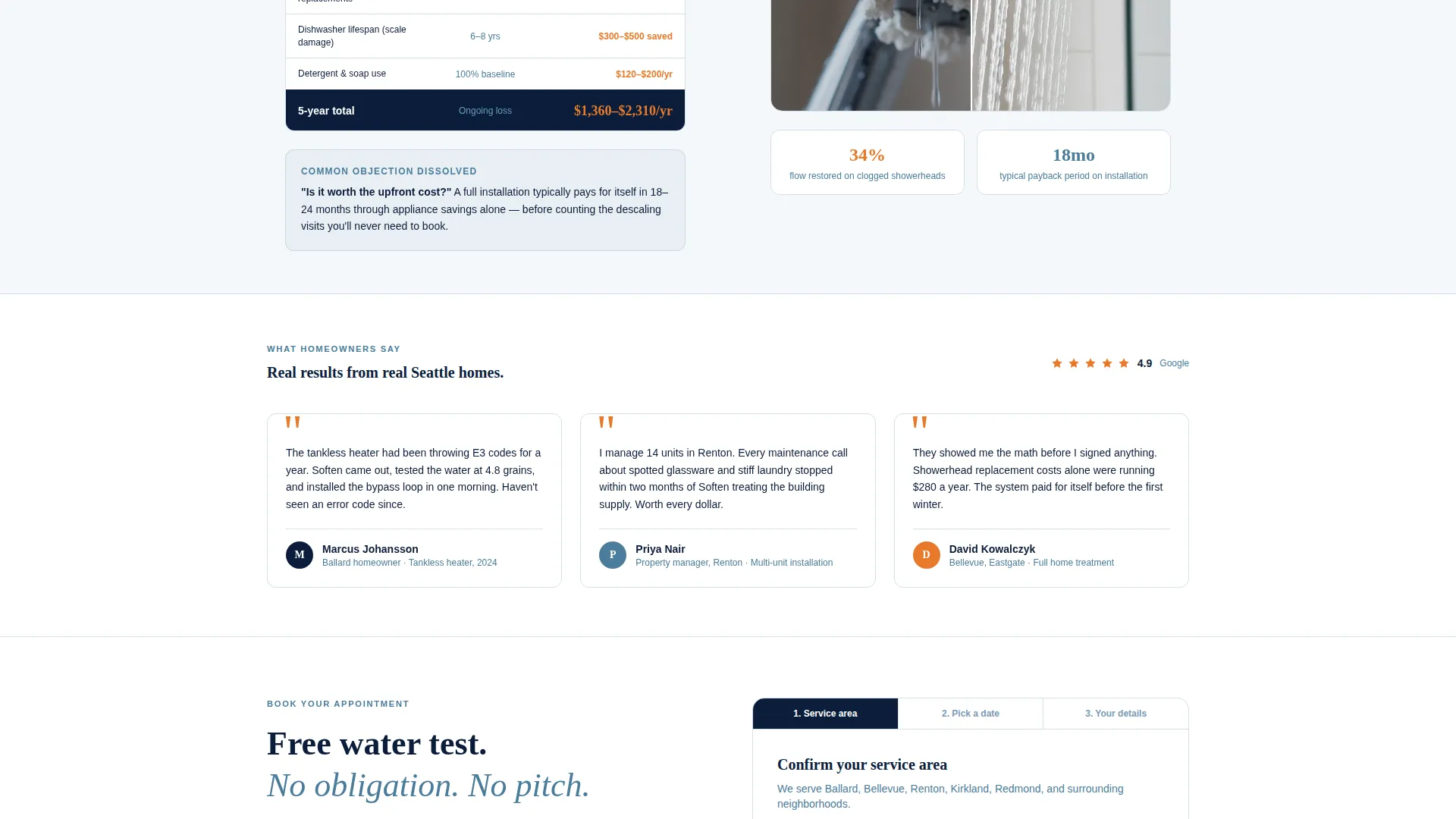
The booking form uses a deliberate three-step sequence. Zip code comes first to confirm service area. A visual calendar showing real availability follows. Name and phone number close the form. This order reduces friction by confirming eligibility before asking for personal details.
Secondary Chat Path
A secondary conversion path labeled "Just Have Questions?" opens a text-message chat widget. This gives hesitant visitors a low-commitment way to engage without filling out the full booking form, keeping the page useful for visitors at every stage of readiness.
Mobile Sticky Call-to-Action Bar
On mobile, the primary call to action reappears as a sticky bottom bar. The "Book Your Free Water Test" button in action-orange stays visible as visitors scroll, so the booking entry point is never more than a tap away regardless of where they are on the page.
Page sections overview
| Section | Purpose |
|---|---|
| Stats Header Panel | Hook visitors with hard water data and a bold headline |
| Free Water Test Split | Explain the diagnostic process in plain language |
| Installation Day Split | Show the installation timeline and reduce disruption fears |
| After and Savings Split | Demonstrate before-and-after results with savings math |
| Booking Form Section | Capture zip code, preferred date, and contact details |
| Secondary Chat Path | Offer a low-commitment question route via text widget |
Design & branding system
The visual identity follows an Educational Guide theme built around a Navy Authority color system. The palette feels like a well-organized utility room: serious, trustworthy, and spotlessly clean, with one bright accent that draws the eye exactly where the template needs it.
- Deep Puget Sound navy (#0B1D3A) for backgrounds and authority-setting sections, clean filtration white (#F4F7FA) for body areas, and reliable steel blue (#4A7C9B) for supporting elements
- Action-orange (#E8792B) used exclusively for buttons and key data callouts to create a clear visual hierarchy
- No stock photography of smiling technicians; visual weight comes from real process photos, data displays, and the animated mineral-buildup gauge
Mobile & speed optimization
The template is structured with mobile booking behavior in mind. The sticky bottom bar ensures the primary call to action is always reachable on smaller screens without requiring the visitor to scroll back to the top.
- Split-screen sections reflow gracefully for single-column reading on mobile devices
- The sticky "Book Your Free Water Test" bar persists on mobile so the booking entry point stays visible throughout the scroll
- The sequential form layout keeps each step visible and tappable without cramped inputs on smaller screens
How this template helps you convert
The page is built around a principle of earning the click through education rather than pressure. Every layout decision serves the goal of moving an informed visitor toward booking.
- The data-led header creates immediate relevance by naming a specific, measurable problem that Seattle-area homeowners already experience but may not have connected to water hardness.
- The transparent process narrative dissolves the three most common objections, cost, disruption, and complexity, before the visitor ever sees the booking form, so the form feels like a natural next step rather than a cold ask.
- The sequential form design, zip code first then calendar then contact details, builds micro-commitment by confirming service eligibility before requesting personal information, which reduces abandonment at the final step.
Other information about this template
This template is purpose-built for the Seattle residential services market and reflects local context throughout. The stat values, neighborhood references, and process photography direction are all grounded in the Pacific Northwest hard water reality.
- The template is categorized under Professional Services and Seattle Local Services, making it well suited for local search-driven traffic landing on a service page
- The Educational Guide creative direction and Navy Authority color system are intentional choices for building credibility with homeowners who are comparison-shopping service providers
- The booking flow is designed to support a free water test offer as the primary lead-generation mechanism, a low-barrier entry point that is common and effective in the water treatment industry
Theme
Executive Suite
Creative direction
Case Study Narrative
Color system
Charcoal & Amber
Style
Sidebar Companion
Direction
Booking/Scheduling
Page Sections
Stats and Metrics Header Panel
Split-screen Process Sections
Objection-dissolving Narrative Flow
Sequential Three-field Booking Form
Mobile Sticky Call-to-action Bar
Secondary Chat Entry Point
Related questions
What type of business is this landing page template designed for?
Can I update the stats and data callouts with my own numbers?
Does the template include the text-message chat widget functionality?
Is this template suitable for property managers as well as individual homeowners?
Why does the booking form ask for zip code first?



