Strategic Sourcing Consultant Landing Page Template
Procure is a strategic sourcing landing page template built for independent procurement consultants targeting VP-level buyers at mid-market manufacturers. It uses a comparison table layout and FAQ-driven scroll structure to build a boardroom-style case for margin recovery. The design pairs deep charcoal with warm amber accents to project authority and precision.
by Rocket studio
Quick summary
Procure is a single-page, click-through landing page template designed for strategic sourcing consultants. It presents a FAQ-driven scroll experience where each question unfolds into a side-by-side comparison table. The goal is to show procurement leaders exactly where money is leaking before asking them to book a call.
Who this template is for
This template is built for independent consultants and boutique advisory firms working in procurement and strategic sourcing. The target visitor is a VP-level procurement leader at a mid-market manufacturer spending between $50 million and $500 million annually who suspects they are overpaying but cannot isolate the cause.
- Procurement and supply chain consultants serving mid-market manufacturers
- Sourcing advisors who lead with data and numerical proof of margin recovery
- Independent consultants positioning themselves against full-time CPO hires
What problem this template solves
Most consultant landing pages list credentials and wait. This one makes an argument. The Procure template solves the challenge of earning trust from skeptical, senior buyers before any sales conversation begins. It does this by structuring the page around the exact questions procurement leaders ask internally.
- Buyers at this level dismiss vague value propositions immediately
- Consultants need to show specific, numerical proof of savings potential early in the scroll
- The page must earn the calendar booking by presenting evidence, not just promises
What you get with this template
You get a fully structured, single-page landing page layout built around a comparison table format and a FAQ-driven scroll experience. Every section is designed to move a cautious VP-level reader from skepticism to a booked diagnostic call.
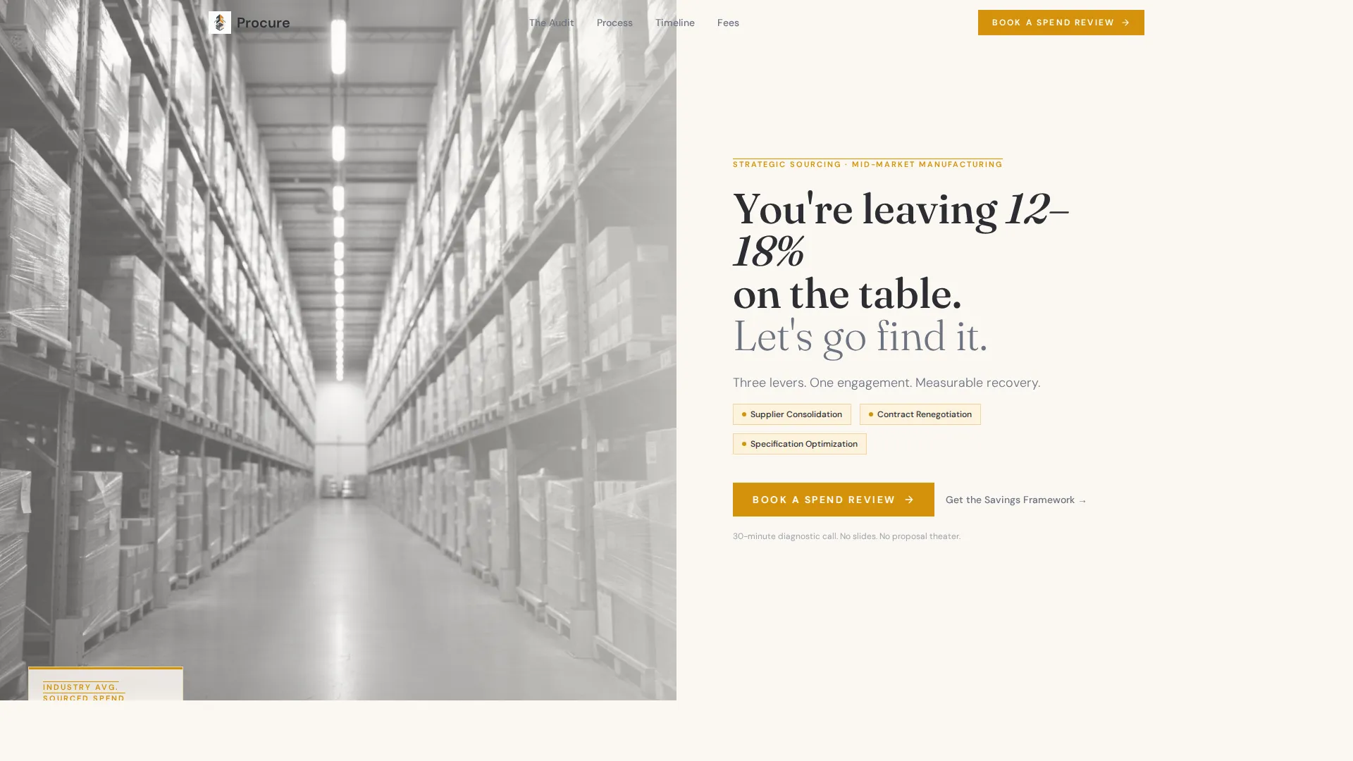
- A half-page split header with a warehouse photograph and a direct headline calling out 12 to 18 percent margin loss
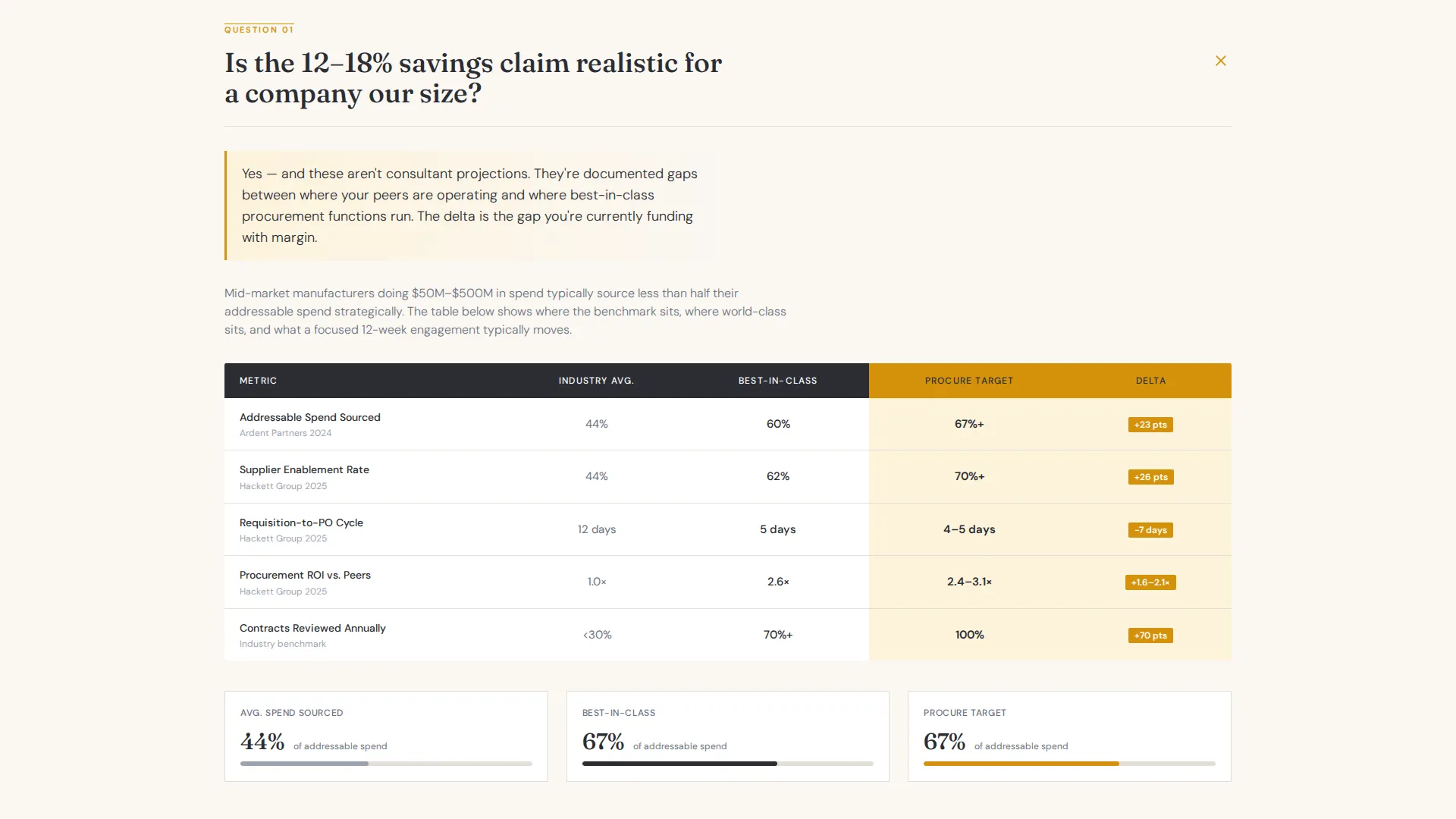
- Scrollable FAQ sections each paired with a current-state versus optimized-state comparison table and amber-highlighted delta columns
- A persistent mobile bottom bar call to action, a mid-page repeat call to action after the third FAQ, and a secondary email-gated download for the savings framework one-pager
Feature list
This template is built around a small number of high-impact components. Each one does specific work in a high-skepticism sales context.
FAQ-Driven Scroll Structure
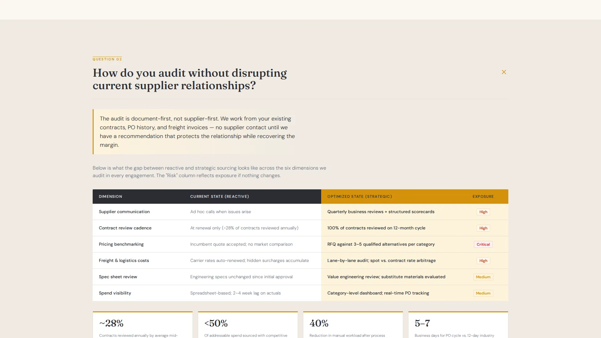
Each scroll section opens with a real procurement question, such as how audits avoid supplier disruption or how fees are structured. The answer unfolds into a structured comparison table rather than a paragraph of copy. This mirrors the way a consultant would walk through evidence in a boardroom.
Side-by-Side Comparison Tables
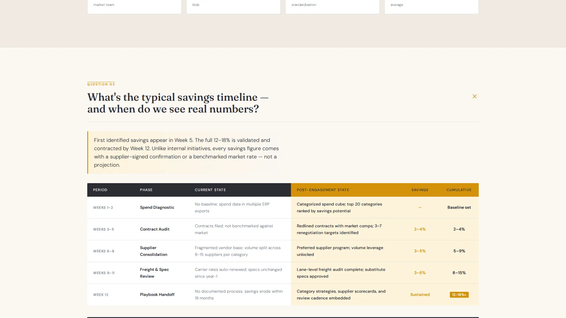
Every FAQ answer is supported by a two-column comparison table showing current state against optimized state. Columns cover areas such as incumbent pricing versus benchmarked market rate and reactive sourcing versus strategic sourcing. An amber-highlighted delta column shows the gap in plain numbers.
Half-Page Split Header
The header divides the viewport into two halves. The left side holds a tightly cropped, desaturated warehouse photograph. The right side delivers a large serif headline, a three-lever subline covering supplier consolidation, contract renegotiation, and specification optimization, and the primary amber call to action button.
Multi-Placement call to action Architecture
The primary call to action, labeled "Book a Spend Review," appears three times: in the header, after the third FAQ section, and as a persistent bottom bar on mobile. All three placements point to a 30-minute diagnostic calendar booking page with no form fields on the landing page itself.
Secondary Lead Capture Path
A second conversion path offers a downloadable one-pager called "Get the Savings Framework." It is gated behind a single email field. This gives visitors who are not ready to book a call a lower-commitment way to engage.
Corporate Precision Visual System
The layout uses a charcoal and amber color system with serif typography for headlines and a structured, document-like grid. The overall feel is designed to read like a senior partner's annotated contract rather than a typical agency website.
Page sections overview
| Section | Purpose |
|---|---|
| Split Header | Frames the margin loss argument and anchors the primary call to action |
| FAQ One | Addresses audit disruption concerns with a comparison table |
| FAQ Two | Shows savings timeline with current versus. optimized benchmarks |
| FAQ Three | Clarifies fee structure with a reactive versus. strategic sourcing table |
| Mid-Page call to action | Repeats the "Book a Spend Review" prompt at peak scroll engagement |
| Secondary Download | Captures email with the savings framework one-pager offer |
| Mobile Bottom Bar | Keeps the primary call to action visible throughout the full mobile scroll |
Design & branding system
The template follows a Corporate Precision theme built to project authority and analytical rigor. The color system uses deep boardroom charcoal as the dominant background, warm document cream for content areas, polished amber for highlights and interactive elements, and cooler slate for secondary text and table borders. Typography leans on large serif type for headlines to convey the weight of a senior-level business document.
- Charcoal (#2B2D33), document cream (#FAF7F2), amber (#D4920B), and slate (#6B7280) form the complete palette
- Desaturated warehouse photography on the left header panel reinforces an operational, evidence-based tone
- Amber-highlighted delta columns in every comparison table function as visual proof points, drawing the eye to the gap between current and optimized states
Mobile & speed optimization
The landing page layout is structured for efficient rendering on mobile devices. The persistent bottom bar call to action is a mobile-specific component that keeps the booking action accessible without interrupting the reading flow.
- The half-page split header reflows for smaller screens without losing the headline hierarchy
- The comparison tables are designed to remain scannable at mobile widths
- No form fields exist on the main page, which reduces friction and load complexity for mobile visitors
How this template helps you convert
The conversion architecture is deliberate and layered. It builds a case progressively rather than asking for commitment upfront.
- The header states the financial gap in specific percentage terms, which immediately filters for qualified readers and establishes credibility before any scrolling begins.
- Each FAQ-plus-comparison-table pairing adds a new layer of evidence, so urgency compounds naturally as the visitor scrolls deeper into the page.
- The dual call to action structure gives visitors two ways to convert: a direct calendar booking for those ready to act and a downloadable framework for those who need more time, reducing the number of visitors who leave without any engagement.
Other information about this template
This template sits at the intersection of professional services and supply chain consulting. It is designed specifically for the category management consulting niche, where consultants need to differentiate on analytical depth rather than general credentials.
- The template style is Comparison Table, which is well-suited to procurement contexts where buyers respond to side-by-side evidence rather than narrative copy
- The creative direction is FAQ-driven, making it easy to update individual sections as your service offer evolves or as you refine the questions your clients ask most
- The click-through landing page direction means all conversion happens off-page on a calendar tool, keeping the page itself clean and argument-focused
- The header concept uses a photo-plus-text split, which grounds the abstract savings argument in a recognizable operational environment
Theme
Corporate Precision
Creative direction
Expert Panel
Color system
Navy Authority
Style
Comparison Table
Direction
Click-Through
Page Sections
Faq-driven Scroll Structure
Side-by-side Comparison Tables
Half-page Split Header
Multi-placement Call to Action Architecture
Secondary Email-gated Download
Corporate Precision Visual System
Related questions
Can I update the comparison table content for my specific service?
Does this template include the calendar booking page?
What is the secondary download section used for?
Can I edit the headline and the three levers in the header?
Is this template suitable for a consultant focused on a specific industry vertical?



