Wholesale Office Supplies Group Buy Landing Page
Procure is a bento grid landing page template built for office supply group buying platforms. It uses a Luxe Minimal design with an Obsidian and Gold color system to communicate wholesale value with confidence. The layout guides office managers, operations leads, and executive assistants from a striking unboxing header straight through to a catalog click, with zero signup friction.
by Rocket studio
Quick summary
Procure is a single-page bento grid template designed for wholesale office supply platforms that pool buying power. The Obsidian and Gold palette signals premium value, while the Unboxing Experience creative direction layers information row by row. Every section moves a visitor closer to clicking through to the live group buy catalog.
Who this template is for
This template is built for the people who keep offices running without fanfare. It speaks directly to buyers who manage supply budgets, vendor relationships, and restocking cycles on behalf of entire teams.
- Office managers juggling multiple vendor accounts and bulk order schedules
- Operations leads at mid-size firms who need wholesale pricing without a procurement department
- Executive assistants responsible for keeping entire floors stocked and running smoothly
What problem this template solves
Buying office supplies at retail prices is a quiet, ongoing drain on operational budgets. Most offices overpay simply because they buy alone. This template gives group buying platforms a landing page that makes the math visible and the value undeniable before asking a visitor for anything.
- Visitors cannot easily see how much they could save until the savings calculator shows them
- The path from interest to catalog is often blocked by signup walls and friction
- Trust signals like supplier logos, delivery guarantees, and real testimonials are rarely presented in one clear flow
What you get with this template
You get a fully structured bento grid landing page that walks visitors through the group buying concept in three distinct row layers. The layout is built to convert browsers into catalog visitors without requiring a form or a commitment.
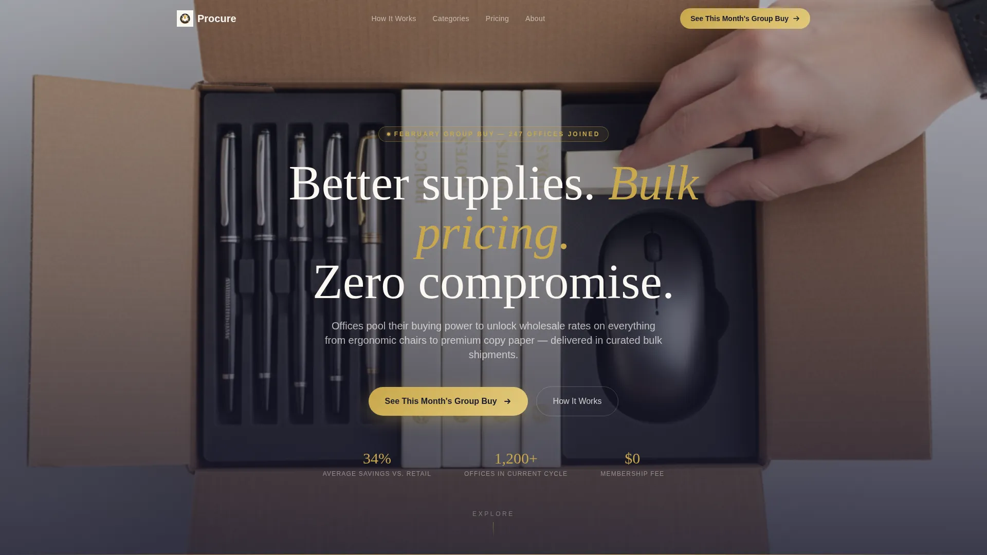
- A full-bleed overhead header with a brushed gold headline and a primary call-to-action button
- A three-row bento grid covering product categories, pricing mechanics, and trust signals
- A persistent bottom call-to-action bar that reappears after the second scroll fold
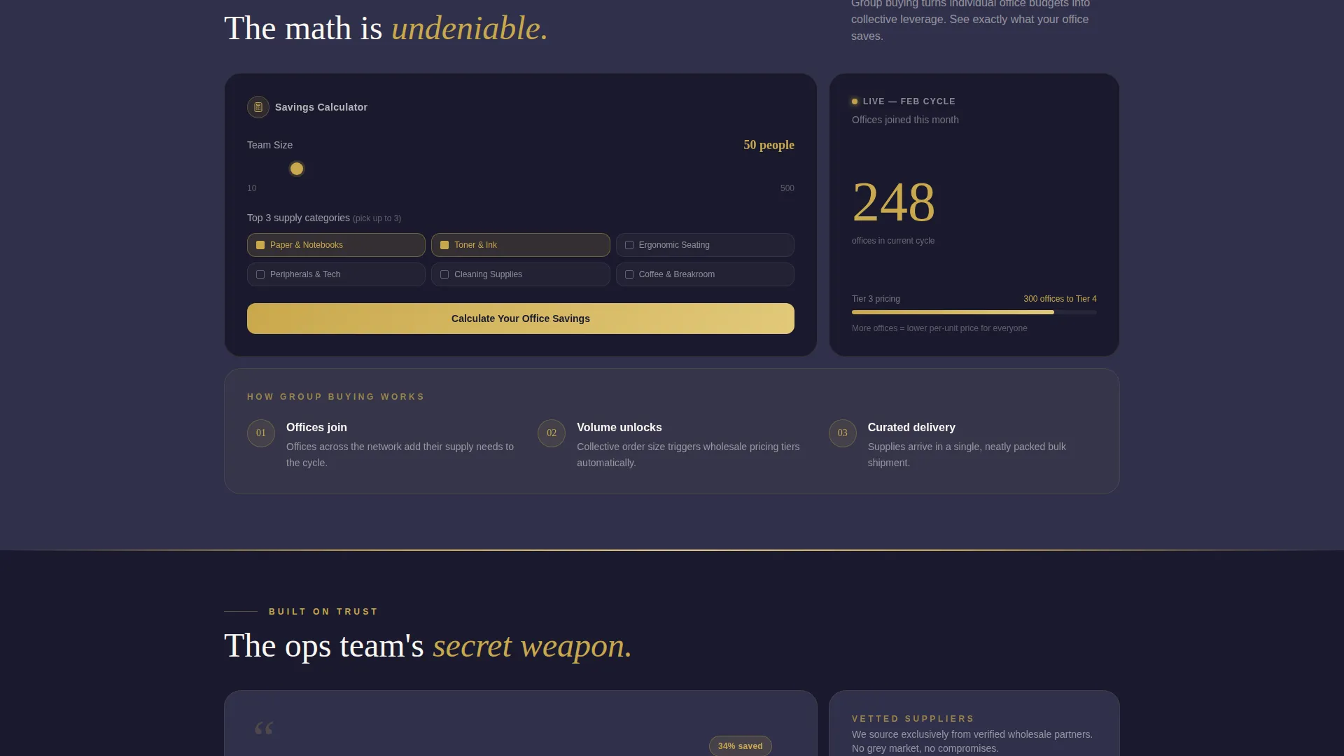
- An inline savings estimator tile that calculates projected annual savings before presenting the catalog link
Feature list
This section describes the core built-in components of the Procure landing page template.
Full-Bleed Overhead Header
The header uses a top-down photograph of an open shipping box on a clean white desk. Neatly arranged supplies in obsidian packaging fill the frame while one hand reaches in mid-unbox. The brushed gold headline "Better supplies. Bulk pricing. Zero compromise." sits over the obsidian tissue paper, and the primary call-to-action button appears inside the image.
Bento Grid Layout
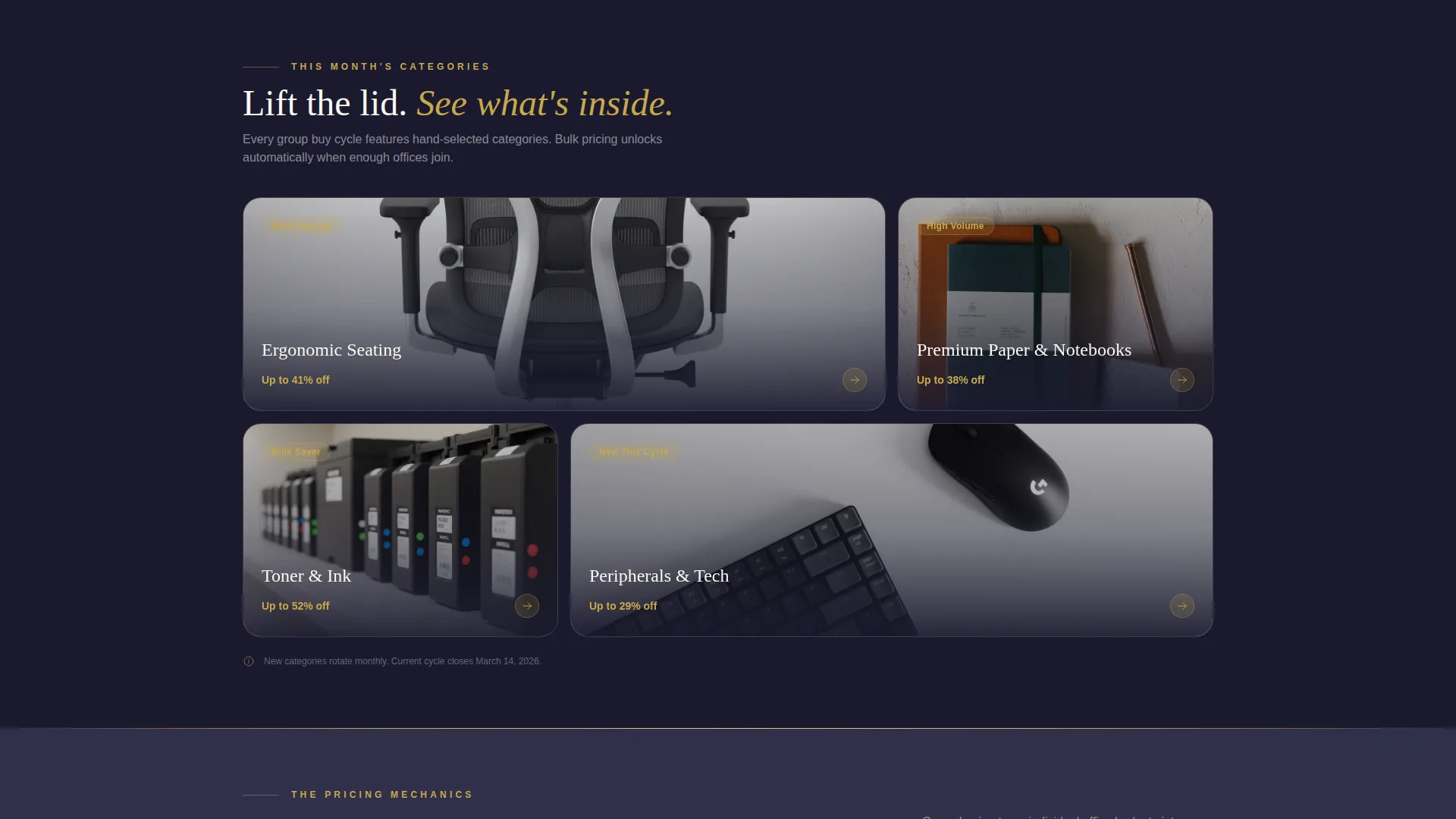
The page is structured as a bento grid divided into three purposeful rows. The first row presents product categories as if lifting items from a box. The second row exposes pricing mechanics with a savings calculator tile and a live counter tile showing how many offices joined this month's buy. The third row unpacks trust with supplier logos, delivery guarantees, and a testimonial tile.
Inline Savings Estimator Tile
A dedicated bento tile inside the pricing row hosts an inline estimator. It asks for team size and top three supply categories, then displays projected annual savings in gold numerals. The catalog call-to-action appears again once the estimate is shown, making the decision feel logical rather than pressured.
Persistent Bottom Call-to-Action Bar
After the visitor scrolls past the second fold, a fixed bottom bar appears with the primary call-to-action in gold on obsidian. It stays visible as the visitor continues reading, reinforcing the next step without interrupting the content flow.
Scroll Lift Animations
Each bento tile features a subtle lift animation on scroll, as though rising out of packaging foam. Gold accent lines trace the grid seams like foil tape on a premium parcel, reinforcing the unboxing creative direction throughout the entire page.
Trust Signal Row
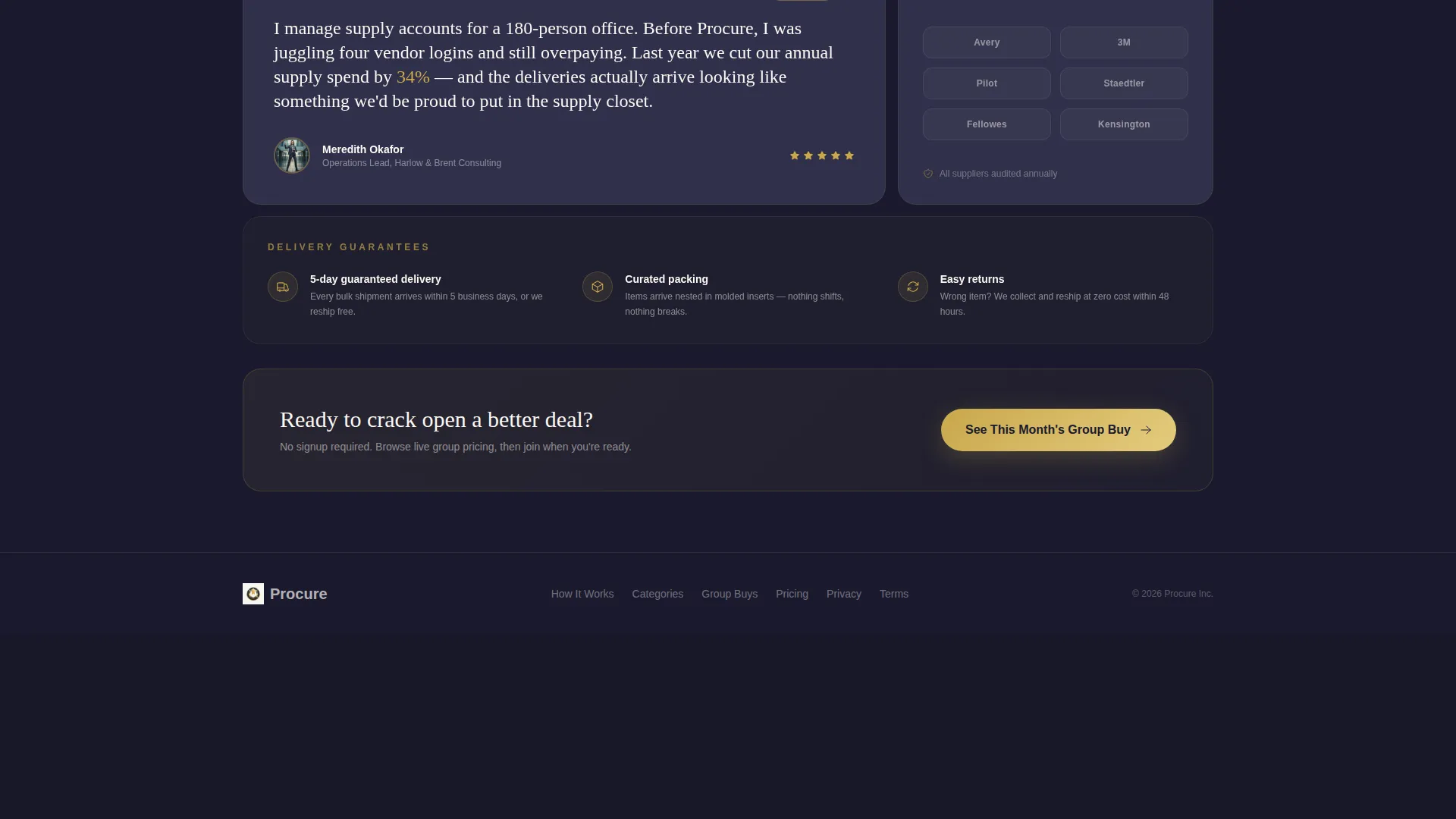
The third bento row is dedicated entirely to credibility. It includes supplier logo tiles, a delivery guarantee tile, and a testimonial tile from an operations manager who reduced her annual supply spend by 34 percent. These elements are placed after the pricing mechanics so trust is earned in the right sequence.
Page sections overview
| Section | Purpose |
|---|---|
| Header Hero Box | Introduces the platform and primary call-to-action inside a full-bleed overhead unboxing photo |
| Product Category Row | Presents available supply categories as the first layer of the bento grid |
| Savings Calculator Tile | Lets visitors estimate projected annual savings based on team size and supply categories |
| Live Member Counter | Shows how many offices joined the current month's group buy to build social proof |
| Supplier Logo Strip | Displays supplier credentials to reinforce platform legitimacy |
| Delivery Guarantee Tile | Communicates curated bulk shipment reliability and fulfillment confidence |
| Testimonial Tile | Features a real-world result from an operations manager to validate the savings claim |
| Persistent call to action Bar | Keeps the catalog call-to-action visible after the second scroll fold |
Design & branding system
The Procure template uses a Luxe Minimal theme built around a four-color Obsidian and Gold system. The palette feels like a matte-black desk accessory with gold foil lettering, making every pricing signal feel deliberate and premium.
- Deep obsidian black (#1A1A2E) and warm charcoal (#30304A) frame the grid gutters and structural elements
- Matte cream (#FAF7F2) dominates the content cards, keeping text readable and tactile
- Brushed gold (#C9A84C) is reserved for pricing callouts, savings badges, hover states, and call-to-action elements, so every flash of it signals money saved
Mobile & speed optimization
The bento grid structure adapts to smaller screens without losing the layered unboxing feel. Column widths and tile proportions reflow so the row-by-row reveal sequence remains intact on any device.
- Tile lift animations are scoped to scroll events, keeping motion purposeful and non-distracting on mobile
- The persistent bottom call-to-action bar is sized for thumb reach on mobile viewports
- Gold accent lines and grid seam details scale proportionally so the premium visual identity holds across screen sizes
How this template helps you convert
The Procure template is engineered as a click-through page with one goal: get the visitor into the live group buy catalog. Every design and copy decision reduces the distance between first impression and that click.
- The savings calculator makes the financial benefit concrete before the visitor is asked to do anything, removing the main objection before it forms.
- The persistent bottom call-to-action bar keeps the next step visible at all times after the second fold, so the visitor never has to scroll back up to act.
- The trust signal row, placed after the pricing mechanics, confirms that the savings are real and the supplier relationships are solid, closing the loop before the final click.
Other information about this template
The Procure template sits at the intersection of the Retail and E-Commerce category and the Office Supplies E-Commerce subcategory. It is specifically designed for the group buying and wholesale pricing niche, where the platform's value depends on communicating collective savings clearly and quickly.
- The template style follows a Masonry and Pinterest-influenced bento grid, giving each content tile its own visual weight while the overall layout reads as a cohesive whole
- The creative direction is an Unboxing Experience, meaning the page reveals information progressively, row by row, much like peeling back layers of tissue paper in a well-packed shipment
- The header concept is grounded in a top-down product photography approach that immediately communicates premium quality and careful curation
- No form, no signup gate, and no commitment barrier appear on this page. The primary call-to-action "See This Month's Group Buy" lands directly on the live catalog
Theme
Luxe Minimal
Creative direction
Unboxing Experience
Color system
Lavender Dream
Style
Masonry/Pinterest
Direction
Quiz/Assessment
Page Sections
Full-bleed Overhead Header
Three-row Bento Grid
Inline Savings Estimator
Persistent Bottom Call to Action Bar
Trust Signal Row
Scroll Lift Tile Animations
Related questions
Does this template include a signup form?
Who is this landing page template designed for?
How does the inline savings estimator work?
Can I replace the testimonial and supplier logos with my own?
Can the Obsidian and Gold color system be changed to fit my brand?



