Dentist LinkedIn Optimization Landing Page
ProfileForge is a bold brutalist landing page template built for a dentist LinkedIn optimization service. It uses a draggable before/after slider, asymmetric 60/40 grid layout, and three creator spotlight case studies to prove transformation through real metrics. A fixed waitlist form with a live position counter drives sign-ups from practice owners, associates, and DSO executives.
by Rocket studio
Quick summary
ProfileForge is a single-page waitlist landing page for a dentist LinkedIn profile optimization service. The design uses a bold brutalist monochrome steel visual system, a draggable before/after hero slider, and a three-part creator spotlight sequence. The page builds trust through visible transformation metrics and captures leads through a fixed-position waitlist form with a live counter.
Who this template is for
This template is built for dental professionals and service providers who need a high-conviction, conversion-focused landing page. It is ideal for anyone launching a LinkedIn profile optimization offering aimed at the dental industry.
- Solo and group practice owners who want more visibility in referral networks
- Associate dentists building a personal brand before opening their own clinic
- DSO (Dental Service Organization) executives who need a thought-leadership presence to attract top talent
What problem this template solves
Most dental professionals have LinkedIn profiles that blend into the feed. A generic headshot, a bio that reads like a résumé, and zero engagement mean missed referrals and lost recruiting opportunities. This template solves the visibility problem by making the transformation undeniable from the very first scroll.
- Removes the guesswork about what a profile overhaul actually delivers by showing before/after results side by side
- Replaces passive browsing with active commitment by anchoring the page to a waitlist form and scarcity counter
- Captures leads at two points: the early micro-audit call to action and the final waitlist form
What you get with this template
The template delivers a fully structured, single-page layout with every section mapped to a specific conversion goal. Each block is designed to move a skeptical dental professional from curious visitor to committed sign-up.
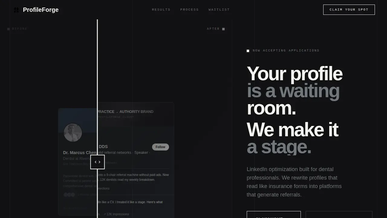
- A draggable before/after hero slider that reveals the full scope of profile transformation without a single line of explanation
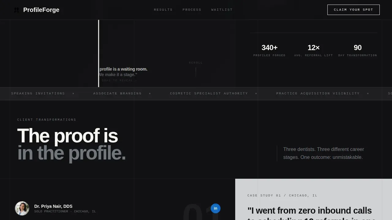
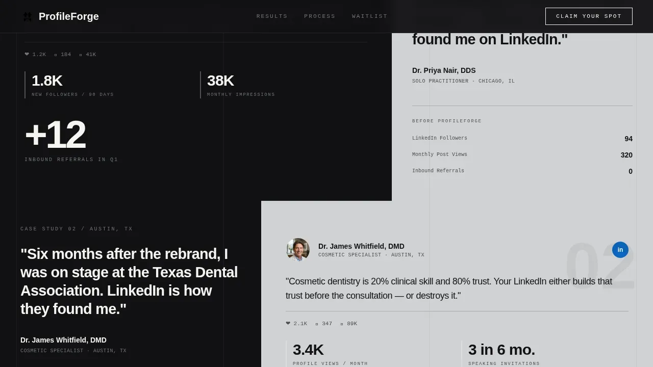
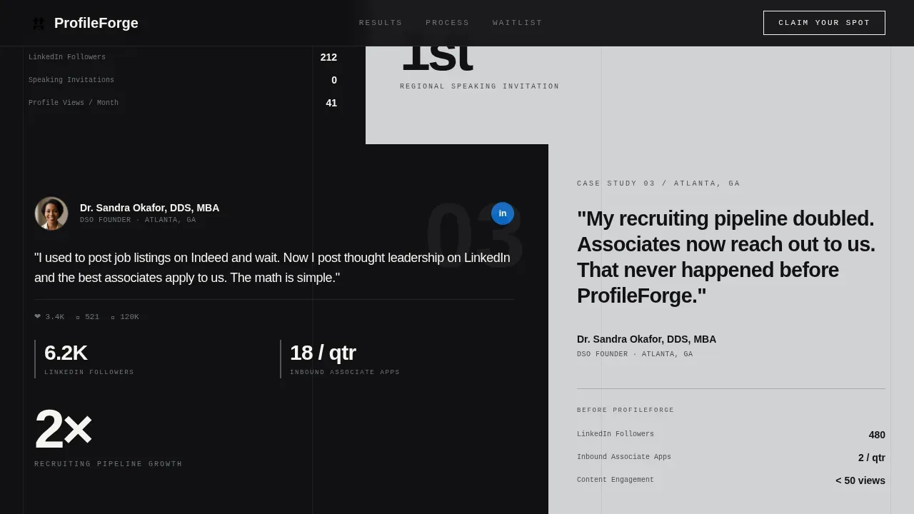
- Three escalating creator spotlight sections built on a 60/40 asymmetric grid, each carrying real engagement metrics and pull-quotes
- A fixed-position waitlist form with a live position counter, LinkedIn URL input, practice type selector, and email field
Feature list
This template includes six core built-in features. Each one is purposeful and directly tied to the service offering described in the brief.
Draggable Before/After Hero Slider
The header splits the 60/40 grid between a generic LinkedIn profile on the left and a fully transformed profile on the right. Visitors drag a steel-colored slider bar to reveal the difference. No copy needed, the contrast does the persuading.
Asymmetric 60/40 Grid Layout
Every section uses a deliberate split between a dominant content panel and a supporting context panel. The imbalance keeps the eye moving and gives LinkedIn screenshots visual priority against the brutalist background.
Creator Spotlight Case Studies
Three sequential spotlight sections present real dental professional transformations. Each one escalates in outcome: 12 inbound referrals for a solo practitioner, a speaking invitation for a cosmetic specialist, and a doubled recruiting pipeline for a DSO founder.
Live Waitlist Position Counter
A real-time counter above the sign-up form shows each visitor their projected position in the queue. This creates urgency without a fake deadline, a scarcity mechanic grounded in actual list length.
Micro-Audit Secondary Call to Action
Earlier in the page, a "See What We'd Change" prompt invites visitors to paste their LinkedIn URL for an automated preview audit. This captures leads before they reach the final form, catching interest at an earlier stage of intent.
Bold Brutalist Typography System
Headlines use oversized, tight-tracked type that hits the page like a concrete slab. The monochrome steel palette, hard background cuts, and no-gradient rule keep every word load-bearing and visually distinct from a typical service landing page.
Page sections overview
| Section | Purpose |
|---|---|
| Hero Slider | Reveal profile transformation visually |
| Spotlight One | Solo practitioner referral result |
| Spotlight Two | Cosmetic specialist speaking outcome |
| Spotlight Three | DSO founder recruiting result |
| Waitlist Form | Capture sign-ups with live counter |
| Footer | Single-row linear navigation close |
Design & branding system
The visual identity is bold brutalist monochrome steel. Every color, typeface, and layout decision reinforces the feeling of raw precision, not polish. The palette strips away softness deliberately so that LinkedIn screenshots pop as foreign objects inside the frame.
- Color palette: forge-black (#111113) for primary backgrounds, surgical steel (#71767C) for mid-tones and hover states, exposed-concrete gray (#D0D1D3) for alternating section backgrounds, and searing accent white (#F5F5F0) reserved for headlines and call-to-action borders
- Typography: Bricolage Grotesque for oversized headline blocks, DM Sans for body copy, JetBrains Mono for counter labels and form field tags
- Backgrounds alternate between forge-black and concrete gray in hard cuts with no blending, no gradients, and no decorative softening
Mobile & speed optimization
The template is built desktop-first to match how LinkedIn users typically browse, while maintaining a responsive mobile fallback for visitors on smaller screens.
- Desktop-first layout preserves the full 60/40 asymmetric grid and slider interaction at full fidelity
- Interactive components including the slider, live counter, and form are isolated as client components to keep static sections lightweight
- Static page sections use server component architecture to reduce unnecessary rendering overhead on load
How this template helps you convert
The page is engineered around two distinct conversion moments, not just one. Every design and copy decision supports moving a dental professional from passive scroll to active commitment.
- The before/after slider and creator spotlight sequence build proof progressively, giving skeptical visitors escalating evidence before they ever see a form
- The "See What We'd Change" micro-audit call to action captures leads mid-page from visitors who are curious but not yet ready to commit to the waitlist
- The fixed-position waitlist form with a live position counter closes the loop with a specific, low-friction ask that creates real urgency without a manufactured deadline
Other information about this template
This template is part of the Personal and Resume category with a focus on the Dentist Profile subcategory. It is built for the dentist LinkedIn optimization niche and is particularly suited for service providers positioning a premium, transformation-led offer.
- The page is localized for the United States market, with English copy, USD pricing context, and MM/DD/YYYY date formatting
- Animation level is high, using cinematic entrance effects, slide-up fade reveals, shimmer states, and GSAP-style intersection observer triggers
- The hover state on the primary call-to-action button uses a vibrate effect to draw attention without breaking the monochrome visual discipline
- The template style is Asymmetric Grid (60/40) with a Bold Brutalist theme, Creator Spotlight creative direction, a Before/After Slider header concept, and a Waitlist/Coming Soon landing-page direction
Theme
Bold Brutalist
Creative direction
Creator Spotlight
Color system
Monochrome Steel
Style
Asymmetric Grid (60/40)
Direction
Waitlist/Coming Soon
Page Sections
Draggable Before/after Hero Slider
Asymmetric 60/40 Grid Layout
Escalating Creator Spotlight Sections
Live Waitlist Position Counter
Micro-audit Secondary Call to Action
Bold Brutalist Typography and Color System
Related questions
Who is this landing page template designed for?
What makes the hero section different from a standard service header?
Does the waitlist form capture anything beyond an email address?
Can I update the case study metrics in the creator spotlight sections?
What is the purpose of the micro-audit call to action mid-page?



