Exclusive Bakery Landing Page Template | Bento Grid
Proof is a bento grid landing page built for on-demand bakeries that sell in limited weekly drops. It pairs a Luxe Minimal theme with a Dopamine Pop color palette and a three-step taste quiz to guide every visitor toward their perfect order. Scarcity-driven cells, live countdown timers, and a full-bleed header create urgency without pressure.
by Rocket studio
Quick summary
Proof is a single-page bento grid landing page designed for a small-batch, on-demand bakery. It runs on visual scarcity, a live countdown timer, and a personalized taste quiz to move visitors from curious to committed. The layout is restrained and editorial, letting bold accent colors and tight macro photography do the heavy lifting.
Who this template is for
This template is built for bakers and food brands that release products in limited, time-sensitive drops rather than running a permanent storefront. It suits anyone whose product sells out fast and whose audience shops with their eyes first.
- Small-batch bakeries and pastry studios selling weekly or bi-weekly drops
- Food entrepreneurs targeting gift buyers, event hosts, and food-passionate millennials
- Dessert brands that want their landing page to feel editorial and high-end rather than generic e-commerce
What problem this template solves
Most bakery websites look like menus. They list items, show a price, and wait. That approach does not create urgency, and it does not help an undecided visitor choose. Proof solves the gap between a beautiful product and a confident order.
- Visitors do not know what to order, so a three-step quiz guides them to the right box
- A static product page kills the sense of scarcity that drives on-demand sales
- Generic food templates cannot communicate "order now or miss it" without feeling pushy
What you get with this template
Proof delivers a fully structured, single-page layout built around the drop-model selling experience. Every section is designed to work together, from the opening image to the final quiz result.
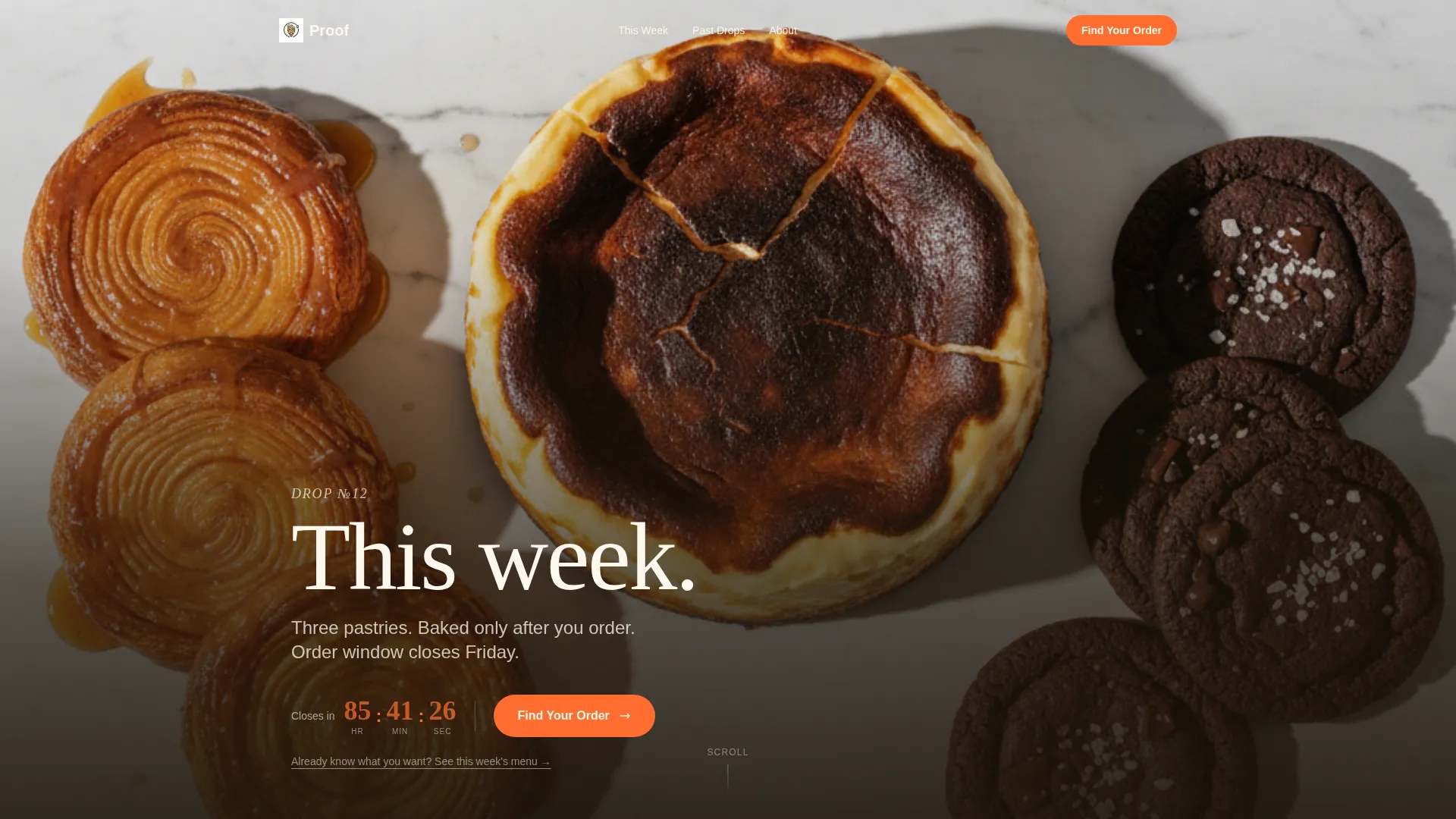
- A full-bleed overhead header with a live countdown timer in candied tangerine
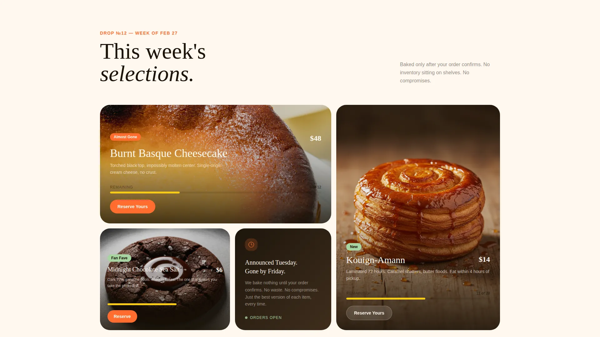
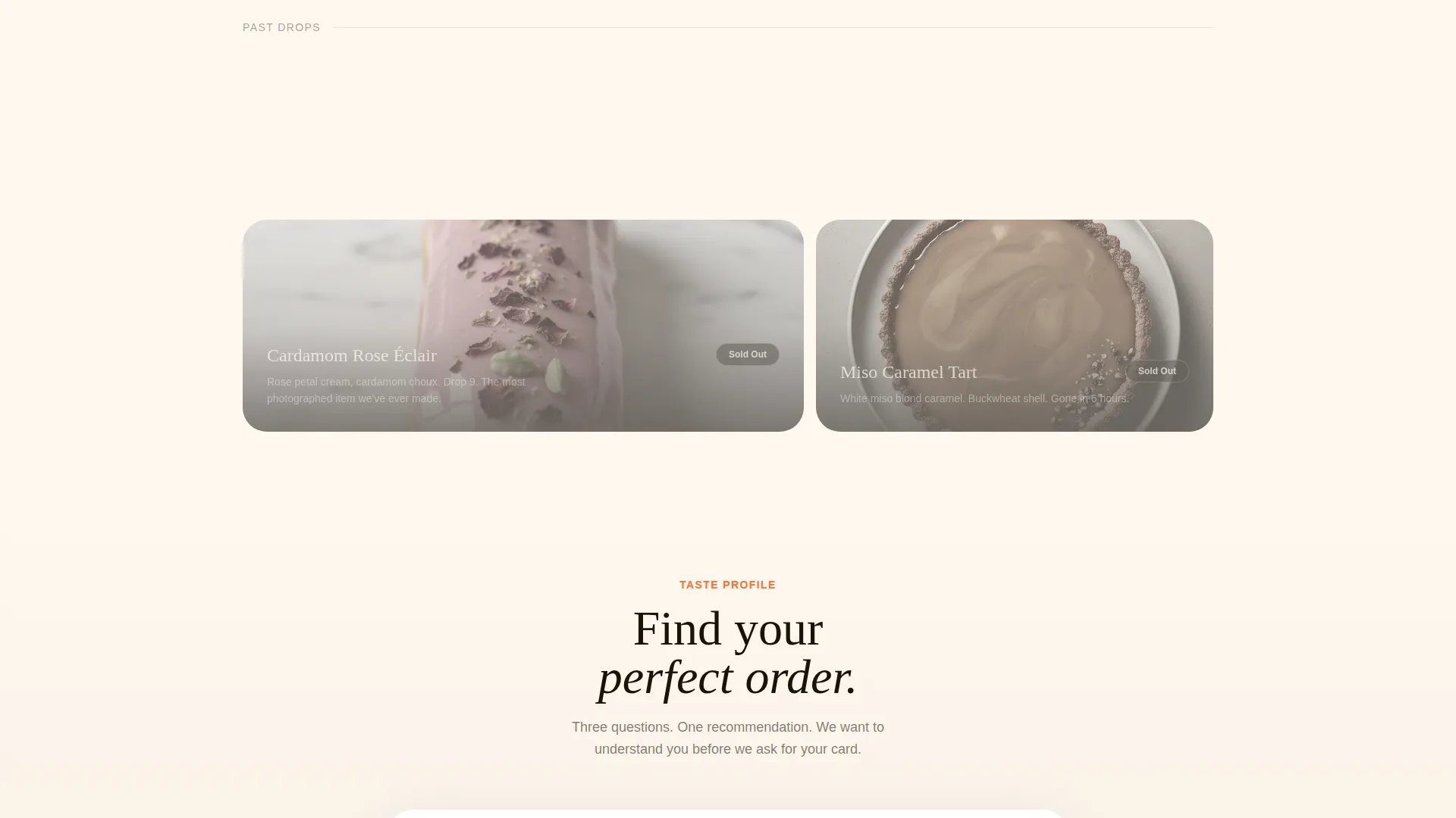
- A scrollable bento grid that moves from live drop items to grayed-out sold-out cells
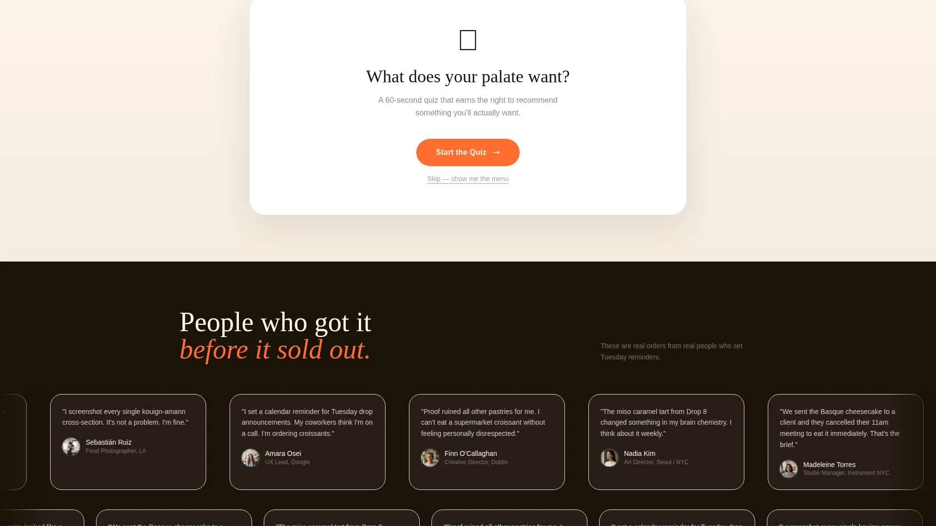
- A three-step embedded taste quiz with a personalized "Claim Yours" result and a secondary skip path for returning customers
Feature list
This template packs distinct, purposeful components into a single page flow. Each one is drawn directly from the brief and serves a specific role in the visitor journey.
Full-Bleed Overhead Header
The header opens with an overhead photo of this week's drop laid on a marble surface. One word fades in over the image in thin espresso type: "This week." A live countdown timer in candied tangerine sits beneath it, ticking toward the order window close.
Scarcity-Driven Bento Grid
The main content area is a bento grid where each cell shows one drop item: a tight macro photo, a two-line flavor story, and a live quantity-remaining indicator. As visitors scroll, available cells give way to grayed-out past drops stamped "Sold Out," building urgency through visual contrast rather than explicit pressure language.
Three-Step Taste Quiz
The primary conversion path is a three-step quiz. Step one is a flavor-leaning slider: butter-forward, fruit-forward, or chocolate-deep. Step two captures texture preference: shatter, chew, or cloud. Step three asks about occasion: self-treat, gifting, or hosting. The result is a personalized drop recommendation with a one-tap "Claim Yours" button.
Returning Customer Skip Path
A secondary call to action lets returning visitors bypass the quiz entirely and go straight to the current week's menu. This keeps the experience efficient for loyal buyers without removing the guided path for new ones.
Dopamine Pop Color System
The palette uses a warm cream base, deep espresso type, candied tangerine for buttons and timers, and pistachio glaze for tags and badges. Color appears only where it earns attention, making every accent feel intentional.
Variable Bento Cell Layout
Grid cells vary between double-wide hero shots and tight texture-detail squares. The eye never settles into a predictable pattern, which keeps the visitor scanning and engaged longer.
Page sections overview
| Section | Purpose |
|---|---|
| Full-Bleed Header | Introduces the current drop with overhead photography and a live countdown timer |
| Live Drop Grid | Displays available bento cells with macro photos, flavor notes, and quantity indicators |
| Sold-Out Archive | Shows grayed-out past drops to reinforce scarcity and desirability |
| Taste Quiz | Guides new visitors through three steps to a personalized order recommendation |
| Quiz Result Panel | Delivers a tailored box recommendation with a one-tap "Claim Yours" action |
| Returning Customer Path | Offers a direct link to the current week's menu for loyal buyers |
Design & branding system
The visual identity follows a Luxe Minimal theme expressed through the Dopamine Pop color system. Restraint is the rule; color and texture land as deliberate punctuation rather than decoration.
- Warm cream base (#FFF8F0), deep espresso typography (#1A1208), candied tangerine (#FF6D2E) on buttons and timers, pistachio glaze (#A8D5A2) on tags and badges
- Thin, editorial typeface in espresso on the header image; tight macro food photography with no symmetrical styling
- Color accents appear only at conversion moments, making them feel urgent and rewarding rather than decorative
Mobile & speed optimization
The bento grid layout is designed to translate from wide desktop cells to a stacked, scrollable mobile experience. The visual hierarchy stays intact at any screen size.
- Variable cell sizes (double-wide heroes and tight squares) reflow naturally into a single-column scroll on smaller screens
- The countdown timer and quantity indicators remain prominent on mobile, keeping urgency visible without requiring a wide viewport
- The three-step quiz is structured as a simple, tap-friendly flow that works just as well on a phone as on a desktop
How this template helps you convert
Proof is built around one core idea: earn the click by making the visitor feel understood before they ever see a price. Every design and layout decision pushes toward that outcome.
- The countdown timer and sold-out cells create genuine time pressure, motivating visitors to act during the order window rather than returning later
- The taste quiz removes decision paralysis by delivering a specific, personalized recommendation, making the "Claim Yours" tap feel like the obvious next step
- The secondary skip path respects returning customers, reducing friction for repeat purchases and keeping the experience fast for buyers who already know what they want
Other information about this template
Proof is a strong fit for food brands building a loyal drop-model audience. It is designed as a standalone landing page, not a multi-page storefront, which keeps the visitor focused on a single, time-sensitive decision.
- The template is categorized under Retail and E-Commerce, specifically the On-Demand Business subcategory
- The Luxe Minimal theme and Dopamine Pop color system are a matched pair designed for editorial food brands that want impact without clutter
- This template is well suited for brands that use social media to announce drops and then drive followers to a single conversion page
- The bento grid style supports a variety of drop sizes: a small three-item week and a larger six-item week both fit naturally within the layout
Theme
Luxe Minimal
Creative direction
Limited Time
Color system
Dopamine Pop
Style
Bento Grid
Direction
Quiz/Assessment
Page Sections
Full-bleed Overhead Header with Countdown
Scarcity-driven Bento Grid Layout
Three-step Personalized Taste Quiz
Returning Customer Skip Path
Dopamine Pop Color Accents
Related questions
Can I use this template if I only offer one or two items per drop?
Does the taste quiz work for gifting-focused bakeries?
How does the sold-out section work visually?
Can returning customers skip the quiz entirely?
What type of bakery brand is this template best suited for?



