Real Estate Agency Professional Website Template
Propertygrid is a cyberpunk-styled real estate landing page built as a dashboard and data grid. It combines dark glass panel aesthetics, neon accents, and interactive filtering into a single-page experience designed to attract serious property seekers. Visitors hunt, filter, pin, and compare listings like assets, then convert through a frictionless three-step inline lead form.
by Rocket studio
Quick summary
Propertygrid turns a real estate agency portfolio page into an interactive data dashboard. The design uses void black surfaces, phosphor green data markers, and a filterable property grid to make listings feel like assets on a trading floor. It is built for agencies that want a landing page that earns attention before asking for contact details.
Who this template is for
This template suits real estate agencies and individual agents who want a high-impact, data-forward online presence. It works especially well for teams serving digitally native or tech-adjacent buyers who respond to clean interfaces over traditional brochure layouts.
- Agencies targeting relocating tech workers who research listings late at night
- Agents serving first-time buyers overwhelmed by crowded listing platforms
- Boutique firms wanting a bold visual identity that stands apart from generic real estate sites
What problem this template solves
Most real estate landing pages look like printed flyers digitized on a screen. They offer static grids with no sense of interactivity, making the visitor feel passive rather than in control. Propertygrid flips that dynamic by giving visitors a tool to operate, not a brochure to skim.
- Buyers lose trust on cluttered listing pages; this template uses focused filters and clean dark surfaces to reduce noise
- Generic layouts make every agency look identical; the cyberpunk visual identity creates a memorable brand impression
- Lead forms that appear too early get ignored; here, visitors earn the form by using the filters first
What you get with this template
You get a single-page landing page structured like a real estate discovery dashboard. Every section serves a clear function, from the opening property grid to the closing lead capture flow, and the design system is consistent from header to footer.
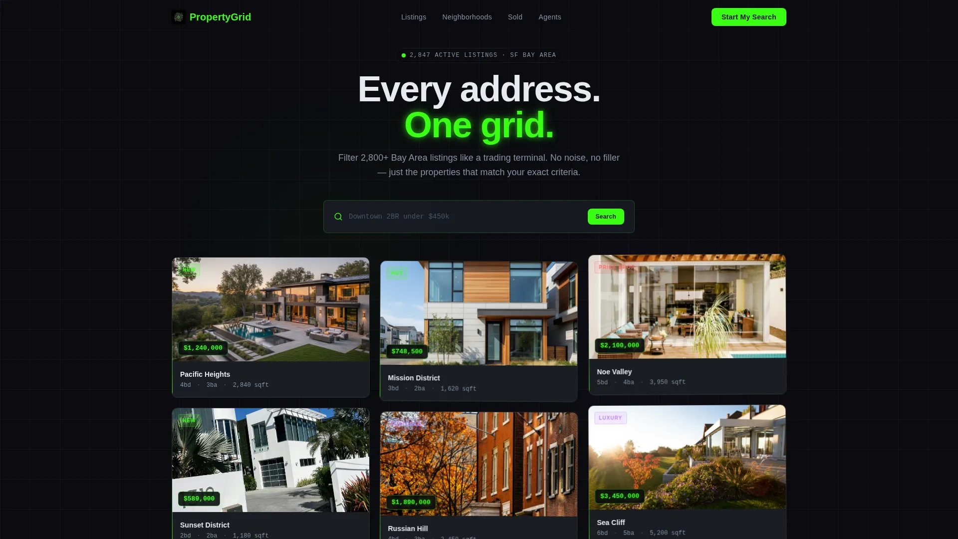
- A dark glass panel header with a floating property card grid, glowing price tags, and a centered ghost-text search bar
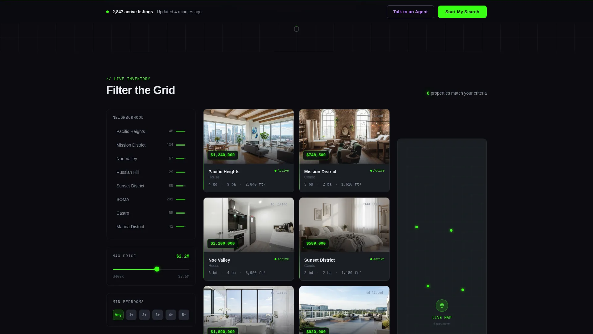
- A scroll-triggered interactive explorer with neighborhood columns, a live map panel, price range sliders, and walkability radial charts
- A sticky bottom bar with a primary "Start My Search" call to action and a secondary "Talk to an Agent" ghost button in electric lilac
Feature list
This section describes the core built-in capabilities delivered by the template as designed.
Dark Glass Panel Header
The header presents a grid of semi-transparent, frosted-glass property cards floating against a void black background. Each card shows a cropped hero image, a phosphor green price label, and a neighborhood tag. A slow parallax drift keeps the composition feeling alive without overwhelming the viewer.
Inline Three-Step Lead Form
Clicking "Start My Search" expands a sequential inline form directly on the page. It asks for neighborhood or zip code first, then a dual-handle budget slider, then a single timeline dropdown. The sequence feels like unlocking a full tool rather than filling out a contact sheet.
Scroll-Triggered Filter Interface
As the visitor scrolls past the header, the layout reshapes into filterable columns. Neighborhood sits on the left, property cards fill the center, and a live map panel anchors the right. Each scroll segment introduces a new filter dimension, including price range sliders and school district toggles.
Sticky Conversion Bar
A bottom action bar appears after the first scroll interaction. It anchors the primary call to action in view at all times without interrupting the browsing experience. The secondary ghost button in electric lilac gives visitors a softer, lower-commitment path to connect with an agent.
Agent Spotlight Break
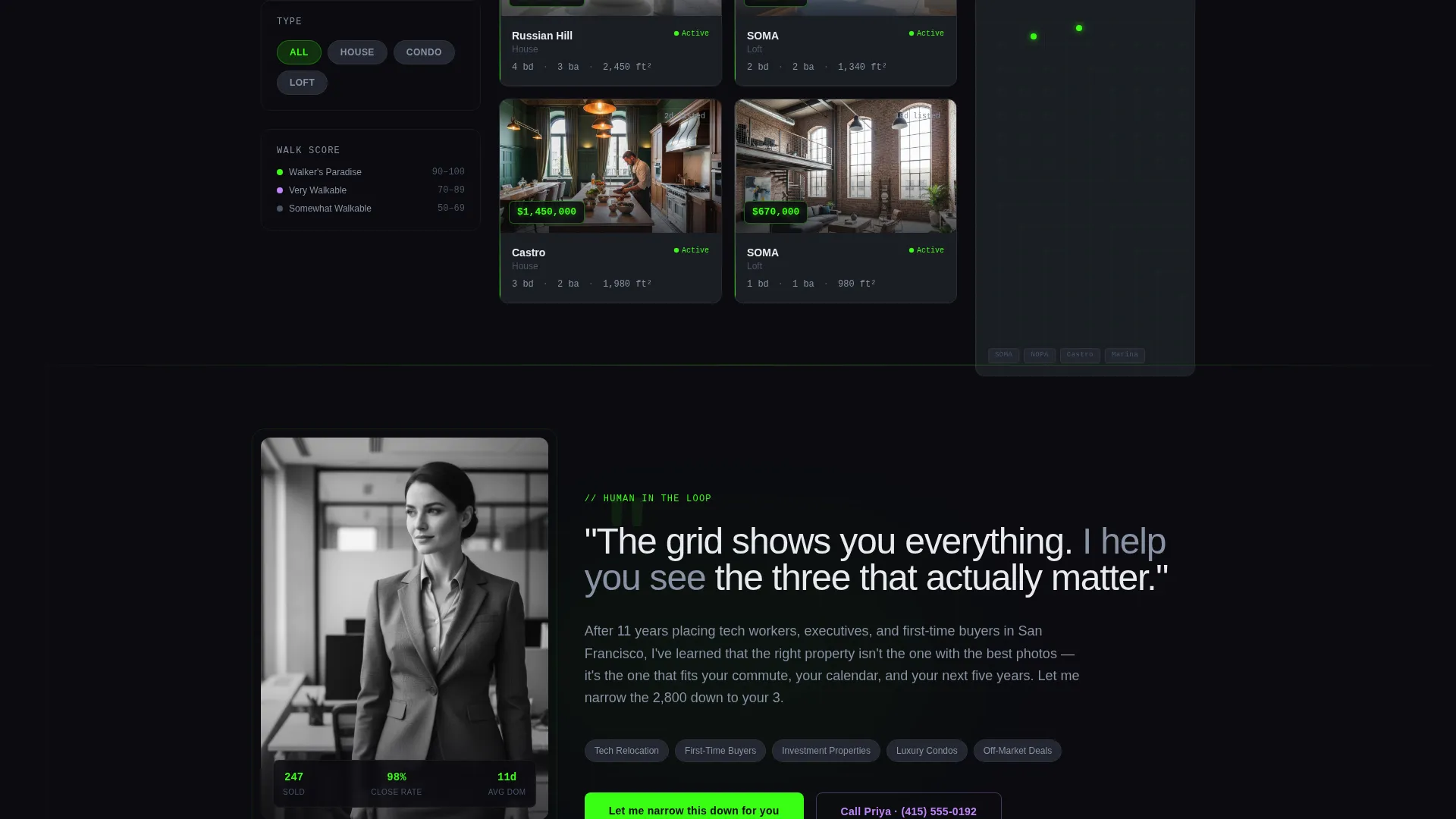
Midway through the data grid, the template pauses for a full-width agent spotlight section. A human face, a short quote, and a direct invitation break the machine rhythm. This moment of warmth re-establishes trust inside an otherwise data-dense layout.
Sold Properties Proof Section
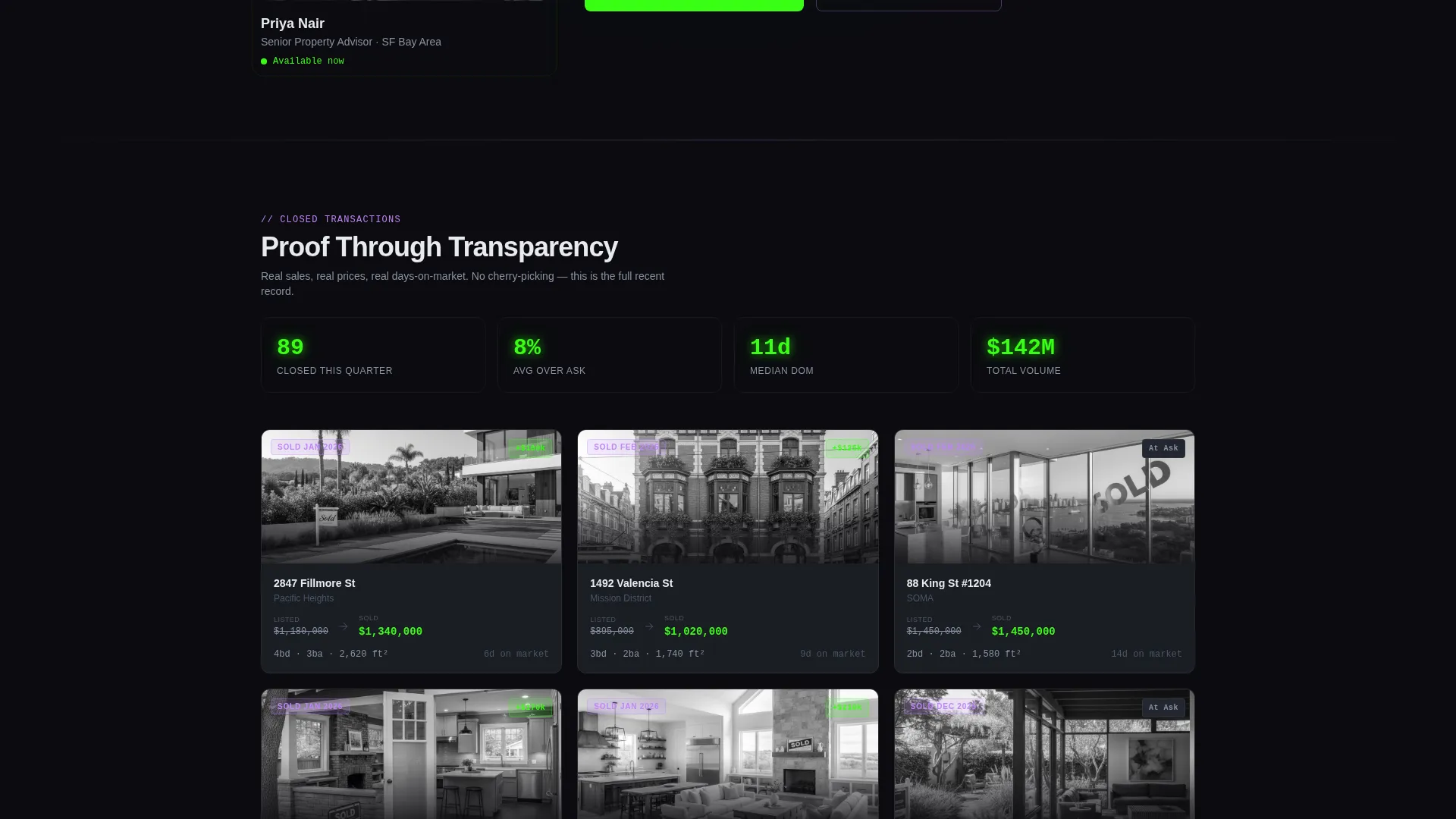
The grid resumes after the agent spotlight to display sold properties with final sale prices and days-on-market statistics. This section builds credibility through transparency, giving visitors concrete evidence of the agency's activity and results.
Page sections overview
| Section | Purpose |
|---|---|
| Glass Panel Header | Introduce agency range via floating property card grid |
| Ghost Text Search | Invite immediate interaction with a pre-filled search prompt |
| Filter Explorer Columns | Let visitors narrow listings by neighborhood, price, and amenities |
| Live Map Panel | Show property locations alongside the filterable card grid |
| Price Range Sliders | Allow precise budget filtering with haptic-style snap animation |
| School District Toggles | Filter properties by school zone with a single toggle interaction |
| Walkability Radial Charts | Display neighborhood walkability scores as visual data graphics |
| Agent Spotlight Section | Humanize the experience with a full-width agent quote and portrait |
| Sold Properties Grid | Build trust by displaying closed deals with prices and market timing |
| Sticky Conversion Bar | Keep "Start My Search" and "Talk to an Agent" anchored during scroll |
| Inline Lead Form | Capture visitor intent through a three-question sequential form |
Design & branding system
The color system is built around four values that work together as a cohesive visual language. Dark surfaces keep property photos visually dominant, while neon accents direct the eye toward the most important data points on any card or filter.
- Void black (#0B0B0F) and cool slate panel (#1A1D23) form the background range across all sections
- Phosphor green (#39FF14) marks active data including price tags, square footage labels, and availability badges
- Electric lilac (#C084FC) activates on hover states, card highlights, and the secondary ghost button to create a blacklight scanning effect
Mobile & speed optimization
The layout is designed to remain functional and readable at smaller screen sizes. The dashboard structure collapses gracefully so that the filtering experience stays usable without requiring a wide viewport.
- Property cards and filter columns reflow to a single-column layout on smaller screens
- The sticky conversion bar remains fixed at the bottom on mobile, keeping the primary call to action accessible at all times
- Typography is set at a crisp scale that reads clearly on high-density mobile displays without requiring zoom
How this template helps you convert
The conversion strategy is baked into the layout sequence itself. Visitors interact with the tool before they are ever asked to share contact information, which reduces friction and increases the perceived value of the lead form.
- Visitors drag sliders, toggle filters, and watch cards rearrange in real time, building investment in the tool before the form appears
- The sticky "Start My Search" bar appears only after the first scroll, so the call to action feels earned rather than intrusive
- The three-step inline form asks only one question at a time, making the commitment feel small and the payoff feel clear
Other information about this template
Propertygrid is categorized under real estate agency website templates and sits within the technology category on the marketplace. It is designed as a single-page landing page, not a multi-page site, so all content and conversion elements live within one continuous scroll experience.
- The template style is Dashboard and Data Grid, making it well suited for agencies that want a data-forward visual identity
- The theme is Directory and Discovery, meaning the layout prioritizes browsability and filtering over static storytelling
- The creative direction is Interactive Explorer, so scroll behavior actively reshapes the interface rather than simply revealing new content
- The header concept is Dark Glass Panels, a visual approach that layers semi-transparent cards at varied depth levels for a dimensional effect
- The landing page direction is Lead Generation, with every design decision oriented toward capturing qualified buyer intent
Theme
Directory & Discovery
Creative direction
Interactive Explorer
Color system
Acid Digital
Style
Dashboard/Data Grid
Direction
Lead Generation
Page Sections
Dark Glass Panel Property Header
Scroll-triggered Filter Explorer
Three-step Inline Lead Form
Sticky Bottom Conversion Bar
Agent Spotlight Section
Sold Properties Proof Grid
Related questions
Who is this landing page template designed for?
Does the template include the lead capture form?
Is this a single-page layout or a multi-page website?
Can I customize the color palette and property card content?
What makes the property filtering feel interactive in this template?



