Prosthodontist Specialist Booking Website Template
Prosth is a split-screen prosthodontist provider directory landing page built to connect patients with board-certified specialists. It guides visitors through an educational step-by-step journey, from understanding what a prosthodontist does to booking an appointment. The warm Forest Trust color system and calm, unhurried layout reduce dental anxiety and build trust before the first click.
by Rocket studio
Quick summary
Prosth is a single-page prosthodontist directory template designed around patient trust and guided decision-making. The split-screen layout pairs an intimate testimonial portrait with a structured four-step journey that walks visitors from awareness to booking. Every section is built to reduce anxiety and answer the questions patients are too nervous to ask out loud.
Who this template is for
This template is built for healthcare directory operators, dental practice groups, and prosthodontic specialists who want to connect patients with verified providers online. It fits anyone running a patient-to-specialist matching service in the dental restoration space.
- Dental directory founders connecting patients with board-certified prosthodontists
- Practice groups offering implants, crowns, dentures, or full-mouth reconstruction
- Health and medical platform builders targeting adults navigating tooth loss or restoration decisions
What problem this template solves
Many patients delay dental restoration for years, not because they lack options, but because the path forward feels confusing and clinical. They do not know the difference between a general dentist and a prosthodontist. They do not know which treatment applies to their situation. This template removes that friction by educating first and booking second.
- Patients arrive uninformed and anxious, unsure which specialist or treatment they need
- Directory pages often drop visitors into search results with no guidance or context
- Complicated booking flows create abandonment before a single appointment is made
What you get with this template
You get a fully structured, single-page directory landing page built around a four-step patient journey. Every section is designed to move a hesitant visitor from curiosity to confidence, and from confidence to a booked consultation.
- A split-screen hero with a real-patient testimonial card and a prominent "Find My Prosthodontist" call to action
- A guided four-step flow covering education, need identification, specialist search, and appointment booking
- Clickable treatment selector cards, an inline zip code and specialty search, and a calendar reveal widget for scheduling
Feature list
This template ships with a focused set of interactive and visual components. Each one is grounded in the brief and built for the patient experience it describes.
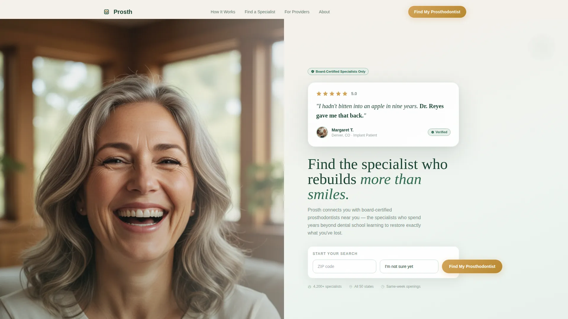
Split-Screen Testimonial Hero
The hero divides the viewport evenly. The left half holds a softly lit, close-cropped patient portrait mid-laugh. The right half presents a floating card with a five-star amber rating, two lines of warm serif testimony, the patient's first name and city, and a verified-patient badge in sage. The layout leads with human emotion, not a product pitch.
Step-by-Step Educational Journey
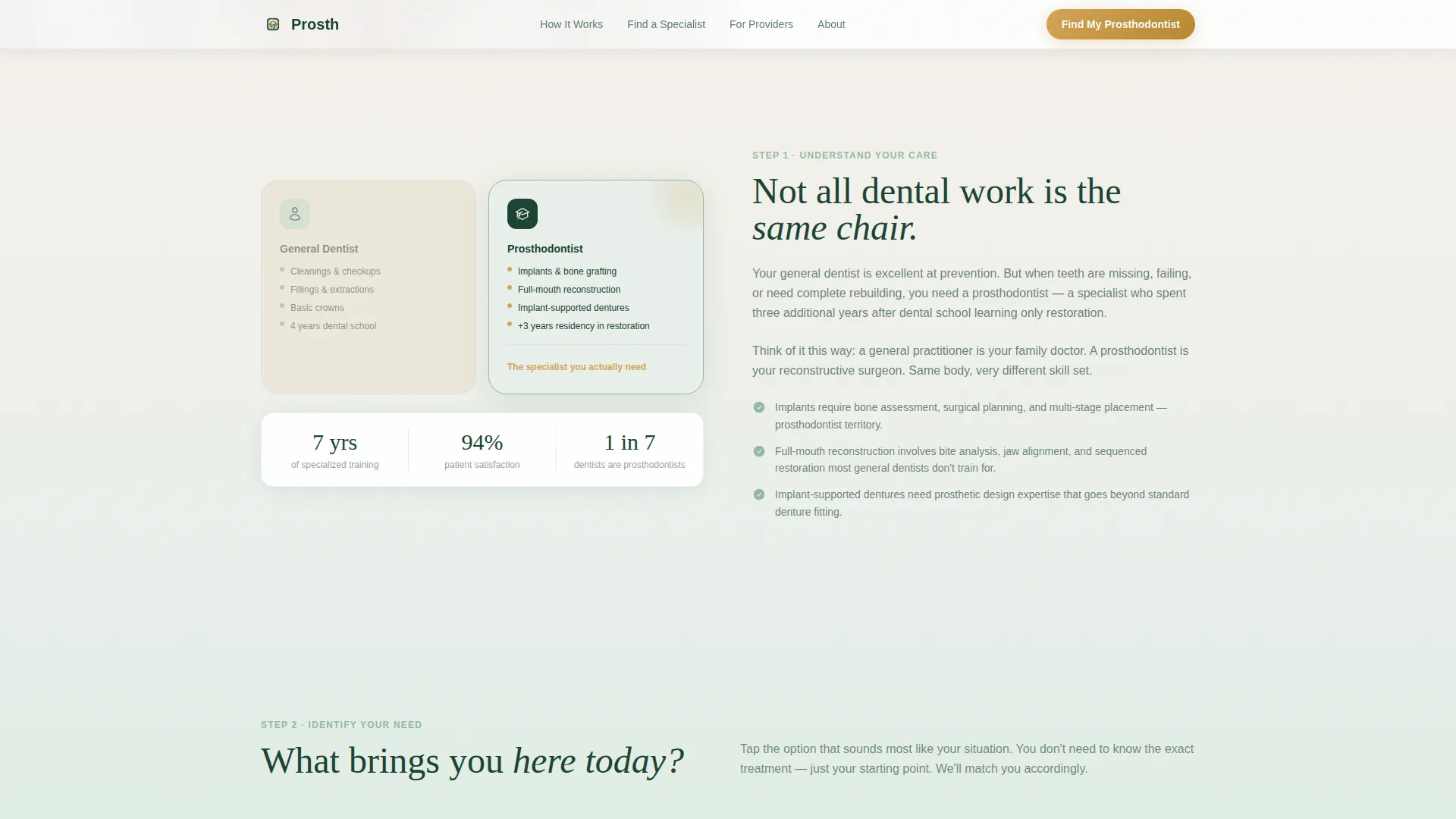
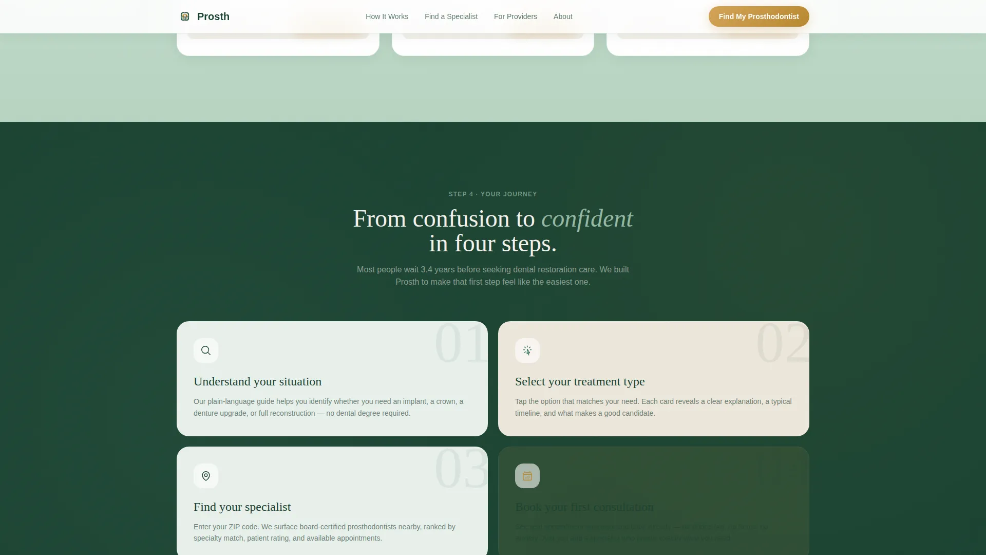
Four numbered steps walk the visitor through the full decision arc. Step 1 explains what a prosthodontist is versus a general dentist. Step 2 helps the visitor identify their treatment need. Step 3 narrows providers by zip code and specialty. Step 4 displays the selected provider's profile with credentials and available appointment slots.
Clickable Treatment Selector
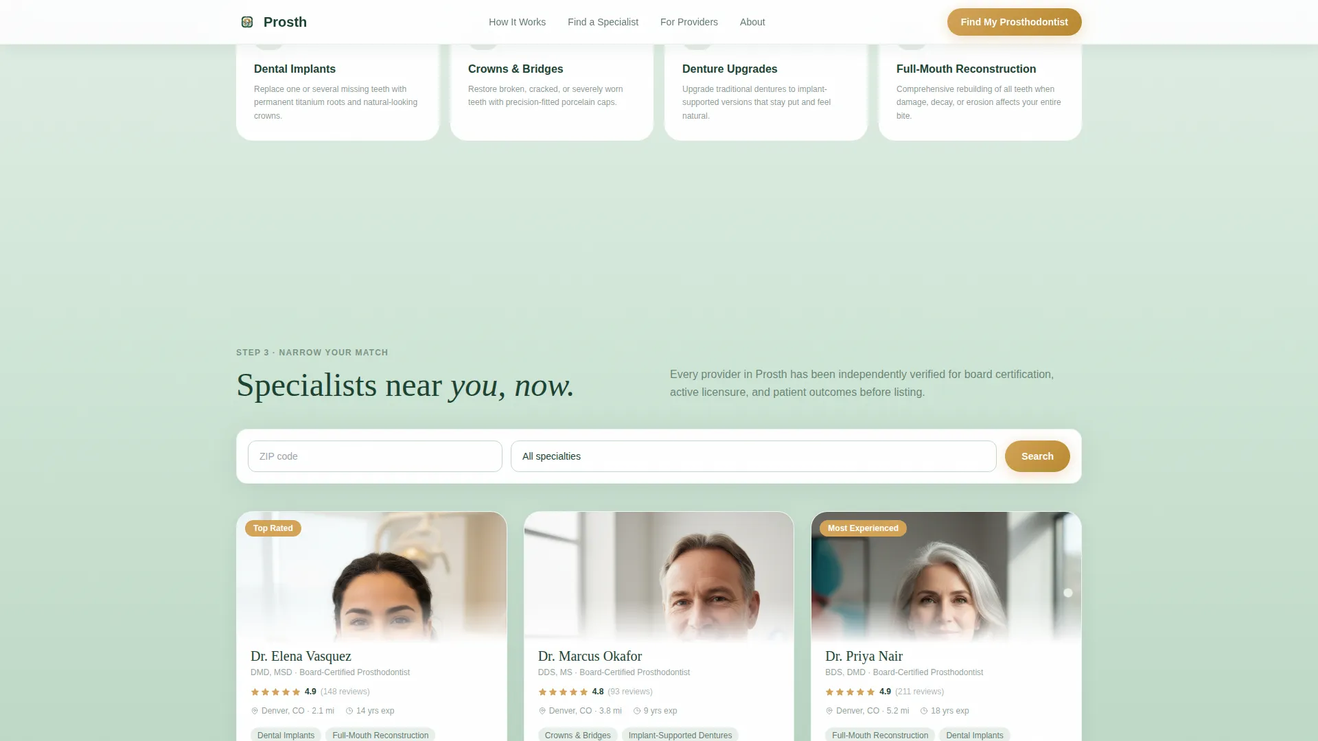
Step 2 presents four clickable cards covering implants, crowns, dentures, and full-mouth reconstruction. Visitors tap or click the card that matches their situation. This interaction personalizes the search that follows and reduces the cognitive load of unfamiliar medical terminology.
Inline Specialist Search with Provider Cards
The search form uses two fields: zip code and treatment type dropdown. Results load without a page change. Each provider card carries a secondary call to action labeled "See Next Opening," which reveals a calendar widget for real-time appointment viewing.
Scroll-Linked Gradient Progression
The page background shifts gradually as the visitor scrolls. It begins at birch white, transitions through sage mist, and deepens toward evergreen by the booking step. This visual progression reinforces the feeling of moving closer to a resolution, making the scroll feel purposeful rather than passive.
Social Proof and Credential Display
Provider profiles include credential badges, before-and-after case visuals, and open appointment slots. Patient testimonials carry first name, city, and a verified-patient badge. These elements work together to establish specialist authority and patient trust before any booking commitment is made.
Page sections overview
| Section | Purpose |
|---|---|
| Hero Split Screen | Opens with patient testimony and primary call to action |
| What Is a Prosthodontist | Explains specialist role versus general dentist |
| Identify Your Need | Clickable cards for implants, crowns, dentures, reconstruction |
| Find Your Specialist | Inline zip and specialty search with live provider cards |
| How It Works | Four-step visual journey with deepening gradient |
| Footer | Horizontal flow pattern with supporting navigation |
Design & branding system
The visual identity uses the Forest Trust color system, which draws from natural, grounded tones to feel calm and reassuring rather than sterile or clinical. Typography pairs Fraunces serif headlines with DM Sans for body text and interface elements.
- Deep evergreen (#1B4332) anchors all body text and navigation; sage mist (#95B8A2) appears in badges, card backgrounds, and secondary elements; birch white (#F5F1EB) serves as the base background
- Warm amber (#D4A357) is used sparingly for buttons, rating stars, and active states, appearing only where a moment of warmth or action is needed
- Backgrounds shift between birch white and soft sage-to-white gradients, with the scroll-linked deepening moving the palette from light to evergreen as the visitor progresses
Mobile & speed optimization
The template is designed desktop-first to match the research behavior of its primary audience, adults aged 45 to 65 who typically begin their healthcare research on a desktop or laptop. The layout is fully responsive for smaller screens.
- The split-screen sections reflow to single-column stacks on mobile, keeping the testimonial portrait and treatment cards readable at any screen size
- Staggered card reveals and Intersection Observer-driven animations are scoped to interactive sections, so static content loads without waiting for animation scripts
- Server Components handle static sections while Client Components manage the interactive search and booking widgets, separating rendering concerns cleanly
How this template helps you convert
This template earns the booking click by educating the visitor before presenting the form. Anxiety is the main reason patients delay dental care for years, and the layout addresses that directly.
- The testimonial hero leads with a real patient's emotional outcome, creating immediate identification before any product or service is mentioned
- The four-step journey removes decision paralysis by walking visitors through what they need and who can help, so they arrive at the booking step already informed
- The inline search and calendar reveal reduce the commitment barrier, letting visitors check real availability without leaving the page or making a phone call
Other information about this template
This template is built for the Health and Medical category, specifically the prosthodontist provider directory niche. It is a single-page landing page with a Soft Gradient theme and a Split Screen (50/50) layout structure throughout.
- The Testimonial Card header concept is central to the credibility strategy, using an authentic patient portrait rather than stock imagery
- The Step-by-Step Guide creative direction structures the entire scroll experience, making the page feel like a guided consultation rather than a passive directory listing
- The Booking and Scheduling landing-page direction means every design decision, from the inline form to the calendar widget, is oriented toward reducing friction at the appointment step
- The Forest Trust color system is documented with exact hex values, making it straightforward to apply or adapt the palette for a specific brand or practice group
Theme
Soft Gradient
Creative direction
Step-by-Step Guide
Color system
Forest Trust
Style
Split Screen (50/50)
Direction
Booking/Scheduling
Page Sections
Split-screen Testimonial Hero
Four-step Patient Journey
Clickable Treatment Selector Cards
Inline Zip and Specialty Search
Scroll-linked Gradient Progression
Provider Credential and Social Proof Display
Related questions
What type of page is included in this template?
Can the treatment selector cards be updated with different specialties?
Does the template include a live booking system?
Who is this template designed to reach?
Can the color system and typography be customized?



