Dental Clinic Professional Website Template
The Prosth Precision Reconstruction Prosthodontist landing page template is specifically designed for high-end prosthodontic dental clinic practices. It features a Stacked Type Tower hero, zigzag Expert Panel sections, high resolution images, a gated guide download, and a sticky call-to-action bar. Every detail speaks directly to complex-case patients who need clarity, not convincing.
by Rocket studio
Quick summary
Prosth is a single-page landing page template built for prosthodontist practices that handle cases most dentists refer out. The layout uses a Stacked Type Tower hero, a zigzag alternating panel structure, and a content-first conversion path centered on a downloadable Reconstruction Guide. It is calm, clinical, and editorially precise from the first screen to the final form.
Who this template is for
This template is a perfect fit for prosthodontic dental clinic practices that serve research-driven, high-income patients with complex dental care needs. It is not built for general dentistry or cosmetic-only studios. The page speaks directly to specialists who want their landing pages to do the clinical communication that a referral letter cannot.
- Prosthodontists handling full-mouth reconstructions, implant-supported bridges, and digital smile designs
- Dental professionals running a specialist practice that receives referrals from other dentist offices
- Clinic teams who want to create a landing page that earns patient trust before the first consultation
What problem this template solves
Complex dental care patients do not respond to generic dental clinic pages. When someone is exploring options after jaw resection, repeated veneer failure, or significant tooth loss, a standard page with stock photos of teeth and a contact form does not answer their real questions. The average conversion rate for health-related landing pages sits at 7.4%, and reaching that benchmark requires focused presentation, not a busy website layout.
This template solves the clarity and credibility gap that specialist dental practice pages typically leave open.
- Visitors with serious dental health concerns need a page that explains procedures in clinical depth, not marketing shorthand
- Generic landing pages fail to communicate the difference between a general dentist and a board-level prosthodontist
- Patients who've had failed previous dental work are skeptical and need trust signals, not just photos of teeth and a phone number
What you get with this template
You get a complete, conversion-focused single-page landing page layout built around visual storytelling and clinical authority. Every section has a defined role. The page moves visitors through a logical sequence of expertise, materials, workflow, and conversion without ever feeling like a sales pitch. Content accompanied by high quality images is 80% more likely to be read, and this template is structured to take full advantage of that fact.
- A Stacked Type Tower hero section, four zigzag Expert Panel content sections, a sticky call-to-action bar, and a linear single-row footer
- A gated "Download the Reconstruction Guide" form with a dropdown qualifier and an ungated full-arch case study video embed
- A Medical Clarity design system using clinical white backgrounds, deep surgical navy headlines, silver dividers, and ceramic blue interactive elements
Feature list
This section gives a clear view of the individual capabilities delivered in the Prosth landing page template.
Stacked Type Tower Hero
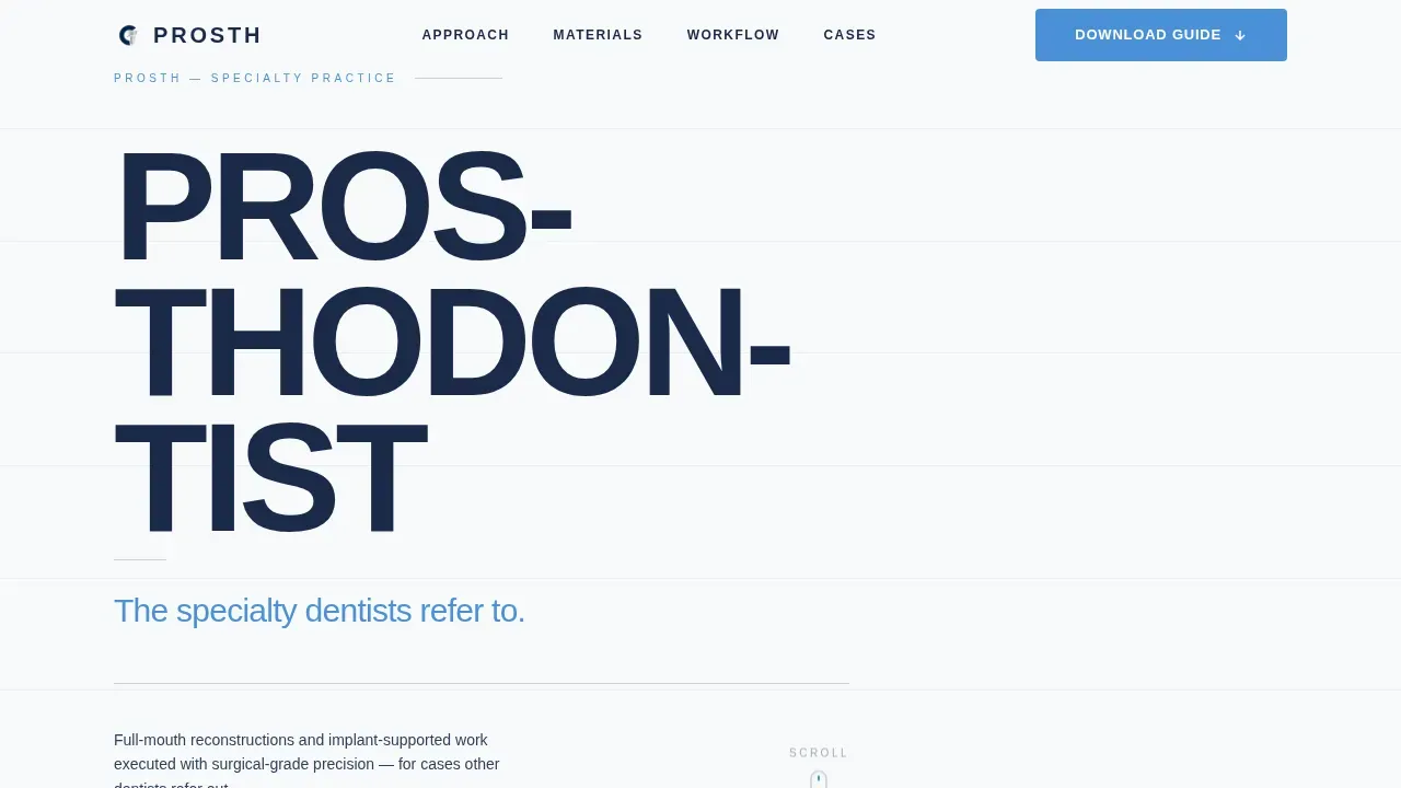
The hero section fills eighty percent of the viewport height with the word PROSTHODONTIST broken across five lines in a massive, tightly tracked sans-serif. Each line steps down in weight from ultra-bold to light. A single subline in ceramic blue reads "The specialty dentists refer to." A thin silver rule and a quiet scroll indicator sit below. No competing image distracts from the typographic presentation. The typography alone establishes authority before a single panel loads on screen.
Zigzag Expert Panel Layout
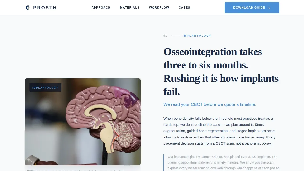
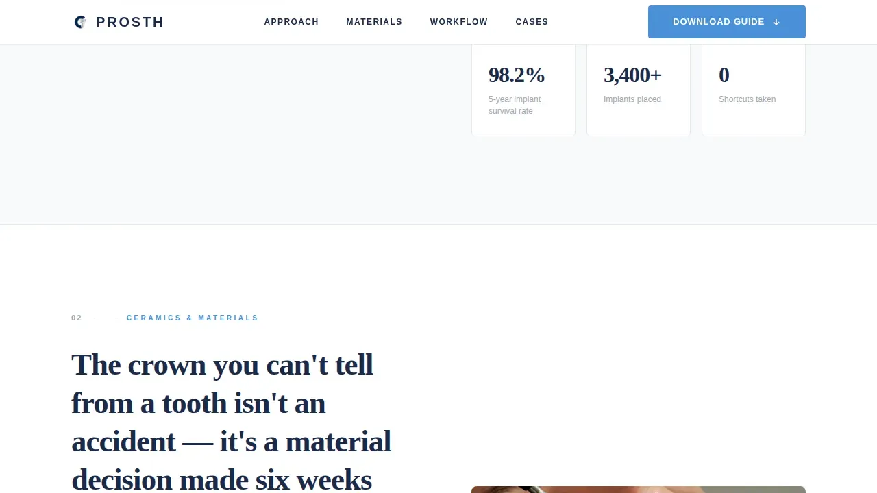
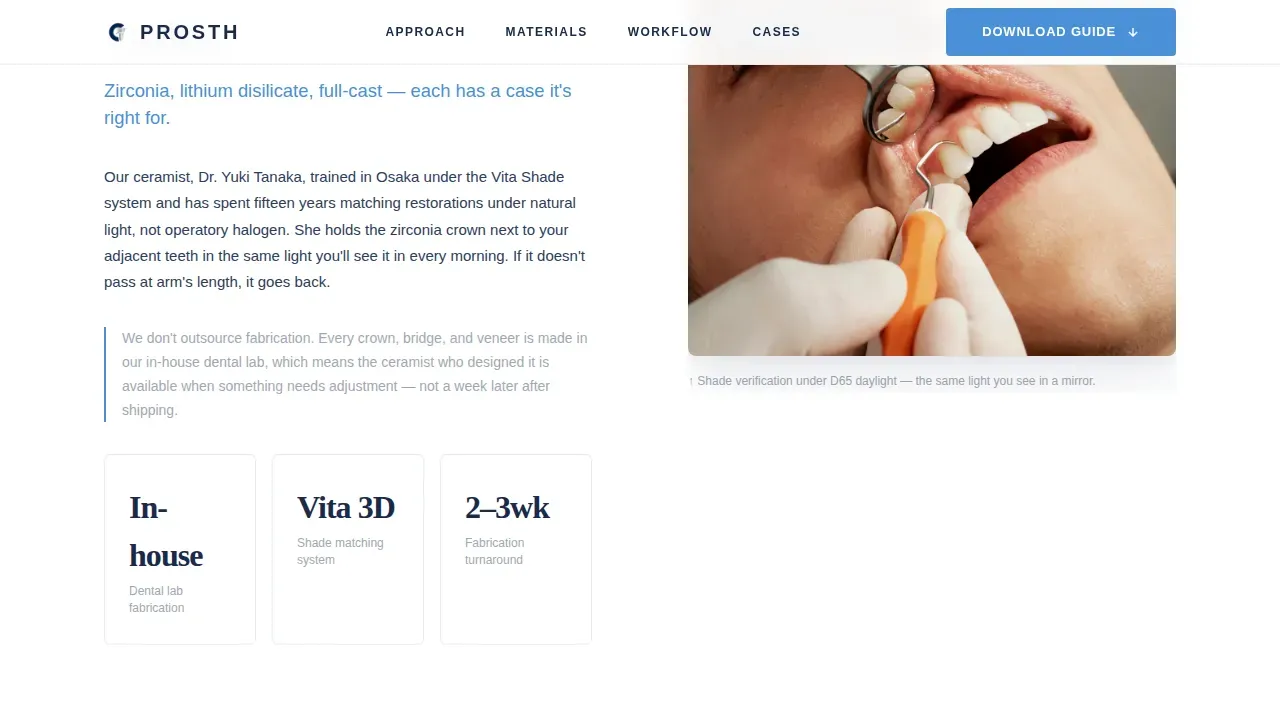
Four alternating panels form the backbone of this landing page. Left-image/right-text alternates with right-image/left-text across the scroll. Panel one covers osseointegration timelines beside a CT scan visual. Panel two shows a ceramist with a zirconia crown under color-matched lighting. Panel three introduces the digital workflow and 3D intraoral scan. Panel four addresses the provisional phase alongside a full-arch case study. Each panel deepens the patient's understanding of what the process actually involves, and each one answers the next logical clinical question. This format keeps visitors engaged and builds the expertise signal that complex-case patients need before they act.
Gated Guide Download with Qualifier Form
The primary call to action is "Download the Reconstruction Guide," displayed in ceramic blue. It appears first after the third panel and repeats in a sticky bottom bar that activates when scroll depth passes sixty percent. The form collects first name, email, and a single dropdown asking "What best describes your situation?" with options covering missing teeth, failed previous dental work, post-surgical reconstruction, and exploring options for a loved one. This qualifier detail makes follow-up conversations more effective and helps the practice connect with the right patient at the right moment.
Ungated Case Study Video Embed
Panel four includes a "Watch the Full-Arch Case Study" video embed that requires no form submission. This ungated trust-builder lets visitors access real clinical evidence before committing to share their contact details. Incorporating video into landing pages can boost conversion rates by 86%, and an authentic case study is especially persuasive when the treatment plan involves major reconstruction. Visitors who watch first are more prepared and more committed when they reach the gated download form.
Sticky Call-to-Action Bar
A persistent bottom bar activates after the visitor passes sixty percent scroll depth on the page. It carries the "Download the Reconstruction Guide" prompt without interrupting the reading flow. This element keeps the primary conversion goal visible without forcing it. The clear call to action remains accessible at every point below the fold, so visitors who are ready to act fast do not have to scroll back up to find the form.
Arctic White Medical Clarity Design System
The entire page uses a carefully controlled color system. Clinical white (#F8FAFB) dominates backgrounds. Deep surgical navy (#1B2A4A) anchors all headlines and body text. Sterilized instrument silver (#C9CED6) separates sections like ruled lines on a diagnostic chart. Ceramic blue (#4A90D9) is reserved exclusively for interactive elements and calls to action. Fraunces serif handles display and headlines. DM Sans handles body and interface text. The result is a professional design that feels like a medical consultation environment rather than a marketing page.
Page sections overview
| Section | Purpose |
|---|---|
| Stacked Type Tower Hero | Establish authority through massive typographic presentation; introduce the specialty |
| Expert Panel One | Explain osseointegration and implant timelines with CT scan imagery |
| Expert Panel Two | Present zirconia crown materials and ceramist expertise with color-matched photos |
| Expert Panel Three | Show digital workflow and 3D intraoral scan; first guide download call to action |
| Expert Panel Four | Cover provisional phase; host ungated video and gated guide download form |
| Sticky call to action Bar | Persist the guide download prompt after sixty percent scroll depth |
| Linear Footer | Deliver single-row contact and sign-off information |
Design & branding system
The design system behind this template is built for medical clarity. Every color, typeface, and spacing choice has a specific function. There is no decorative noise. The palette feels like a freshly prepared clinical tray: every surface reflective, every edge defined, nothing hidden. This level of aesthetic appeal is what gives the page its authority before the visitor reads a single word. Engaging visuals and a clean background work together to create a reading environment that feels safe, expert, and unhurried.
- Color system: clinical white (#F8FAFB) for backgrounds, deep surgical navy (#1B2A4A) for headlines and body text, sterilized silver (#C9CED6) for section dividers, ceramic blue (#4A90D9) for all interactive and call-to-action elements only
- Typography: Fraunces serif for display headlines and the hero tower; DM Sans for body copy, form labels, and interface elements
- Scroll-triggered reveals, staggered content entry animations, and subtle parallax on panel images enhance the editorial presentation without overwhelming the clinical tone
Mobile & speed optimization
This template is desktop-first by design, reflecting how high-income patients research complex dental care decisions. That said, full mobile support is included because mobile optimization is essential regardless of primary device priority. Over fifty percent of web traffic is mobile, and a page that does not perform well on a smaller screen loses visitors before they reach the first panel. The layout adapts across every device size so that the same clear layout and high resolution images display correctly on phone, tablet, and desktop screen.
- Responsive design ensures the Stacked Type Tower, alternating panels, sticky bar, and form all adapt to smaller screen sizes without breaking layout or losing visual appeal
- Scroll-triggered animations are optimized for touch-based scrolling so the panel reveal sequence feels as intentional on mobile as it does on a large desktop screen
- The sticky call-to-action bar remains functional and visually clear on mobile, keeping the download prompt accessible at every scroll point across every device
How this template helps you convert
A dentist landing page is designed to attract and acquire new patients and guide them toward a single clear action. This template applies that principle with clinical precision. Personalization in dental landing pages can lead to a 34% increase in conversions, and the qualifier dropdown in this template is exactly that kind of personalization. Trust signals, including credentials and case evidence, build credibility at every panel. Removing standard site navigation keeps the focus entirely on the reconstruction guide and the consultation path. The result is a landing page where conversion rates improve because every element earns its place.
- Each zigzag panel answers the next clinical question visitors have, building trust progressively so that by the time the download form appears, the patient already understands the expertise and wants the detailed version they can bring to their next consultation.
- The ungated video, the gated guide, and the sticky bar create three distinct access points to conversion without overwhelming visitors with multiple competing calls to action on a single page.
Other information about this template
This template can support a range of additional use cases and adaptation needs that dental professionals and their teams may consider before committing to the layout. The page is specifically designed as a single landing page rather than a multi-page website, which keeps the focus singular and reduces booking friction. Research shows that each page should focus on one goal for maximum effectiveness, and this template reflects that principle throughout its creation.
- This template is a strong fit for practices that want to promote specialist authority to referred patients who arrive already aware they need advanced dental care but uncertain about the process or timeline
- Teams can customize the panel images, body copy, headlines, credential callouts, and dropdown options to match the specific brand voice and highlighted categories of their practice
- The template supports multiple options for adaptation: adjust the guide topic, swap the case study video, or update the form dropdown to reflect the most common patient situations in your community
- Page variations are possible by updating the panel sequence or adding an orthodontic treatment context panel for practices that also handle complex bite reconstruction alongside prosthodontic work
- Additionally, the template works well for practices that serve education and referral audiences, where the detailed clinical presentation style signals to other dental professionals that this practice handles the cases they cannot
- Small businesses and solo practitioners in the prosthodontic space will find this template a clear-layout starting point that would otherwise require significant custom design investment to create from scratch
- The Prosth Precision Reconstruction Prosthodontist Landing Page Template is listed in the Health and Medical category under the Dental Clinic subcategory, making it easy to find and access within the template library
- The treatment plan dropdown qualifier in the lead capture form promotes smarter patient segmentation from the first sign of interest, giving the practice better starting-point data before the consultation date is even set
Theme
Medical Clarity
Creative direction
Expert Panel
Color system
Arctic White
Direction
Content/Resource
Page Sections
Stacked Type Tower Hero Section
Zigzag Alternating Expert Panels
Gated Reconstruction Guide Download
Ungated Case Study Video Embed
Sticky Conversion Bar After Scroll
Arctic White Medical Clarity Design System
Related questions
Who is this landing page template built for?
Can I customize the panel content and images?
How does the guide download form work?
Does this template include a video section?
Is this template suitable for a general dental practice?



