Prosthodontist Booking Website Template
Prosth is a single-page prosthodontist appointment booking landing page built around an educational comparison table structure. It guides referred patients and self-researching visitors from confusion to confident action through a credential badge header, symptom-to-deterioration tables, a treatment path comparison, and a five-step interactive quiz that ends with a personalized restoration summary and booking prompt.
by Rocket studio
Quick summary
Prosth is a prosthodontist appointment booking landing page designed to turn anxious, referred patients into booked consultations. The page teaches visitors what is happening in their mouth, compares treatment options honestly, and funnels them through a five-question diagnostic quiz that produces a personalized restoration path and a direct booking prompt.
Who this template is for
This template is built for board-certified prosthodontists and specialist dental clinics that rely on referrals and want an online presence that matches the clinical rigor of their practice. It suits practices that restore smiles with implants, crowns, bridges, or full-arch prosthetics and need a page that earns patient trust before the consultation begins.
- Prosthodontists receiving referred patients post-extraction who need to understand their options quickly
- Dental specialists treating adults who have been quietly managing a failing bridge or visible tooth gap
- Practice managers or clinic owners whose patients research full-arch restorations for aging family members before booking
What problem this template solves
Patients referred to a prosthodontist typically arrive with anxiety, not understanding. They do not know what is deteriorating in their mouth, they cannot compare treatment paths clearly, and most practice websites do not help them get there. This template closes that gap by making education the conversion mechanism.
- Confusion about whether an implant, bridge, partial, or full-arch restoration is the right choice
- Distrust caused by pages that feel clinical and cold rather than honest and explanatory
- Lost leads from visitors who are not yet ready to book but need a lower-commitment first step
What you get with this template
This template delivers a complete, single-page booking flow structured around comparison tables and an interactive quiz. Every section is purpose-built to reduce a specific layer of patient anxiety before presenting the next decision.
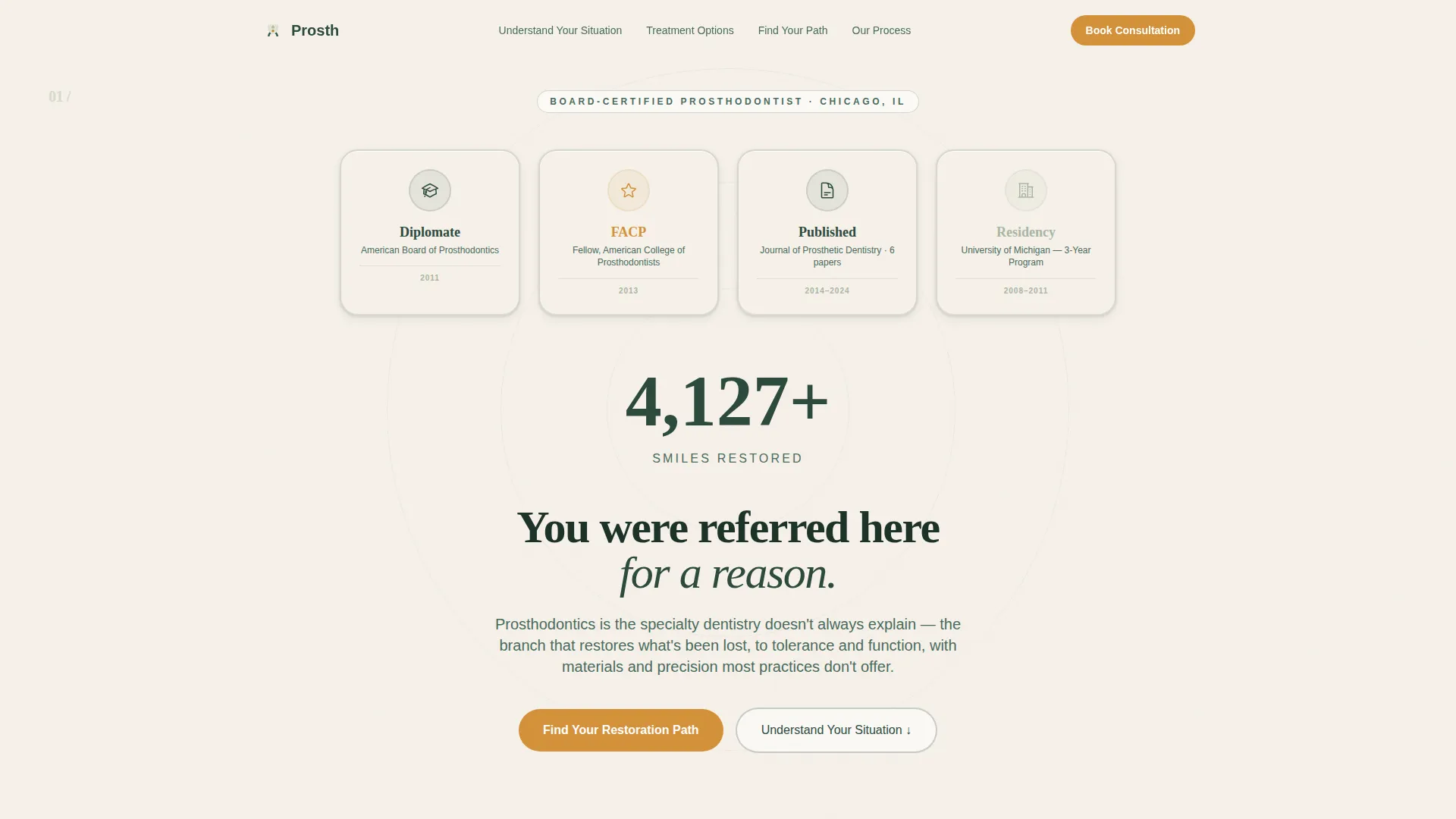
- A credential badge header that establishes authority without a hero portrait, using embossed board certification seals, fellowship rosettes, journal marks, and a restored-smile counter
- Two educational comparison tables: one mapping symptoms to what is actually deteriorating, and one comparing treatment paths across healing time, longevity, bone preservation, and cost range
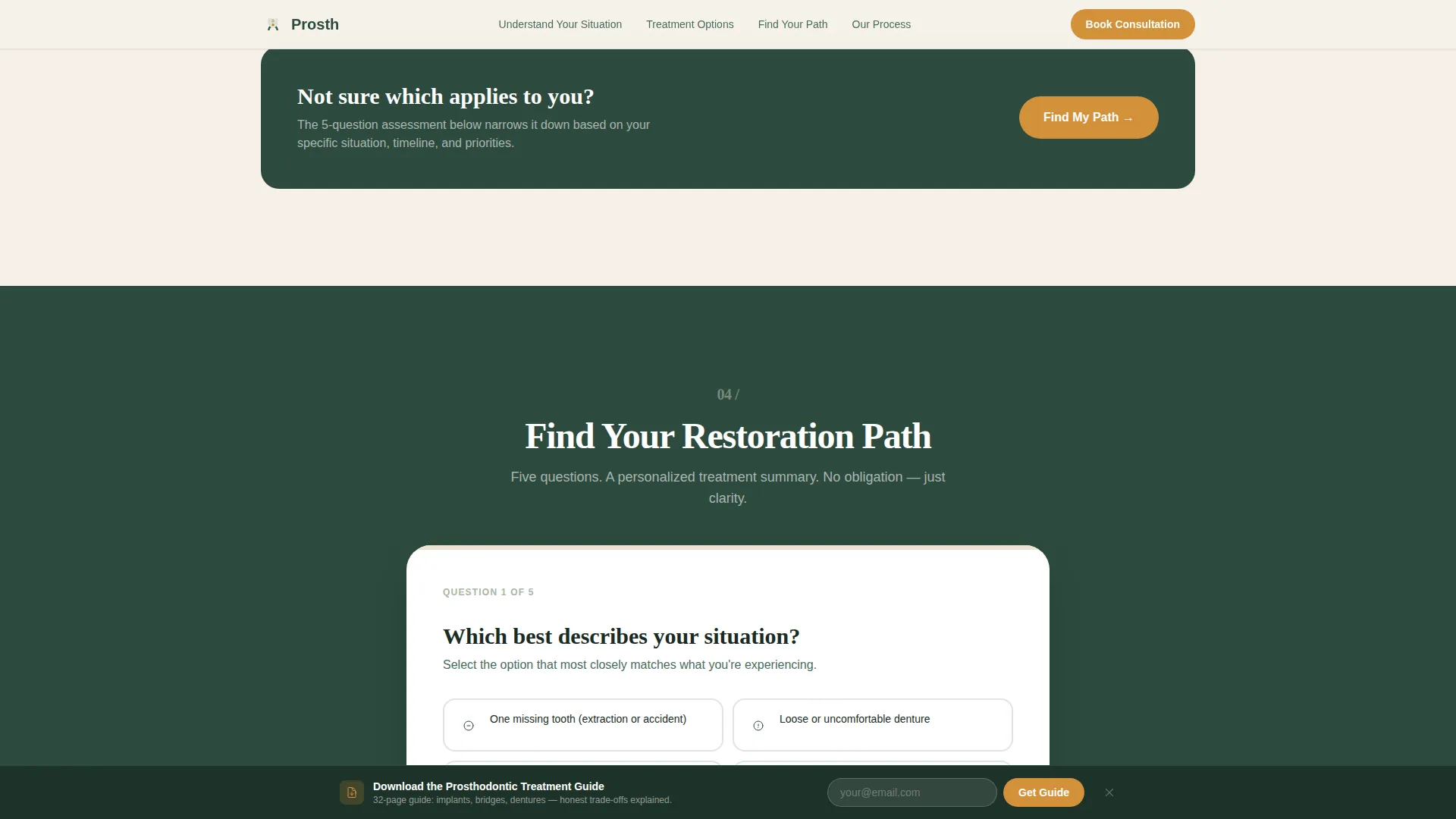
- A five-step quiz labeled "Find Your Restoration Path" with illustrated selectors, personalized results, a calendar embed, and a sticky download bar for a prosthodontic treatment guide
Feature list
This template combines educational depth with structured conversion design. Each feature below is drawn directly from the page layout and interactive components described in the source brief.
Credential Badge Header Field
The header opens with a clean birch bark cream field displaying embossed board certification seals, fellowship rosettes, journal publication marks, and a "Restored 4,000+ Smiles" counter. There is no stock photography. The badges carry the authority, with enough emboss and texture to feel stamped rather than digitally designed.
Symptom-to-Deterioration Comparison Table
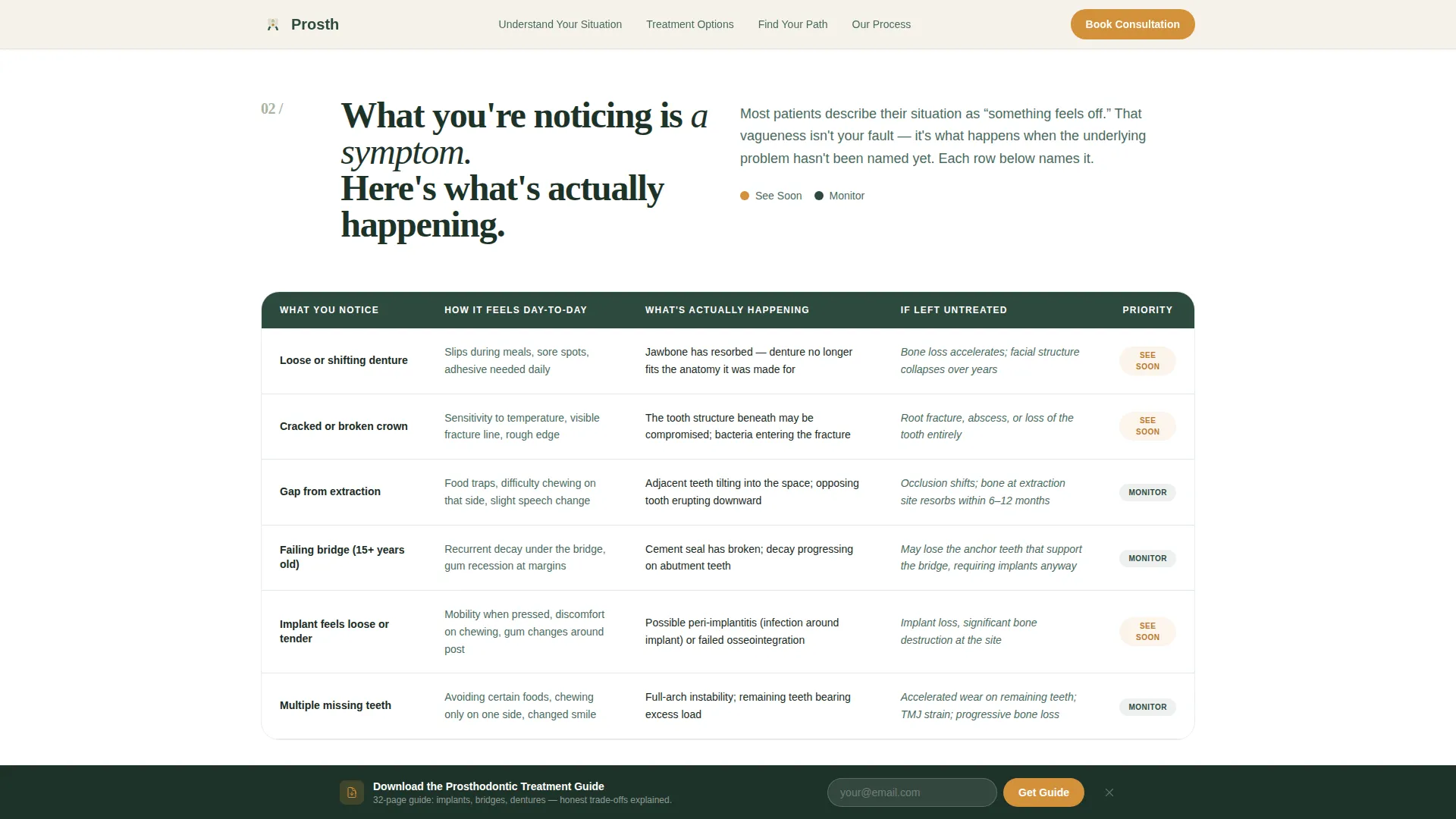
The first table maps patient symptoms, such as a loose denture, cracked bridge, extraction gap, or failing implant, against what is actually deteriorating in clinical terms: bone density, occlusion, and adjacent tooth integrity. Each row functions as a small patient education moment.
Treatment Path Comparison Table
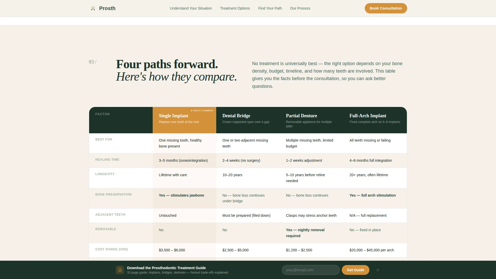
A second comparison table evaluates four restoration routes, including single implant, bridge, partial, and full-arch options, across real decision factors. Columns cover healing time, longevity, bone preservation, and cost range so visitors can weigh options without needing a prior consultation.
Five-Step Restoration Path Quiz
The primary call to action launches a five-question diagnostic. Visitors select their situation using illustrated mouth diagrams, describe how long the issue has persisted, indicate whether a treatment was already recommended, rank their priorities, and confirm their insurance type. Results produce a personalized treatment summary page.
Personalized Results Page with Booking Prompt
Quiz results generate a tailored restoration summary and present a "Book Your Consultation, We'll Review Your Case" button alongside a calendar embed. This moves a visitor from informed reader to scheduled patient in a single flow.
Sticky Download Bar for Lead Capture
A persistent bottom bar offers visitors the option to download a prosthodontic treatment guide in exchange for their email address. This secondary path captures visitors who are researching but not yet ready to commit to a consultation.
Page sections overview
| Section | Purpose |
|---|---|
| Award Badges Header | Establish clinical authority with credential insignia and a counter |
| Symptom Deterioration Table | Educate visitors on what is actually worsening in their mouth |
| Treatment Path Comparison | Help visitors compare implant, bridge, partial, and full-arch options |
| Quiz Assessment call to action | Guide visitors through a five-step diagnostic to find their restoration path |
| Process and Trust | Explain how the consultation works and how specialist collaboration operates |
| Sticky Download Bar | Capture emails from visitors who want the treatment guide before booking |
| Footer | Present practice contact information in a clean horizontal flow layout |
Design & branding system
The visual identity follows an Educational Guide theme using a Forest Trust color system. The aesthetic reads like a university lecture hall built from reclaimed wood: authoritative without sterility, warm without casualness.
- Evergreen (#2D4A3E) anchors section backgrounds and headers; birch bark cream (#F5F0E8) carries body text areas and card surfaces; lichen gray (#A8B5A2) softens dividers and secondary type; warm amber (#D4913B) is reserved strictly for calls to action and interactive elements
- Typography pairs DM Sans for body text with Fraunces serif for display headings, reinforcing the educational authority tone
- Animation uses scroll reveals with cubic-bezier easing, table row stagger on entry, and badge emboss hover states to add depth without distraction
Mobile & speed optimization
The template is built desktop-first but fully responsive for mobile visitors. Patient research typically happens on a phone, while consultation booking more often happens on a desktop, so both experiences are deliberate.
- Static page sections use server-rendered components to reduce load overhead on slower connections
- The interactive quiz and comparison table hover states are handled as client-side components, keeping heavy interactivity isolated from the static content load
- The sticky download bar and calendar embed are designed to remain accessible and usable at small screen sizes without breaking the page layout
How this template helps you convert
The page is structured as a problem-to-solution arc. Each scroll resolves one layer of patient anxiety before introducing the next decision, so visitors arrive at the booking prompt already informed rather than overwhelmed.
- The credential badge header establishes specialist authority immediately, before a visitor reads a single line of body copy, making the referral feel validated
- The two comparison tables shift the visitor's identity from confused patient to informed decision-maker, which reduces the psychological friction that stops people from booking specialist appointments
- The quiz produces a personalized result, making the booking prompt feel like a logical next step rather than a cold ask, and the sticky download bar provides a low-commitment alternative that still captures the lead
Other information about this template
This template is categorized under Health and Medical, specifically within the prosthodontist website and appointment booking niche. It is localized for English-language practices using United States Dollar pricing and United States date formatting.
- The footer follows a horizontal flow layout pattern suited to practice contact details, location, and policy links
- The page supports a high level of interactivity by design: five-step quiz logic, comparison table hover states, and a sticky bar are all included as part of the template structure
- The template is a single landing page, not a multi-page website, making it straightforward to deploy as a standalone booking destination or to embed within an existing practice domain
Theme
Educational Guide
Creative direction
Problem→Solution Arc
Color system
Forest Trust
Style
Comparison Table
Direction
Quiz/Assessment
Page Sections
Credential Badge Authority Header
Symptom-to-deterioration Education Table
Treatment Path Comparison Table
Five-step Restoration Diagnostic Quiz
Personalized Results and Booking Flow
Sticky Lead Capture Download Bar
Related questions
Who is this landing page template designed for?
Does the template include the five-step quiz functionality?
Can the comparison tables be edited to match my specific treatments?
What is the sticky download bar used for?
Is this a single landing page or a full website?



