Specialist Low Income Finance Professional Website Template
Shield is a dignified, zigzag-layout landing page template built for low-income credit card services. It guides visitors through a checklist-style trust audit, eliminates common financial fears one by one, and drives form submissions through progressive disclosure. The Plum Executive color system, serif headlines, and a no-hard-pull qualification form make this template a strong fit for fintech and financial assistance programs.
by Rocket studio
Quick summary
Shield is a single-page, zigzag-layout template designed for financial services programs targeting underserved consumers. It uses a deep plum and warm parchment color system to create a dignified, unhurried atmosphere. Each alternating section addresses a specific fear, then resolves it with a gold checkmark, walking visitors toward one clear action: checking their qualification without a hard credit pull.
Who this template is for
This template is built for fintech brands, community finance programs, nonprofit organizations, and independent professionals who offer credit-building services to people earning under $35,000 per year. It serves both the end consumer and the advisor or referral partner who helps guide them to the right product.
- Credit-building services and low-income finance programs that need a landing page emphasizing dignity, transparency, and access over aggressive sales tactics.
- Nonprofit organizations, financial counselors, and community assistance departments that refer clients to responsible credit products and need a trustworthy page to send those referrals.
- Fintech businesses and independent financial professionals launching a new credit card product who want a pre-designed, customizable page that communicates safety and inclusion from the first scroll.
What problem this template solves
People with thin credit files, fixed incomes, or past financial hardship have often been told "no" so many times they stop applying altogether. The fear of another decline, another hard pull, another page full of confusing documents and fine print is enough to stop them from seeking the financial tools they genuinely need. Standard credit card landing pages were not built for this audience. They lead with rewards and perks that feel irrelevant. They bury eligibility details. They trigger anxiety rather than relief.
Shield solves this by restructuring the entire page experience around trust. Each section of the page removes a specific objection before the visitor has to voice it. The page does not ask visitors to believe in a product first. It shows them, step by step, that they already qualify.
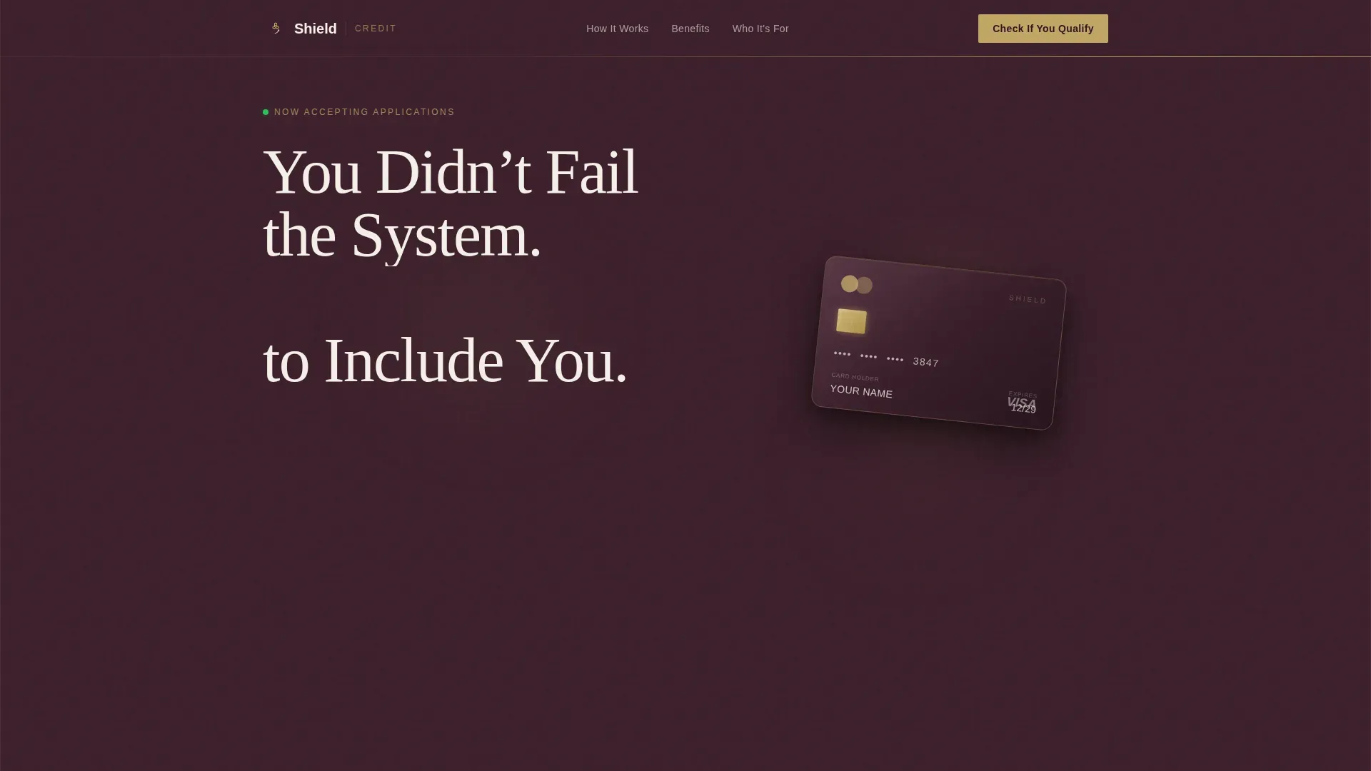
- Fear of rejection is addressed immediately in the hero section, which leads with a headline that validates the visitor's experience and anchors protection and reassurance on the left side of the screen.
- Confusion about fees, credit pulls, and eligibility is eliminated through a checklist-audit format where each zigzag block uses a gold checkmark to resolve one fear at a time, turning red flags green as the visitor scrolls.
- Hesitation and distrust are reduced by a two-step qualification form that asks only for income type and zip code in the first pass, with no Social Security Number required and clear language stating the process will not affect the visitor's credit score.
What you get with this template
You get a complete, ready-to-customize landing page layout built around the specific emotional and practical needs of low-income credit applicants. The template includes every section needed to move a skeptical visitor from doubt to action, using a dignified visual language that communicates that every person who visits this page belongs here.
- A full zigzag section structure with five distinct content blocks, each alternating between deep plum and warm parchment backgrounds, and each designed to carry either a fear or its resolution.
- A multi-step progressive disclosure form that collects only what is needed at each step, reducing friction and supporting higher form completion rates among users who are cautious about sharing personal data.
- A secondary lead capture path offering a free downloadable credit-building resource via email, so visitors who are not ready to apply today are still nurtured within the system and can return when they are ready to sign up.
Feature list
This section covers the core built-in capabilities of the Shield template as described in the source brief.
Giant Headline Hero with Card Illustration
The hero section opens with a bold serif headline on the left side of the viewport. The headline reads "You Didn't Fail the System. The System Failed to Include You." This copy anchors the emotional tone of the entire page. The right forty percent of the hero holds a clean, angled card illustration with a muted gold chip catching light. There is no stock photography of smiling families. The hero section is the topmost part of the landing page and sets the tone for everything that follows, helping visitors decide within seconds whether this page is speaking to them. High-quality images of the card help users visualize ownership and reinforce trust without overloading the layout.
Zigzag Checklist Audit Sections
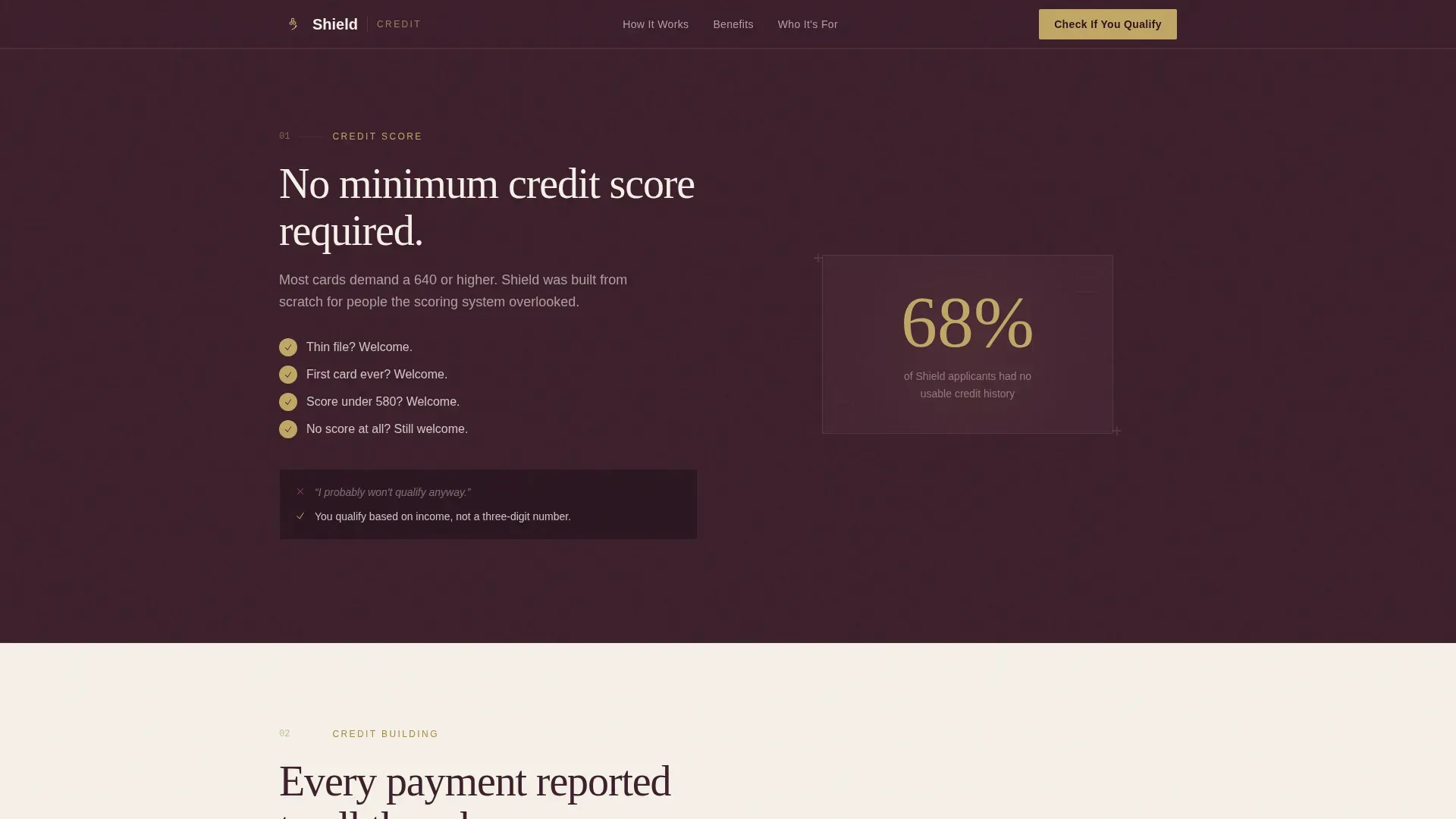
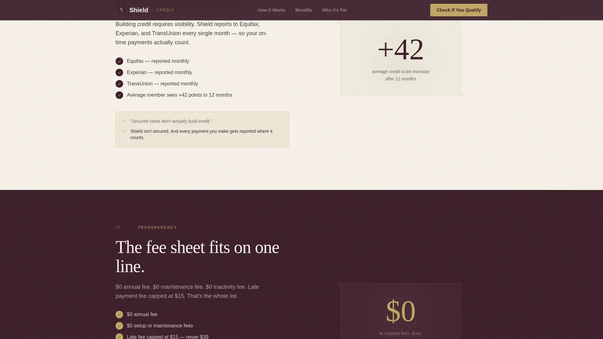
The creative direction is a Checklist and Audit format. Each alternating zigzag block walks the visitor through a credit-readiness audit that feels like reassurance rather than interrogation. The plum-background sections carry the fear. The parchment-background sections carry the resolution. Gold checkmarks appear beside each resolved objection: no minimum credit score required, reports to all three bureaus, no security deposit, no hidden fees, no hard pull to check eligibility. The scroll feels like watching every red flag turn green, one section at a time. This concept is proven in high-converting financial landing page design, where a focused layout minimizes cognitive load so visitors do not have to weigh multiple options at once.
Progressive Disclosure Qualification Form
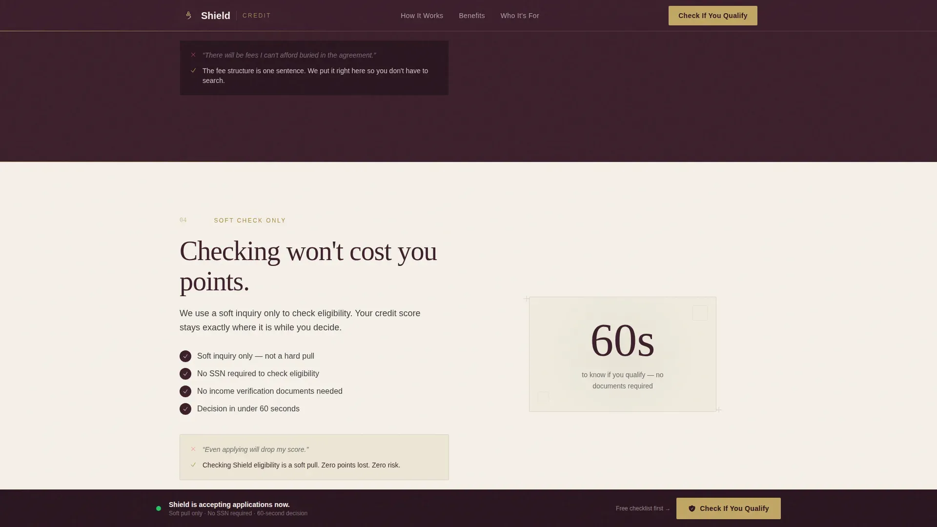
The primary call to action, "Check If You Qualify," appears first beneath the hero and again as a sticky bottom bar after the third section. The form uses progressive disclosure: step one asks only for estimated monthly income and employment type, using a dropdown that includes options for employed, self-employed, benefits recipients, and retired individuals. Step two asks for zip code and whether the visitor currently has any open credit accounts. No Social Security Number is requested at any step. The phrase "This won't affect your credit score" appears directly beneath the submit button in charcoal italic, removing one of the most common barriers to completing a financial request form. Using clear calls to action such as "Check If You Qualify" is proven to improve user engagement on financial landing pages.
Secondary Email Lead Capture
Not every visitor is ready to apply on their first visit. Shield includes a secondary path that offers a free downloadable credit-building checklist for low-income households, captured via email. This nurtures visitors who are in research mode, positions the brand as a financial education resource and partner in their long-term well-being, and gives the business a way to stay in contact with a warm audience. Financial education resources are widely recognized as a way to build trust with users and support their financial well-being over time. This secondary path turns a single-visit landing page into an ongoing relationship-building tool.
Sticky Call-to-Action Bottom Bar
After the third zigzag section, a sticky bottom bar appears and follows the visitor for the remainder of the page. This bar repeats the primary "Check If You Qualify" call to action in muted gold text on a deep plum background. It keeps the conversion opportunity visible without interrupting the checklist narrative. A well-placed, well-worded call to action is the tipping point between interest and action, and this sticky bar ensures that the moment a visitor feels ready, the next step is always one tap away. The bar is particularly useful on mobile devices, where users scroll quickly and may miss a static button in the middle of a long page.
Scroll-Triggered Animations and Staggered Checklist Reveals
The template uses medium-intensity animations, including fade-slide-in transitions, scroll-triggered reveals, beam border effects, and staggered checklist item appearances. These animations create a rhythm that allows visitors to follow the narrative without feeling rushed. Using animations can grab attention and make content feel more lively. The staggered checklist reveal, in particular, reinforces the audit concept: each checkmark appears as the visitor reaches that section, mimicking the feeling of a loan officer sliding a sheet of paper across the desk and checking each item one by one.
Page sections overview
| Section | Purpose |
|---|---|
| Hero with Headline | Validates visitor experience, introduces card, anchors primary call to action |
| Zigzag Block One | Addresses fear around minimum credit score with gold checkmark resolution |
| Zigzag Block Two | Communicates bureau reporting across all three agencies to reassure visitors |
| Zigzag Block Three | Eliminates concern about hidden fees and surprise charges on bills |
| Zigzag Block Four | Resolves hard-pull fear and presents the progressive disclosure qualification form |
| Footer Lead Capture | Collects email for downloadable credit-building checklist resource |
Design & branding system
The visual identity follows a Plum Executive theme. The palette draws from the imagery of a velvet-lined folder handed to you at a financial office you didn't think would let you through the door. Every color choice carries meaning. Deep plum signals dignity and authority. Warm parchment creates warmth and breathing room. Muted gold rewards the eye and marks every positive signal. The typography system uses Fraunces for serif headlines and DM Sans for body text, a pairing that feels both official and approachable.
- Color palette: Deep plum (#3B1F2B) as the primary background on alternating plum sections; warm parchment (#F5F0E8) on opposing parchment blocks; muted gold (#C2A665) on badges, checkmarks, and trust indicators; soft charcoal (#3D3D3D) for body text. The design elements work together to reinforce a sense of safety, protection, and calm authority without feeling cold or corporate.
- Typography: Fraunces serif for all major headlines, bringing a dignified legal-financial weight to the page; DM Sans for body copy, keeping the reading experience clean and accessible at every income level and education background.
- Trust indicators and logo placement: Muted gold is used consistently for bureau logos, badge frames, and checkmark icons, creating a visual grammar that trains the eye to recognize gold as a signal that something has been verified and approved. Recognizable logos and trust badges enhance credibility, and displaying security features prominently helps alleviate privacy concerns for every person who visits this page.
Mobile & speed optimization
The target demographic for this template skews heavily toward mobile usage. Single parents, gig workers, retirees, and others in the low-income finance space are far more likely to access this landing page on a phone than on a desktop computer. The template is built mobile-first, meaning every section, form, and call-to-action element is designed for small-screen readability before being adapted upward for larger devices.
- Mobile-first layout structure: The zigzag sections reflow cleanly on smaller screens. The giant headline, which sits on the left side of the desktop viewport, stacks vertically on mobile devices so that the headline, card illustration, and call-to-action button remain in a logical reading order without requiring horizontal scrolling.
- Sticky bottom bar for mobile users: The sticky call-to-action bar is especially valuable on mobile devices, where users scroll quickly through financial services content. Keeping the "Check If You Qualify" button visible at all times ensures that the conversion opportunity is never more than one tap away, no matter how far down the page a visitor has scrolled.
- Progressive form optimized for touchscreens: The multi-step form uses large tap targets, dropdown menus suited to mobile interaction, and a two-step flow that avoids overwhelming visitors with multiple fields on one screen. This reduces drop-off rates among users on slower connections or smaller devices and supports higher form completion across all devices.
How this template helps you convert
Conversion on a financial landing page for low-income services is not just about a well-placed button. It is about earning the trust of a visitor who has been burned before, who approaches every financial form with caution, and who needs to feel that this page is different before they will type a single character. Shield is built specifically to earn that trust and then convert it.
- The checklist audit format turns objection elimination into momentum. Each zigzag section removes one fear from the visitor's mental list. By the time they reach the qualification form, they have already mentally cleared every objection. The only remaining action is clicking "Check If You Qualify." This is how a well-structured landing page quickly answers visitors' questions and nudges them toward a decision without applying pressure.
- The two-path conversion system captures visitors at every stage of readiness. Visitors who are ready to apply submit the short qualification form. Visitors who need more time can sign up for the free credit-building checklist by email. Both paths create a business relationship and support the visitor's financial well-being, regardless of where they are in their decision process. This approach mirrors what financial education-focused services like Galileo and Opal demonstrate: transparent, benefit-led pages that meet users where they are convert better than aggressive single-path funnels.
- Trust signals are embedded at every scroll depth. From the "This won't affect your credit score" note beneath the form to the muted gold bureau logos and the no-hard-pull language, every section reinforces the message that this is a safe, legitimate financial service. Security trust signals, including displaying security badges and bureau partnership logos, can significantly increase conversion rates on financial landing pages. The page is designed so that no visitor reaches the form without having already seen multiple layers of protection and safety reassurance.
Other information about this template
The Shield template is part of a broader set of financial services templates designed for specific underserved audiences. It reflects current best practices in financial landing page design, drawing from design concepts used by high-performing fintech pages. Pages like Finy's use user-centric layouts with clear calls to action and minimal distractions. Discover's approach uses bold headlines and icons to communicate value efficiently. Opal's landing page addresses user pain points directly and uses testimonials to build trust. Galileo's page uses friendly language and transparent pricing for cost-conscious users. Aura's landing page relies on social proof to build credibility. Seen's page delivers value upfront using device mockups and app store links. ArriveSafe uses scroll-triggered storytelling, a concept central to the Shield checklist audit format. Beeper's design elements align closely with its messaging platform concept, showing how visual tone and copy can reinforce each other. Soft's template structure includes benefits and pricing in a logical order, which Shield mirrors through its checklist-to-form sequence.
Shield is also informed by broader principles of effective financial landing page design. A well-optimized landing page can attract new audiences actively searching for solutions. Tracking user behavior on the page can provide knowledge and insights for ongoing development. Using analytics tools to monitor landing page performance can inform future strategy. A/B testing different design elements can help identify which versions perform better in terms of engagement and conversion. Including descriptive alt text for images on the landing page can enhance discoverability. Structured content allows search engines to better index the information, improving visibility for relevant search queries.
This template is particularly relevant for the following audiences, use cases, and related programs:
- Financial counselors and nonprofit department staff who work with low-income families and need a referral-ready page that instills confidence in the programs they recommend. The page can serve as a link shared in community outreach, training sessions, or client intake documents.
- Credit-building programs targeting disability recipients, retired employees, and gig economy workers who may have gaps in their credit history but are otherwise financially responsible. The form's dropdown options, including benefits and retired income types, make this page inclusive across income categories.
- Organizations and agencies working on financial inclusion initiatives who want a page that treats every visitor as a real person deserving of the highest level of dignity in financial services, not a risk to be screened out before they can even make a request.
- Accounting and finance professionals who advise low-income clients on credit management and want to promote a specific card product or referral program with a page that communicates protection, safety, and transparent practices without legal jargon.
- Community development organizations and university financial assistance offices that support students or community members managing limited dollar resources and seeking access to responsible credit programs.
The template supports a wide range of financial services contexts: credit-building programs, savings account promotion, income-based assistance services, and financial education programs. It can be adapted for employee benefit plans within organizations that want to offer financial wellness resources to lower-wage staff members. The concept of dignified, transparent financial access is central to this template's design, and every structural and visual decision serves that concept.
The page structure also reflects compliance-aware design practices. The "no hard pull" language and the absence of Social Security Number collection in the initial form steps reflect current practices in responsible credit pre-qualification. The progressive disclosure form is designed to collect only the data needed at each stage, reducing risk and supporting visitor confidence. Documents and forms referenced in the page copy are kept minimal and plain-language, ensuring that visitors at every knowledge level feel informed rather than overwhelmed.
The Shield trusted low income credit card landing page template is ultimately a tool for creating access where access has historically been denied. It does not promise outcomes it cannot deliver. It does not hide fees in fine print. It does not treat financial vulnerability as a liability. It treats every visitor as someone who deserves clear, honest information and a straightforward path to a better financial future.
Theme
Legal Shield
Creative direction
Checklist & Audit
Color system
Plum Executive
Style
Zigzag/Alternating
Direction
Lead Generation
Page Sections
Zigzag Checklist Audit Layout
Giant Headline Hero Section
Progressive Disclosure Qualification Form
Sticky Bottom Call-to-action Bar
Secondary Email Lead Capture
Scroll-triggered Animations and Staggered Reveals
Related questions
Who is the primary audience for this template?
Can the qualification form be customized for different income types?
Does the template include a secondary lead capture option?
Is this template designed for mobile users?
What makes Shield different from a standard credit card landing page?



