Critical Illness Policy Landing Page Template
Shield is a guaranteed global critical illness insurance landing page template built for expat-focused insurance companies. It uses a split-screen layout, data-driven headlines, and stacked guarantee sections to convert visitors into quote requests. The Teal Catalyst color system and Legal Shield theme create authoritative trust without heavy legal jargon. Every section moves visitors one step closer to clicking.
by Rocket studio
Quick summary
Shield is a single-page insurance landing page template designed for international critical illness coverage. It leads with hard data, stacks three ironclad guarantees, and routes every visitor toward a quote. The layout is 50/50 split-screen throughout, paired with a Legal Shield visual theme that feels precise, warm, and completely trustworthy.
Who this template is for
This template is built for insurance companies and marketers selling critical illness products to globally mobile professionals. It fits teams that need a focused, high-converting landing page without starting from scratch.
- Insurers and brokers targeting expat health insurance buyers in Singapore, the Gulf, or Southern Europe
- Designers and marketers building campaigns around lump-sum critical illness insurance products
- Insurance business teams who need to publish a polished, conversion-ready page quickly
What problem this template solves
Most people shopping for expat health coverage land on pages that overwhelm visitors with policy jargon, long forms, and vague promises. This template solves that by leading with guarantees and data, not feature lists and fine print.
- Expat visitors rarely trust that coverage will follow them across borders, this page addresses that fear directly in the hero
- Employer group plans vanish when a contract ends; this template positions a private policy as the permanent safety net
- Most insurance landing pages bury the value proposition, this layout surfaces it in the first scroll
What you get with this template
You get a complete, ready-to-customize health insurance landing page structured around three escalating guarantee sections. Every element is pre-built and named for easy editing.
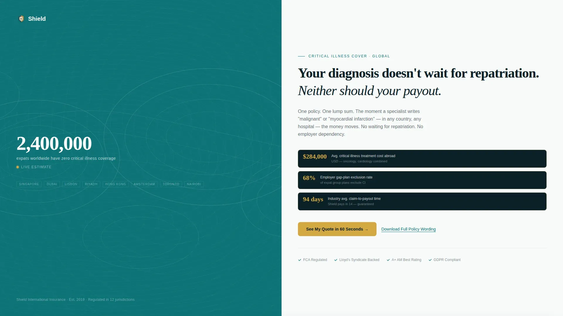
- A split-screen hero with an animated data counter, topographic world map, bold headlines, and three catalyst-gold data pills
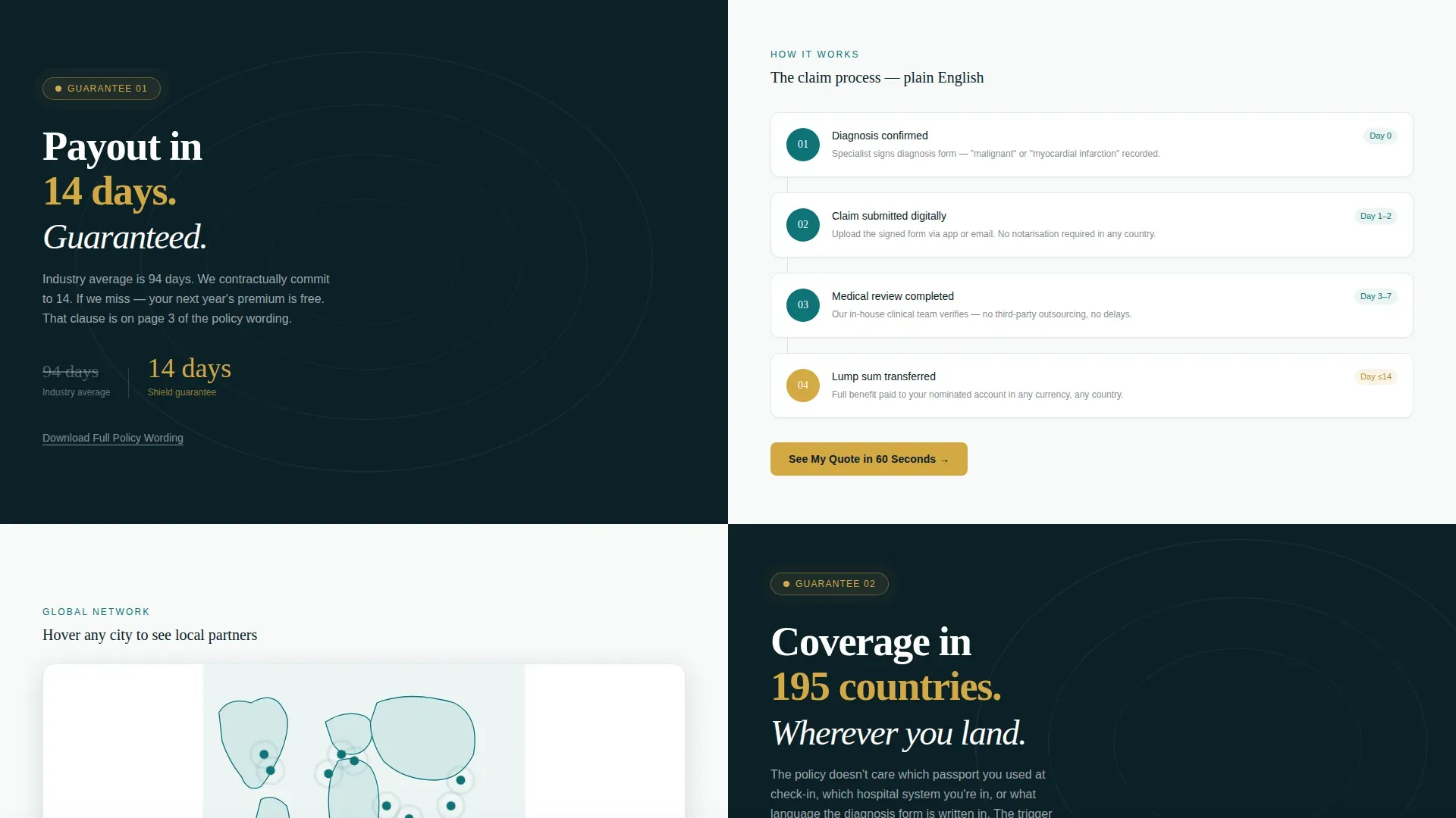
- Three guarantee split-screen sections, each pairing a specific commitment on the left with a supporting visual proof element on the right
- A sticky call-to-action bar, a secondary policy-wording download link, and a minimal footer using a horizontal flow pattern
Feature list
This landing page template includes purpose-built features that focus every page element on driving quote requests from expat health insurance visitors.
Split-Screen Hero with Live Data Counter
The hero opens with a real-time-styled counter showing the number of expats worldwide with zero critical illness coverage. It sits over a muted teal topographic world map on the left panel. The right panel holds a bold headline and three gold data pills showing average treatment costs, employer gap rates, and average claim-to-payout time. This hero image approach does emotional work without relying on stock photography.
Stacked Guarantee Sections
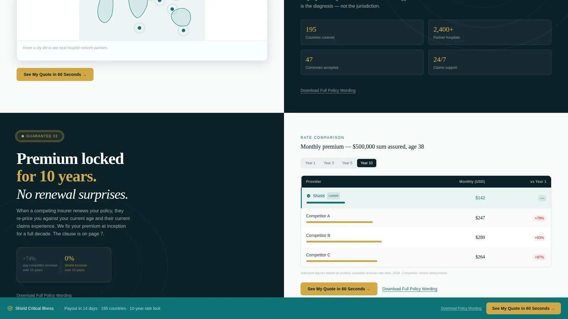
Three sequential split-screen sections each anchor one ironclad promise. The first pairs a 14-day payout guarantee with a simplified claims-process flowchart. The second pairs 195-country coverage with an interactive map showing local hospital network partners. The third pairs a 10-year premium lock with a competitor rate comparison table. Each section escalates the stakes so visitors feel the safety net widening beneath them as they scroll.
Catalyst Gold Micro-Interactions
Every guarantee badge pulses with a catalyst gold animation on scroll reveal. The interactive map uses hover states to surface local network details. The comparison table highlights competitor rate hikes against a locked premium line. These micro-interactions keep users engaged and reinforce that these are commitments, not marketing copy.
Sticky Call-to-Action Bar
A persistent bottom bar appears after the second guarantee section and stays visible through the rest of the page. It carries the primary call-to-action button in catalyst gold on deep teal, routing clicks directly to the quoting engine. This placement keeps conversion pressure consistent without overwhelming visitors with repeated pop-ups or modal forms.
Secondary Policy Download Link
Below each guarantee section sits a plain text link inviting visitors to download the full policy wording. This serves the detail-driven expat who reads every exclusion clause before committing. It signals transparency and helps build trust with the most skeptical segment of the target audience.
Minimal Footer with Horizontal Flow
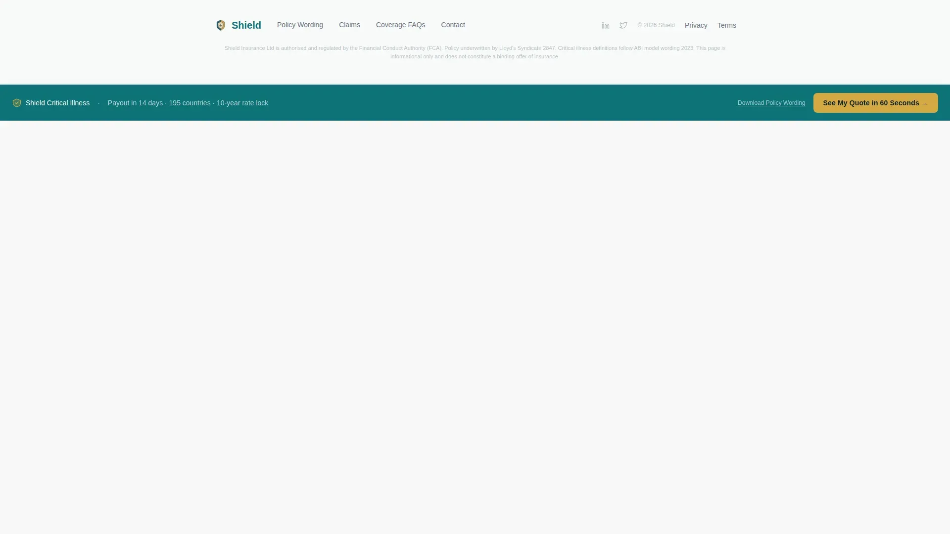
The footer follows a horizontal flow pattern that keeps the page clean and uncluttered. It carries only essential links and avoids adding visual noise at the bottom of a page designed for a single conversion goal. White space is used deliberately to give the page room to breathe without losing focus.
Page sections overview
| Section | Purpose |
|---|---|
| Hero split screen | Opens with a data counter, world map, headline, and three gold data pills |
| Guarantee one | Pairs 14-day payout promise with a claims flowchart |
| Guarantee two | Pairs 195-country coverage with an interactive hospital network map |
| Guarantee three | Pairs 10-year premium lock with a competitor rate comparison table |
| Sticky call to action bar | Persists from guarantee two onward to keep quote clicks accessible |
| Minimal footer | Closes the page cleanly with a horizontal link pattern |
Design & branding system
The Teal Catalyst color system gives this insurance landing page a notarized-document aesthetic. It feels authoritative without being cold, and precise without being hostile. Consistent branding runs from the hero all the way to the footer.
- Deep policy teal (#0D7377) anchors section backgrounds and headers; contract-ink navy (#0B2027) handles all body text and legal-weight typography
- Clinical white (#F7FAFA) provides breathing room between sections; catalyst gold (#D4A843) is reserved exclusively for calls to action, key statistics, and interactive highlights
- Fraunces serif handles all display headlines; DM Sans handles all body copy, keeping the layout legible and structurally clean
Mobile & speed optimization
The template is built desktop-first to support the split-screen layout, but every section stacks cleanly for mobile visitors. A responsive mobile stack ensures the page remains readable and actionable on any screen size.
- The sticky call-to-action bar and guarantee badges scale to large, easy-to-tap button sizes on smaller screens
- Scroll-triggered reveals and counter animations are handled by client components, while static sections use server components to keep the page loading efficiently
- The minimal footer and short quote-request form reduce friction so mobile visitors can fill in essentials without frustration
How this template helps you convert
An insurance landing page converts when every element works toward one goal. This template is designed to guide visitors from data awareness to quote request in a single focused scroll. Companies using landing pages generate 55% more leads than those that do not, and this layout applies the best practices that drive that result.
- The hero leads with a concrete data story and three proof-point pills, so visitors understand the scale of the coverage gap before reading a single policy clause. Clear visual structure and strategic use of imagery guide visitors to the most important details first, improving conversion rate from the first page view.
- The stacked guarantee sections answer key questions upfront, how fast is the payout, where does coverage apply, and what happens to premiums at renewal. Attention-grabbing headlines in each section communicate the core promise immediately. Trust signals like the claims flowchart, interactive map, and competitor comparison table help build trust and replace skepticism with confidence.
- The sticky call-to-action bar and short quote form make signing up for a policy or requesting a quote as easy as possible. The landing page form stays minimal to reduce friction. Every click routes to the quoting engine, so the page earns the conversion without ever feeling like a hard sell.
Other information about this template
This template sits inside the Finance and Insurance category, under the International Expat Insurance subcategory. It is a great example of a guarantee-led health insurance landing page that earns clicks through proof, not persuasion.
- The Shield guaranteed global critical illness insurance landing page template is designed to help insurance companies create professional, high-converting landing pages focused on a single action
- The layout supports A/B testing of headlines, button colors, and form layouts so marketers and designers can adjust elements to find what works best for their specific campaigns
- Covered conditions such as cancer, heart attack, and stroke can be listed using scannable bullet points inside the guarantee sections, keeping health details easy to scan
- Engagement tools like a coverage calculator can be added to help users estimate their needed benefit amount, supporting a richer customer experience
- Social proof elements including testimonials and trust signals such as security seals and industry awards can be placed within the existing section structure to further build trust
- The template works effectively for travel insurance and other international insurance products beyond critical illness, making it a versatile starting point for any global insurance business
- Dynamic content that adjusts based on location or ad source can make the landing page feel more relevant to visitors from different markets, whether they are browsing for health insurance options in Singapore or auto insurance alternatives in the Gulf
- The structure of this landing page template is meticulously arranged, with all components properly named and grouped for easy customization, so designers can explore, fill in brand details, and publish without rebuilding layouts from scratch
Theme
Legal Shield
Creative direction
Guarantee-Led
Color system
Teal Catalyst
Style
Split Screen (50/50)
Direction
Click-Through
Page Sections
Split-screen Hero with Data Counter
Stacked Guarantee Sections
Catalyst Gold Micro-interactions
Sticky Call-to-action Bar
Secondary Policy Download Link
Minimal Horizontal Footer
Related questions
What sections are included in this landing page template?
Can this template support covered-conditions lists for health insurance?
How does the sticky call-to-action bar work?
Is this template suitable for other international insurance products?
Does the frequently asked question section address waiting periods and claim filing?



