Elite Occupational Safety Landing Page Template
The Comply Executive Suite Safety Officer Comparison Landing Page Template is built for EHS consultancies that need to win high-stakes B2B contracts before a competitor does. It combines animated data storytelling, structured comparison tables, and a streamlined proposal form into one focused landing page that converts procurement managers and EHS directors into qualified leads.
by Rocket studio
Quick summary
The Comply template is a single-page, frequently asked question-driven layout designed for safety officer consultancies serving construction, manufacturing, and energy sectors. It opens with a live-metric counter wall, moves through credential and coverage comparison tables anchored by real procurement questions, and closes with a dual call to action path: a proposal request form and a gated credential download.
Who this template is for
This template is built for B2B professional services firms that place certified safety officers on active job sites. It speaks directly to the buyers who sign the contracts and approve the vendors. If your sales cycle involves procurement committees, internal approval chains, or multi-site EHS directors, this page was structured with those users in mind.
The primary audience includes:
- General contractors managing multi-trade construction sites who need certified coverage fast
- Plant managers inheriting facilities with citation histories who require documented compliance support
- Regional EHS directors stretched across multiple locations who need boots on the ground by a specific date
What problem this template solves
Safety officer consultancies face a credibility gap when competing for large contracts. Potential buyers conduct extensive online research before they ever reach out. Without a structured page that answers due-diligence questions head-on, qualified leads bounce to competitors who do. This template addresses that gap directly.
The core problems it solves:
- Prospects cannot quickly compare service tiers, certifications, or response times without calling a sales rep
- Procurement managers lack the documentation artifacts they need to build an internal approval case
- Consultancies have no structured format to display geographic coverage, credential depth, and deployment speed side by side
What you get with this template
This template delivers a full single-page layout built around comparison-first content architecture. Every section earns the scroll. The page proves value before it asks for contact information, which is the right sequence for high-trust B2B service decisions.
Included in the template:
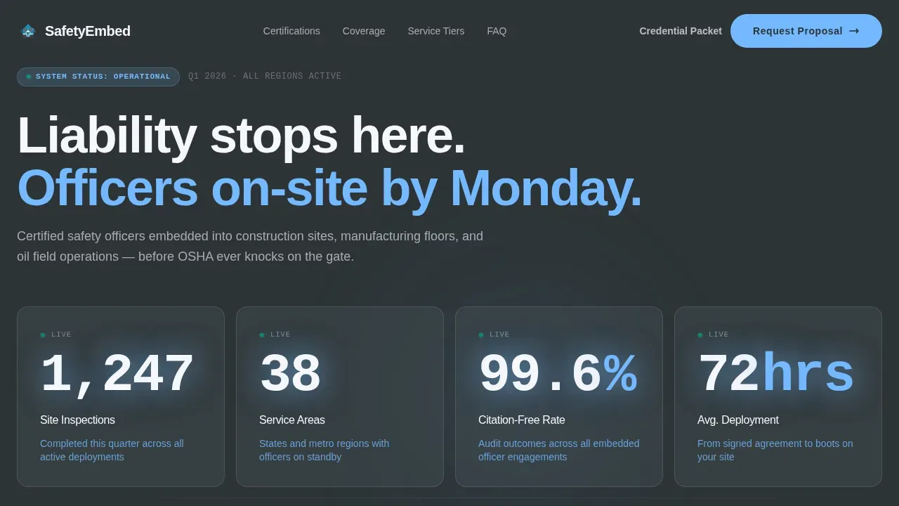
- An animated counter wall hero section showing live-style metrics on a deep charcoal slate background
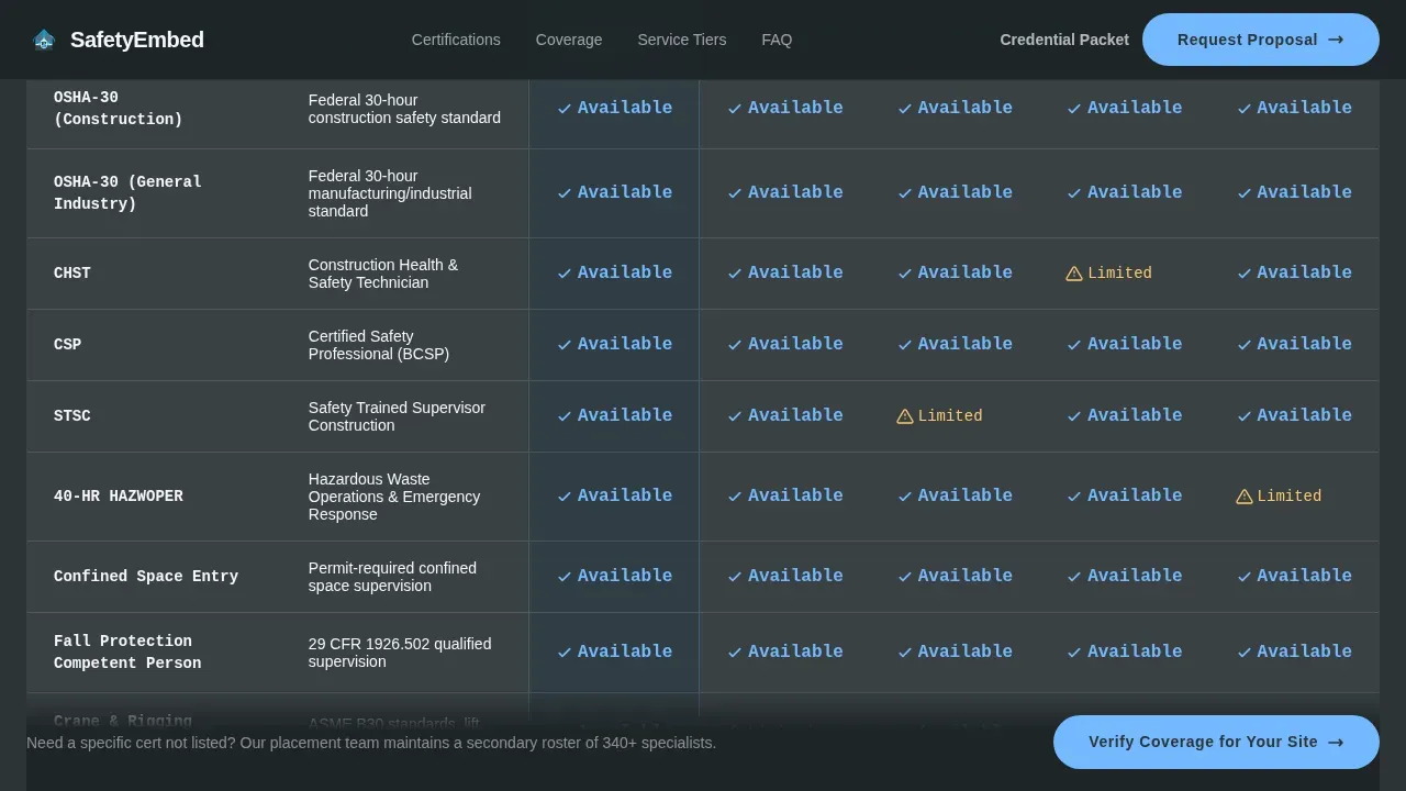
- Multiple frequently asked question-anchored comparison tables covering credentials, coverage areas, and service tiers
- A dual call to action block with a proposal request form and a gated credential PDF download path
Feature list
This template ships with six purpose-built components. Each one addresses a specific step in the procurement decision process.
Animated Data Counter Wall
The hero section opens with a counter wall that ticks upward against a deep charcoal (#2D3436) background. Metrics such as site inspections completed, service areas covered, citation-free audit rates, and average officer deployment times animate into view using intersection observer triggers. Each number is rendered in JetBrains Mono typeface for a terminal-style data aesthetic. Context sentences appear in open-sky blue (#74B9FF) beneath each counter. This section functions as the page's credibility anchor. It replaces stock photography with real operational data, which resonates far more strongly with procurement managers and EHS directors who make decisions based on evidence.
frequently asked question-Anchored Comparison Tables
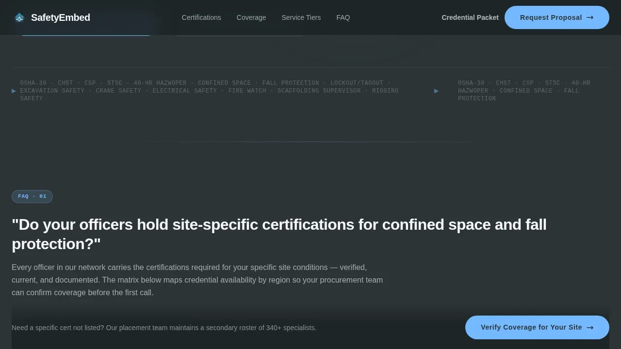
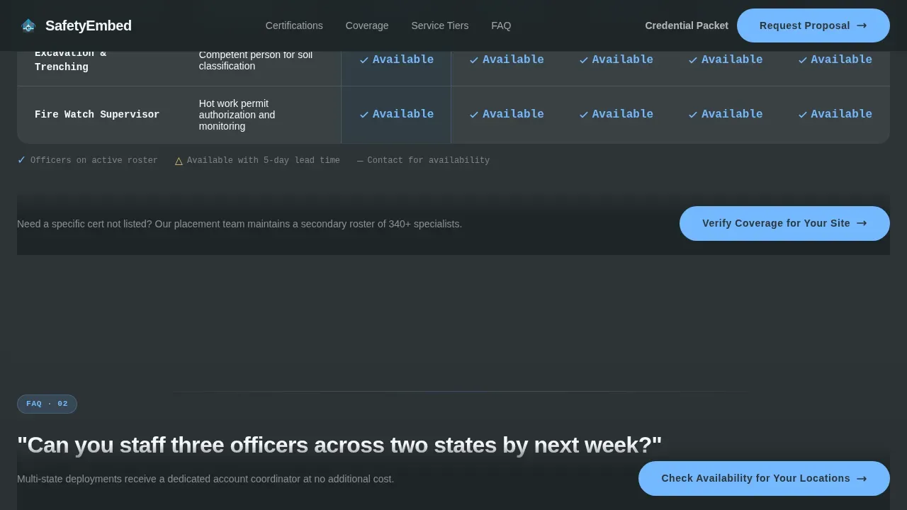
Each scroll section is introduced by a real question that a procurement manager or EHS director would send in an email. Questions like "Do your officers hold site-specific certifications for confined space and fall protection?" or "Can you staff three officers across two states by next week?" anchor each comparison block. The answer unfolds into a structured comparison table rather than a paragraph of text. This approach mirrors the due-diligence conversation that buyers are already having internally. It means that by the time a prospect reaches the proposal form, the page has already handled their objections. A side-by-side comparison layout is used throughout because it is the preferred display format for helping users absorb and process comparable information at a glance.
Credential Matrix Section
This dedicated section displays officer certifications organized by role and region. Credentials such as OSHA-30, Construction Health and Safety Technician (CHST), and Certified Safety Professional (CSP) are mapped into a structured matrix. Potential buyers can scan which certifications are available in which service areas without asking a sales representative. This level of transparency is fundamental to building trust with procurement-stage customers. Supporting claims with this kind of structured data adds a layer of credibility that generic service pages cannot match.
Coverage and Response Time Table
A separate comparison table maps geographic service areas against deployment response times. Users can compare coverage zones and availability windows in a single view. This section directly answers the question that EHS directors managing multiple locations ask most often: "How fast can you get someone on site?" The table format makes the answer scannable rather than buried in prose. For potential buyers evaluating two or more vendors, this section provides the kind of concrete, comparable data that moves decision making forward.
Service Tier Comparison Block
Three service tiers are displayed side by side in a structured comparison format. Each tier shows its included features, pricing structure, and coverage terms so that customers can determine the right plan without a discovery call. This is one of the most effective features on high converting landing pages in the professional services sector. Clear pricing and tier differentiation remove friction from the approval process. Procurement managers can present the comparison internally without waiting for a proposal.
Dual Call to Action and Proposal Form
The primary call to action, "Request a Coverage Proposal," is locked to the bottom of each comparison table. This placement ensures it appears at the exact moment a user has processed enough information to act. The form collects four to five essential fields: company name, number of active sites, primary industry vertical via dropdown, and preferred start date. A secondary path offers "Download Our Credential Packet" as a gated PDF, serving potential buyers who are still building their internal approval case. Limiting the form to essential fields reduces abandonment and keeps the submission experience clean.
Page sections overview
| Section | Purpose |
|---|---|
| Hero Counter Wall | Establish credibility through animated operational metrics |
| Credential Matrix Table | Display certifications by role and region |
| Coverage Response Table | Map service areas against deployment timelines |
| Service Tier Comparison | Show three tiers side by side with pricing |
| Proposal call to action Form | Capture qualified leads with a short, focused form |
| Credential PDF Path | Serve stakeholders still building internal approval |
| Footer Row | Provide single-row navigation links and compliance signals |
Design & branding system
The visual identity uses an Executive Suite aesthetic modeled on a corner-office environment. The palette communicates authority and precision before a single word is read. Typography reinforces the data-first direction.
Design elements include:
- Color system: deep charcoal slate (#2D3436) for primary backgrounds, brushed gunmetal (#636E72) for secondary panel surfaces, open-sky blue (#74B9FF) for action accents on buttons and table highlights, and compliance white (#F5F6FA) for data cells and white space
- Typography: Plus Jakarta Sans for all headings and body copy, JetBrains Mono for metric counters and data table values, creating a visual separation between narrative text and hard data
- Layout direction: desktop-first column structure with staggered section reveals and subtle parallax scrolling to enhance depth without distraction
Mobile & speed optimization
Although this template is designed desktop-first for procurement managers working on workstations, it includes full mobile support so that stakeholders reviewing the page on a phone or tablet get a complete experience.
Mobile and performance considerations built into the template:
- Responsive column stacking ensures comparison tables remain readable on smaller screens without horizontal scrolling
- Counter animations and frequently asked question accordion interactions are handled through client-side components, while static content sections use server-rendered markup to keep initial load fast
- The form is structured to be quick to complete on a mobile device, with dropdown fields and a date picker that work cleanly on touch interfaces
How this template helps you convert
This template is built around a single principle: earn the click before asking for it. By the time a prospect reaches the proposal form, the page has already answered their top objections through structured comparison tables, live-style metrics, and documented credential data. The conversion architecture follows a deliberate sequence.
- The counter wall hero establishes authority immediately. Potential buyers see real operational numbers before reading a single service description. Social proof delivered through data is more persuasive than customer testimonials alone, and this page leads with it. The animated metrics create an impression that holds up under scrutiny because the numbers are specific and contextualized.
- Each frequently asked question-anchored comparison section removes one more barrier to commitment. Users can compare service tiers, certifications, and coverage areas without speaking to a sales representative. The call to action appears after each table, not just at the bottom of the page. This placement ensures that users who reach a decision point mid-scroll have an immediate path forward rather than having to hunt for a form. A clear call to action positioned at multiple scroll points is one of the most reliable ways to increase conversions on B2B service landing pages.
- The dual conversion path serves two distinct buyer mindsets. Procurement managers ready to act submit the proposal form. Stakeholders who need more time, or who are building an internal approval case, download the credential packet. Both paths capture contact information and move the relationship forward. This approach delivers more value to potential buyers at different stages of their decision making process and reduces the risk of losing qualified leads who are not yet ready to commit.
Other information about this template
This template draws on best practices developed across professional services, safety consultancy, and B2B service landing pages. It is built to function as a standalone competitor comparison landing page that helps potential customers understand how a consultancy stacks up against other options in the market. Several additional points are worth noting for teams evaluating this template.
- Competitor comparison landing pages are particularly effective in industries where multiple companies offer similar services. The safety officer sector is exactly this kind of market. The template is designed to answer the question "How does this compare to others?" before a prospect types it into a search engine. Creating competitor comparison pages with this level of structure allows a consultancy to guide visitors toward a proposal request by surfacing credential depth, pricing transparency, and geographic coverage that competitors may not publish openly.
- The frequently asked question section format used throughout this template mirrors how other comparison pages in the professional services space structure due-diligence content. Each frequently asked question-anchored comparison block functions as a mini landing page within the page, addressing a specific objection and resolving it with data before the reader scrolls further. The faq section is not decorative; it is a conversion tool. Teams that have used frequently asked question-driven comparison structures on their landing pages consistently report improvement in time-on-page and lead quality.
- Customer testimonials and social proof play a supporting role in this template. The primary social proof mechanism is the live-style metric wall. Additional social proof elements such as credential badges for OSHA-30, CHST, and CSP certifications can be placed alongside comparison tables or near the call to action block. When the template highlights customer testimonials from EHS directors or plant managers, it reinforces the claims made in the comparison tables with real user voices. Third party ratings or case studies from past engagements can also be incorporated into the credential matrix section to add further credibility.
- The form design follows best practices for data protection and user consent. Clear, non-pre-ticked checkboxes for data collection align the template with responsible data handling standards. Displaying relevant security signals near the form reassures executive-level users that their submission is handled appropriately. The form is intentionally limited to four to five fields, which reduces abandonment and keeps the experience fast.
- This template is relevant to teams working across environmental science, construction safety, and industrial operations. The Defense Manpower Data Center and similar institutional frameworks inform how credential matrices should be structured for government-adjacent clients. Teams serving small businesses in the construction or warehousing sector will find the service tier comparison especially useful, as it allows customers to self-select a plan that fits their scale. Larger organization structures with multiple sites and departments benefit from the coverage and response time table, which directly addresses multi-location project management challenges.
- Competitive comparison pages built with this template can serve as the foundation for a broader content strategy. Each comparison table can be updated regularly to reflect new service areas, revised pricing, or updated certification rosters. Regular updates are essential to ensure the information on comparison pages remains current. This keeps the page functioning as a live resource rather than a static brochure. Users who return to the page after an initial visit should find accurate, current data rather than outdated claims.
- The comply executive suite safety officer comparison landing page template is designed for consultancies that need to compete at the enterprise level without a large sales team. It functions as a 24-hour sales asset that handles objections, presents credentials, and captures leads through a structured, trust-first architecture. Teams looking to enhance their competitive advantage in the EHS consultancy market will find this template ready to deploy with minimal customization.
- Additional resources such as the gated credential PDF and the coverage proposal form create two distinct lead capture paths. Potential buyers who are not yet ready to commit still enter a follow-up sequence through the PDF download. This ensures that the page serves both fast-moving procurement managers and slower-moving stakeholders who need time to build internal approval cases. The dual path approach is one of the unique features of this template compared to other comparison pages that offer only a single conversion point.
- SaaS comparison page principles apply directly here. SaaS companies have refined the art of the side-by-side comparison and the feature-by-feature breakdown. This template borrows those structures and applies them to professional services, where the "product" is a certified human being deployed on a job site. The result is a page that feels familiar to procurement managers who have evaluated SaaS tools but serves a fundamentally different and higher-stakes service context.
- Business processes within an EHS consultancy, from officer assignment and training coordination to deployment procedures and documentation, are reflected in the section structure. Each section of this template maps to a step in the buyer's evaluation process. The result is a page that feels less like a marketing asset and more like a structured briefing document, which is exactly the tone that executive suite buyers respond to.
Theme
Executive Suite
Creative direction
FAQ-Driven
Color system
Slate & Sky
Style
Comparison Table
Direction
Partnership/B2B
Page Sections
Animated Data Counter Wall Hero
Faq-anchored Comparison Tables
Credential Matrix by Role and Region
Coverage and Response Time Table
Service Tier Side-by-side Comparison
Dual Call to Action and Proposal Form
Related questions
What types of businesses is this template built for?
Can I update the comparison tables when my service areas or pricing change?
How does the dual call to action path work?
Does the template include the counter animation and frequently asked question accordion interactions?
Is this template suitable for consultancies that serve multiple industry verticals?



