Protect — Instant Insurance Innovation Landing Page Template
Underwrite is a bento grid landing page template built for InsurTech startups ready to show buyers exactly what they offer. It pairs a carrier logo bar, a Problem-to-Solution scroll arc, and an interactive comparison layout to move confused visitors toward a clear decision. The three-step progressive form and a sample comparison path make conversion feel effortless.
by Rocket studio
Quick summary
Underwrite is a single-page InsurTech landing page template designed for Series A startups. It uses a bento grid layout, a carrier logo bar, and a Problem-to-Solution scroll arc to guide visitors from confusion to confident action. The primary call to action drives users into a three-step progressive form, while a secondary path lets them preview a real plan comparison before committing.
Who this template is for
This template is built for InsurTech founders and product teams who need to communicate instant, unbiased policy matching to a skeptical audience. It suits startups at the Series A stage that already have carrier relationships and comparison data ready to display.
- First-time founders shopping for coverage types like Directors and Officers (D&O) insurance they barely understand
- HR managers at growing startups comparing group health plans under board deadlines
- Freelance contractors who know they need liability coverage but are unsure where to start
What problem this template solves
Insurance shopping is slow, fragmented, and overwhelming. Most buyers face long hold times, dense policy documents, and no clear way to compare options side by side. This template gives your platform a visual structure that mirrors the clarity your product promises.
- Replaces the broken broker experience with a clean, scannable comparison layout
- Removes the anxiety of jargon-heavy policies by surfacing premiums, deductibles, and claim approval rates in plain data pairs
- Closes the trust gap with recognized carrier names displayed front and center before a single word of copy
What you get with this template
You get a fully structured bento grid landing page with every section purpose-built for insurance discovery and comparison conversion. The layout progresses from social proof through problem framing to interactive solution, ending with a conversion-focused form sequence.
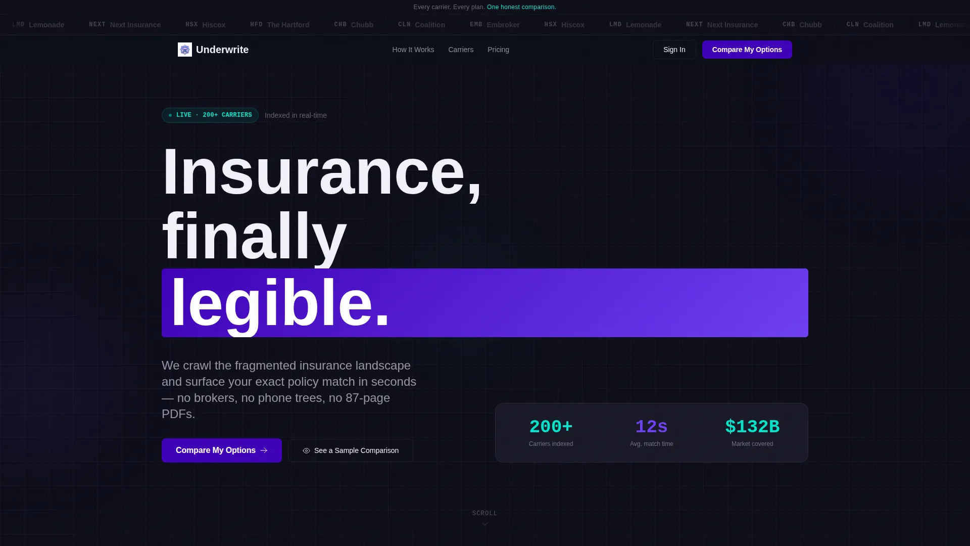
- A horizontal carrier logo bar with monochrome-to-color hover animation for instant credibility
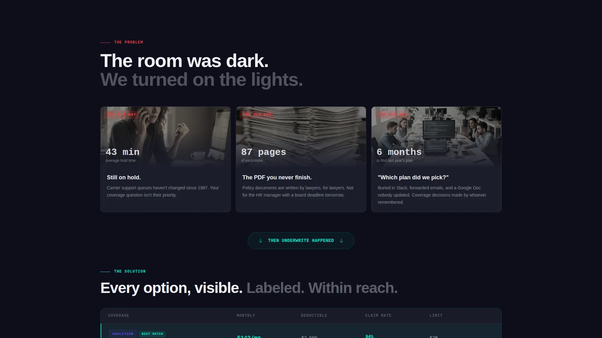
- A three-card problem row followed by a wide single-column breath moment and then the solution bento grid
- A three-step progressive form plus a "See a Sample Comparison" secondary conversion path
Feature list
This template includes six purpose-built components drawn directly from the Underwrite brief.
Carrier Logo Bar with Hover Animation
A horizontal scroll of carrier logos renders in monochrome against the deep slate background. Each logo pulses into full color as the cursor passes over it. The effect communicates carrier breadth without a single line of marketing copy.
Problem-to-Solution Bento Arc
Three problem cards open the scroll, each anchored to a specific frustration: hold times, exclusion-heavy PDFs, and lost plan history. The grid then breaks into a full-width breath section before the solution bento appears with side-by-side comparison tiles.
Interactive Comparison Tiles
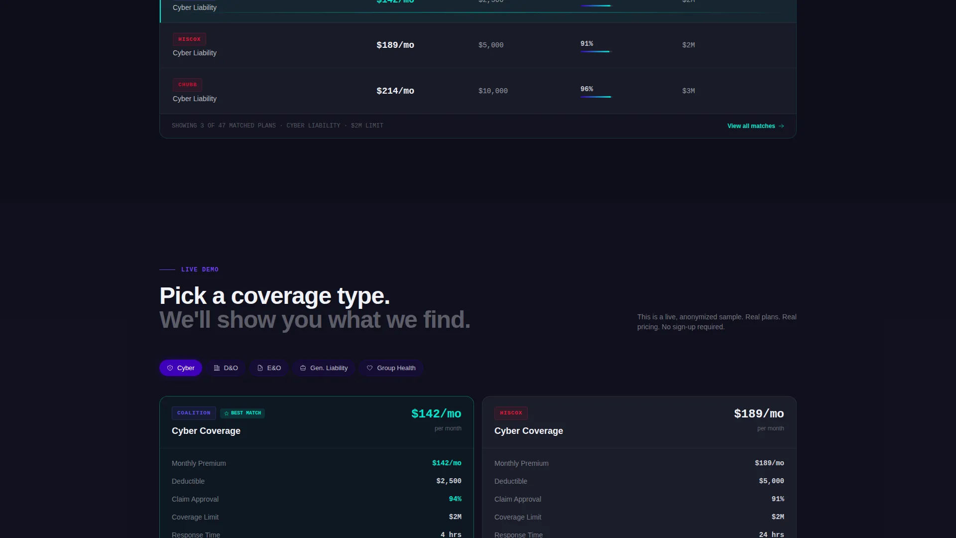
Coverage types sit next to each other with premiums, deductibles, and claim approval rates shown as clean data pairs. Reactive cyan highlights fire on comparison moments and toggle switches, making the contrast between plans immediately readable.
Three-Step Progressive Form
The primary conversion path walks visitors through three focused steps: business type via dropdown, coverage needs via multi-select chips, then email and company size. Each step is narrow enough to feel easy and specific enough to qualify the lead.
Sample Comparison Secondary Path
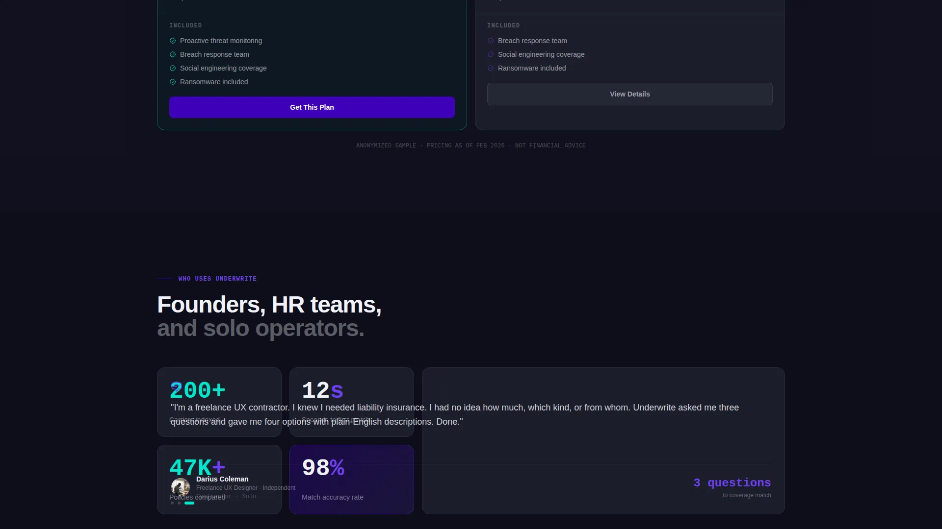
Visitors who are not ready to submit their details can click "See a Sample Comparison" to view a live, anonymized side-by-side of two real plans. This path proves product value before asking for any personal input.
Sticky Mobile Call-to-Action Rail
On mobile, a sticky bottom rail keeps the primary "Compare My Options" call to action visible at all times. The header bar also carries the same call to action for desktop users, ensuring the conversion entry point is always within reach.
Page sections overview
| Section | Purpose |
|---|---|
| Carrier Logo Bar | Establish credibility through recognized carrier names |
| Headline Positioning Line | State the core value proposition above the logos |
| Problem Cards Row | Surface the three frustrations of the old process |
| Wide Breath Section | Create a visual pause before the solution reveal |
| Solution Comparison Bento | Show coverage options side by side with real data |
| Progressive Form Flow | Qualify and capture leads in three focused steps |
| Sample Comparison Path | Let visitors preview product value without a form |
| Sticky Mobile Rail | Keep the primary call to action accessible on scroll |
Design & branding system
The visual identity follows a Directory and Discovery theme built around an Electric Indigo color system. The palette feels precise enough to trust with financial decisions and vivid enough to make insurance feel like a modern product rather than a regulatory obligation.
- Deep digital indigo (#3D00B8) anchors the primary brand, charged violet (#6E3FF3) handles hover and active states, and cool slate (#1B1D2A) fills card backgrounds and text containers
- Reactive cyan (#00E5CC) activates on comparison highlights and toggle switches, drawing the eye exactly where decisions happen
- Typography uses a medium-weight sans-serif at every level, keeping the layout legible and data-dense without feeling clinical
Mobile & speed optimization
The template is structured to work cleanly across screen sizes, with the bento grid adapting to narrower viewports without losing the comparison clarity that drives decisions.
- The sticky bottom call-to-action rail replaces the header button on mobile, keeping the conversion entry point visible throughout the scroll
- The three-step progressive form breaks into single-column steps on smaller screens so each input feels focused and not crowded
How this template helps you convert
Every layout decision in this template is oriented toward moving a hesitant insurance buyer from curiosity to action.
- The carrier logo bar opens with instant authority, reducing the instinct to bounce before the headline is even read.
- The Problem-to-Solution arc walks visitors through their own frustration in three specific cards, then resolves it visually before asking them to do anything.
- Two conversion paths, the progressive form and the sample comparison, mean visitors with different levels of readiness both have a clear next step.
Other information about this template
This template was designed specifically for the InsurTech startup category and fits the Startup and Launch niche particularly well. It is suited for teams preparing a Series A pitch page or a public product launch where carrier trust and comparison clarity are the primary conversion drivers.
- The template style is Bento Grid, the creative direction is Problem-to-Solution Arc, and the landing page direction is Comparison and Versus
- The header concept is Logo Bar and the theme is Directory and Discovery, making it a strong fit for any platform that aggregates and surfaces complex product options
- The Electric Indigo color system can be recolored to match a different brand palette by updating the four core hex values defined in the design system
Theme
Directory & Discovery
Creative direction
Problem→Solution Arc
Color system
Electric Indigo
Style
Bento Grid
Direction
Comparison/Versus
Page Sections
Carrier Logo Bar with Hover Animation
Problem-to-solution Bento Arc
Interactive Comparison Tiles
Three-step Progressive Form
Sample Comparison Secondary Path
Sticky Mobile Call-to-action Rail
Related questions
Who is this landing page template designed for?
Can I use this template to showcase multiple coverage types at once?
Does the template include both a form and a no-form conversion path?
What makes the carrier logo bar effective for building trust?
Is this template suitable for a product that is not yet fully launched?



