Local Publishing & Book Industry Pre-Launch & Coming Soon Website Template
Codex is a hero-dominant waitlist landing page built for an academic and scholarly publisher. It guides doctoral researchers, tenured professors, and university departments through a cinematic origin story, from blank page to book launch, using a scroll-triggered video header, obsidian and gold visual identity, a frictionless sign-up form, and a live waitlist counter that builds real anticipation before launch day.
by Rocket studio
Quick summary
Codex is a prestige waitlist landing page designed for an academic publishing press. It opens on a static book-block close-up, then unfolds chapter by chapter as the visitor scrolls. Each section escalates in energy, moving from solitary writing to a festival-style launch celebration. The page exists to collect early sign ups from scholars who want to publish beautifully typeset volumes with a press that treats their work as a cultural event.
Who this template is for
This landing page was built with a very specific target audience in mind: scholars who understand the emotional weight of seeing years of research finally in print. If you are launching an academic or scholarly publishing press and need to create a waitlist before your service launches, this template gives you a complete, conversion-ready starting point.
- Early-career researchers defending their first monograph and seeking a press with genuine prestige and craft
- Tenured professors with decade-long projects ready for print, and university departments coordinating new journal series
- Publishers, editors, and press founders who want to build excitement and collect sign ups from potential customers before launch day
What problem this template solves
Most academic publishers launch quietly. A plain announcement page with vague value propositions and a generic form fails to communicate the intellectual and emotional gravity of scholarly publishing. Potential customers land on the page, feel nothing, and leave. A well crafted waitlist landing page changes that entirely.
- It replaces weak, undifferentiated messaging with a clear value proposition that speaks directly to the scholar's experience
- It eliminates the problem of low conversion rates by reducing friction in signup forms and placing social proof exactly where hesitation peaks
- It solves the absence of urgency by showing a live waitlist counter and framing early access as a genuine privilege, not a placeholder
What you get with this template
This template delivers a complete, single-page waitlist landing experience with five narrative chapters that build toward a product launch celebration. Every section has a defined role, and every interaction is designed to convert visitors into waitlist subscribers. You get high-quality engaging visuals, typographic precision, and a dual call-to-action structure that captures both casual interest and manuscript-ready scholars.
- A scroll-triggered video hero, five distinct content chapters, a live waitlist counter, and an animated launch section with confetti particles
- A two-field sign-up form asking only for academic email and discipline, plus a secondary manuscript submission path below the fold
- A persistent navigation button, full-width call-to-action after the launch chapter, and endorsement quote blocks for social proof
Feature list
This section breaks down the key features built into the Codex template. Each one serves a specific conversion or engagement purpose grounded in the brief.
Scroll-Triggered Video Hero
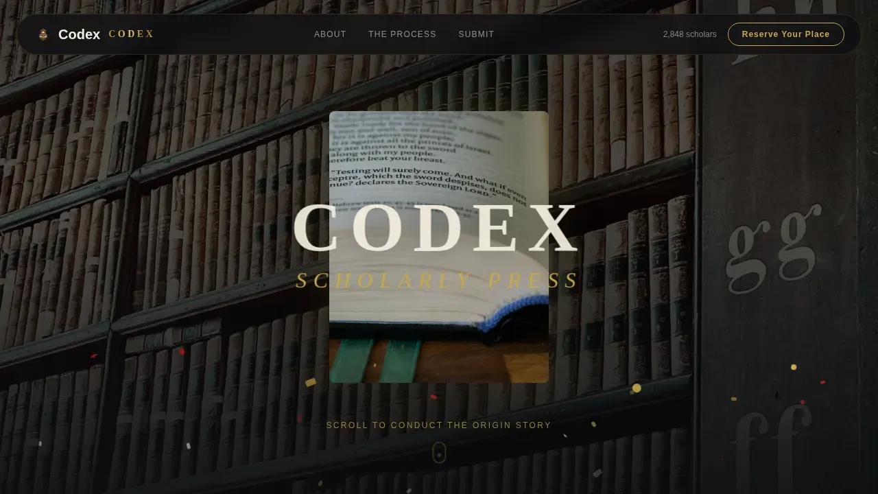
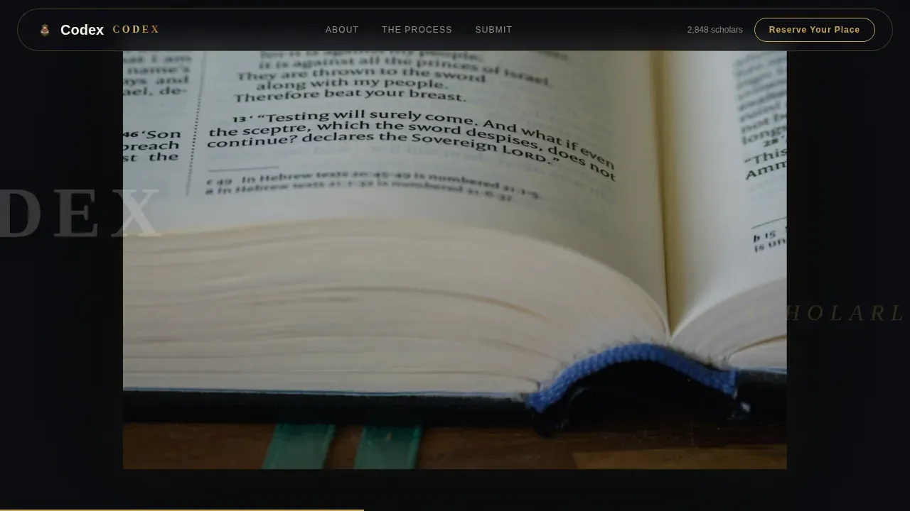
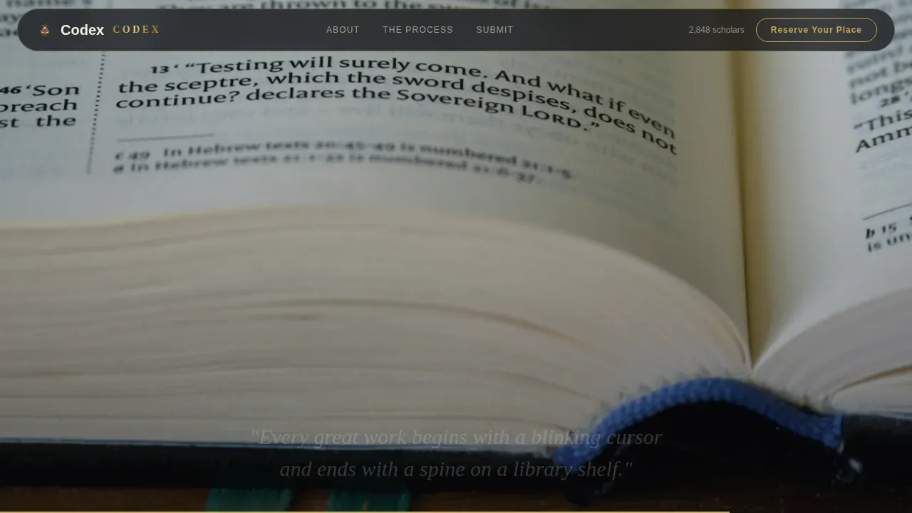
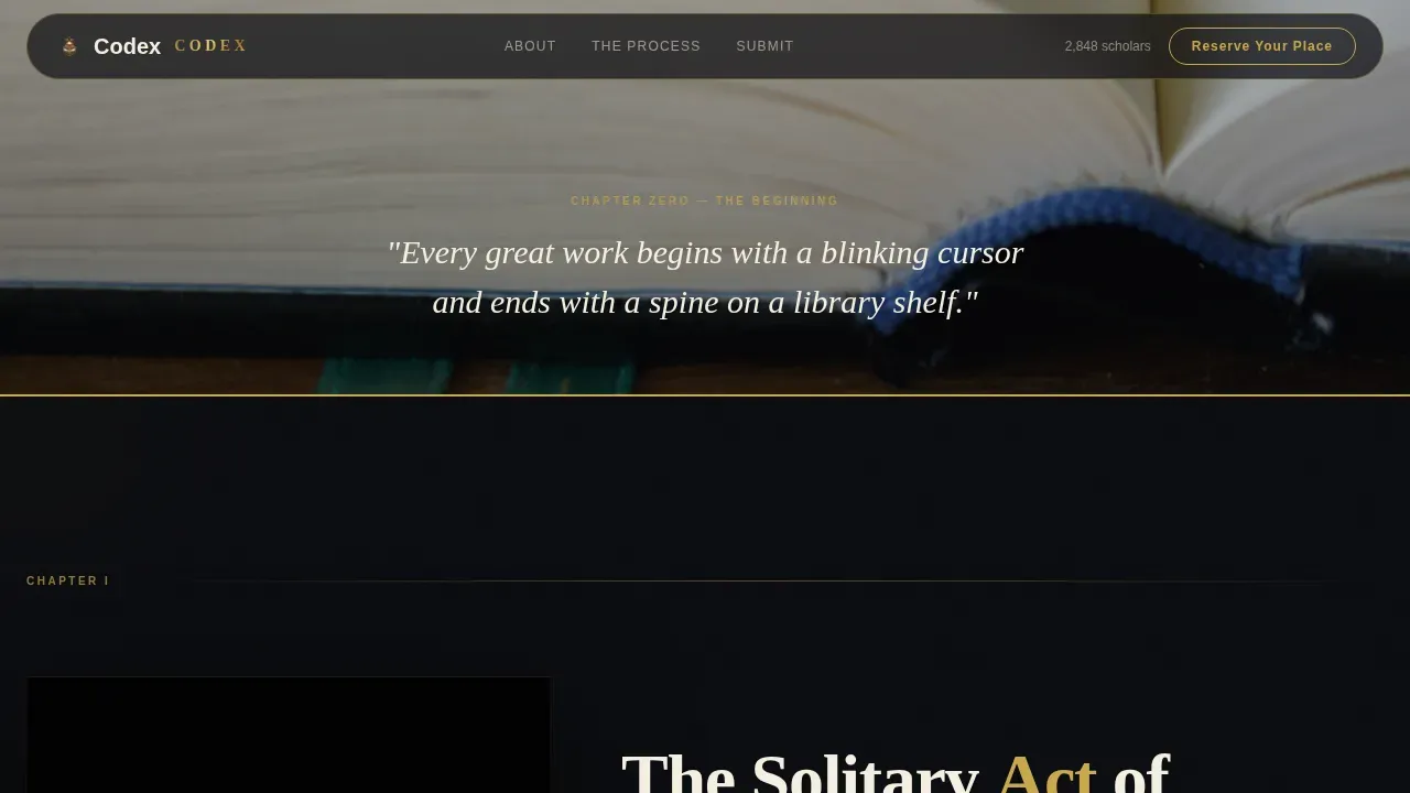
The viewport opens on a still close-up of an uncut book block with a gold foil title barely visible. As the visitor scrolls, a reverse time-lapse plays: a book launch celebration dissolves back through press sheets, editorial annotations, and finally a blinking cursor on a blank document. The visitor controls playback speed, making them the conductor of the origin story. This is one of the most powerful key features for building anticipation before a single word of body copy is read.
Five-Chapter Origin Story Layout
Past the hero, the page is structured as five escalating chapters. Writing is quiet and obsidian-heavy. Editorial dialogue shows gold annotations appearing like marginalia. Typesetting spreads fan open in parallax. The press chapter uses full-bleed photography with mechanical rhythm. The launch chapter detonates with animated confetti particles in gold and crimson. This step by step narrative build creates a compelling waitlist page that earns the sign-up emotionally, not just logically.
Live Waitlist Counter and Social Proof Block
A live counter displays the current number of scholars who have already joined your waitlist. This is one of the most effective tools to generate excitement and create urgency. Social proof, such as showing how many people have signed up, can increase conversion rates by creating a sense of validation. Alongside the counter, endorsement quotes from journal editors reinforce trust and intellectual authority, making this an effective waitlist landing tool for eager customers.
Dual Call-to-Action Structure
The primary call to action, "Reserve Your Place on the List," appears first as a persistent gold-outlined button in the slim navigation bar. It then reappears full-width after the launch chapter. A secondary path below invites manuscript submissions with a separate form. This structure gives interested users two distinct entry points based on where they are in their decision. A strong call to action placed at multiple scroll depths consistently improves sign ups.
Frictionless Two-Field Sign-Up Form
The sign-up form asks only for an academic email address and a discipline dropdown. The discipline options are Humanities, Social Sciences, STEM, Law, and Arts. Email-only or near-email-only signup forms consistently outperform those requesting additional details. By keeping friction nearly absent, the template helps you convert visitors who might otherwise abandon a longer form. Best waitlist landing pages treat the sign-up form as the single most critical element on the page.
Festival Energy Launch Chapter
The final chapter of the page is where building anticipation gives way to celebration. Animated confetti particles in gold and crimson fill the screen. Endorsement quotes from journal editors appear alongside the live counter. A full-width call-to-action button invites scholars to join the waitlist today. The energy of this section mirrors a candlelit awards banquet, making every potential user feel that joining is an occasion, not a transaction.
Page sections overview
| Section | Purpose |
|---|---|
| Navigation Bar | Persistent call to action button for constant sign-up access |
| Scroll-Triggered Hero | Cinematic origin story opens the emotional arc |
| The Writing Chapter | Quiet obsidian section anchors the scholar's identity |
| The Editorial Chapter | Gold marginalia animations show craft and dialogue |
| The Craft Chapter | Parallax typesetting spreads prove design quality |
| The Press Chapter | Full-bleed photography delivers mechanical prestige |
| The Launch Chapter | Festival energy, counter, quotes, and dual call to action |
| Footer | Horizontal flow footer closes the page with authority |
Design & branding system
The visual identity was built around the feeling of a candlelit awards banquet in a centuries-old university hall. Obsidian dominates every background and typographic block. Gold illuminates headlines and interactive flourishes like a foil stamp on a title page. Parchment cream opens breathing room for body copy. Crimson pulses only on hover states and notification elements. The typography uses Fraunces for serif display headlines and DM Sans for body and user interface text.
- Color palette: deep obsidian black (#0B0C10), burnished manuscript gold (#C9A84C), parchment cream (#F5F0E1), and celebratory crimson (#8B1A1A)
- Typography: Fraunces (display serif for headlines and chapter titles) paired with DM Sans (body text and user interface elements)
- Visual style: ceremonially dark, gilded, typographically precise, evoking dark wood paneling and gilded book spines catching light
Mobile & speed optimization
Over 60% of traffic to academic publishing landing pages comes from mobile devices, necessitating responsive design. This template follows a desktop-first approach given the dense typographic layouts, but the page is built to work cleanly across mobile devices and multiple devices without losing visual hierarchy or form usability. Mobile optimization is not just responsive design; it requires rethinking the entire user experience for smaller screens.
- The layout adapts for mobile first design principles, preserving the chapter-by-chapter scroll flow and the sign-up form on all screen sizes
- Video preload and GPU-accelerated transforms are specified in the brief to keep animation smooth without sacrificing load performance
- The two-field signup form and call-to-action buttons remain fully accessible and tappable across mobile devices, tablets, and desktops
How this template helps you convert
A compelling waitlist landing page converts visitors by combining a clear value proposition, emotional resonance, and strategically placed friction-reduction. This template does all three in a single scroll. A high converting waitlist landing page needs social proof near the form, a mobile-first design, a referral system, and a headline that answers three questions inside three seconds: What is this? How is it different? Why should I care?
- The scroll-triggered hero and origin story chapters build excitement and emotional investment before the first call to action appears, so visitors arrive at the sign-up form already primed and eager customers rather than skeptical strangers
- The live waitlist counter and journal editor endorsements supply social proof at the exact moment of decision, creating urgency and encouraging sign ups from scholars who respond to peer validation rather than promotional language
- The dual call-to-action structure and near-frictionless two-field form reduce abandonment, helping you convert visitors across both early-stage interest and manuscript-ready commitment, which collectively raises overall conversion rates
Other information about this template
This template is designed for publishers who want to create a waitlist before their service launches and need more than a basic holding page. The Codex prestigious academic publishing waitlist landing page template is a complete, emotionally intelligent product launch tool. Below are additional details relevant to buyers evaluating it.
- The page is designed to collect data at minimal friction, asking just email and discipline, so you can segment waitlist subscribers by field for targeted launch communication
- A referral system component can be incorporated to reward referring friends by moving them up the waitlist, introducing gamification and referral mechanics that increase organic sign ups
- Exit intent popups and usage statistics tracking are consistent with the kind of performance monitoring supported alongside this template's conversion-focused structure
- Google Analytics and similar tools can be connected to the page to monitor conversion rates, track successful waitlist growth, and collect valuable insights on which disciplines are joining
- The template supports building community among early adopters before launch day by making the waitlist itself feel like a founding moment, not a waiting room
- Offering perks such as Founding Member status with priority access can incentivize early sign ups and reward the most eager customers who join your waitlist today
- Launch timelines and post-signup communication are left to the publisher to define, but the template's confirmation flow is built to communicate what happens next so waitlist members are never left wondering
- A free waitlist landing page alternative will not match this level of craft, visual identity, or emotional arc; this template is for presses that want the landing page itself to signal their editorial standards
- The landing page builder workflow is straightforward: customize the copy chapter by chapter, swap in your own video assets, and update the waitlist counter integration before you go live
- Best waitlist landing pages in high-prestige verticals balance exclusivity with intellectual authority, and this template was purpose-built to deliver exactly that balance for an academic and scholarly publisher
Theme
Festival Energy
Creative direction
Origin Story
Color system
Obsidian & Gold
Style
Hero-Dominant (90/10)
Direction
Waitlist/Coming Soon
Page Sections
Scroll-triggered Video Hero
Five-chapter Narrative Structure
Live Waitlist Counter
Dual Call-to-action System
Frictionless Academic Sign-up Form
Festival Energy Launch Section
Related questions
Who is this landing page template built for?
What information does the sign-up form collect?
How does the live waitlist counter work?
Can I add a referral system to this template?
What makes this different from a standard coming-soon page?