Local Brick & Mortar Business Professional Website Template
Pulls is a modular card-grid landing page built for sports card and collectible shops. It organizes inventory into live-feeling seasonal blocks, new arrivals, graded slabs, and player-performance highlights, so every visit feels like checking the latest hobby intel. The layout is clean, the color palette stays neutral, and every tile routes browsers directly to product pages.
by Rocket studio
Quick summary
Pulls is a single-page, modular grid template designed for sports card and collectible retailers. It structures inventory around urgency-driven seasonal blocks, letting shops show exactly what is new, graded, and trending right now. The palette stays neutral so the cards carry the color, and every tile is built to earn the click without a single form or gate.
Who this template is for
This template is built for collectible shop owners who need a storefront that moves as fast as the hobby does. It works equally well for a weekend show seller with fresh case breaks and a full-time brick-and-mortar dealer managing a live slab inventory.
- Sports card shop owners showcasing new product drops and graded inventory
- Hobby dealers who want a page that reflects current player movement and seasonal releases
- Nostalgia-driven collectors building an online presence around curated sets and vintage pulls
What problem this template solves
Static product pages kill urgency. Collectors checking on a rookie's value or a new release want to feel the shop is alive, not archived. This template solves the stale-storefront problem by organizing the page around what is happening in the hobby right now.
- Buyers land on a page that signals current stock instead of a generic catalog
- Each seasonal block creates a reason to scroll and a reason to click through
- The layout communicates grading standards and inventory freshness without a single word of fluff
What you get with this template
You get a fully structured, section-led landing page built around three modular grid blocks and a strong editorial header. Everything is designed to direct traffic toward product pages with minimal friction.
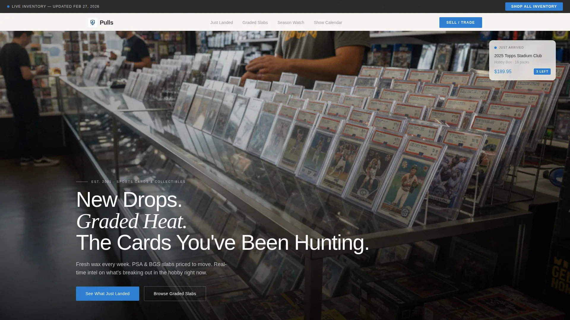
- A full-bleed header with an owner's-eye counter shot and a bold headline across the lower third
- Three distinct seasonal grid modules: new arrivals, graded slabs, and player-performance highlights
- A sticky navigation bar carrying a persistent secondary call to action for deep inventory browsing
Feature list
This template is built around a handful of deliberate structural decisions, each one tuned to how collectors actually browse and buy.
Full-Bleed Counter Header
The header opens with a wide photo shot from behind the counter, rows of graded slabs fanned across glass and fresh hobby boxes in the foreground. A headline lands in clean white type across the lower third, and a subtle scroll cue pulses once to invite the next move.
Modular Seasonal Grid Blocks
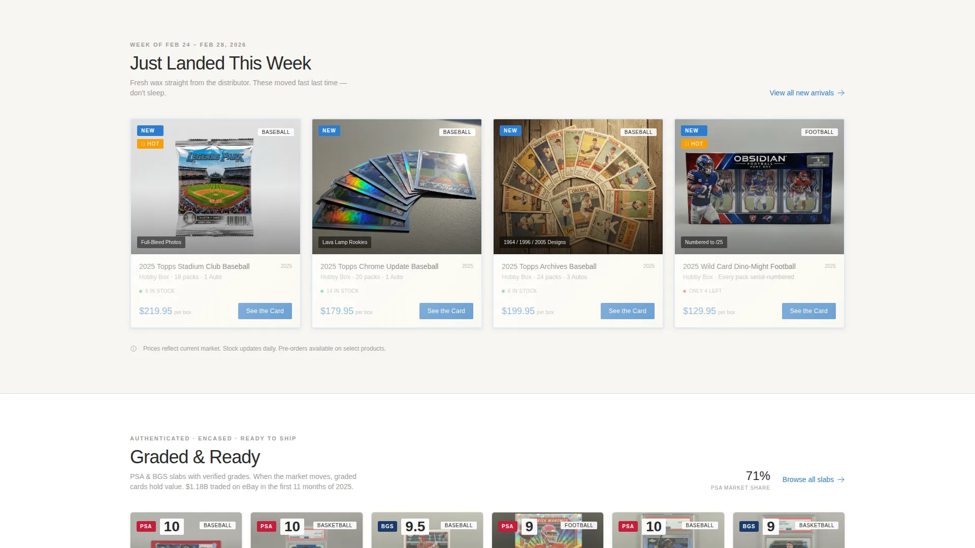
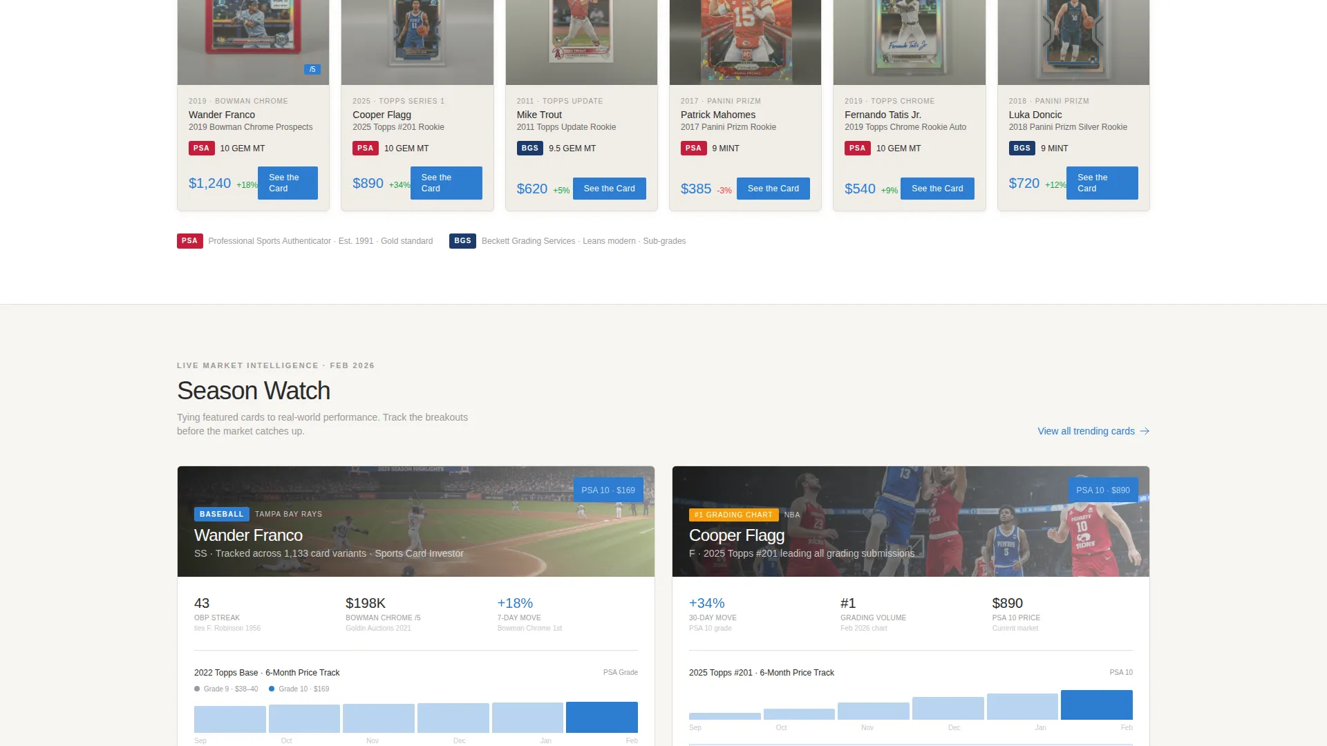
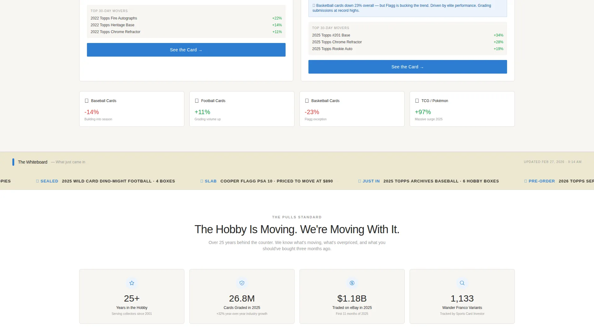
The page is organized into three refreshable grid modules: "Just Landed This Week," "Graded and Ready," and "Season Watch." Each block works independently, so you can update one section without rebuilding the full page layout.
Trading-Card-Sized Tile Format
Every product tile is proportioned like an actual trading card. Each tile carries a barely-there shadow that mimics a top-loader leaning against a showcase shelf, keeping the tactile language of the hobby present throughout the browsing experience.
Per-Tile Click-Through Calls to Action
Each card tile includes a "See the Card" call to action in hobby-box electric blue. The button routes directly to the full product page or live inventory listing, keeping friction as low as possible for a collector ready to buy.
Sticky Inventory Navigation Bar
A persistent top bar stays in view as visitors scroll. It carries a secondary "Shop All Inventory" call to action for buyers who arrive ready to browse the full catalog rather than explore the seasonal highlights.
Season Watch Performance Module
The "Season Watch" block pairs featured cards with real-world player context, placing a rookie card tile next to performance highlights. This gives collectors the at-a-glance market signal they are already tracking on their own.
Page sections overview
| Section | Purpose |
|---|---|
| Full-Bleed Header | Sets the owner's-eye visual tone and delivers the primary headline |
| Sticky Top Bar | Keeps "Shop All Inventory" accessible throughout the scroll |
| Just Landed Grid | Showcases new releases and fresh pulls from the current week |
| Graded and Ready | Curates PSA and BGS slab inventory in a scannable tile format |
| Season Watch Module | Connects featured cards to current player performance context |
| Scroll Cue Indicator | Guides first-time visitors from the header into the grid content |
Design & branding system
The visual identity follows a Directory and Discovery theme built on the Cloud Canvas color system. The palette is intentionally restrained so the card art and product photography carry all the visual energy.
- Background tones use soft gallery white (#F7F5F2), pencil-sketch gray (#9B9B9B), and uncut-sheet cream (#EDE8D0) for a freshly opened binder feel
- Hobby-box electric blue (#2D7DD2) is reserved exclusively for clickable elements and price callouts, making every action point immediately visible
- Typography runs in a confident sans-serif at pencil gray, and tile shadows are kept subtle to mimic a top-loader resting against glass
Mobile & speed optimization
The modular grid is structured to reflow cleanly at smaller screen sizes, keeping tile proportions readable whether a collector is checking inventory from a show floor or a couch.
- Card-sized tiles maintain their aspect ratio on smaller screens, preserving the tactile browsing feel on mobile devices
- The sticky top bar stays functional across screen widths, so the "Shop All Inventory" shortcut is never more than a tap away
- The light, neutral background palette minimizes heavy visual assets, keeping page weight manageable for image-heavy product grids
How this template helps you convert
Every structural decision on this page is aimed at removing the distance between a visiting collector and the card they are looking for. The template replaces passive browsing with active discovery.
- The seasonal grid blocks create immediate urgency by surfacing what is new, graded, and trending rather than a flat alphabetical catalog, giving collectors a clear reason to click through today rather than return later.
- The per-tile "See the Card" call to action in electric blue keeps the next step visible and obvious on every product tile, reducing the number of decisions a buyer has to make before reaching the actual listing.
- The sticky "Shop All Inventory" bar captures visitors who arrive with buying intent already formed, routing them to the full catalog without requiring them to scroll back to the top.
Other information about this template
This template is a single landing page, not a multi-page site. It is designed to serve as the front-of-shop discovery layer that sits between a social media post or show advertisement and your full inventory system.
- The page is built for a local brick-and-mortar collectibles business that also operates or wants to grow an online presence
- The grid layout is described as modular and card-proportioned, consistent with how hobby shops physically display slabs and singles
- The template supports the visual language of the sports card hobby, including graded card presentation and release-day urgency without requiring any specific third-party platform
- It is suited to shops that carry a mix of vintage sets, current rookie cards, and graded slabs across multiple sports categories
Theme
Neo-Retro
Creative direction
Unboxing Experience
Color system
Citrus Burst
Style
Masonry/Pinterest
Direction
Marketplace/Multi
Page Sections
Full-bleed Counter Header
Modular Seasonal Grid Blocks
Trading-card-proportioned Tiles
Per-tile Click-through Action
Sticky Inventory Navigation Bar
Season Watch Performance Module
Related questions
Can I update the seasonal grid sections on my own?
Does this template include checkout or product listing functionality?
Is this template suitable for a shop that carries both vintage and modern cards?
Can a small or solo seller use this template effectively?
What kind of header image works best for this template?



