Endodontist Booking Website Template
Pulp is a single-column patient education landing page built for endodontists. It guides anxious patients through a root canal referral with a labeled tooth explainer, an interactive symptom checklist, and an accordion-style procedure timeline. A downloadable pre-appointment guide and printable readiness checklist turn first-time visitors into informed, prepared patients before they ever pick up the phone.
by Rocket studio
Quick summary
Pulp is a calm, focused patient education landing page designed for endodontic practices. It meets patients at the moment of peak anxiety, right after a root canal referral, and walks them through what is actually happening inside their tooth. Interactive checklists, a visual explainer, and a step-by-step timeline replace fear with clarity, and two downloadable resources give patients a reason to stay and engage.
Who this template is for
This template is built for endodontists who want to reach patients before the first appointment, not just at it. It works equally well for solo practitioners and group practices that accept referrals from general dentists.
- Endodontists looking to reduce patient anxiety before consultations
- Dental practices that want to offer genuine educational value online
- Clinicians whose referral base includes patients with little prior knowledge of root canal treatment
What problem this template solves
Most dental websites offer a brief paragraph about root canals and then ask for a booking. That approach fails anxious patients completely. People referred to an endodontist are often searching their phone in a parking lot, heart rate elevated, with no clear picture of what the procedure involves. They need information before they need a calendar link.
- Patients abandon bookings when they feel uninformed or frightened
- Generic dental content does not address the specific fears tied to root canal treatment
- Practices lose referral conversions when they cannot calm and educate patients online
What you get with this template
You get a fully structured, single-column landing page that functions as a patient education hub. Every section is designed to reduce anxiety progressively, so by the time a visitor reaches the call to action, they feel ready rather than reluctant.
- A portrait-centered hero with a humanizing headline that meets patients emotionally
- An interactive symptom checklist and visual tooth cross-section explainer
- A downloadable pre-appointment guide form and a printable readiness checklist as a secondary path
Feature list
This template includes a focused set of interactive and educational components drawn directly from the source brief.
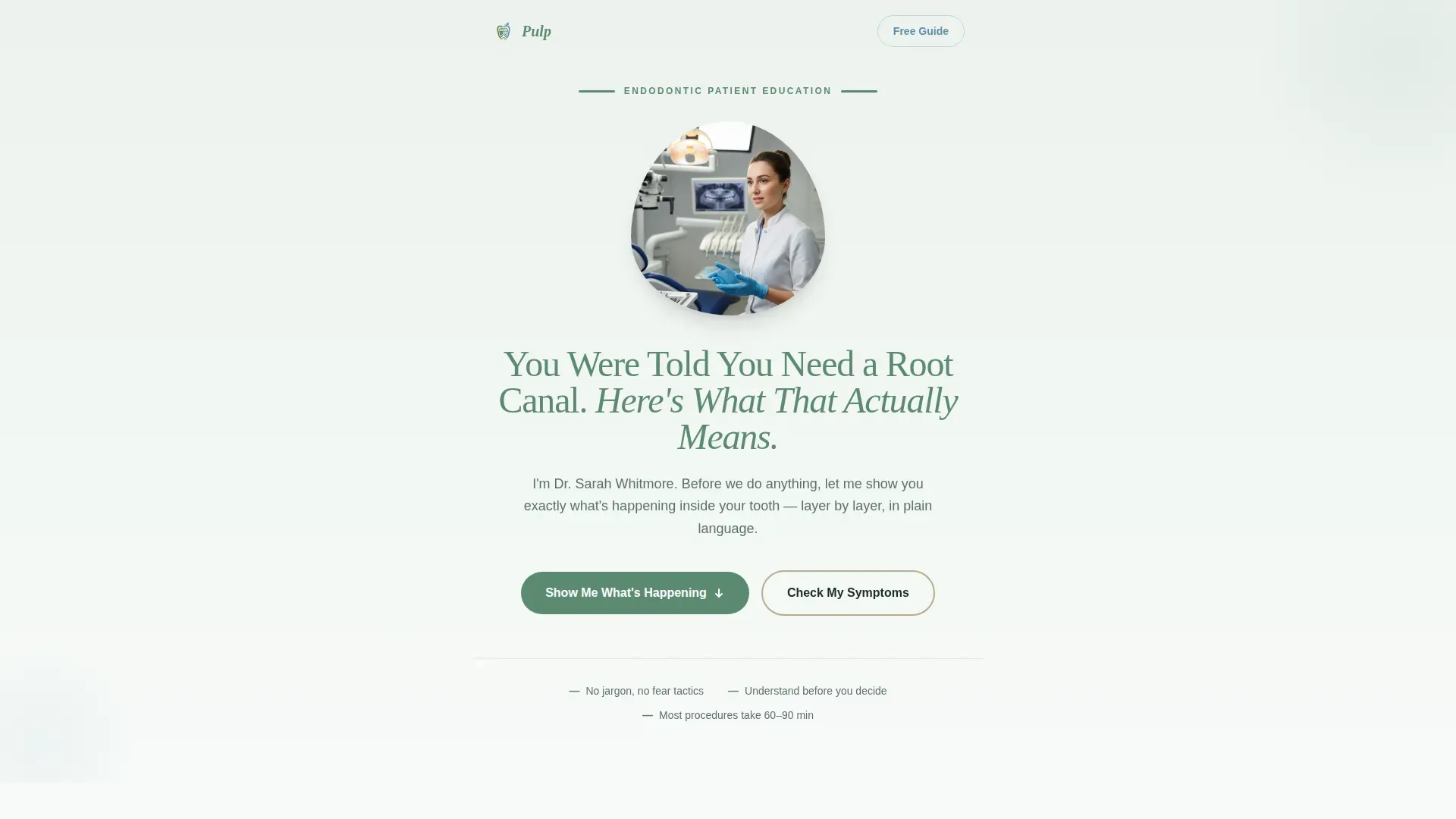
Portrait-Centered Hero Section
The hero opens with a warmly lit, shoulders-up photograph of the endodontist standing in front of a softly blurred operatory. Below the portrait, a single pine green headline reads: "You Were Told You Need a Root Canal. Here's What That Actually Means." A floating trust card sits beneath it. The composition is human and direct, with no stock imagery or clinical tool displays.
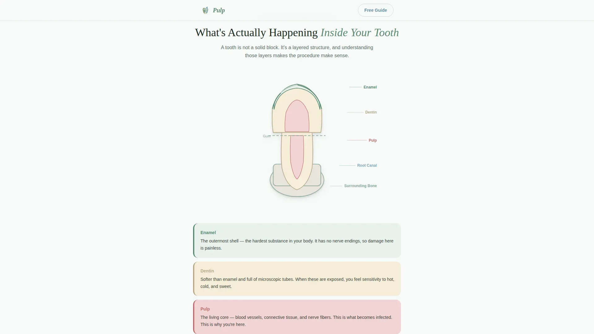
Labeled Tooth Cross-Section Explainer
A visual layer-by-layer breakdown of tooth anatomy anchors the educational core of the page. The bento asymmetric layout presents labeled cross-section illustrations that show patients exactly which layers are affected during root canal treatment. This section converts abstract clinical language into something a patient can actually picture.
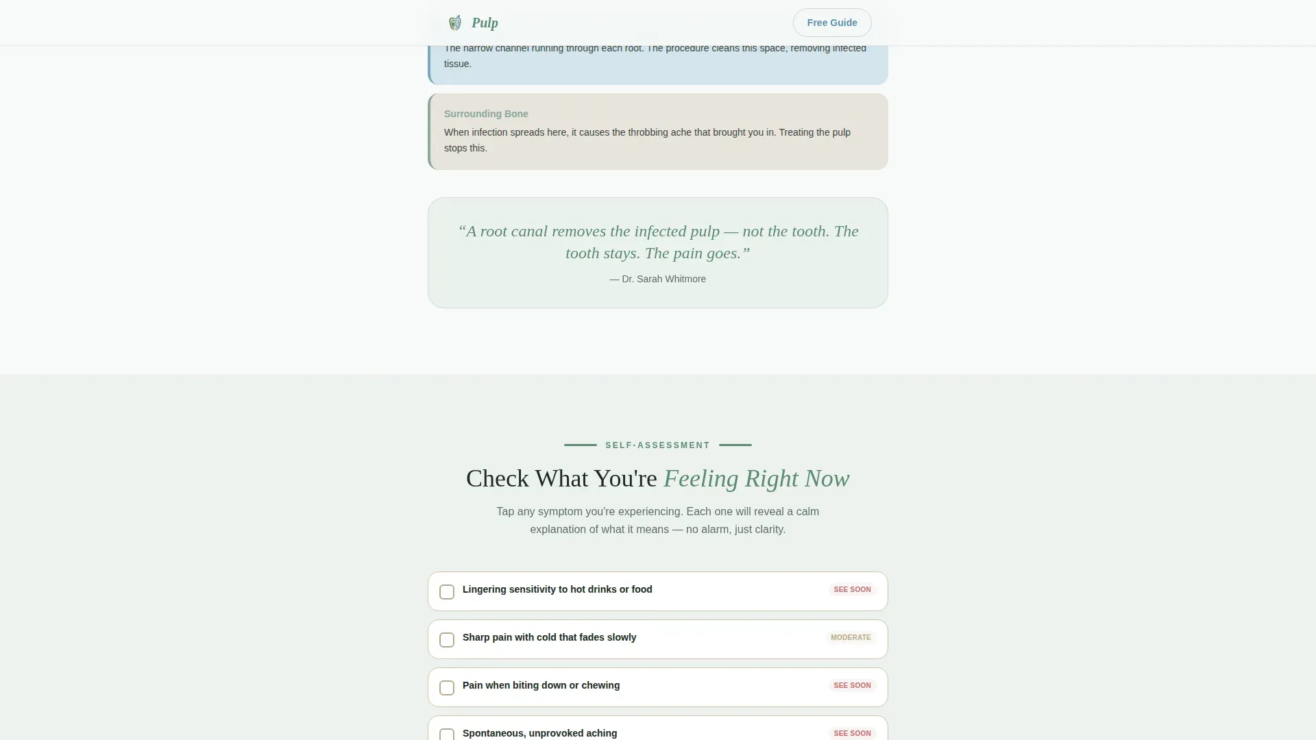
Interactive Symptom Checklist
The symptom checklist lets visitors tap items such as lingering sensitivity to hot, pain when biting down, or swelling near the gumline. Each checked item reveals a calm, one-sentence clinical explanation. The checklist builds a simple severity snapshot as the visitor progresses, making the experience feel personal rather than generic.
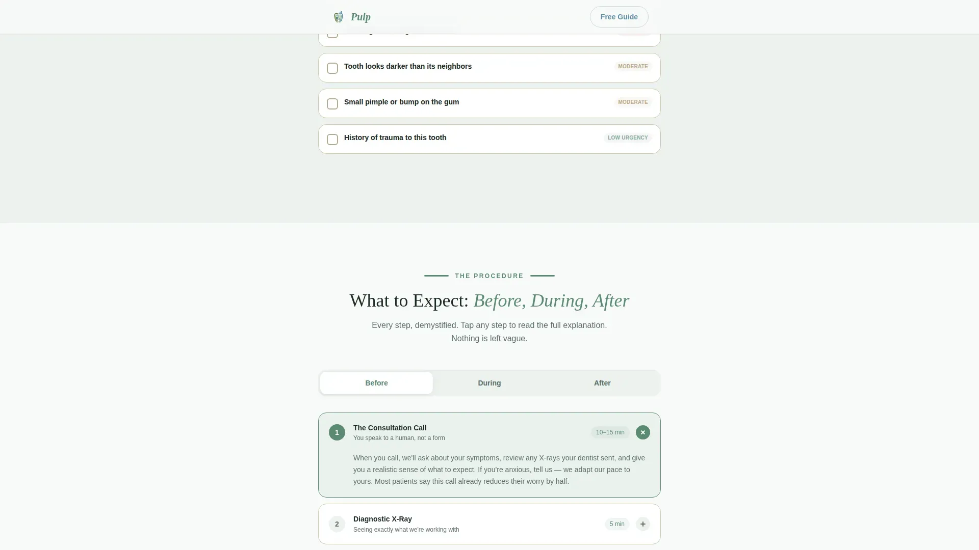
Accordion Procedure Timeline
A "Before, During, After" timeline uses expandable accordion steps to walk patients through each stage of their appointment. Each step demystifies a moment patients typically dread. The alternating rhythm of learning and self-assessing keeps visitors engaged through the full scroll.
Dual Call-to-Action Download Flow
The primary call to action, "Download Your Pre-Appointment Guide," appears in glacier blue after the symptom checklist and again after the timeline. It asks only for a first name and email address. A secondary path offers a printable readiness checklist as a portable document format (PDF) summarizing the patient's checked symptoms to bring to their consultation.
Page sections overview
| Section | Purpose |
|---|---|
| Hero Portrait | Humanize the practice and meet anxious patients with a reassuring headline |
| Tooth Anatomy Explainer | Break down tooth layers visually to replace fear with clinical understanding |
| Symptom Checklist | Let patients self-assess and receive calm, one-sentence explanations per item |
| Before/During/After Timeline | Demystify the root canal procedure step by step using accordion interactions |
| Pre-Appointment Download | Capture first name and email in exchange for a practical guide |
| Printable PDF Checklist | Offer a secondary resource patients can bring to their consultation |
| Footer | Single-row linear footer with practice contact and navigation essentials |
Design & branding system
The visual identity follows a Healing Space theme built around the Alpine Fresh color system. The palette feels calm, clean, and clinical without being cold. Typography pairs Plus Jakarta Sans for body copy with Fraunces serif display headings for warmth and editorial authority.
- Pine green (#5B8A72) anchors headings and section dividers; morning frost white (#F7FAF8) fills generous negative space between content blocks
- Warm birch (#D4C5A9) warms card backgrounds and pull-quote panels throughout the page
- Glacier blue (#7BA7BC) draws the eye to interactive elements, clickable checklists, downloadable resource buttons, and progress indicators
Mobile & speed optimization
The template is built mobile-first, recognizing that the primary audience is searching on a phone moments after receiving a referral. Interactive sections use client-side components only where needed, keeping the rest of the page lightweight.
- Scroll reveals use spring physics animations at medium intensity, keeping motion purposeful without overwhelming mobile users
- The symptom checklist and accordion timeline are built as interactive client components, while static sections remain server-rendered for faster initial load
- The single-column flow translates cleanly to small screens with no layout shifts or hidden content
How this template helps you convert
The page is structured so that visitors receive genuine clinical value before they are asked for anything. This approach builds trust progressively across the scroll, making the download call to action feel like a natural next step rather than an interruption.
- The symptom checklist creates a personalized experience early in the scroll, giving patients a reason to stay engaged rather than bouncing to a competitor's site.
- The downloadable pre-appointment guide appears only after the patient has already learned something useful, so the exchange feels fair and the conversion feels earned.
Other information about this template
This template is categorized under Health and Medical, specifically the Endodontist Website subcategory, and is designed as a content and resource hub. The landing page direction is focused on education-led conversion rather than hard promotional selling.
- The creative direction follows a Checklist and Audit approach, alternating learning moments with self-assessment so patients feel progressively more in control
- The header concept is Portrait-Centered, prioritizing the practitioner's face and voice over clinical imagery or facility photography
- Inline patient voice quotes are included as social proof elements, adding credibility through real-world perspective alongside clinical specificity
- The footer uses a Pattern 1 Linear Single-Row layout, keeping the page close and uncluttered at the bottom
- The template is localized for English-language audiences in the United States
Theme
Healing Space
Creative direction
Checklist & Audit
Color system
Alpine Fresh
Style
Single Column Flow
Direction
Content/Resource
Page Sections
Portrait-centered Hero with Trust Card
Visual Tooth Layer Explainer
Interactive Symptom Checklist
Accordion Procedure Timeline
Dual Download Call-to-action Flow
Related questions
Who is this landing page template designed for?
What interactive elements does this template include?
How does the downloadable guide call to action work?
Is this a single page or a multi-page website?
Does the template require a real practitioner photograph?



