Advanced Telemedicine & Health Tech Professional Website Template
Pulse is a health data analytics landing page template built for enterprise healthcare teams. It transforms raw patient records, claims data, and clinical workflows into a compelling, audit-driven lead generation experience. Designed for chief medical officers, health system CFOs, and population health directors, it converts diagnostic urgency into qualified leads through a progressive three-step form.
by Rocket studio
Quick summary
Pulse is a single-page landing page template for health data analytics platforms. It uses a zigzag alternating layout to guide senior healthcare decision-makers through a compliance-style audit experience. Each section poses a clinical operations question, pairs it with a visual answer, and builds toward a lead capture form. The design is rooted in clinical minimalism with precise typography and a tightly controlled color palette.
Who this template is for
This template is built for B2B healthcare technology companies that sell data intelligence platforms to large health systems. It speaks directly to the people who carry the heaviest operational weight inside those organizations.
- Chief Medical Officers and Population Health Directors who need to prove outcome ROI to skeptical boards
- Health system Chief Financial Officers hunting for margin in value-based contracts
- Healthcare SaaS teams whose buyers are too busy for long-form demos and need instant diagnostic clarity
What problem this template solves
Senior healthcare leaders are drowning in raw Electronic Health Record (EHR) exports and disconnected claims data. They know something is wrong with their margins and outcomes, but they cannot articulate it in board-ready terms. This template frames that pain precisely and positions your platform as the organizing intelligence they have been missing.
- No visual way to connect readmission rates, diagnostic-related group (DRG) costs, and value-based contract gaps in one place
- Boards and finance teams demand proof of intervention ROI, but population health teams lack presentation-ready dashboards
- Sales conversations stall because prospects do not recognize the full scope of their data gap until it is shown to them section by section
What you get with this template
You get a fully structured, single-page lead generation experience designed for desktop-first healthcare enterprise buyers. Every section is purposeful, ordered, and built around a clear conversion architecture.
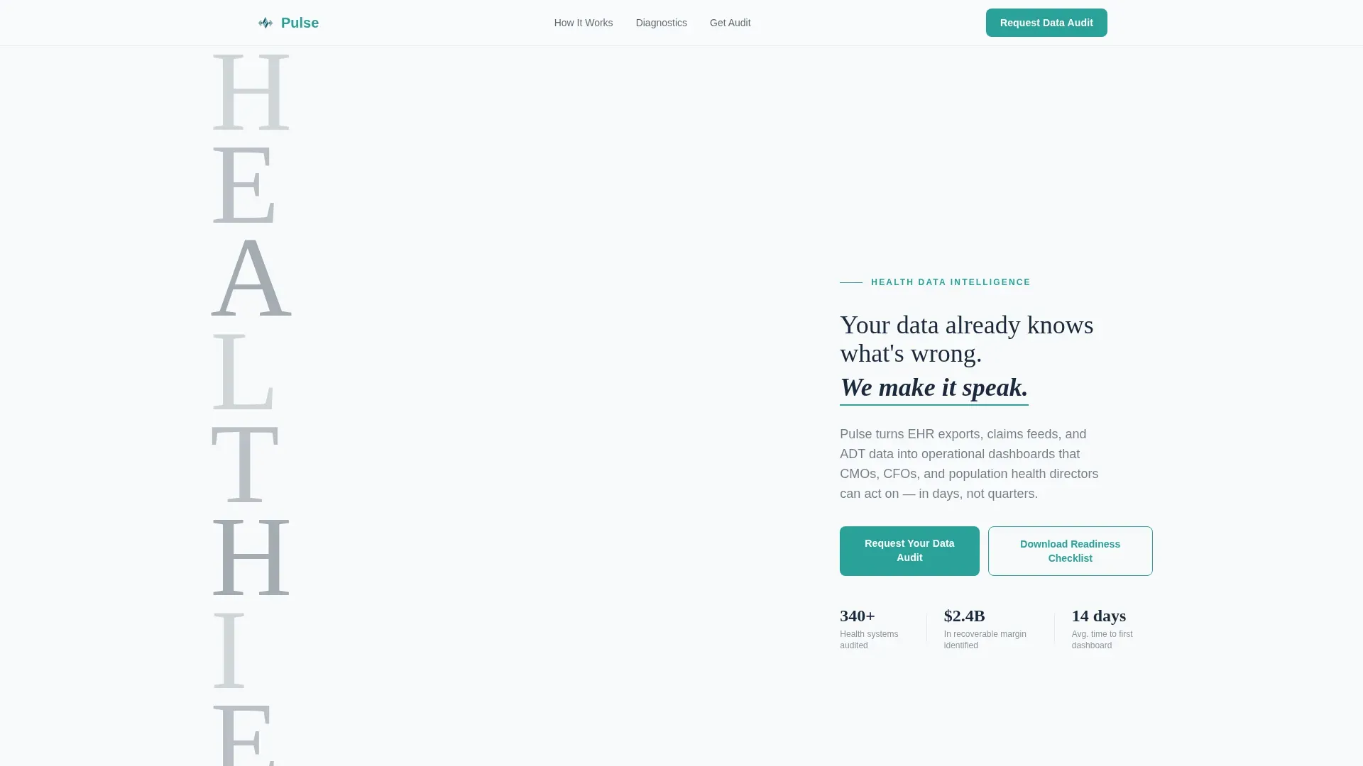
- A monumental hero section with a stacked typographic tower, an animated teal heartbeat underline, and a primary call-to-action button reading "Request Your Data Audit"
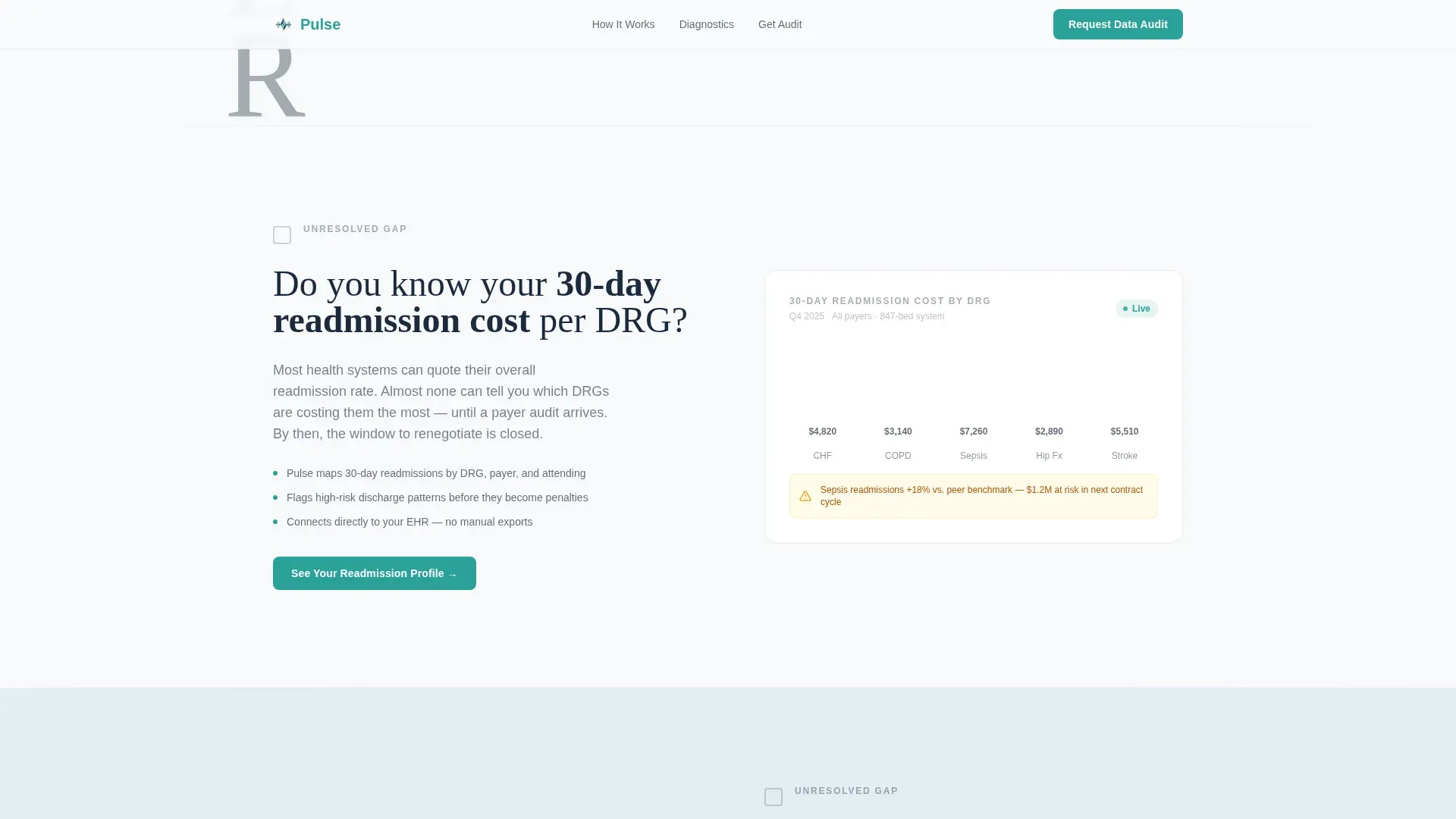
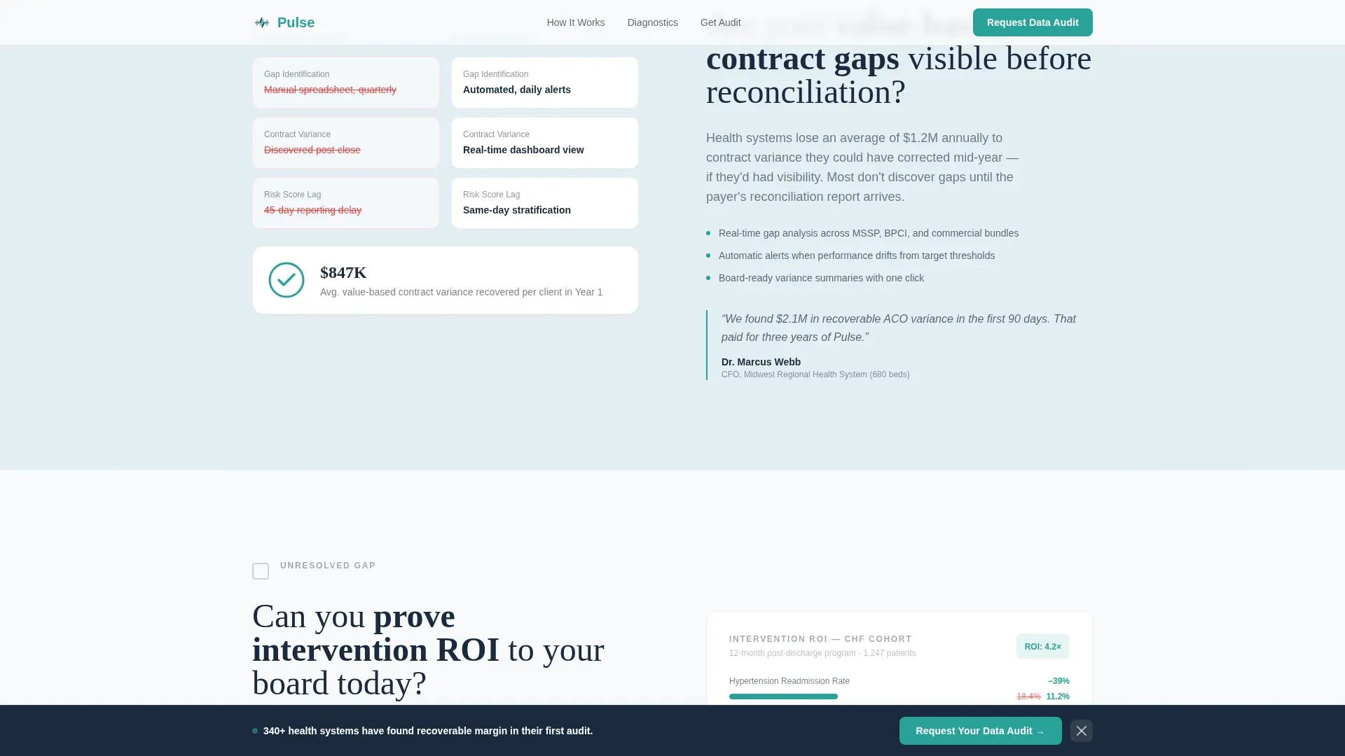
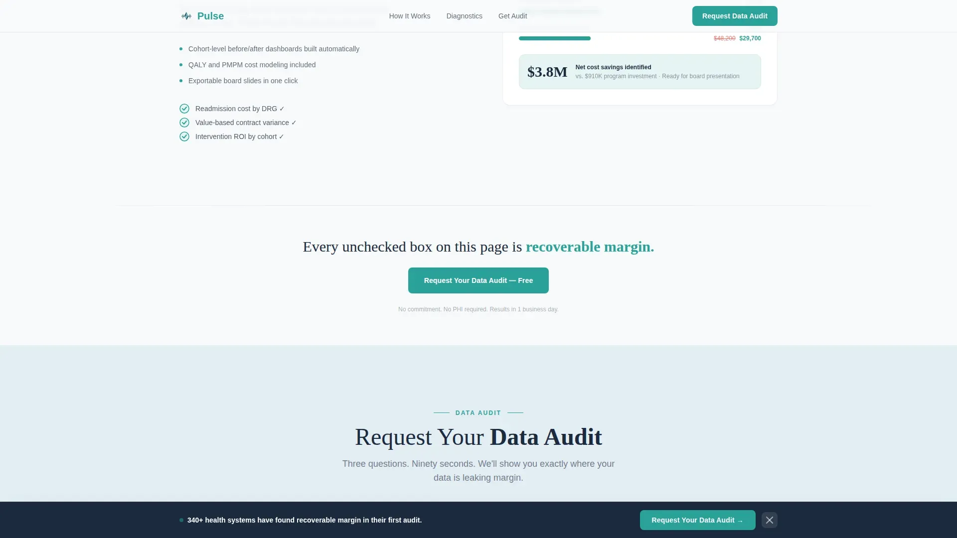
- Three alternating zigzag diagnostic sections, each pairing a clinical operations question with a visual answer such as a mini-dashboard, a before-and-after metric, or an animated checkmark
- A progressive three-step lead capture form and a secondary gated PDF download for visitors who are not yet ready to talk
Feature list
This section covers the core built-in components and interaction patterns that make the Pulse template function as a lead generation machine for health data analytics platforms.
Stacked Type Tower Hero
The hero occupies the full viewport. The word "HEALTHIER" is built vertically in massive ultra-light serif type on the left two-thirds, each letter slightly translucent against the Arctic White background. The right third holds a single subheadline with a thin teal underline that animates like a heartbeat monitor on scroll entry.
Zigzag Diagnostic Sections
Three alternating left-right content blocks each open with a pointed clinical question directed at the visitor. The paired visual side delivers a mini-dashboard metric reveal, a before-and-after comparison, or a scroll-triggered animated checkmark. Alternating background fills between Arctic White and Glacier Blue keep the eye moving forward.
Progressive Three-Step Lead Form
The primary conversion form unfolds across three disclosure steps. Step one collects organization type and bed count range. Step two asks which data sources are connected, including EHR, claims, and ADT feeds. Step three captures name, title, and work email. This staged approach reduces friction for enterprise buyers.
Sticky Call-to-Action Bar
A persistent bottom bar surfaces the "Request Your Data Audit" call to action after every third zigzag section. It stays visible as the visitor scrolls without interrupting the diagnostic narrative, keeping the primary conversion path available at all times.
Gated PDF Secondary Conversion
A downloadable "Health System Data Readiness Checklist" PDF is gated behind email capture only. It catches visitors who feel the urgency the page creates but are not yet ready for a full audit conversation. The gate opens through a modal overlay without navigating away from the page.
Scroll-Triggered Animations
Counter animations, staggered section reveals, and self-completing animated checkmarks fire as each section enters the viewport. The heartbeat underline in the hero animates on load. These motion patterns reinforce the audit narrative without overwhelming the clinical visual tone.
Page sections overview
| Section | Purpose |
|---|---|
| Hero Tower | Establish brand authority and surface primary call to action |
| Zigzag One | Pose readmission cost question, reveal metric dashboard |
| Zigzag Two | Pose value-based contract gap question, show before-and-after |
| Zigzag Three | Pose intervention ROI question, complete animated checkmark |
| Lead Capture Form | Convert qualified visitors through three-step progressive disclosure |
| PDF Gate Modal | Capture early-stage leads with gated checklist download |
| Footer Row | Close with minimal single-row linear footer pattern |
Design & branding system
The visual identity follows a Healing Space theme. Every color and type decision reinforces the feeling of a freshly organized, clinical environment where precision signals trustworthiness. The palette avoids sterile coldness by leaning into warmth through careful use of negative space.
- Four-color system: Arctic White (#F8FAFB) as the dominant background, Glacier Blue (#E3EDF4) for alternating section fills, Deep Charcoal (#1B2A3D) for all body text and headlines, and Living Teal (#2AA198) reserved exclusively for calls to action, progress indicators, and interactive checkmarks
- Typography pairing: Fraunces serif for hero headlines to convey authority and weight, DM Sans for all body copy and interface elements to maintain clinical readability
- Layout logic: clinical minimalism with generous negative space, desktop-first proportions, and a zigzag alternating structure that keeps the eye advancing without visual fatigue
Mobile & speed optimization
The template is built desktop-first to match where chief medical officers and chief financial officers work. The layout collapses gracefully for mobile visitors without losing the diagnostic narrative structure.
- Static sections use server components to reduce initial load weight, while the interactive form and animation layers load as client components
- The three-step form, sticky call-to-action bar, and PDF gate modal are all mobile-responsive and maintain touch-friendly interaction targets
- Scroll-triggered animations degrade gracefully on lower-powered devices, keeping the core content readable even without motion support
How this template helps you convert
The entire page is engineered around a single insight: healthcare leaders who feel an unresolved diagnostic gap are far more likely to request an audit than those who receive a standard feature walkthrough.
- The zigzag checklist structure creates progressive urgency, each unanswered clinical question builds on the last, so by the time the visitor reaches the form, they have already identified their own gaps
- The three-step progressive form reduces perceived commitment by asking for context before contact details, making enterprise buyers more willing to engage
- The secondary PDF gate captures visitors at an earlier intent stage, growing the lead pool beyond those ready for an immediate sales conversation
Other information about this template
This template is part of the Telemedicine and Health Tech subcategory under Health and Medical. It is designed for the health data analytics niche, where buyer trust and clinical credibility are non-negotiable before any conversion happens.
- The creative direction is Checklist and Audit, meaning the scroll experience is structured like a compliance review, building quiet urgency with every unchecked box and offering relief with every resolved one
- The header concept is a Stacked Type Tower, a typographic architecture approach that communicates organizational intelligence before a single product screenshot appears
- The template supports US healthcare terminology, English language copy, and USD-denominated value framing throughout
Theme
Healing Space
Creative direction
Checklist & Audit
Color system
Arctic White
Style
Zigzag/Alternating
Direction
Lead Generation
Page Sections
Stacked Type Tower Hero Section
Zigzag Diagnostic Content Blocks
Progressive Three-step Lead Form
Sticky Conversion Bar
Gated PDF Checklist Download
Scroll-triggered Motion System
Related questions
Who is the primary audience for this landing page template?
What lead generation tools are included in this template?
Is this template suitable for a payer or ACO organization, not just a hospital system?
Do I need animation experience to use this template?
What makes the Checklist and Audit layout effective for healthcare buyers?



