Telemedicine & Health Tech Comparison Website Template
The Pulse landing page template is a comparison table layout built for a clinical-grade wrist-worn biosensor. It opens with award badge authority, guides visitors through three expert panel sections, and closes with a confident click-through to a product configuration page. The Forest Trust color system and Organic Flow visual style create a grounded, premium feel that earns trust before asking for a click.
by Rocket studio
Quick summary
This is a single-page comparison table landing page template for Pulse, a wrist-worn biosensor tracking cortisol, blood oxygen saturation, and sleep architecture simultaneously. It is designed to build clinical trust through expert panels, award badge credibility, and structured competitor comparisons, then drive a confident click-through to a product configuration screen.
Who this template is for
This template fits product teams and marketers launching a premium health wearable with clinical-grade positioning. It works best when the product has earned third-party recognition and benefits from expert credibility over simple feature lists.
- Direct-to-consumer biosensor or wearable health tech brands
- Health-optimizing product marketers targeting performance athletes and chronic condition communities
- Teams selling a wellness device that benefits from side-by-side competitor comparison
What problem this template solves
Most health wearable landing pages either overwhelm visitors with specs or underwhelm them with vague wellness copy. Neither approach builds the kind of trust a clinical-grade device requires. Visitors arrive skeptical and leave unconvinced.
- Visitors need expert voices to trust biosensor accuracy claims
- Raw feature tables without context fail to communicate real-world value
- A disconnected call to action breaks the momentum that expert credibility builds
What you get with this template
You get a fully structured, scroll-guided comparison table landing page that pairs clinical expert panels with focused competitor tables. Every section is designed to answer the skepticism raised by the one before it.
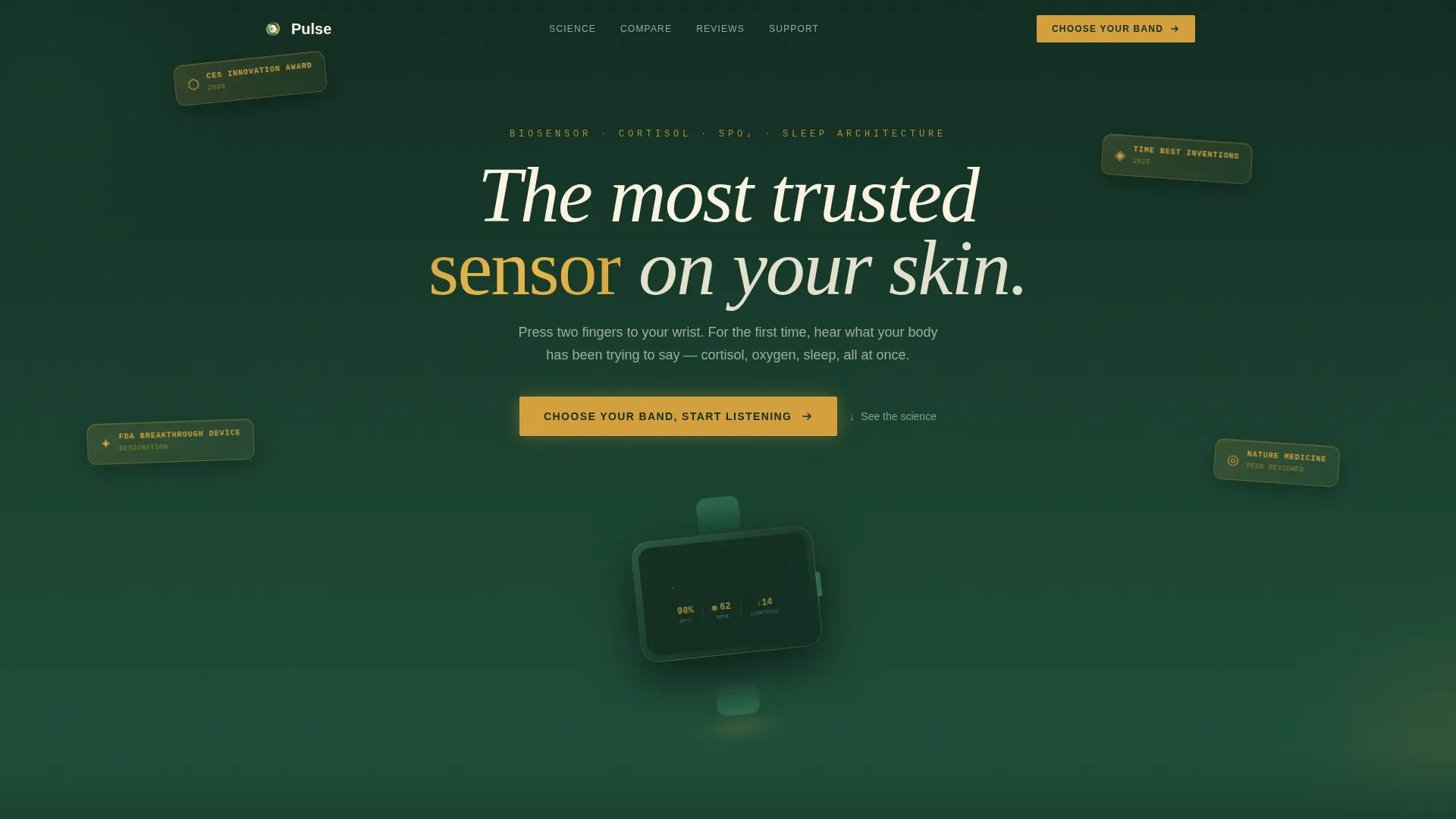
- Hero section with award badge constellation, parallax float animation, and device reveal
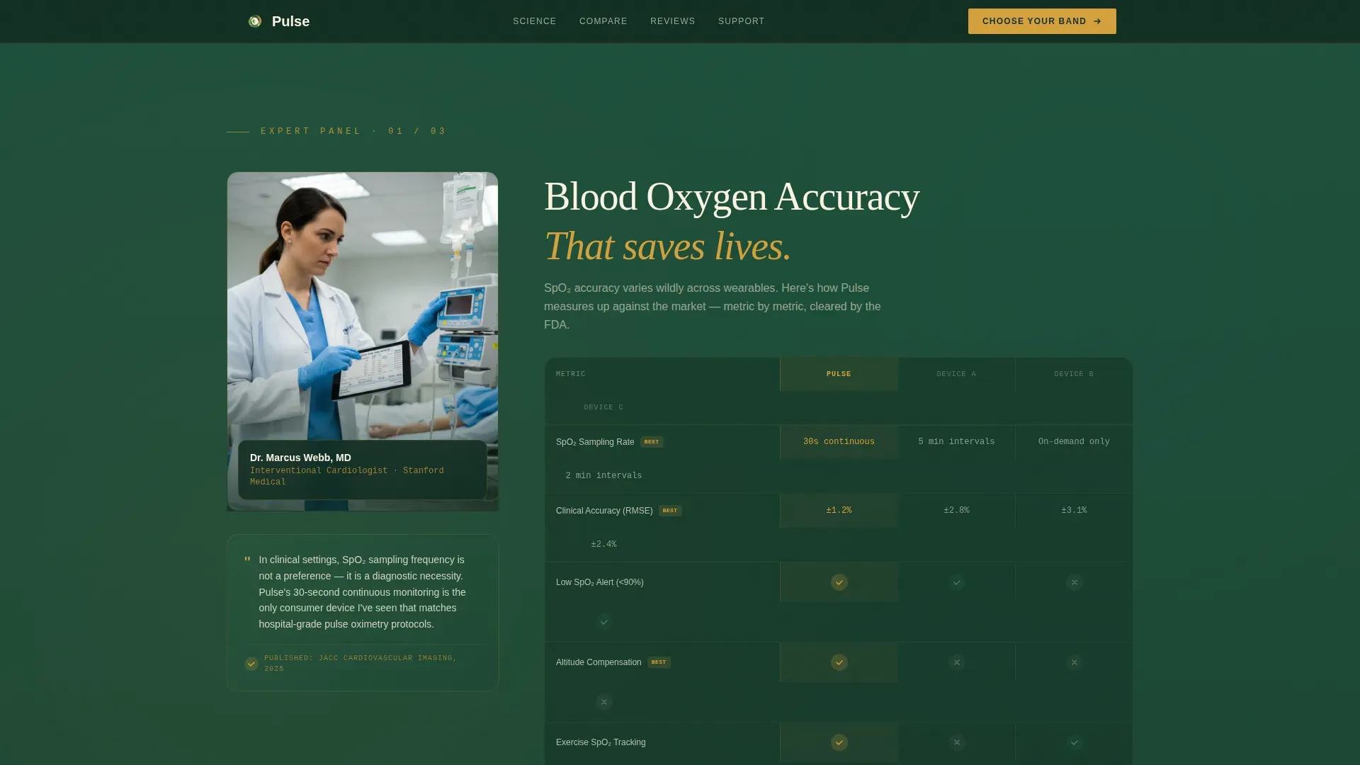
- Three expert panel sections, each paired with a comparison table column highlighting Pulse's advantages
- Click-through call to action placed strategically after the first expert panel and repeated as a sticky bottom bar
Feature list
This template includes purposefully designed components that serve the comparison-table landing page format for a health wearable product.
Award Badge Hero Section
The header opens with a constellation of award badges rendered in sap amber foil against deep evergreen. A subtle parallax float animation gives each badge a gentle, leaf-like drift. The product device fades in below, band open, screen showing a live heart-rate waveform in SVG animation. No product hero shot competes with the credibility cluster.
Expert Panel Layout
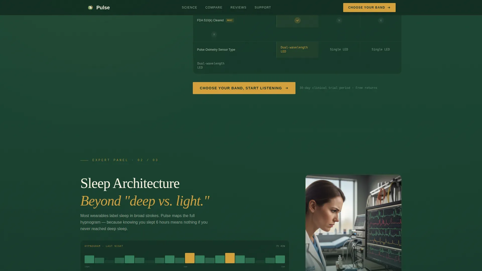
One clinical voice anchors each scroll section. A cardiologist covers blood oxygen saturation accuracy, a sleep researcher annotates the hypnogram feature, and an endocrinologist walks through cortisol curve tracking. Each panel positions the expert's insight directly beside the relevant comparison table column, so authority and data arrive together.
Animated Comparison Tables
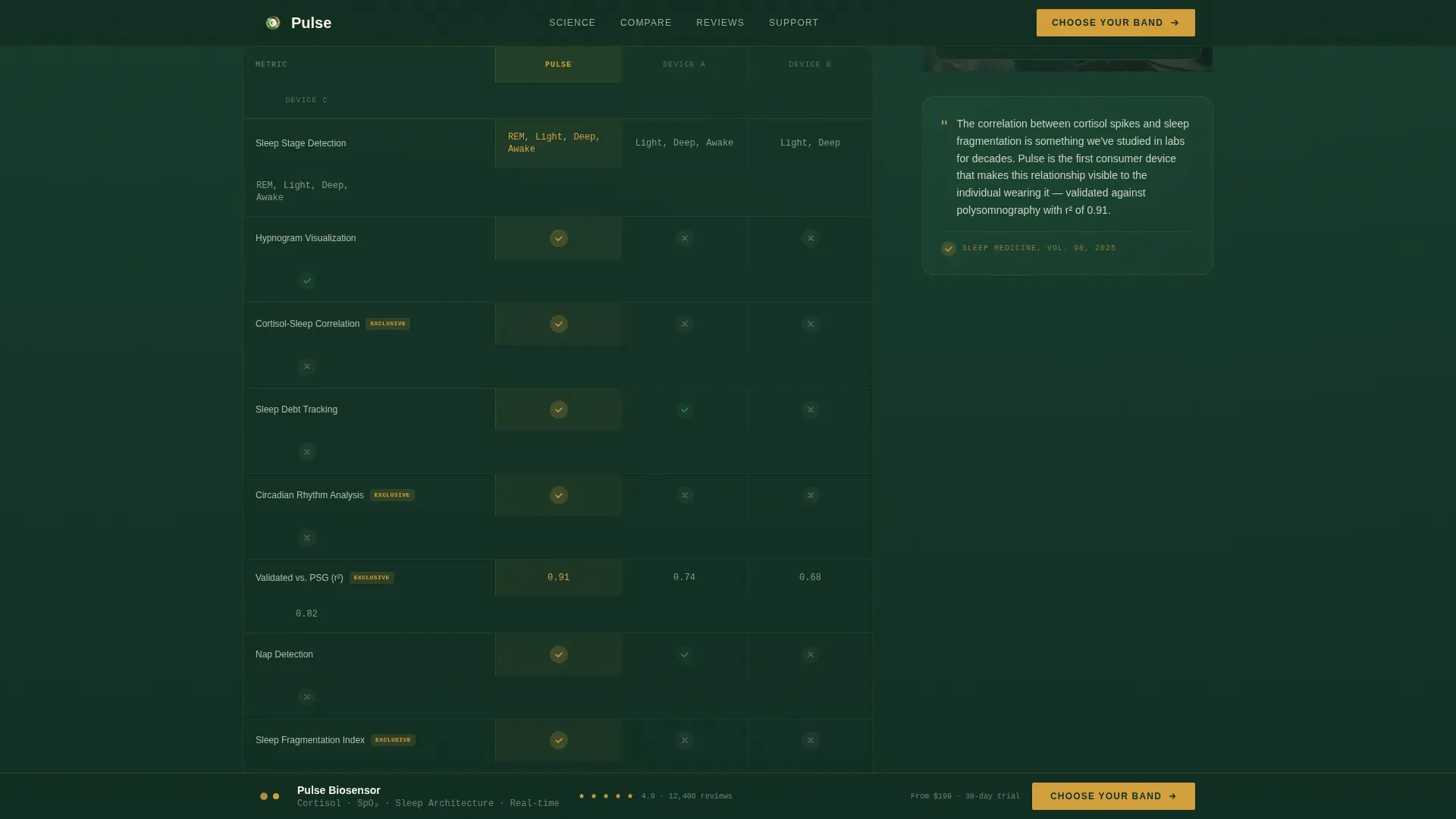
Three structured comparison tables measure Pulse against unnamed competitors across blood oxygen saturation precision, sleep architecture depth, and cortisol tracking. Winning checkmarks bloom in sap amber on scroll reveal, drawing the eye to Pulse's key differentiators without heavy prose.
Sticky Click-Through Call to Action
A persistent bottom bar appears after the second comparison table. It carries the primary call to action in sap amber on deep evergreen. The bar stays visible as the visitor scrolls, keeping the next step accessible without interrupting the reading experience.
Social Proof Testimonial Section
Real user perspectives anchor the page before the footer. A marathon trainer, a chronic fatigue patient, and a new parent each describe a specific use case. This grounds the clinical data in lived human experience, making the product feel both proven and personal.
Organic Flow Typography System
Headlines use a serif typeface for warmth and authority. Body copy uses a clean sans-serif for readability. Data metrics and comparison values use a monospace typeface, giving clinical numbers a distinct, trustworthy visual register.
Page sections overview
| Section | Purpose |
|---|---|
| Hero Award Badges | Open with clinical credibility before showing the device |
| Device Reveal | Introduce the product after authority is established |
| Expert Panel One | Cardiologist validates blood oxygen saturation accuracy |
| SpO2 Comparison Table | Side-by-side feature comparison with three competitors |
| First call to action Block | Drive early click-throughs to configuration page |
| Expert Panel Two | Sleep researcher explains hypnogram architecture tracking |
| Sleep Comparison Table | Highlight sleep depth data against competitor offerings |
| Expert Panel Three | Endocrinologist breaks down cortisol curve monitoring |
| Cortisol Comparison Table | Final competitor table with sticky call to action trigger |
| Social Proof Section | Marathon trainer, fatigue patient, new parent testimonials |
| Footer Row | Linear single-row footer pattern |
Design & branding system
The visual identity follows an Organic Flow theme grounded in the Forest Trust color system. Every color choice references something living and ancient, making clinical data feel as trustworthy as the natural world it evokes.
- Deep evergreen (#1B4332) anchors backgrounds; birch bark cream (#FAF3E0) lifts comparison table cells; moss (#2D6A4F) separates sections like canopy layers
- Sap amber (#D4A03C) highlights winning checkmarks, interactive hover states, and every call to action element
- Fraunces serif handles headlines, DM Sans handles body and interface text, and JetBrains Mono renders data metrics for a distinct clinical register
Mobile & speed optimization
The template is built desktop-first with full mobile responsiveness carried through every section. Comparison tables reflow cleanly on smaller screens so no data is hidden or clipped.
- Server Components handle static sections like the hero and expert panels for faster initial load
- Client Components manage animations including parallax badge float, scroll-triggered table bloom, and waveform SVG rendering
- The sticky call to action bar is optimized for mobile tap targets, keeping the click-through accessible on any screen size
How this template helps you convert
This template is structured as a click-through landing page with a single conversion goal: send the visitor to a product configuration page with confidence. Every design decision serves that outcome.
- The award badge hero establishes credibility before the product is even visible, so visitors arrive at the device reveal already primed to trust it
- Each expert panel answers the skepticism created by the previous one, stacking clinical authority in a scroll sequence that leaves doubt with nowhere to go
- The sticky call to action bar ensures the conversion path is always visible, removing friction at the exact moment a visitor decides they are ready
Other information about this template
This template is designed specifically for health wearable tech products positioned at the premium end of the direct-to-consumer wellness market. It is suited to products with genuine third-party recognition and clinical backing.
- The template is localized for English (US) audiences with USD pricing contexts implied by layout
- Animation intensity is high, including parallax float, scroll reveals, waveform SVG, and comparison table bloom effects
- The footer uses a Pattern 1 linear single-row layout, keeping the page exit clean and uncluttered
- The page type is a landing page, not a multi-page website, keeping the visitor focused on a single conversion path
Theme
Organic Flow
Creative direction
Expert Panel
Color system
Forest Trust
Style
Comparison Table
Direction
Click-Through
Page Sections
Award Badge Hero with Parallax Float
Three Expert Panel Sections
Animated Comparison Tables with Bloom Effect
Sticky Click-through Call to Action Bar
Social Proof Testimonial Section
Forest Trust Color and Typography System
Related questions
What is the primary goal of this landing page template?
Can the expert panel sections be adapted for a different product?
How many competitor columns do the comparison tables include?
Does the sticky call to action bar work on mobile screens?
What animation effects are included in this template?



