Cardiology Practice Website Template with Heart Health Assessment
Pulse is a cardiology practice landing page built around a three-step heart-health self-assessment, a diagnostic comparison table, and a testimonial mosaic. It guides at-risk adults from curiosity to a booked appointment by combining clinical education with patient stories. The design is warm and authoritative, and every section earns trust before asking for a commitment.
by Rocket studio
Quick summary
Pulse is a single-page cardiology practice template designed to convert at-risk visitors into booked cardiac screening appointments. It opens with an interactive self-assessment, moves through a mosaic of patient stories and procedure cards, and anchors the middle of the page with an educational comparison table. The experience feels like a calm, informed conversation rather than a hard sell.
Who this template is for
This template is built for cardiology practices that need a patient-facing landing page combining clinical education with genuine human warmth. It suits practices that offer multiple screening types and want visitors to understand the differences before booking.
- Cardiologists and cardiac screening clinics serving adults aged 45 to 65 with known risk factors
- Practices targeting post-menopausal women, endurance athletes with unexplained symptoms, or patients seeking a second opinion
- Medical marketing teams who want a conversion-focused page without sacrificing educational depth
What problem this template solves
Many potential cardiac patients delay booking because they feel overwhelmed or unsure which screening they actually need. A plain appointment form does nothing to reduce that hesitation. This template addresses the gap between awareness and action.
- Patients arrive with vague symptoms or family-history anxiety and leave with a clear next step
- A bare booking page cannot explain why a stress echocardiogram differs from a calcium score test or a cardiac CT angiography
- Without social proof, first-time visitors have no reason to trust an unfamiliar practice over a referral
What you get with this template
The template delivers a fully structured, single-page layout purpose-built for a cardiology practice. Every section has a specific job, and they work together to move the visitor from self-awareness to appointment.
- A three-step heart-health self-assessment form with an animated heart graphic that shifts color as the visitor progresses
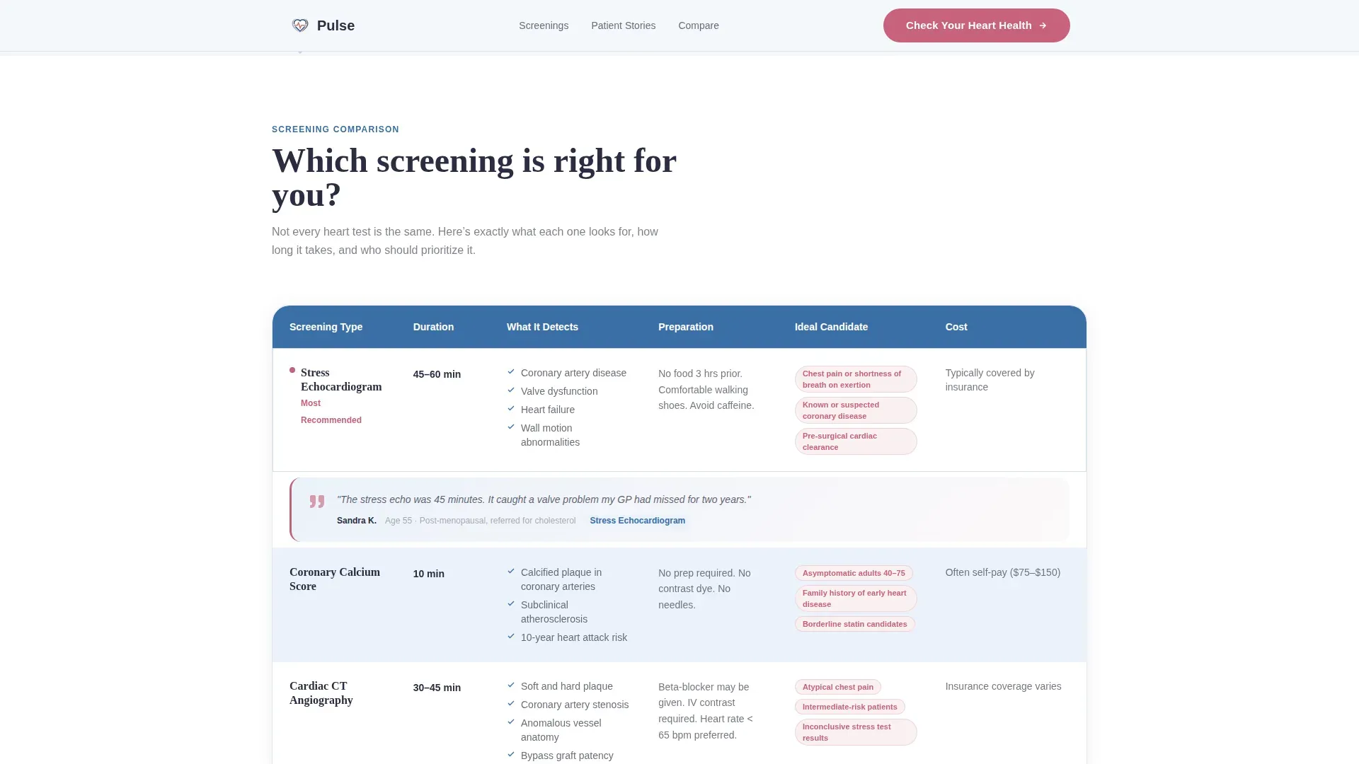
- A diagnostic comparison table contrasting stress echocardiogram, calcium score, cardiac CT angiography, and Holter monitor across duration, detection scope, preparation, and ideal candidate profile
- A testimonial mosaic pairing real patient stories with the specific procedures that helped them, plus a sticky "Check Your Heart Health" call-to-action bar and a secondary email-capture link
Feature list
Three-Step Self-Assessment Header Form
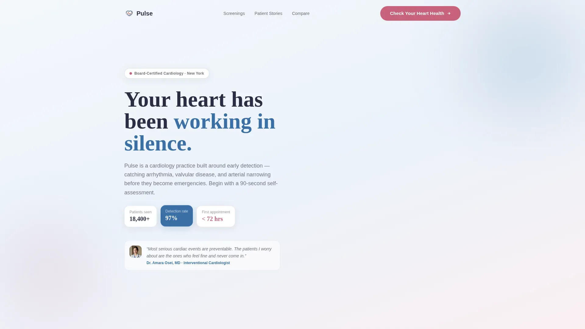
The header opens as a guided, conversational form rather than a static hero image. Step one asks what brings the visitor in today, with illustrated icon choices covering chest pain, high cholesterol, family history, routine screening, and second opinion. Step two collects age range and last cardiac workup date. Step three presents a personalized risk snapshot alongside a soft-animated heart graphic whose color shifts from rose to blue as each field is completed.
Diagnostic Comparison Table
The mid-page comparison table is the educational centerpiece of the layout. It contrasts four screening types across four criteria: duration, what the test detects, preparation required, and the ideal candidate profile. The structure gives visitors enough clinical context to arrive at their appointment already informed, which reduces friction and increases booking confidence.
Testimonial Mosaic with Procedure Cards
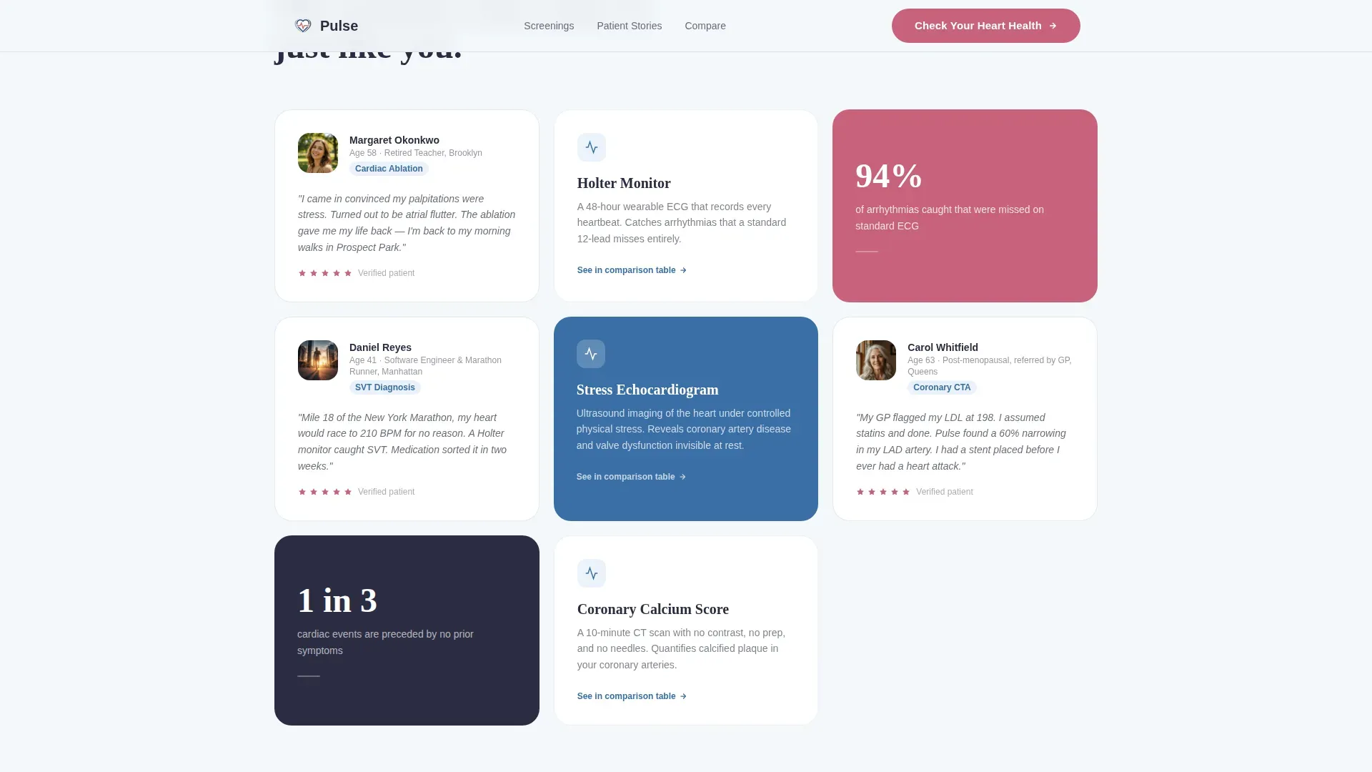
Patient stories are displayed as a tiled mosaic grid alongside the specific procedure cards that correspond to each story. Video thumbnails and pull-quotes are woven between rows of clinical data. A retired teacher describes her ablation recovery. A young father explains how a Holter monitor identified his supraventricular tachycardia. The mosaic makes trust tangible rather than abstract.
Sticky Call-to-Action Bar
After the comparison table, a sticky bottom bar keeps the primary call to action visible as the visitor continues scrolling. The bar routes to the booking platform and stays present without obscuring the content beneath. The primary prompt, "Check Your Heart Health," first appears inside the self-assessment form's final step and repeats here for continuity.
Secondary Email Capture Link
A text link labeled "Download Our Screening Guide" appears for visitors who are not yet ready to book. It captures an email address in exchange for a guide, giving the practice a way to stay in contact with warm leads who need more time before committing to an appointment.
GSAP Scroll Reveals and Step-Form Transitions
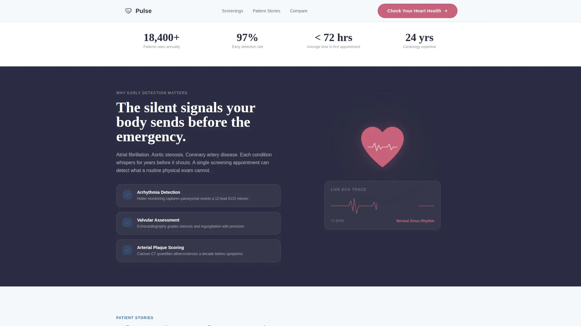
Scroll-triggered animations built with GSAP bring each section into view progressively, preventing the page from feeling overwhelming. Step-form transitions guide the visitor smoothly between self-assessment stages. The animated heart-pulse SVG in the header reinforces the cardiology context visually without relying solely on text.
Page sections overview
| Section | Purpose |
|---|---|
| Hero Self-Assessment | Opens with a three-step form to personalize the visitor's experience and surface cardiac risk context |
| Testimonial Mosaic | Pairs real patient stories with procedure cards to build trust through human proof |
| Diagnostic Comparison Table | Educates visitors on four screening types side by side so they arrive at booking informed |
| Sticky call to action Bar | Keeps the primary booking prompt visible after the comparison table without interrupting scroll |
| Footer | Provides a single-row linear footer for practice contact details and secondary navigation |
Design & branding system
The visual identity follows an Educational Guide theme using a Cloud Canvas color system. The palette is clinical without being cold, and warm without being sentimental. Typography pairs Fraunces for display headings with DM Sans for body text, creating an editorial authority that feels both medical and approachable.
- Soft cirrus white (#F4F7FA) dominates the background, giving the layout breathing room and clarity
- Calm arterial blue (#3A6EA5) structures headings, table headers, and information architecture; warm pulse rose (#C7627A) highlights calls to action and critical data points; deep diastolic charcoal (#2B2D42) grounds body text with physician-level authority
Mobile & speed optimization
The template is built desktop-first but is fully responsive across mobile screen sizes. Interactive components, including the three-step form and comparison table, adapt to smaller viewports without losing usability.
- Static page sections use server components to reduce initial load, while interactive elements such as the form, sticky bar, and animated heart graphic use client components
- GSAP animations are scoped to scroll reveals and form transitions, keeping motion purposeful and lightweight rather than decorative
How this template helps you convert
Every design decision in this template is oriented toward one outcome: turning a hesitant, at-risk visitor into a booked patient. The page earns commitment by delivering value first.
- The self-assessment form creates personal investment before any booking prompt appears. By the time the visitor reaches step three, they have already shared their risk context and feel understood, making the "Check Your Heart Health" call to action feel like a natural next step rather than an interruption.
- The comparison table removes the most common objection to booking a cardiac screening. Visitors who do not know which test they need often delay indefinitely. Seeing stress echocardiogram, calcium score, cardiac CT angiography, and Holter monitor compared side by side gives them enough confidence to act.
- The testimonial mosaic closes the trust gap by showing real outcomes from real patients. Pull-quotes and video thumbnails between table rows mean the visitor is never more than a few seconds away from a human story that mirrors their own situation.
Other information about this template
This template is designed specifically for the United States market, localized for English-language content and USD-denominated service pricing. The layout assumes a New York-based or comparable metropolitan cardiology practice context, though the structure is adaptable to other regions.
- The footer follows a linear single-row pattern, keeping the page focused on conversion rather than distributing attention across multiple footer columns
- The template supports high interactivity through a three-state form, an animated SVG heart, a sticky bar, and GSAP scroll reveals, making it suitable for practices that want a premium digital presence
- Fraunces and DM Sans are the specified typefaces; both are available as web fonts and contribute to the clinical-editorial tone without requiring custom font licensing
Theme
Educational Guide
Creative direction
Testimonial Mosaic
Color system
Cloud Canvas
Style
Comparison Table
Direction
Click-Through
Page Sections
Three-step Heart-health Self-assessment
Diagnostic Comparison Table
Testimonial Mosaic with Procedure Cards
Sticky Call-to-action Bar
Secondary Email Capture for Undecided Visitors
GSAP Scroll Reveals and Animated Heart SVG
Related questions
Who is this landing page template designed for?
What does the three-step self-assessment form include?
Which screening types does the comparison table cover?
How does the template handle visitors who are not ready to book?
Is this template a single page or a full multi-page website?



