Cardiology Medicine Professional Website Template
Pulse is a cardiology research center landing page designed around evidence-based authority and structured comparison. It combines an animated stats-first hero, scroll-triggered comparison tables for risk factors and diagnostic methods, and an eight-question heart risk assessment with a live heartbeat line animation. The Soft Mist palette and serif typography give every section the calm, clinical weight that physicians, students, and health-conscious adults expect.
by Rocket studio
Quick summary
Pulse is a single-page cardiology research center landing page built to turn complex heart health data into clear, actionable decisions. It opens with a confrontational stat, moves through animated counters and structured comparison tables, and ends at a progressive eight-question heart risk assessment. Every section is designed to build trust and guide the visitor toward a meaningful next step in their health journey.
Who this template is for
This template is built for cardiology research centers, academic medical institutions, and specialized heart care practices that need to communicate high-stakes clinical information clearly. It serves three distinct visitor types at once: the referring doctor evaluating treatment pathways for a complex patient, the medical student working through a cardiology rotation and looking for evidence-based clarity, and the health-conscious adult who just received a cholesterol reading that raised serious questions. If your work sits at the intersection of published research and patient care, this landing page was designed for you.
- Cardiology research centers and academic heart care institutions publishing peer-reviewed studies
- Referring physicians and specialist doctor teams comparing diagnostic and treatment options for complex patients
- Health-conscious adults and medical students seeking evidence-based heart health guidance
What problem this template solves
Cardiology research centers face a specific credibility challenge. Their content must satisfy the scrutiny of a senior doctor and remain accessible to a non-clinical adult in the same scroll. Most generic healthcare templates cannot hold that range. They either drown the visitor in dense jargon or oversimplify to the point of losing clinical authority. The result is a landing page that earns neither trust nor conversions. Pulse solves that gap with a narrative structure designed to escalate visitor agency, giving each person more power to understand their own heart health situation as they move down the page.
- Visitors leave before engaging because generic healthcare pages lack the structured data that a physician or informed patient needs
- Research-backed content gets buried in walls of text instead of surfaced through scannable comparison tools
- The conversion path is unclear, leaving visitors with no logical next step after reading heart care information
What you get with this template
Pulse delivers a complete, section-led landing page built specifically for a cardiology research center context. Every component in the template has a defined role in the visitor's journey from confrontation to conversion. The page does not simply present heart health information; it structures that information as a clinical tool the visitor feels entitled to use. This approach reflects a core principle in effective cardiology landing page design: the core goal is to build trust through authoritative, research-backed content while guiding visitors to a specific action.
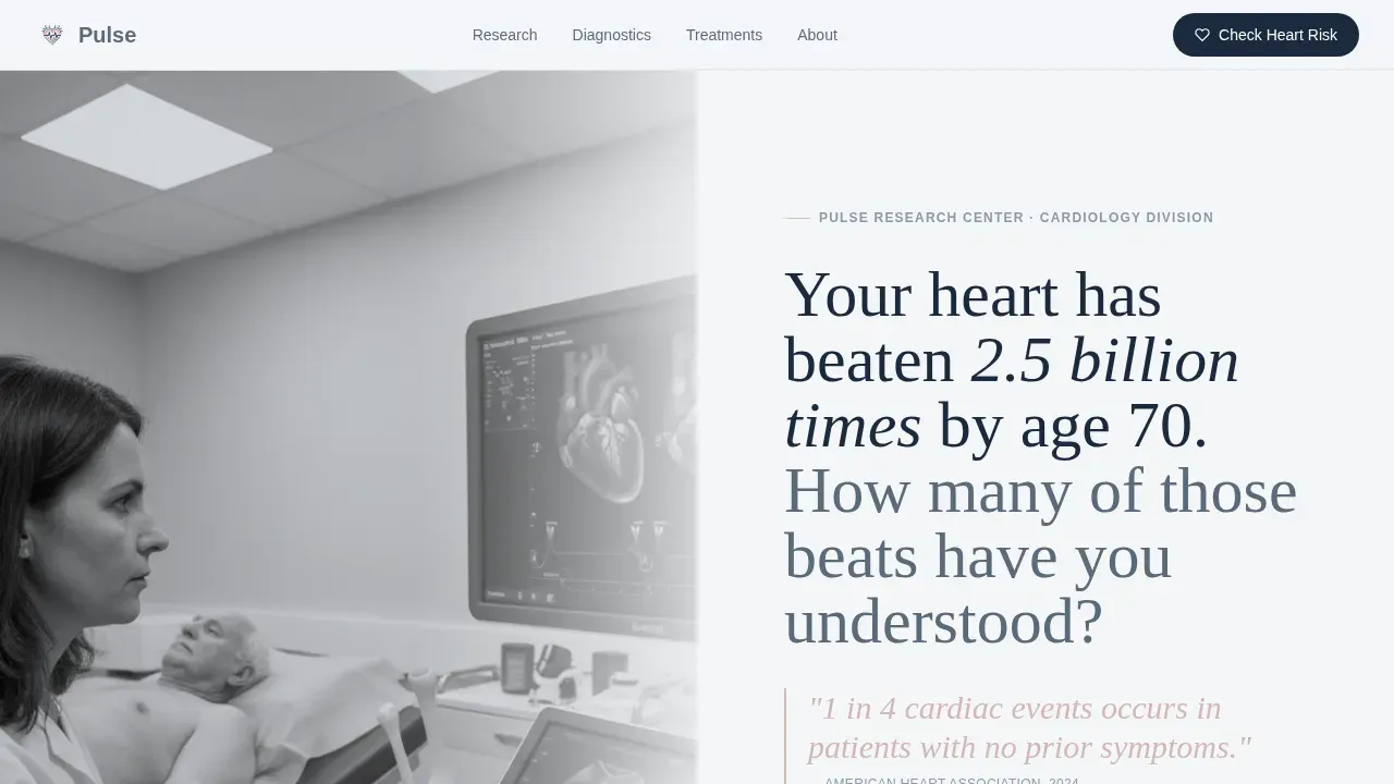
- A Half-Page Photo and Text hero with a cinematic researcher photograph, a serif headline, and a confrontational stat in arterial rose type
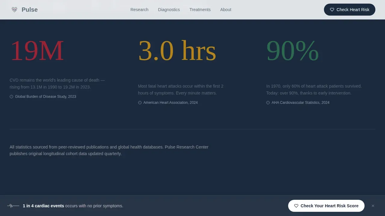
- Three scroll-triggered animated stat counters covering cardiovascular health data followed by two structured comparison tables for risk factors and diagnostic methods
- An eight-question progressive heart risk assessment with a live heartbeat line animation, a personalized risk tier output, and a secondary research digest signup path
Feature list
A landing page for a cardiology research center carries more functional weight than a standard clinic page. The following features are built directly into this template and reflect the full scope described in the source brief.
Half-Page Cinematic Hero Section
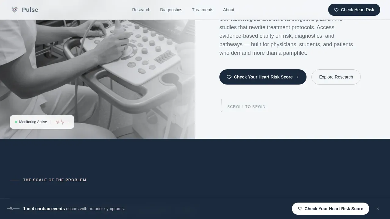
The hero uses a Half-Page Photo and Text layout. The left side holds a desaturated, tightly cropped photograph of a researcher adjusting an echocardiograph probe, with the monitor waveform softly blurred behind the gel. The right side presents a clean serif headline set in Fraunces, followed by a single oversized stat in arterial rose type and a subtle downward arrow. Critical heart health information is visible without scrolling, which aligns with best practices for cardiology clinic landing page design: the hero section must contain the most important content above the fold.
Animated Stats Counter Section
Three scroll-triggered animated counters follow immediately below the hero. Each counter ticks upward as it enters the viewport, surfacing data on global cardiovascular deaths per year, average delay in minutes before seeking emergency care, and survival rate improvement with early heart intervention. This Stats-First Impact direction sets the tone for the page: the visitor is confronted with the weight of heart care decisions before they are asked to make one.
Scroll-Reveal Comparison Tables
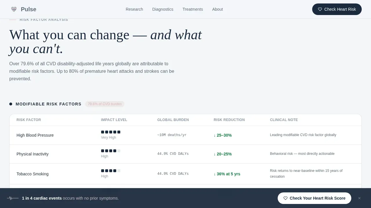
The template includes two structured comparison tables, each built to reveal rows on scroll. The first table compares modifiable and non-modifiable cardiac risk factors side by side. The second table compares three diagnostic methods, specifically stress test, coronary computed tomography angiography (CCTA), and cardiac magnetic resonance imaging (MRI), with accuracy percentages, cost ranges, and invasiveness ratings set next to each other. A third section covers treatment pathway comparisons for common cardiac conditions. These tools give a doctor or an informed patient the structured data they need to follow clinical reasoning clearly.
Eight-Question Progressive Heart Risk Assessment
The primary call to action is a progressive assessment that opens with a single low-friction question about age range and then discloses seven more questions in sequence. The questions cover resting heart rate, family history of cardiac events, smoking status, last cholesterol reading, weekly exercise minutes, blood pressure awareness, and current medications. A heartbeat line animation runs along the form's edge and subtly adjusts with each answer. On completion, the visitor receives a personalized risk tier: low, moderate, or elevated, with a recommendation to download the center's published guidelines or schedule a consultation. Forms for lead capture like this work best when they feel purposeful rather than administrative, and this assessment is designed to feel like a clinical tool.
Persistent and Full-Width Call-to-Action System
The primary call to action, "Check Your Heart Risk Score," appears twice. It first activates as a persistent bottom bar after the animated stat counters, ensuring that visitors who are ready to act can do so at any point during their scroll through the comparison tables. It then reappears as a full-width section after the final comparison table. This dual-placement approach keeps the conversion path clear without repeating the same visual block in a way that feels mechanical.
Secondary Research Digest Signup Path
A second conversion path, "Get the Study Before the Headline," targets visitors who are not yet ready to complete the assessment but are willing to stay connected to the research center. This path asks only for an email address, consistent with best practices that lead capture forms should request only essential information. It serves as a lower-commitment entry point that keeps the visitor in the center's orbit while they continue to process their heart health questions.
Page sections overview
| Section | Purpose |
|---|---|
| Hero Photo and Text | Opens the page with a cinematic researcher image, serif headline, and a confrontational heart health stat |
| Animated Stat Counters | Delivers three scroll-triggered counters surfacing cardiovascular health data to set the stakes |
| Risk Factor Table | Compares modifiable and non-modifiable cardiac risk factors row by row with scroll-reveal animation |
| Diagnostic Methods Table | Places stress test, CCTA, and cardiac MRI side by side with accuracy, cost, and invasiveness data |
| Treatment Pathways Section | Outlines comparison of common cardiac condition treatment approaches |
| Heart Risk Assessment | Presents the eight-question progressive quiz with heartbeat line animation and personalized risk output |
| Research Digest Signup | Offers a low-commitment secondary conversion path for visitors not ready to assess |
| Linear Footer | Closes the page with a single-row footer layout |
Design & branding system
The visual identity follows an Educational Guide theme built around the Soft Mist color system. The palette is designed to feel like morning light diffusing through frosted glass in a teaching hospital corridor. Every color choice reinforces calm authority. No element shouts. Each hue quietly signals competence and clinical precision. Typography pairs Fraunces, a clean serif face, for all headings with DM Sans for body text, creating a balance between academic weight and readable clarity. Visual elements such as images of healthcare professionals are a proven way to enhance engagement on cardiology clinic landing pages, and the hero photograph is designed to deliver exactly that effect.
- Clinical fog white (#F4F6F8) and arterial pale rose (#E8D5D3) serve as page backgrounds, keeping the reading environment clean and unhurried
- Steady-state slate (#5B6B7A) carries all body text, while deep vascular navy (#1B2A3D) anchors section headers, table borders, and interactive states
- The arterial rose accent is used for the primary confrontational stat in the hero and for key call-to-action highlights, drawing the eye without disrupting the clinical calm
Mobile & speed optimization
The template is designed desktop-first because its primary audience, physicians reviewing clinical comparison data, most often works on a larger screen. However, the layout is fully responsive and adapts to mobile devices without losing the integrity of the comparison tables or the assessment flow. This matters because over 60% of searches are conducted on mobile devices, and 53% of mobile users leave a page that takes more than three seconds to load. The static sections of this landing page are built as Server Components to keep initial load fast, while the interactive assessment is scoped as a Client Component to isolate its rendering cost.
- All comparison tables reflow cleanly on smaller screens, preserving the column structure that makes heart care data readable
- The persistent bottom bar call to action is sized and spaced for thumb interaction on mobile, ensuring the assessment entry point is always reachable
- The heartbeat line SVG animation is performance-scoped to avoid layout shifts on mobile, keeping the experience smooth across devices
How this template helps you convert
A landing page for a cardiology research center has two types of visitors: those who are ready to act and those who need more information before they trust the source. This template is designed to serve both, using a dual-path conversion model that meets each visitor where they are in their heart health decision process. Credibility is paramount in specialized medicine, and every structural choice in this template is made to reinforce that credibility before asking for any commitment.
- The Stats-First Impact direction confronts visitors immediately with the real weight of cardiovascular health decisions, which creates the emotional context that makes the assessment feel necessary rather than promotional. The primary call to action appears as a persistent bar the moment those counters complete, so visitors who are ready can act without scrolling further.
- The comparison tables function as a clinical tool that builds the case for the assessment through structured data. Each row reveal adds a layer of insight, and by the time the visitor reaches the full-width assessment call to action at the end of the table sequence, they have already invested in understanding their own heart health risk.
Other information about this template
This section covers additional context that helps teams understand how the Pulse evidence based cardiology research center landing page template fits within a broader healthcare and cardiology publishing landscape.
Presentation templates can help create professional presentations related to health and cardiology topics, and the same principles of structured clarity that make a presentation effective also apply to a landing page for a research center. Using templates tailored to specific health topics enhances the effectiveness of communication and can save significant time during production. No-code solutions allow teams to create and customize these templates without technical skills, which is an important practical benefit for healthcare organizations. AI-powered tools can assist in generating and refining templates for health and cardiology contexts, though the core structure and clinical framing in this template are built from the source brief.
Cardiology website themes and templates can enhance the online presence of healthcare providers. Using cardiology-specific themes improves user experience and engagement on healthcare websites. Healthcare providers can choose from a variety of cardiology website templates to suit their specific needs, and templates for cardiology websites can be customized to reflect the branding and style of the individual provider or research center.
The cardiology research landscape is evolving rapidly. The American College of Cardiology and the American Heart Association have released updated guidelines for managing adults with congenital heart disease. Research on the genetic contributions to dilated cardiomyopathy aims to establish a comprehensive genetic map to improve patient risk evaluation. The use of artificial intelligence (AI) in cardiology is being explored to enhance patient care and improve outcomes through innovative technologies. The INFUSE HFpEF study will explore the use of intravenous iron in heart failure with preserved ejection fraction (HFpEF) patients. A first cardiac contractility modulation device was implanted at a major university hospital to treat a heart failure patient. Research into heart regeneration and the loss of cardiomyocyte proliferation after birth continues to attract fellowship support. These developments represent the kind of evidence-based cardiology work that a research center landing page like Pulse is designed to communicate clearly and credibly to every visitor, whether they are a senior doctor, a student, or a health-conscious adult taking their first serious look at heart health.
- The template is designed to announce new research publications, updated clinical guidelines, and center milestones through the content sections already built into the layout
- Reporting on heart health data through structured comparison tables gives every visitor, from physician to patient, a shared vocabulary for discussing heart care decisions
- The secondary digest signup path supports ongoing feedback loops between the research center and its audience, helping the center stay connected to visitors who are not yet ready to convert
- Teams looking to streamline the process of publishing new cardiology studies can use the comparison table sections to announce findings in a format that is immediately readable by both clinical and non-clinical audiences
- The pharmacy and prescription medication question included in the eight-question assessment acknowledges that many patients managing cardiovascular risk are already taking medications, and this insight is captured as part of the personalized risk tier output
- The page is designed to work within a US English context with USD pricing references and US date formatting, ensuring the content and any linked clinical guidelines follow the appropriate localization standard
- Consulting teams and academic publishing departments can adapt the comparison table structure to highlight different diagnostic tools, treatment protocols, or research findings as the center's publication portfolio grows
Theme
Educational Guide
Creative direction
Stats-First Impact
Color system
Soft Mist
Style
Comparison Table
Direction
Quiz/Assessment
Page Sections
Cinematic Half-page Hero with Clinical Stat
Scroll-triggered Animated Stat Counters
Dual Scroll-reveal Comparison Tables
Progressive Eight-question Heart Risk Assessment
Dual-path Conversion System
Soft Mist Clinical Design System
Related questions
Who is this landing page template designed for?
What sections are included in this template?
Can the comparison tables be updated with different cardiology data?
How does the eight-question heart risk assessment work?
Is this template suitable for both desktop and mobile visitors?



