Cardiology Medicine Comparison Website Template
Pulse is a cardiology patient education landing page template built for health platforms that need to earn trust fast. It pairs an award-badge hero, an animated comparison table, and a transparent editorial process section to turn clinical complexity into plain-language understanding. The result is a focused, evidence-led page that moves confused patients toward a free condition library.
by Rocket studio
Quick summary
Pulse is a single-page template for cardiology patient education platforms. It opens with clinical trust badges, moves through an evidence-led comparison table, and closes with a guided condition selector. Every section is designed to replace confusion with clarity, giving newly diagnosed patients and busy cardiologists a fast path to plain-language cardiac explanations.
Who this template is for
This template is built for health and medical teams who need to communicate complex cardiac information to people who are anxious, time-pressed, or searching for answers at midnight on a phone. It works equally well for patient-facing platforms and clinician tools.
- Newly diagnosed heart patients looking for clear explanations of their echocardiogram results, valve conditions, or arrhythmia diagnosis
- Cardiologists and care teams who want a shareable, visually clear education resource they can point patients toward before or after appointments
- Adult children and caregivers researching cardiac conditions on behalf of a parent or family member from a distance
What problem this template solves
Standard hospital discharge paperwork is dense, written at a high reading level, and rarely leaves patients feeling confident about what happens next. Patients leave appointments with unanswered questions and turn to unreliable sources online. This template gives cardiology education platforms a structured way to demonstrate that their approach is genuinely different.
- Patients cannot easily compare the clarity of a visual education platform against a printed discharge summary without a side-by-side proof point
- Cardiologists have limited appointment time and need a credible, ready-made resource they can trust and share
- Caregivers searching remotely have no single, authoritative starting point that speaks to their specific role
What you get with this template
You get a complete, single-page layout built around one core conversion goal: moving visitors into a free cardiac condition library without friction. Every section earns trust before asking for anything in return.
- A hero section with an award-badge array, deep navy headline, and GSAP ScrollTrigger reveal animation
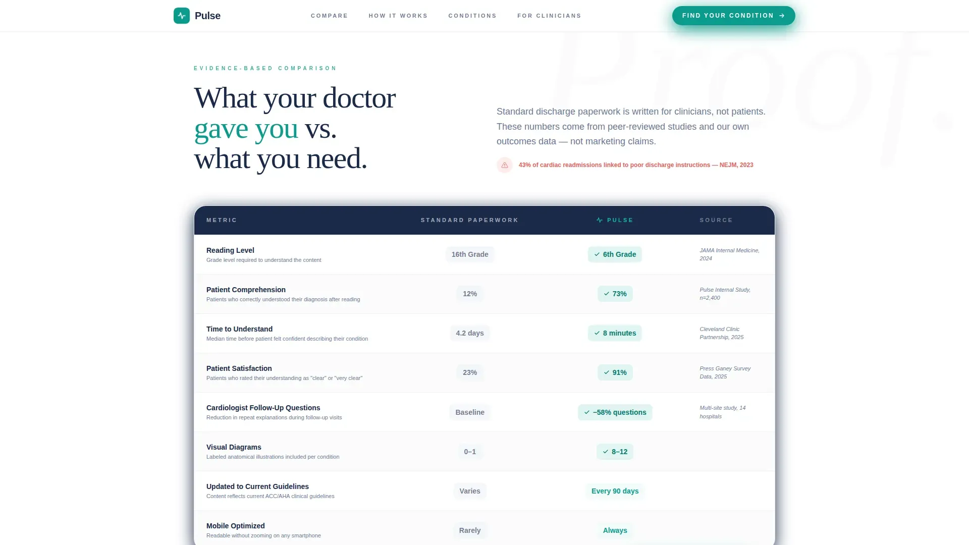
- An animated comparison table contrasting the platform against standard discharge paperwork across reading level, comprehension rate, time to understand, and patient satisfaction
- A four-stage transparent editorial pipeline section, a condition library preview with an interactive category selector, and a testimonials section with hospital logos
Feature list
This template includes the following built-in capabilities, each grounded in the project brief.
Award-Badge Hero Section
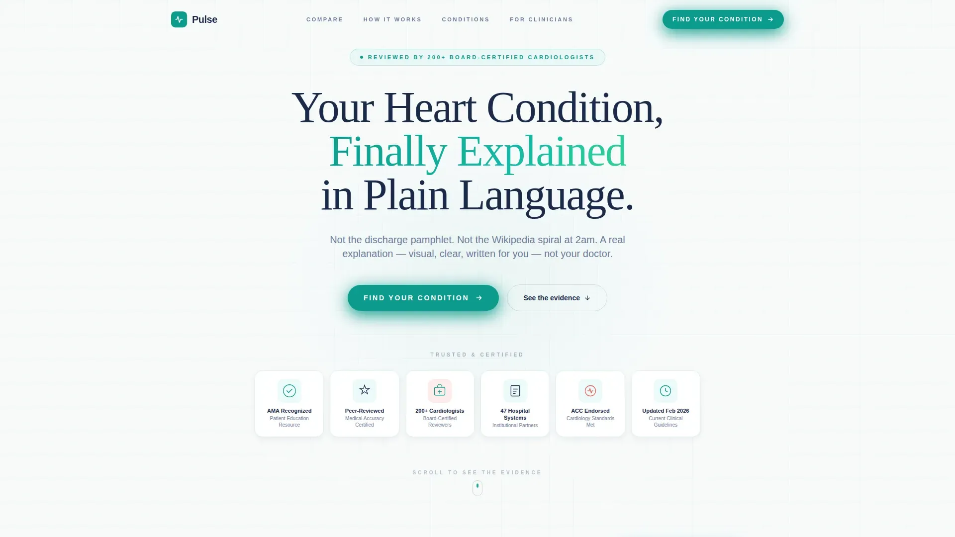
The hero opens with an array of trust markers rendered with subtle dimensional shadows that feel stamped and embossed. These include recognition seals, peer-reviewed accuracy certifications, hospital system partnership logos, and a "Reviewed by 200+ Board-Certified Cardiologists" trust mark. A single deep-navy headline anchors the section without any stock photography.
Animated Comparison Table
The comparison table places the platform's visual explanations directly beside standard discharge paperwork. Each row covers a different metric, including reading level, comprehension rate, time to understand, and patient satisfaction score. Rows animate into view using GSAP ScrollTrigger stagger reveals, letting the evidence build as the visitor scrolls.
Transparent Editorial Pipeline
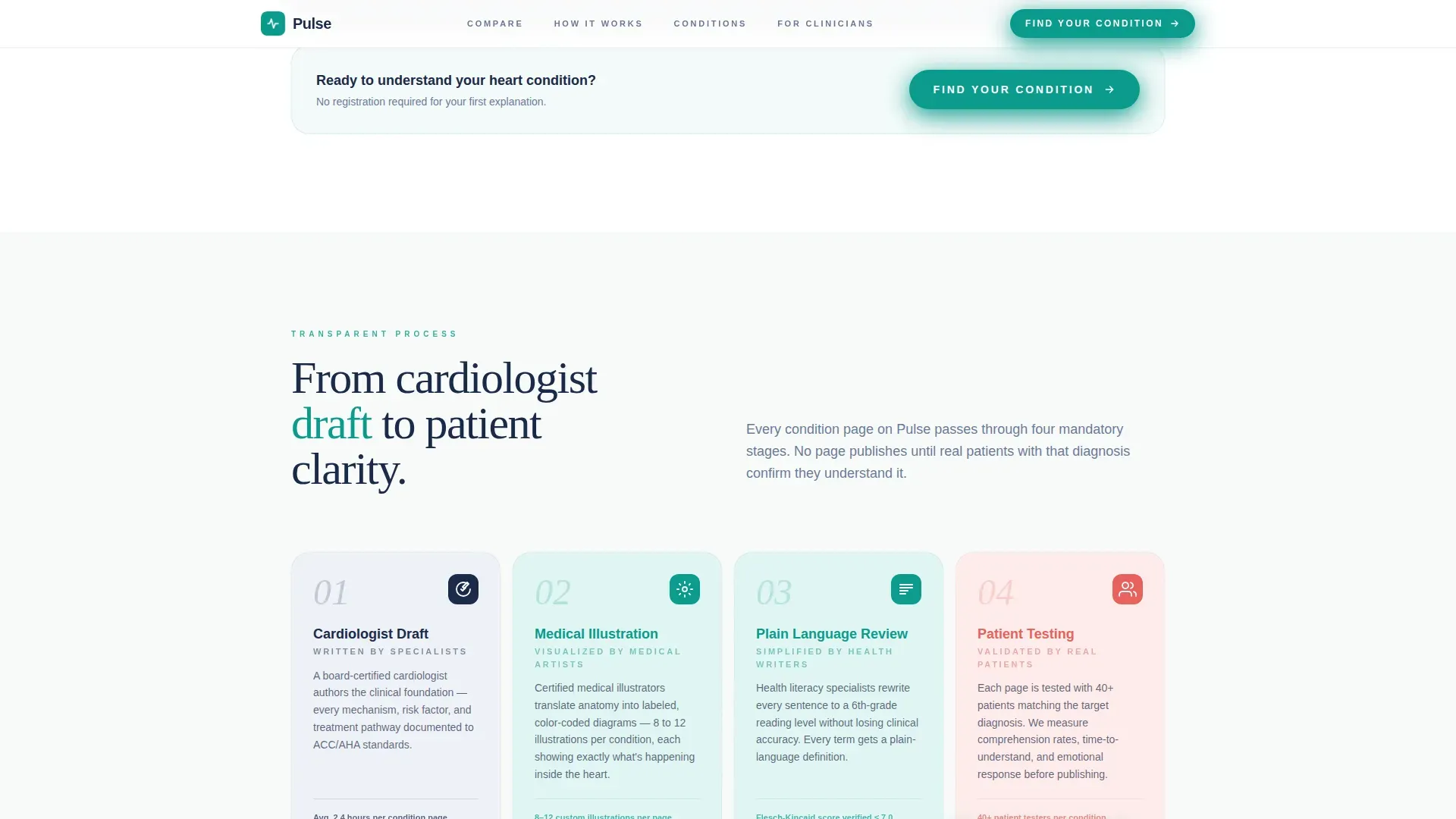
A four-stage process section shows exactly how a condition page moves from cardiologist draft to medical illustration to plain-language review to patient testing. Each stage is displayed side by side, building a case through evidence rather than emotion. This section is a key trust anchor for both patients and clinical partners.
Interactive Condition Selector
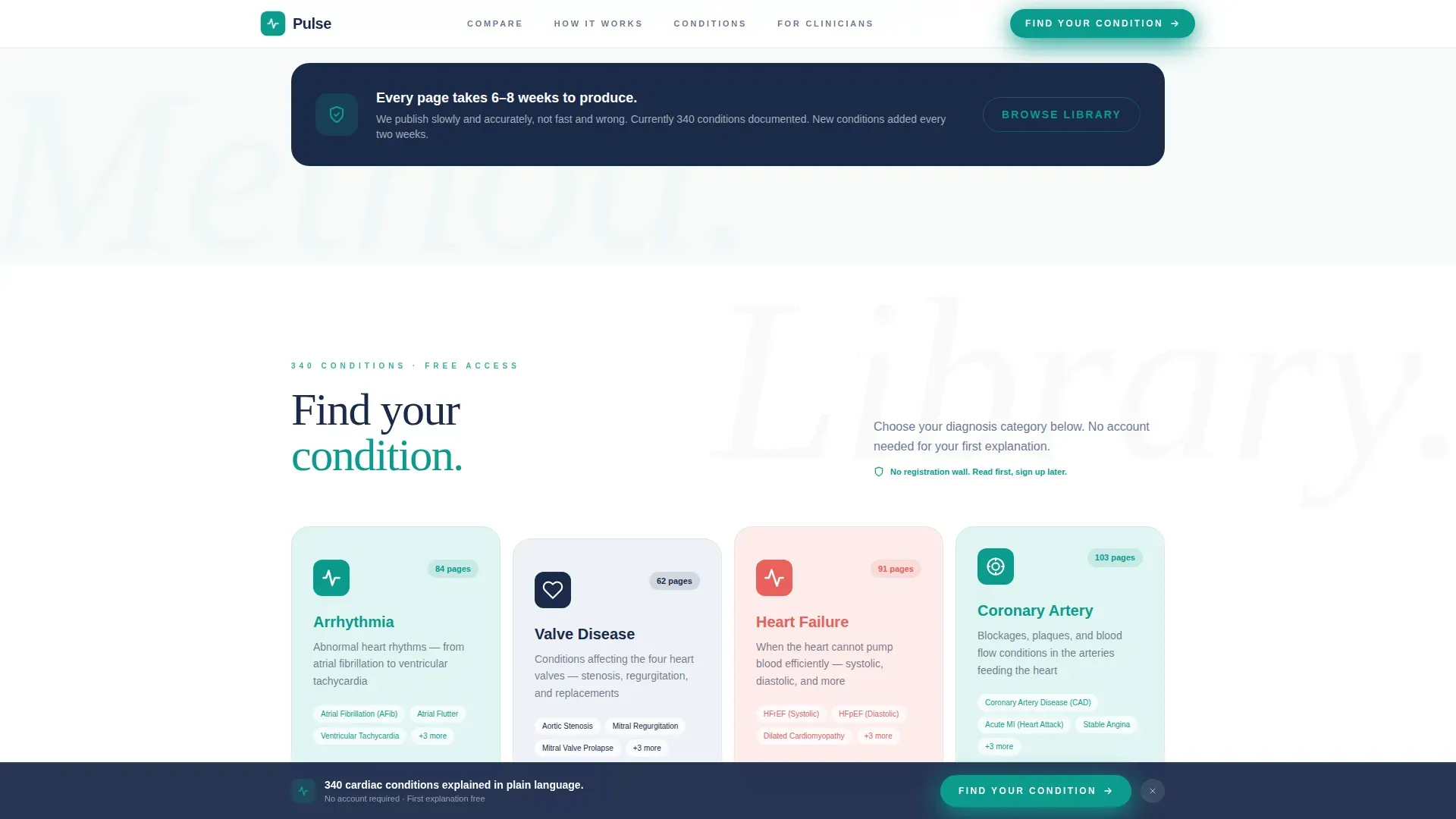
The condition library preview includes a guided selector that lets visitors choose a diagnosis category, such as arrhythmia, valve disease, heart failure, or coronary artery disease, then narrow to a specific condition and select whether they are the patient or a caregiver. No registration is required before reading the first full explanation.
Persistent Call-to-Action Bar
After the midpoint of the page, a persistent bottom bar keeps the primary call to action visible without interrupting the reading experience. The button reads "Find Your Condition" and appears first beneath the comparison table, then stays anchored at the bottom as visitors continue scrolling.
Social Proof with Specificity
The testimonials section pairs named patient testimonials with hospital system logos, giving the social proof section both emotional resonance and institutional credibility. Cardiologist count, comprehension study data, and hospital partnerships are all surfaced in this section.
Page sections overview
| Section | Purpose |
|---|---|
| Hero Badge Array | Establish clinical authority with trust seals and the primary headline before any content is read |
| Animated Comparison Table | Prove platform superiority over standard discharge paperwork using animated, data-driven rows |
| Editorial Process Pipeline | Show the four-stage content creation process to build evidence-based trust with patients and clinicians |
| Condition Library Preview | Let visitors explore diagnosis categories interactively and find their specific condition without a registration wall |
| Testimonials and Logos | Reinforce credibility with named patient testimonials and recognizable hospital system partnerships |
| Footer | Provide a clean single-row navigation baseline to close the page |
Design & branding system
The visual identity follows an Educational Guide theme built on the Teal Catalyst color system. The overall feeling is clinical calm, similar to a consultation room rather than an emergency ward. Warmth comes through the serif headline typeface, and clarity comes through the clean open layout.
- Colors: clinical teal (#0D9B8C) for primary actions and trust anchors, deep vascular navy (#1B2A4A) for headings and body text, oxygenated white (#F7FAFA) for open background spaces, and cardiac coral (#E8615D) reserved for urgent callouts and interactive highlights only
- Typography: Plus Jakarta Sans is used for body text and user interface elements; Fraunces, a warm serif, is used for headings to add consultation-room approachability
- Animation system: GSAP ScrollTrigger drives clip-path reveals, staggered row animations, and marquee effects throughout the page
Mobile & speed optimization
This template is built mobile-first, reflecting the reality that most patients search for cardiac information on a smartphone late at night. The layout and interaction model are designed to function clearly on small screens before scaling up to desktop views for clinical users.
- Mobile-first layout ensures the comparison table, condition selector, and persistent call-to-action bar are all fully usable on a phone screen without horizontal scrolling or pinching
- Server Components handle static sections such as the hero and testimonials, while Client Components power the interactive condition selector and GSAP animations, keeping the heaviest rendering work targeted and controlled
How this template helps you convert
The entire page flow is designed as a click-through funnel toward one action: entering the free condition library. Conversion is built through earned trust rather than pressure.
- The hero badge array and comparison table deliver clinical credibility in the first scroll, so visitors are already convinced before they reach the call to action beneath the table
- The no-registration-wall policy means visitors enter the condition library immediately after clicking "Find Your Condition," experiencing the platform's value before being asked to create an account
Other information about this template
This template is suited for health and medical platforms operating in the cardiology medicine space, particularly those serving both direct patients and clinical partners in a business-to-consumer and business-to-business-to-consumer model. A few additional details worth noting before you build.
- The footer follows a linear single-row pattern, keeping the page close clean and uncluttered after a content-dense scroll journey
- Localization defaults are set for English (United States), with date formatting in the MM/DD/YYYY convention and currency in USD where applicable
- The page is structured so that account creation is prompted only after a visitor has read their first full condition explanation, reducing drop-off from premature registration walls
- The condition selector covers four primary diagnosis categories: arrhythmia, valve disease, heart failure, and coronary artery disease, with a patient-or-caregiver context option at the final step
Theme
Educational Guide
Creative direction
Transparent Process
Color system
Teal Catalyst
Style
Comparison Table
Direction
Click-Through
Page Sections
Award-badge Hero with Trust Anchors
Animated Comparison Table
Four-stage Editorial Pipeline Display
Interactive Condition Library Selector
Persistent Bottom Call-to-action Bar
Social Proof Section with Named Testimonials
Related questions
Who is the primary audience for this template?
Does this template require visitors to register before accessing content?
What sections are included in this landing page?
What animation technology does this template use?
Can cardiologists and clinical teams use this template too?



