Employee Wellness & Benefits Booking Website Template
Pulse is a bold, modular landing page template crafted for corporate fitness programs. It uses a card grid design to teach the financial cost of workplace inactivity before asking visitors for anything. Built for HR directors, operations leads, and executives, Pulse guides every visitor from cold data to a booked pilot week through a five-step interactive assessment.
by Rocket studio
Quick summary
Pulse is a single-page landing template built for corporate wellness programs. It leads with a giant, data-driven headline, then teaches the business case for fitness through layered stat cards. A five-question interactive assessment sits at the heart of the conversion flow, delivering a personalized cost estimate before asking for contact details.
Who this template is for
This template is perfect for operators bringing structured fitness services directly into the workplace. It speaks the language of business outcomes, not gym culture, making it the right fit for:
- Corporate wellness coaches and personal trainers pitching on-site fitness programs to mid-size and enterprise employers
- HR directors and operations leads who need to present a clear return on investment to budget holders
- Fitness studios and gyms expanding their services into the corporate wellness category
What problem this template solves
Most fitness landing pages are built for consumers. They show energy, lifestyle images, and class schedules. Corporate decision-makers need something different. They need numbers, trust, and a reason to act today. This template solves that gap.
- It replaces vague wellness messaging with cited stat cards that highlight the financial cost of inactivity
- It removes friction by leading with a low-stakes quiz instead of a hard contact form
- It builds the business case progressively, widening from individual impact to team-level and then org-wide results
What you get with this template
You get a fully structured, modular landing page designed for one goal: booking a pilot week. Every section is a self-contained proof module, ensuring clarity at every scroll depth.
- A charcoal-based card grid layout with bold coral calls to action, cyan metric highlights, and chalk white breathing room
- A five-step interactive quiz with a coral progress bar, results calculator, and a gated final report
- A sticky mid-page call-to-action bar, a closing full-width assessment module, and a linear single-row footer
Feature list
This template is crafted around a specific set of design and content decisions. Each feature serves the conversion goal directly.
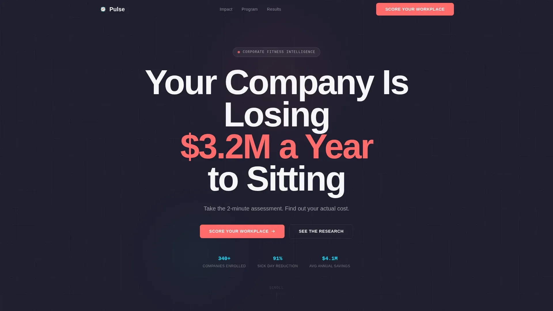
Giant Pulsing Hero Headline
The landing page opens with a single bold headline on a deep charcoal field. The dollar figure renders in electric coral and pulses once on load, creating an immediate physical reaction. A chalk white subline invites visitors to take a two-minute assessment, setting up the quiz from the first second.
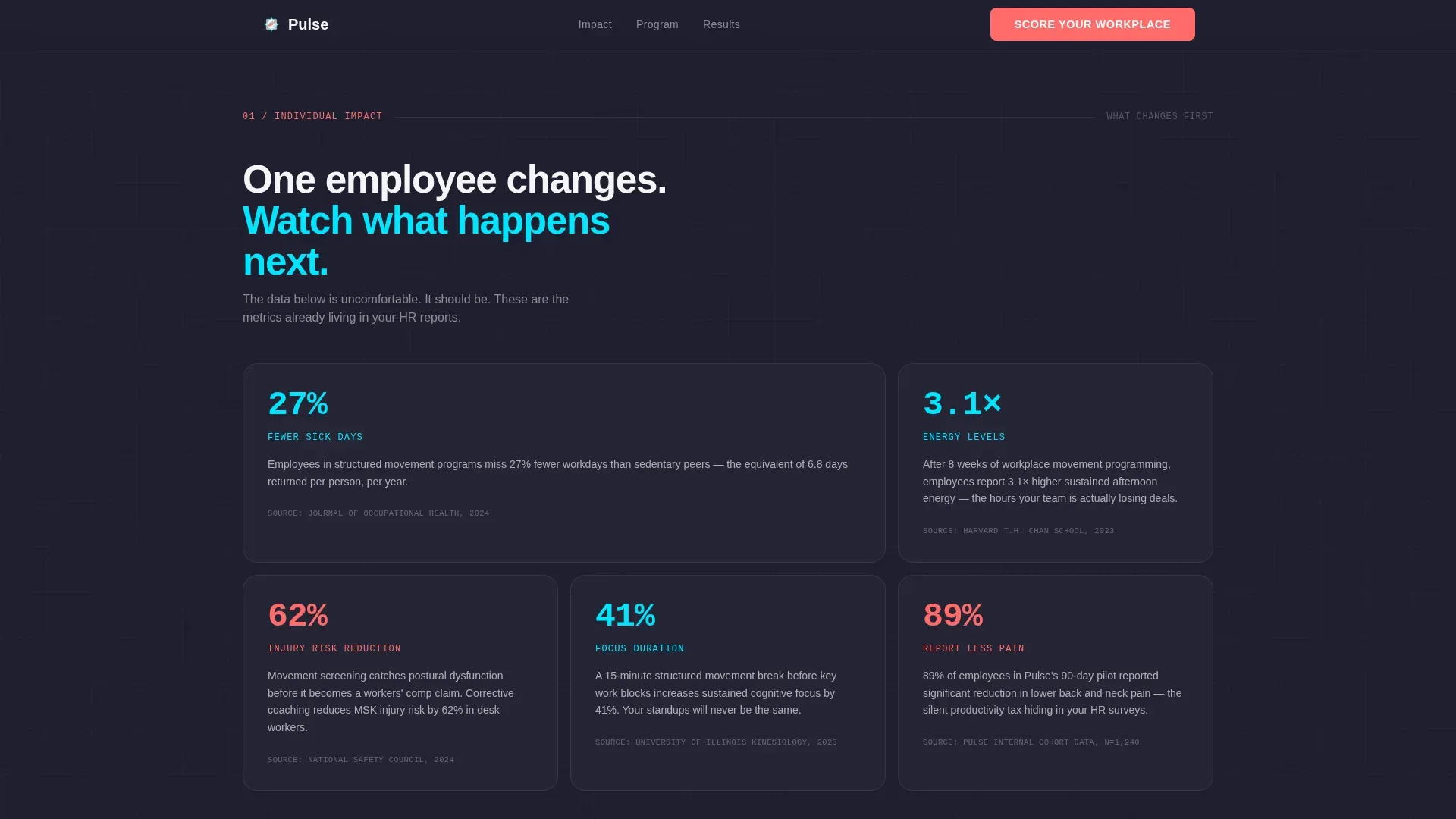
Modular Stat Card Grid
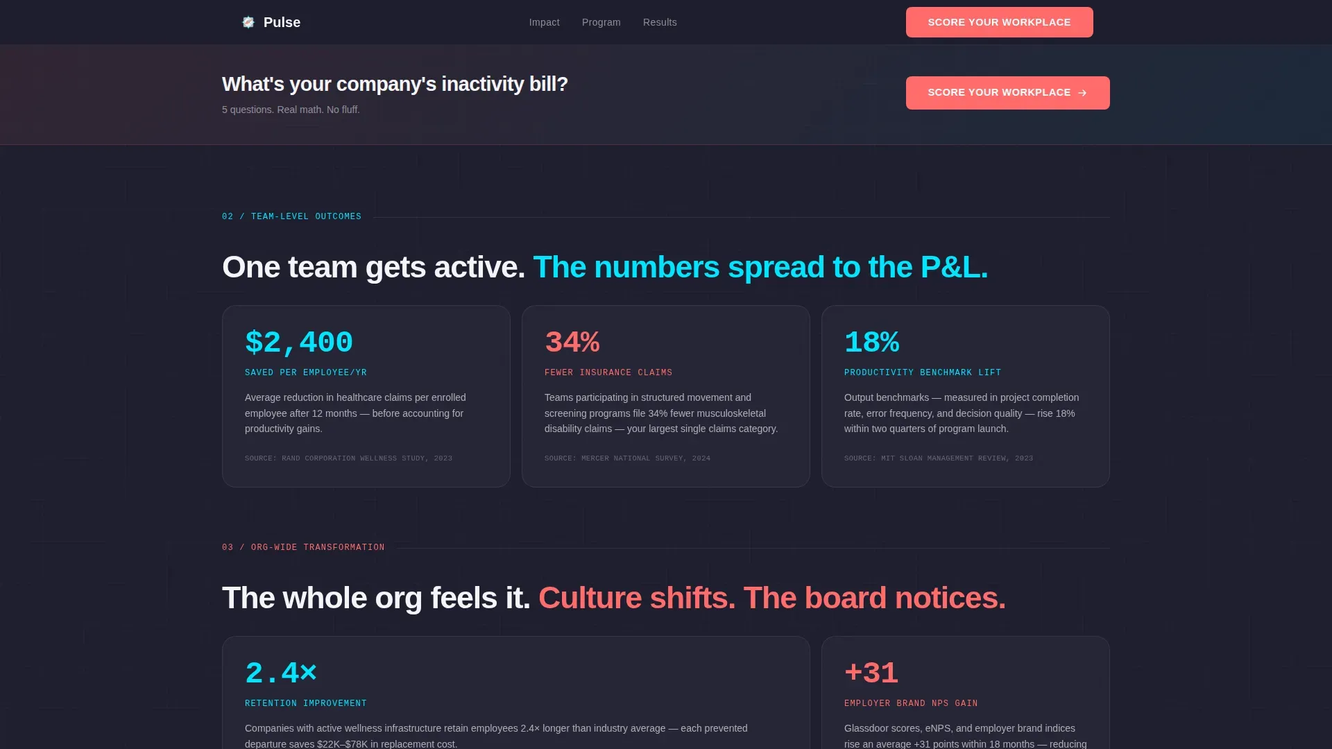
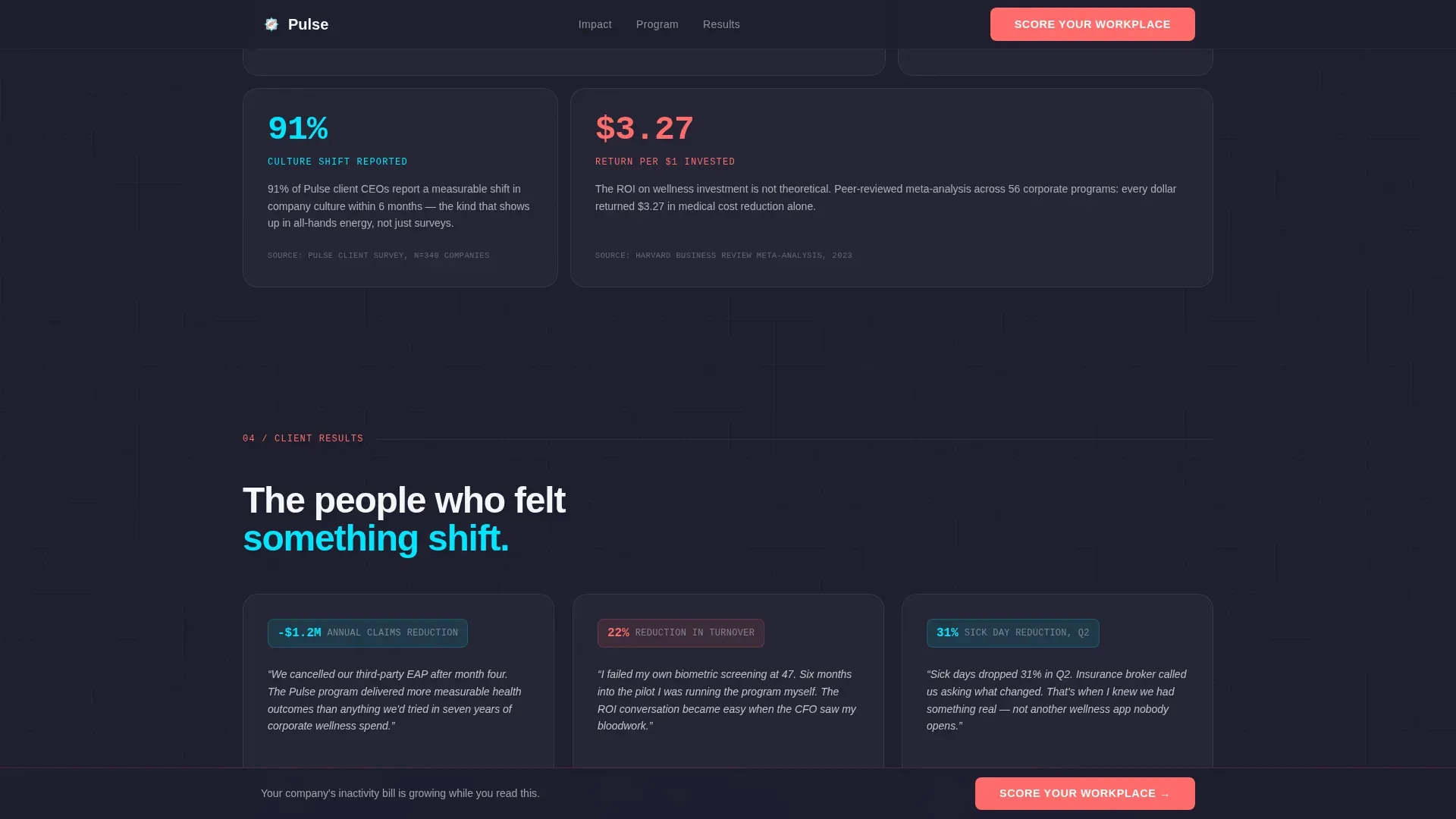
Three rows of bento-style cards build the business case in stages. Individual impact cards cover absenteeism, energy levels, and injury risk. Team-level cards highlight productivity benchmarks and insurance claim trends. Org-wide cards address retention lifts and employer brand scores. Each card holds a cyan stat, a one-sentence explanation, and a source citation in monospaced type.
Animated Network Connection Lines
As visitors scroll, faint SVG connection lines draw between cards, visualizing how one employee's participation ripples outward. This Network Effect creative direction makes the business case feel alive and interconnected rather than static.
Five-Step Interactive Assessment
The quiz opens with the lowest-friction question first and progresses through five screens, each with a coral progress bar. Results deliver a personalized cost-of-inactivity estimate and a recommended program tier. The final screen gates the full report behind a work email and company size field, capturing qualified leads with minimal friction.
Strategically Placed Calls to Action
The primary call to action, "Score Your Workplace," appears after the first card row, again as a sticky bottom bar after the second row, and as a full-width closing module. This placement guides visitors toward action at every natural decision point without interrupting the educational flow.
Dopamine Pop Color and Typography System
The design uses DM Sans at weight 800 for bold headings and JetBrains Mono for stat citations, ensuring clarity and clinical trust simultaneously. The Dopamine Pop palette combines deep charcoal, electric coral, vivid cyan, and chalk white to create a sleek, high-energy visual identity that feels modern without sacrificing credibility.
Page sections overview
| Section | Purpose |
|---|---|
| Hero Headline | Delivers bold cost claim and assessment prompt |
| Individual Impact Cards | Shows absenteeism, energy, and injury data |
| Mid-Page call to action Bar | Sticky prompt to score the workplace |
| Team Level Cards | Highlights productivity and insurance outcomes |
| Org-Wide Cards | Covers retention, brand scores, culture shifts |
| Quiz Assessment Module | Five-step interactive cost calculator |
| Linear Footer Row | Contact and program navigation links |
Design & branding system
Pulse fitness uses a carefully considered color system that balances clinical authority with kinetic energy. The design feels like a modern gym dashboard rather than a generic wellness brochure.
- Color palette: deep charcoal (#1E1E2E) as the base, electric coral (#FF6B6B) for calls to action, vivid cyan (#00E5FF) for metrics, and chalk white (#F5F5F7) for spacing and legibility
- Typography: DM Sans at weight 800 for headlines and body, JetBrains Mono for stat source citations, creating a clean design that highlights data with precision
- Animation layer: pulse keyframe on the hero figure, scroll-triggered card reveals, spotlight card hover states, and SVG draw animations for connection lines
Mobile & speed optimization
The template is designed desktop-first for HR directors reviewing pages at their desks, but it is fully responsive across every screen size. Every card, quiz step, and call-to-action adapts cleanly to smaller viewports.
- All card grid rows reflow gracefully on tablet and mobile, ensuring no stat or citation gets clipped on any device
- The quiz component is built as a client-side module, keeping static cards fast while allowing the interactive assessment to perform smoothly
- Scroll-reveal animations and SVG draw effects are designed to remain smooth without blocking content on any device
How this template helps you convert
Pulse fitness is built on a teach-first, sell-second philosophy. Every design decision supports the conversion goal by earning trust before asking for commitment.
- The stat card sequence builds an undeniable financial argument across three scroll depths, so visitors arrive at the quiz already convinced the problem is real
- The five-step assessment creates a personalized experience, making visitors feel the results are specific to their organization before they submit any contact details
- Multiple strategically placed calls to action ensure visitors who are ready to act early can do so, while those who need more context are still guided toward booking a pilot week
Other information about this template
The Pulse corporate fitness program landing page template is designed to support the full range of corporate wellness services, from on-site classes and movement screening sessions to virtual coaching and habit architecture programs. Personal trainers and coaches who run structured corporate fitness programs will find the card grid style flexible enough to adapt to their own program description and brand voice.
- The template supports fitness tips content in stat card descriptions, allowing coaches to deliver value before the sales conversation begins
- Pages are built with reusable components, making it straightforward to manage content changes without rebuilding the layout
- The template is crafted to work alongside tools like Google Analytics to track visitors and measure landing page performance over time
- Site owners can customize color tags, swap images, and update card content to align with their fitness brand and unique value proposition
- Dedicated contact sections and a clean footer support potential clients who want to reach out directly rather than through the quiz flow
- The template can also support a blog or store link in the footer, giving visitors access to additional resources without cluttering the main conversion path
- Success stories and client testimonials can be added as card modules, allowing coaches to share feedback and social proof from existing programs
- Personal trainers and gyms entering the corporate fitness category will find the Educational Guide style supports trust-building at every scroll stage
Theme
Educational Guide
Creative direction
Network Effect
Color system
Dopamine Pop
Style
Card Grid (Modular)
Direction
Quiz/Assessment
Page Sections
Giant Pulsing Hero Headline
Modular Stat Card Grid
Animated Network Connection Lines
Five-step Interactive Assessment
Strategically Placed Calls to Action
Dopamine Pop Design System
Related questions
Can personal trainers use this template for corporate pitches?
How does the five-step quiz work?
Can I update the stat cards with my own data?
Does the template include a contact section?
Is this template suitable for gyms expanding into corporate wellness?


