Fitness Studio Pricing Website Template
Pulse is a bento grid landing page template built for fitness studio directories. It pairs a Stats/Metrics header wall with a Feature Matrix comparison engine, letting visitors filter studios by format, price, class size, and vibe. The Void & Violet color system gives it a dark, electric feel that matches the energy of the studios it showcases.
by Rocket studio
Quick summary
Pulse is a single-page bento grid template designed for fitness studio discovery blogs. It opens with a full-width data dashboard, drops visitors straight into a comparison engine, and closes with a personalized quiz that surfaces a top-three studio match. The design is dark, punchy, and built for people who already know what they want but need a faster way to find it.
Who this template is for
This template is built for fitness content creators and directory publishers who want their page to work as hard as the people they write about. It suits anyone running a multi-studio review blog or a neighborhood fitness guide.
- Class-hoppers and credit-jugglers who browse multiple studios per month
- Newcomers overwhelmed by too many Reformer Pilates or cycling options in one area
- Seasoned gym-goers hunting specific equipment or training environments
What problem this template solves
Finding the right fitness studio online usually means jumping between a dozen half-updated websites, reading promotional copy, and guessing at real class sizes. Pulse solves that by putting all comparison data on one scrollable page with an interactive filter system.
- Visitors can compare studios side by side without leaving the page
- Vague studio marketing gets replaced by spec rows: price, class size, shower rating, vibe tag
- New visitors get a guided quiz instead of an overwhelming list of options
What you get with this template
You get a structured, interaction-led landing page that doubles as a studio comparison engine. Every section has a clear job, from the opening metrics wall to the sticky quiz bar at the bottom.
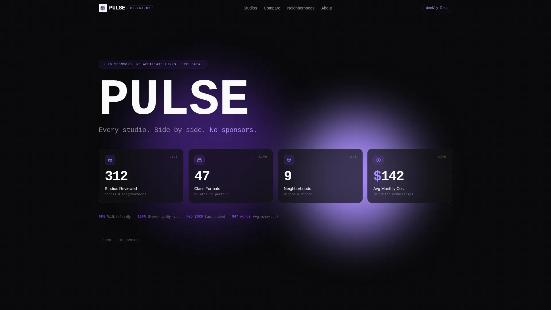
- A full-width Stats/Metrics header with four animated bento tiles and a bold mono headline
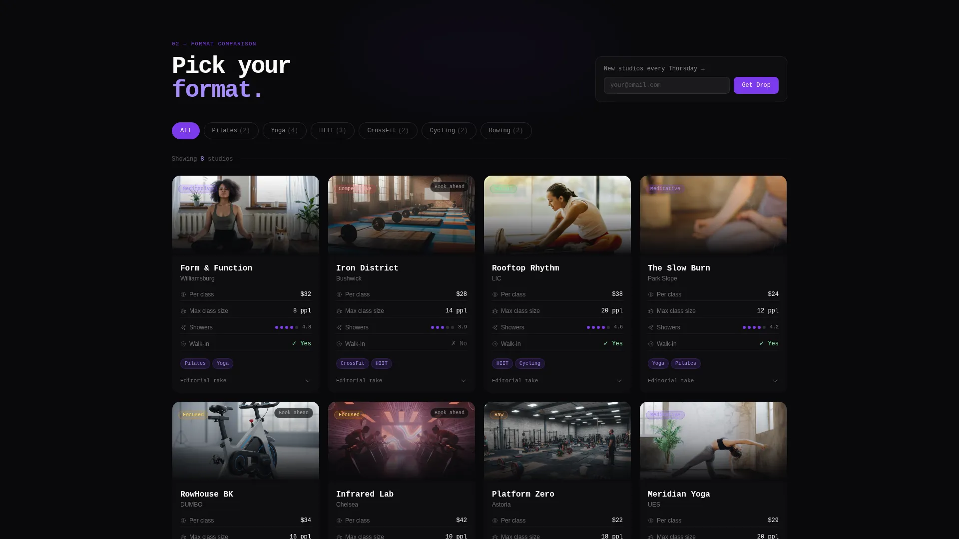
- A reshuffling bento grid with expandable studio cards, format toggle buttons, and spec row data
- A sticky bottom bar with a three-step personalization quiz and a secondary email capture field
Feature list
This template packs several purposeful components into a single scroll-through experience. Each one is designed to move visitors from browsing to deciding.
Animated Stats Header Wall
The header is a full-width dashboard displaying four key metrics: 312 studios reviewed, 47 class formats compared, 9 neighborhoods mapped, and an average monthly cost of $142. Each metric tile uses a scroll-entry count-up micro-animation, so the data itself becomes the visual hook instead of a hero image.
Format Toggle Comparison Grid
Visitors choose their workout format using toggle buttons at the top of the main grid. Pairs include Pilates versus. Yoga, HIIT versus. CrossFit, and Cycling versus. Rowing. The bento grid reshuffles in response, surfacing matched studio cards with comparable spec rows for each selection.
Expandable Studio Cards with Spec Rows
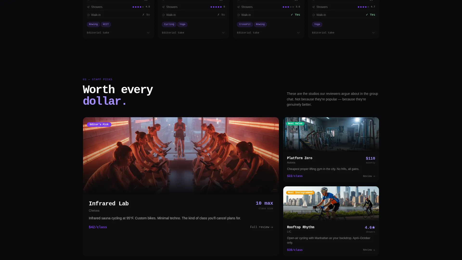
Each studio card shows price per class, maximum class size, shower quality rating, walk-in availability, and a vibe tag such as competitive, meditative, or social. Cards expand inline to reveal a short editorial take, so visitors get context without navigating away.
Three-Step Personalization Quiz
A sticky bottom bar appears after the first comparison interaction and anchors the primary call to action. Clicking opens a three-step quiz: a slider for workout intensity versus recovery preference, a drag handle for budget ceiling, and a neighborhood pin-drop on a mini-map. The result is a personalized top-three studio card set with direct booking links.
Category-Embedded Email Capture
Each category header section includes a single-field email capture with copy promising new studio reviews every Thursday. This secondary conversion path is low-friction and contextually placed, so it does not interrupt the comparison flow.
Bento Grid Layout System
The entire page is built on a bento grid structure where tiles vary in size and weight to create visual hierarchy without traditional column layouts. Larger tiles anchor anchor sections, while smaller data tiles fill supporting roles, giving the page a dashboard feel throughout.
Page sections overview
| Section | Purpose |
|---|---|
| Stats Metrics Header | Opens the page with animated data tiles and the core editorial headline |
| Format Toggle Bar | Lets visitors choose a workout format pair to filter the studio grid |
| Comparison Bento Grid | Displays reshuffled studio cards with spec rows based on selected format |
| Expandable Studio Cards | Provides inline editorial detail and spec data for each reviewed studio |
| Category Email Capture | Collects email addresses inside each category header with a weekly review promise |
| Sticky Quiz Bar | Anchors the primary call to action after the first comparison interaction |
| Personalization Quiz | Guides visitors through three steps to generate a matched top-three studio list |
| Top Three Results | Displays personalized studio matches with direct booking links |
Design & branding system
The Void & Violet color system creates a look that feels like a phone screen glowing between sets: punchy, high-contrast, and impossible to ignore. Every color choice has a role, and none of them are decorative without purpose.
- Absolute void black (#09090B) fills the background, pushing card surfaces and text into sharp relief
- Electric violet (#7C3AED) marks interactive states, category tags, and accent borders to signal what is clickable
- Muted orchid (#A78BFA) handles secondary text and hover glow states, softening the contrast without losing energy
- Clinical white (#FAFAFA) covers card surfaces and headline type, keeping data readable against the dark ground
Mobile & speed optimization
The bento grid layout adapts across screen sizes without losing the card-and-tile logic that drives the comparison experience. Interaction-led sections like the quiz and the toggle grid are built to function cleanly on touch screens.
- Bento tiles restack into a vertical scroll on smaller screens, keeping data readable without horizontal overflow
- The sticky quiz bar remains anchored at the bottom of the viewport on mobile, maintaining the primary call to action
- Micro-animations on the stats header are triggered by scroll entry, so they fire at the right moment on any device
How this template helps you convert
Pulse is built around a comparison-first conversion model. Instead of asking visitors to trust a recommendation upfront, it earns that trust by showing them the data first and then offering a shortcut.
- The stats header establishes authority immediately. Visitors see 312 reviewed studios and 47 compared formats before reading a single editorial sentence, which builds credibility in the first scroll.
- The format toggle and expandable cards let visitors self-qualify. By the time they reach the sticky quiz bar, they have already seen enough data to feel confident clicking it.
- The three-step quiz converts browsers into committed users by delivering a personalized result. A top-three list with direct booking links removes the last barrier between discovery and action.
Other information about this template
Pulse was designed specifically for the fitness studio blog page niche, where generic grid layouts fail to communicate the real differences between studios. The template's Directory and Discovery theme means it works best when the publisher has genuine editorial depth to populate it with, not just aggregated listings.
- The template style is Bento Grid, which gives it a modular, app-like quality suited to data-heavy fitness content
- The Void & Violet palette is distinctive enough to stand apart from typical fitness website templates, which tend to favor white backgrounds and bold photography
- The Feature Matrix creative direction means the page is built around comparison as a primary interaction, not passive reading
- The Comparison/Versus landing page direction makes Pulse a strong fit for publishers who want to position their content as more trustworthy than sponsored studio roundups
Theme
Directory & Discovery
Creative direction
Feature Matrix
Color system
Void & Violet
Style
Bento Grid
Direction
Comparison/Versus
Page Sections
Animated Stats Metrics Header
Format Toggle Comparison Grid
Expandable Inline Studio Cards
Three-step Personalization Quiz
Category-level Email Capture
Bento Grid Layout System
Related questions
What kind of content works best with this template?
Does the page work without a hero image?
Can the quiz and the email capture run as separate conversion paths?
Is this template designed for one city or multiple markets?
Who is this template designed for?