TikTok Story Template Landing Page for Creators
Pulse is a hero-dominant TikTok story template landing page built for creators who need scroll-stopping content fast. It delivers kinetic text frames, beat-synced transitions, and swipe-ready overlays inside a festival-energy visual system. The page guides visitors straight into a browsable template library with zero friction and three clear calls to action.
by Rocket studio
Quick summary
Pulse is a single-page TikTok story template toolkit designed for creators who live on tight timelines. It showcases ready-made story frames, kinetic text, beat-synced transitions, and swipe-ready overlays through a high-energy festival visual identity. The page is click-through focused, pushing visitors directly into a browsable gallery with no signup wall.
Who this template is for
Pulse is built for creators who need polished TikTok stories fast. Whether you are filming a haul between classes or prepping a product launch at 2 AM, this template gives you a running start with a ready-built visual system.
- Bedroom creators and micro-influencers preparing content on tight deadlines
- Social media managers at direct-to-consumer brands who need scroll-stopping stories by morning
- Anyone producing short-form video content who wants cinematic polish without starting from scratch
What problem this template solves
Raw footage rarely looks stage-ready without significant editing time. Most creators lose hours trying to match text timing, color energy, and visual rhythm before a single clip goes live. Pulse removes that bottleneck with pre-built frames that already move on beat.
- Story frames that lack kinetic text or rhythm feel flat and get scrolled past
- Building transitions from scratch eats time creators do not have before a launch
- Generic templates produce generic results, this page exists to prove Pulse delivers something different
What you get with this template
You get a fully designed, hero-dominant landing page that puts the templates front and center. Every section of the page is live proof of the toolkit in action, from the looping hero mockup to the rapid-fire before-and-after carousel.
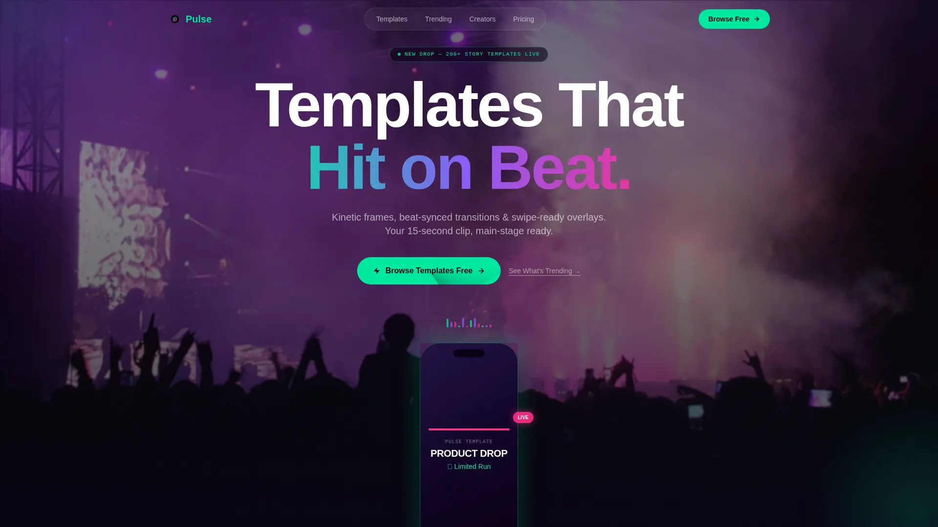
- A full-bleed festival crowd hero with a looping phone mockup showing templates animating in real time
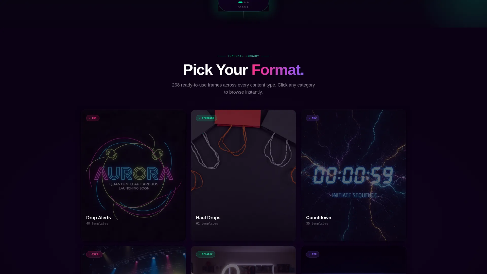
- Album-art-style template category cards that tilt on hover, plus a before-and-after story clip carousel
- Three placements of the primary call to action and a secondary trending-collection link below each button
Feature list
This section highlights what is built into the Pulse landing page template and what makes each component work.
Full-Bleed Hero with Live Mockup
The hero section opens with a motion-blurred festival crowd photograph and a looping phone mockup. The mockup shows a story template animating in real time, with text snapping to rhythm and colors shifting on the downbeat. Visitors see the product working before they read a single word.
Beat-Synced Transition Frames
The template toolkit includes ready-made transition frames timed to musical rhythm. Creators drop their footage in, and the frame handles the visual beat. This removes one of the most time-consuming steps in short-form video editing.
Kinetic Text Overlays
Each story frame includes kinetic text layouts designed to move with the content. Text snaps, scales, and shifts in ways that feel native to TikTok's fast-cut visual language. Creators get expressive typography without building animations by hand.
Swipe-Ready Story Overlays
The toolkit provides overlays sized and formatted for vertical story viewing. They are built to land cleanly on a fifteen-second clip and require minimal adjustment before export. This keeps production moving even under pressure.
Before-and-After Proof Carousel
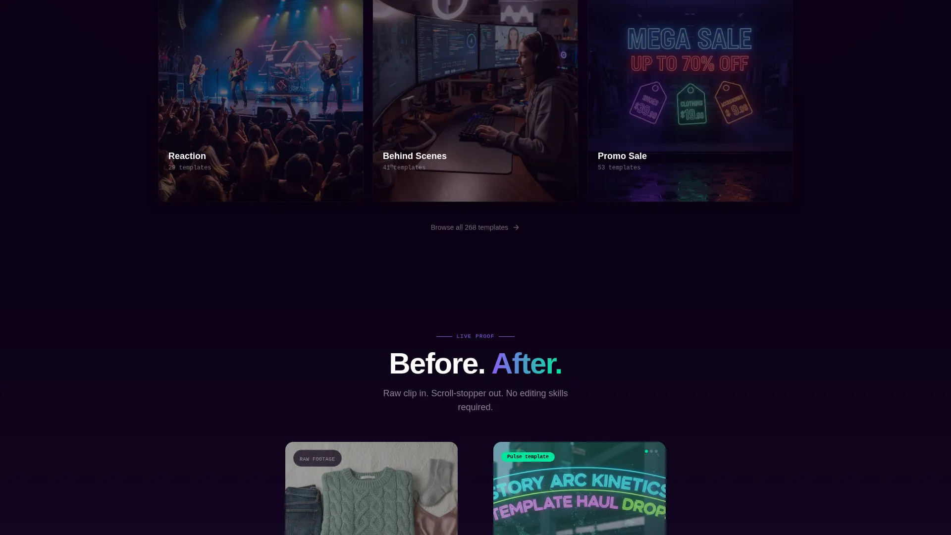
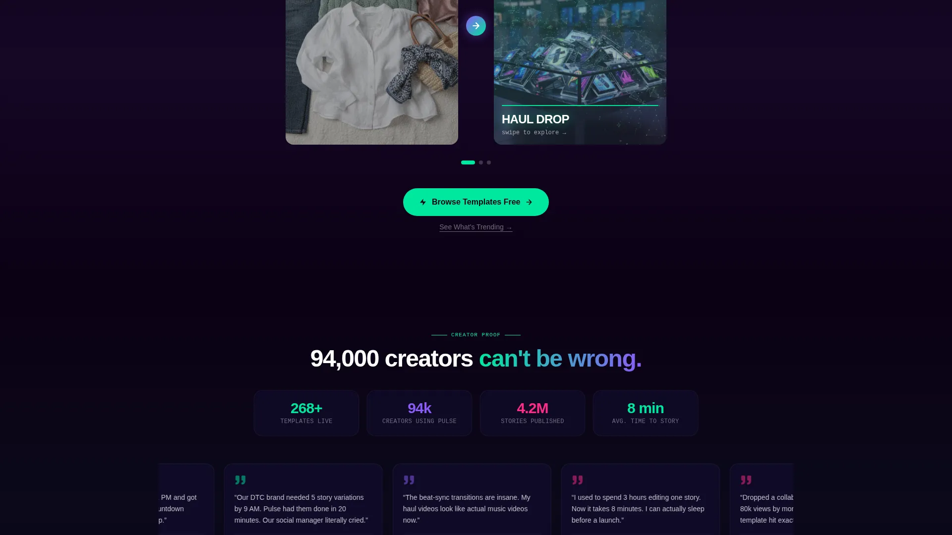
A rapid-fire carousel pairs raw footage clips on the left with polished template output on the right. Each pair appears faster than the last, creating a visual rhythm that mirrors the tension-and-release energy of a live set. Visitors leave with no doubt about what the templates deliver.
Tiered Call-to-Action Structure
The primary call to action, Browse Templates Free, appears three times across the page. A secondary text link, See What's Trending, sits beneath each primary button. This layered structure gives visitors two entry points into the library without adding friction.
Page sections overview
| Section | Purpose |
|---|---|
| Full-Bleed Hero | Introduces the toolkit with festival crowd photo and animated phone mockup |
| Template Category Cards | Displays template categories as hover-tilt album-art cards |
| Before-and-After Carousel | Proves template quality with side-by-side raw and polished clip pairs |
| Mid-Scroll Call to Action | Recaptures visitor intent after the proof section |
| Final Looping Montage | Closes the page with energy and a third call-to-action placement |
Design & branding system
The visual identity is built around a Northern Lights color system that channels festival energy. Colors ripple and layer rather than sitting flat, giving the page a sense of constant motion even in static sections.
- Void black (#0B0014) and deep arctic navy (#110C2E) dominate backgrounds, with aurora green (#00E89D) marking primary actions and progress indicators
- Electric violet (#8B5CF6) washes across section transitions like a slow strobe, and plasma pink (#FF2D87) punctuates hover states and notification badges
- Typography uses a condensed sans-serif at oversized scale in the hero, reinforcing the festival-stage aesthetic throughout
Mobile & speed optimization
The page is designed with vertical-first viewing in mind, which matches where TikTok creators and their audiences already live. Every visual element is laid out to read cleanly on a phone screen without losing the immersive scale of the desktop experience.
- Hero imagery and looping mockups are framed for portrait orientation so the impact carries on small screens
- The before-and-after carousel and hover-tilt cards translate to touch interactions naturally, keeping the page engaging on mobile without requiring redesign
How this template helps you convert
Every design decision on this page is built to move a visitor from curiosity to click. The page earns the action by showing the templates working, not just describing them.
- The looping hero mockup and before-and-after carousel give visitors visual proof of the toolkit in action before any call to action appears, which builds genuine confidence in the product.
- Three placements of the primary call to action at the hero, mid-scroll, and page bottom mean a visitor ready to click never has to search for the button.
- The secondary See What's Trending link offers a lower-commitment entry point that still routes visitors into the library, reducing drop-off from hesitant buyers.
Other information about this template
Pulse fits naturally into a creator workflow that moves between content ideas and rapid production. The page is designed as a click-through experience, meaning there is no form or signup wall standing between a visitor and the template gallery.
- The template is categorized under Media and Entertainment, specifically within the TikTok Templates subcategory, targeting the TikTok story template niche
- The Sound and Rhythm creative direction means scrolling the page feels like moving through a track, with massive full-bleed moments alternating with tight grid sections
- The hero-dominant layout (roughly a 90 to 10 split) keeps the visual experience the main event, with supporting content serving as context rather than competition
Theme
Festival Energy
Creative direction
Sound & Rhythm
Color system
Northern Lights
Style
Hero-Dominant (90/10)
Direction
Click-Through
Page Sections
Full-bleed Hero with Live Mockup
Beat-synced Transition Frames
Kinetic Text Overlays
Swipe-ready Story Overlays
Before-and-after Proof Carousel
Tiered Call-to-action Structure
Related questions
Who is the Pulse landing page template designed for?
Does the page require visitors to sign up before browsing templates?
What does the before-and-after carousel actually show?
Can I adapt the Northern Lights color system to my own brand?
What are the two calls to action included on this page?