Specialist Emergency Medicine Reviews & Social Proof Website Template
Pulse is a split-screen landing page template built for emergency medicine peer support communities. It guides EM nurses, paramedics, and physicians from a compelling anonymous testimonial straight through to a membership registration click. The layout uses a calm Alpine Fresh color system, scroll-linked process reveals, and amber call-to-action buttons to convert exhausted clinicians into engaged community members.
by Rocket studio
Quick summary
Pulse is a single-page click-through landing page template for emergency medicine support communities. It opens with a split testimonial card, walks visitors through a transparent community process, and ends with a focused call to action. The design balances clinical calm with late-night warmth, built specifically to earn trust from skeptical EM professionals.
Who this template is for
This template is designed for operators building peer support platforms or communities aimed at emergency medicine professionals. It suits anyone who needs to convert a highly skeptical, time-pressed clinical audience into registered members.
- Community organizers running peer support groups for ER nurses, paramedics, or emergency physicians
- Healthcare platform builders launching credentialed, moderated spaces for clinical debriefs
- Emergency medicine educators or advocacy groups creating a private member network
What problem this template solves
Emergency medicine professionals distrust institutional wellness programs. They need proof that a community is real, anonymous, and moderated by people who have actually worked a trauma bay. A generic sign-up page does not answer that. This template is built to answer every layer of that skepticism before asking for a click.
- Breaks down community structure step by step so nothing feels hidden or performative
- Shows anonymity, moderator credentials, and ground rules before the registration ask
- Keeps visitors engaged with a secondary path for those not ready to commit yet
What you get with this template
You get a fully structured, single-page click-through layout that moves a visitor from first impression to registration click without requiring a form on the page itself. Every section is sequenced to reduce friction and build trust with a clinically trained audience.
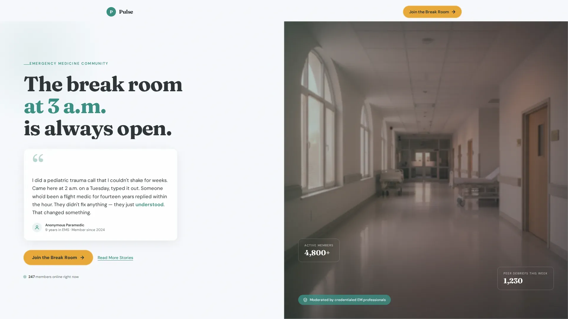
- A 50/50 split-screen hero with an anonymous testimonial card and a dawn corridor photograph
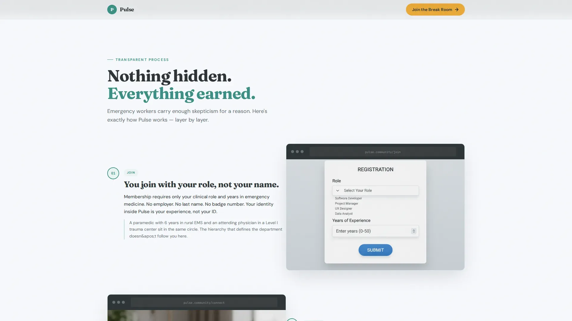
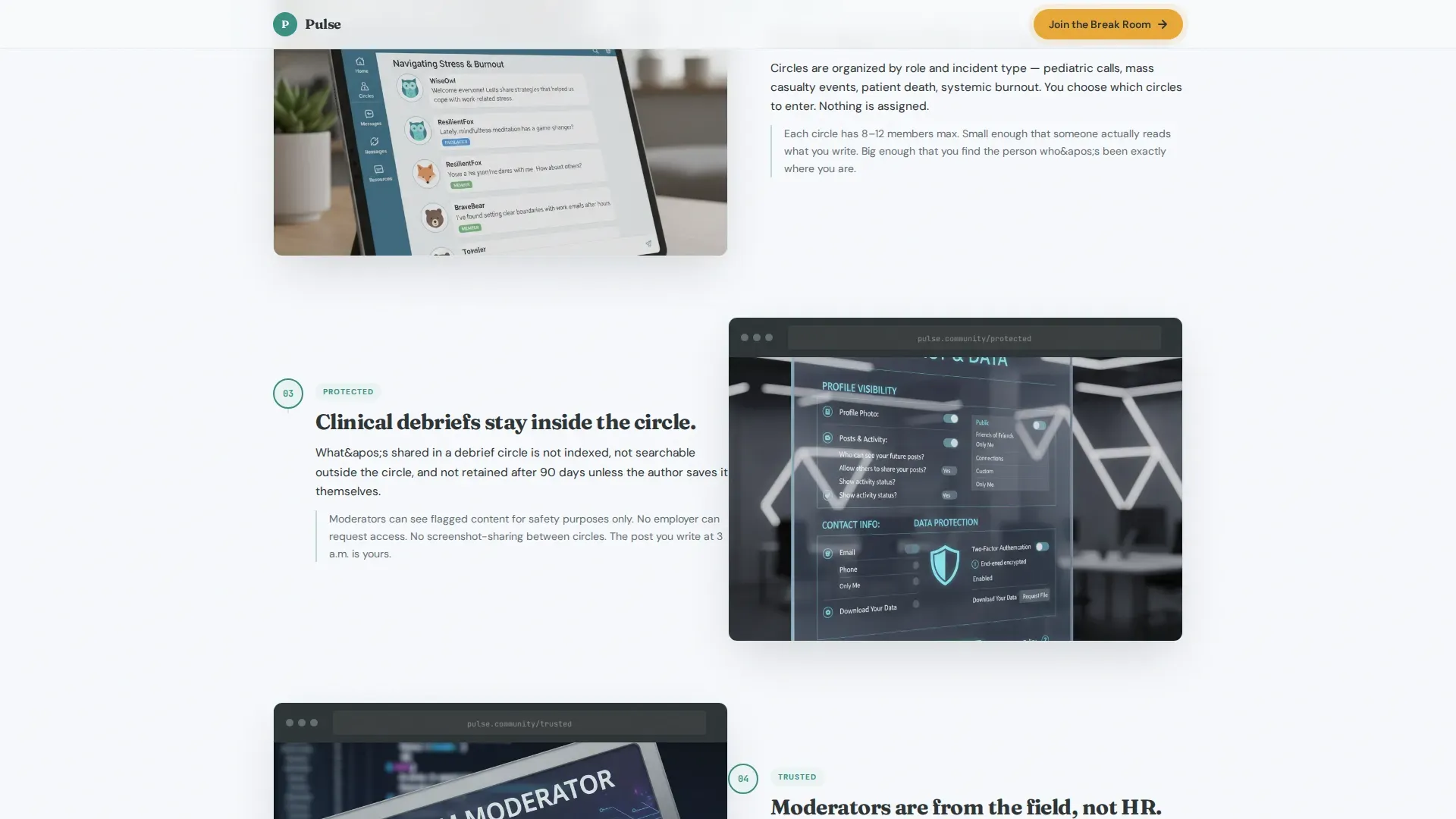
- A scroll-linked process reveal section with mirrored left and right panels
- A final call-to-action block with an active member counter and two distinct action paths
Feature list
The template includes a focused set of layout and interaction features drawn directly from the brief.
Split-Screen Testimonial Hero
The header uses a 50/50 viewport split. The left side holds a single anonymous member testimonial in a rounded card with a soft shadow. Handwritten-style quotation marks appear in alpine teal. The right side displays a softly blurred dawn corridor photograph for emotional grounding, with no stock imagery clichés.
Scroll-Linked Process Reveal
The community process unfolds layer by layer as the visitor scrolls. The left panel describes each step: joining, peer support circle structure, anonymous clinical debriefs, and moderator ground rules. The right panel mirrors each step with anonymized screenshots, sample discussion threads, and short facilitator video clips.
Staged Call-to-Action Placement
The primary call-to-action button, labeled "Join the Break Room," appears three times: inside the testimonial card, midpage after the process reveal, and anchored at the bottom. This staged placement ensures the conversion prompt meets visitors at every stage of readiness.
Active Member Counter
A scroll-triggered number counter displays active members currently online. The counter uses client-side animation to create a live, dynamic feel. It appears directly above the final call-to-action block to reinforce social proof at the moment of decision.
Secondary Retention Link
A text link labeled "Read More Stories" routes hesitant visitors to an expanded testimonial archive. This keeps undecided visitors in orbit rather than losing them entirely, supporting a second conversion window the next time a difficult shift sends them back.
Alpine Fresh Color System
The template applies a four-color palette with precision. Oxygen white dominates the background, alpine lake teal carries headings and dividers, granite ridge charcoal grounds body text, and high-altitude amber is reserved exclusively for call-to-action buttons and notification badges.
Page sections overview
| Section | Purpose |
|---|---|
| Split-Screen Hero | Opens with testimonial card left, dawn corridor photo right, and primary call-to-action button |
| Process Reveal | Walks through community structure step by step with mirrored screenshots and video |
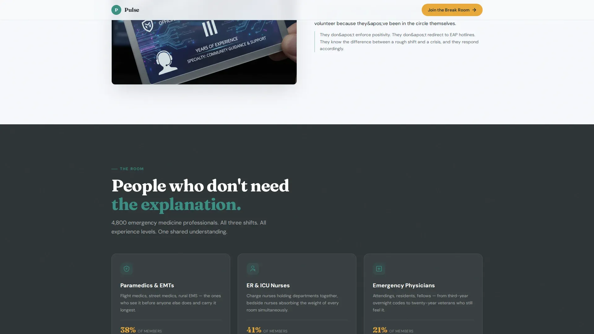
| Who's Here | Shows member role breakdown, social proof, and animated active member counter |
| Clinical Safety | Covers anonymity policy, moderator credentials, and community ground rules |
| Final Call to Action | Anchors "Join the Break Room" button and "Read More Stories" secondary link |
| Minimal Footer | Ultra-minimal horizontal footer pattern with essential links |
Design & branding system
The visual identity follows an Educational Guide theme expressed through the Alpine Fresh color system. Typography pairs DM Sans for body text with Fraunces for display text and pull quotes, creating a contrast between clinical legibility and emotional warmth.
- Four-color palette: oxygen white (#F7F9FC) background, alpine lake teal (#3A8F85) for headings, granite ridge charcoal (#2D3436) for body text, and high-altitude amber (#E8A838) for calls to action only
- Fraunces handles display headings and handwritten-style quotation marks to evoke the intimacy of a 3 a.m. break room conversation
- Soft card shadows, scroll-linked opacity reveals, and staggered entrance animations create a sense of the page gradually coming into focus
Mobile & speed optimization
The template is built desktop-first, reflecting the research habits of emergency medicine professionals browsing during downtime on larger screens. Full mobile support is included for shift-end browsing on phones.
- Server components handle all static sections to keep initial load lean
- Client-side components are isolated to the animated member counter and scroll-linked interactivity
- Scroll-linked opacity and stagger reveal animations are set to medium intensity, keeping motion meaningful without overwhelming the layout
How this template helps you convert
The page is engineered as a click-through, not a lead capture form. Every decision in the layout removes a reason to leave before the registration click.
- The testimonial hero leads with a peer voice rather than a platform pitch, meeting skeptical clinicians on their own emotional terms before making any ask.
- The transparent process reveal answers the three questions every EM professional carries: who sees what I write, is this mandatory wellness theater, and is anyone here actually from the field.
- The staged call-to-action placement combined with the active member counter creates a low-pressure, high-trust path to the registration page for visitors at different levels of readiness.
Other information about this template
This template is part of a Health and Medical category build focused on emergency medicine support and peer connection. It is built with a specific application type in mind: a healthcare community and peer support platform targeting B2C subscription for emergency medicine professionals.
- The registration flow linked from this page asks only for name, role (from a dropdown: paramedic, nurse, physician, or other), and years in emergency medicine
- The footer uses a Vercel-style horizontal ultra-minimal pattern to keep the close of the page clean and uncluttered
- Animation intensity is set to medium across the template, using reveal text, scroll-linked opacity, and counter animation without overloading the experience
- The page is localized for English-language audiences in the United States with USD pricing context in mind for downstream registration flows
Theme
Educational Guide
Creative direction
Transparent Process
Color system
Alpine Fresh
Style
Split Screen (50/50)
Direction
Click-Through
Page Sections
Split-screen Testimonial Hero
Scroll-linked Process Reveal
Staged Call-to-action Placement
Animated Active Member Counter
Secondary Retention Path
Alpine Fresh Color System
Related questions
Does this template include the registration form?
Can I update the testimonial and member counter content?
Is the scroll-linked process section flexible for different community structures?
Who is this landing page template designed for?
What does the 'Read More Stories' link do?



