Endometriosis Care Professional Website Template
Pulse is a hub and spoke landing page template built for an endometriosis wearable monitor. It guides visitors through a three-step conversational form, then answers their most pressing questions across anchor-nav spoke sections. The design uses an Organic Flow visual system with soft alpine colours, breathing gradient animations, and a rose-hip call to action that earns trust before asking for anything in return.
by Rocket studio
Quick summary
Pulse is a single-page, anchor-nav landing page template for a soft-sensor abdominal patch that tracks inflammation markers, pelvic muscle tension, and pain patterns in real time. It opens with a three-step conversational form, then flows into self-contained FAQ-driven spoke sections. Every section closes with the same primary call to action: "Download Your Flare Pattern Guide."
Who this template is for
This template is built for FemTech founders, medical device marketers, and health content teams who need to reach women living with endometriosis. It suits direct-to-consumer health device launches where trust must be earned before a conversion is requested.
- Teams launching a wearable health monitor to women aged 18 to 45 with diagnosed or undiagnosed endometriosis
- Marketers who need a content and resource destination rather than a hard-sell product page
- Clinicians or patient advocacy groups who want a credibility-first digital presence for a chronic pain management device
What problem this template solves
Women with endometriosis often spend years cycling through referrals and inconclusive tests. When they finally find a solution, they approach it with deep scepticism. A generic product page cannot answer the questions they have already typed into search bars at 2 a.m. This template is designed to meet that scepticism with patience and proof.
- It removes friction by answering the most common hesitation questions before asking for contact details
- It builds clinical credibility through downloadable PDFs, an ungated demo video, and section-level social proof
- It converts passive researchers into engaged leads by delivering personalised resources at the point of highest trust
What you get with this template
You get a fully structured, single-page layout built around a hub and spoke anchor navigation system. Each spoke is a real question your audience has already asked. The hub stays visible throughout, so no visitor ever feels lost or pressured.
- A three-step multi-step form header with a body-map tap, a pain-days slider, and a personalised resource output
- Five fully designed spoke sections covering sensor science, clinical credibility, safety, and real-pattern stories
- A linear single-row footer, a rose-hip primary call to action repeated at every spoke close, and a gated resource download form that asks only for a first name and email
Feature list
Three-Step Conversational Form Header
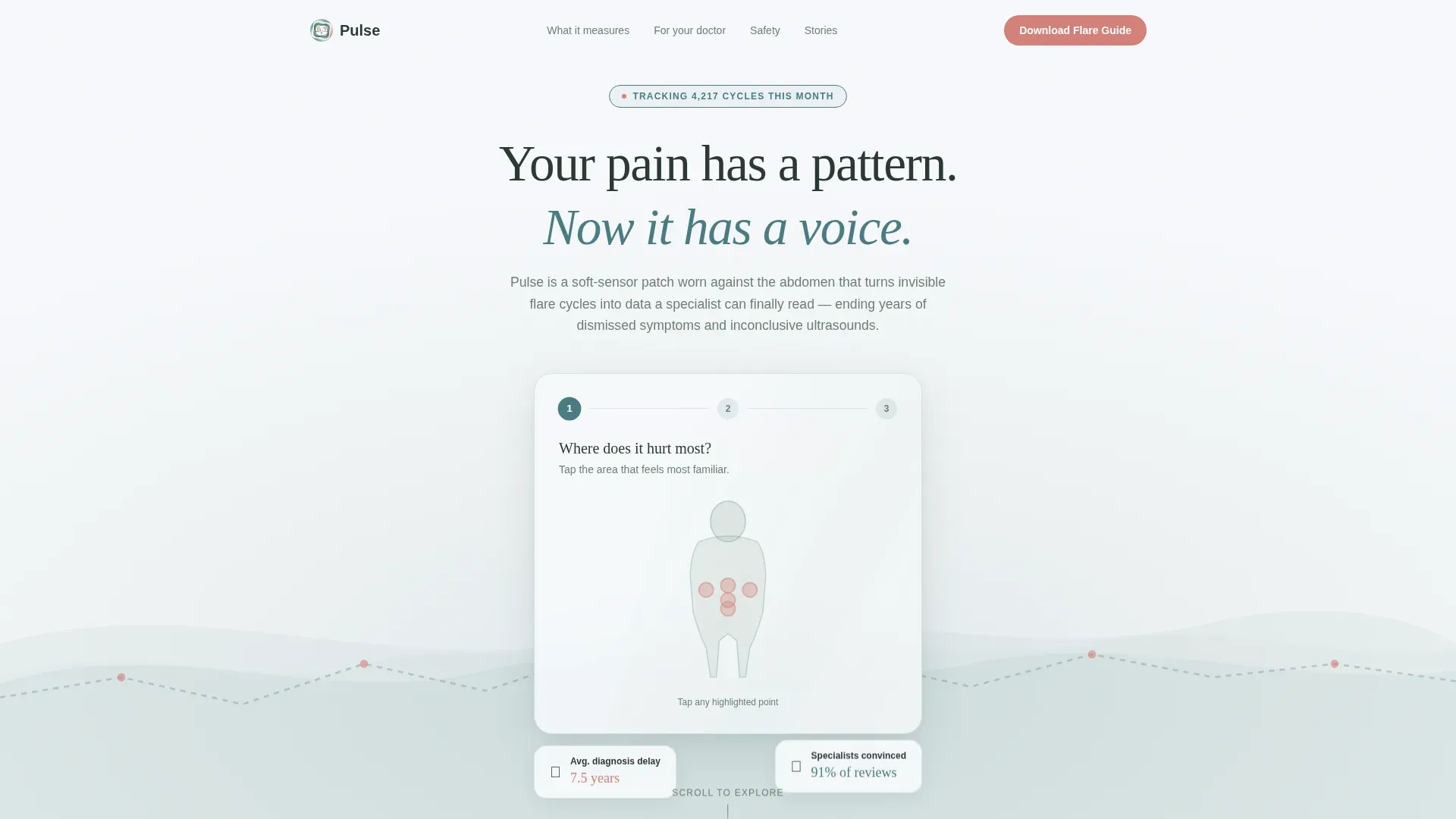
The header floats a three-step form over a slow looping animation of organic waveforms rendered as soft breathing gradients. Step one presents a body-map tap to identify pain location. Step two uses a slider to capture how many days per month are affected. Step three delivers a personalised resource based on the pattern entered, with no email gate at this stage.
Anchor Nav Hub and Spoke Layout
A persistent anchor navigation bar sits at the hub level and links to every spoke section on the page. Clicking any spoke label smooth-scrolls to a self-contained answer section. The hub always remains visible, letting visitors jump between questions in any order they choose rather than following a forced linear path.
FAQ-Driven Spoke Sections
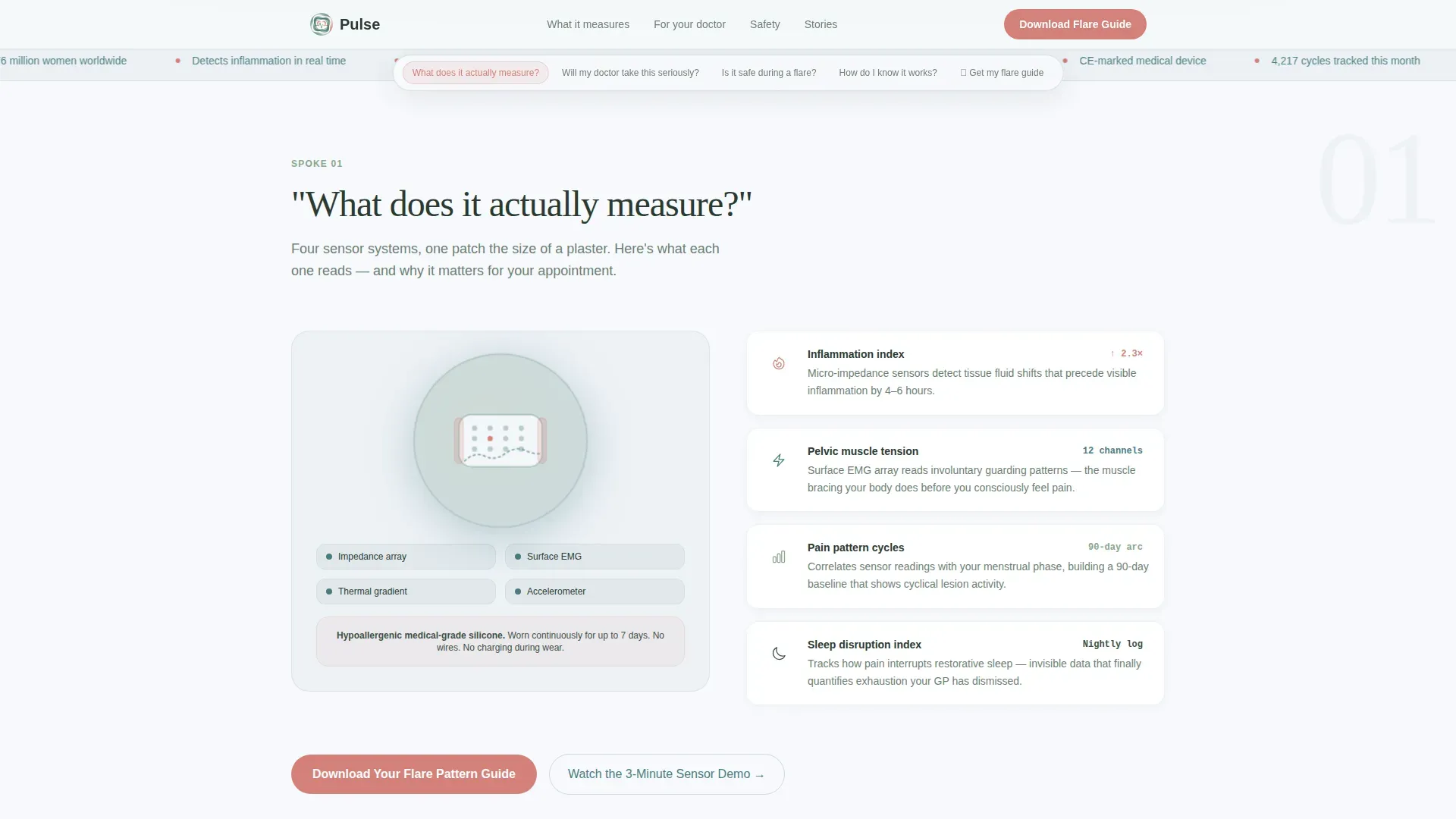
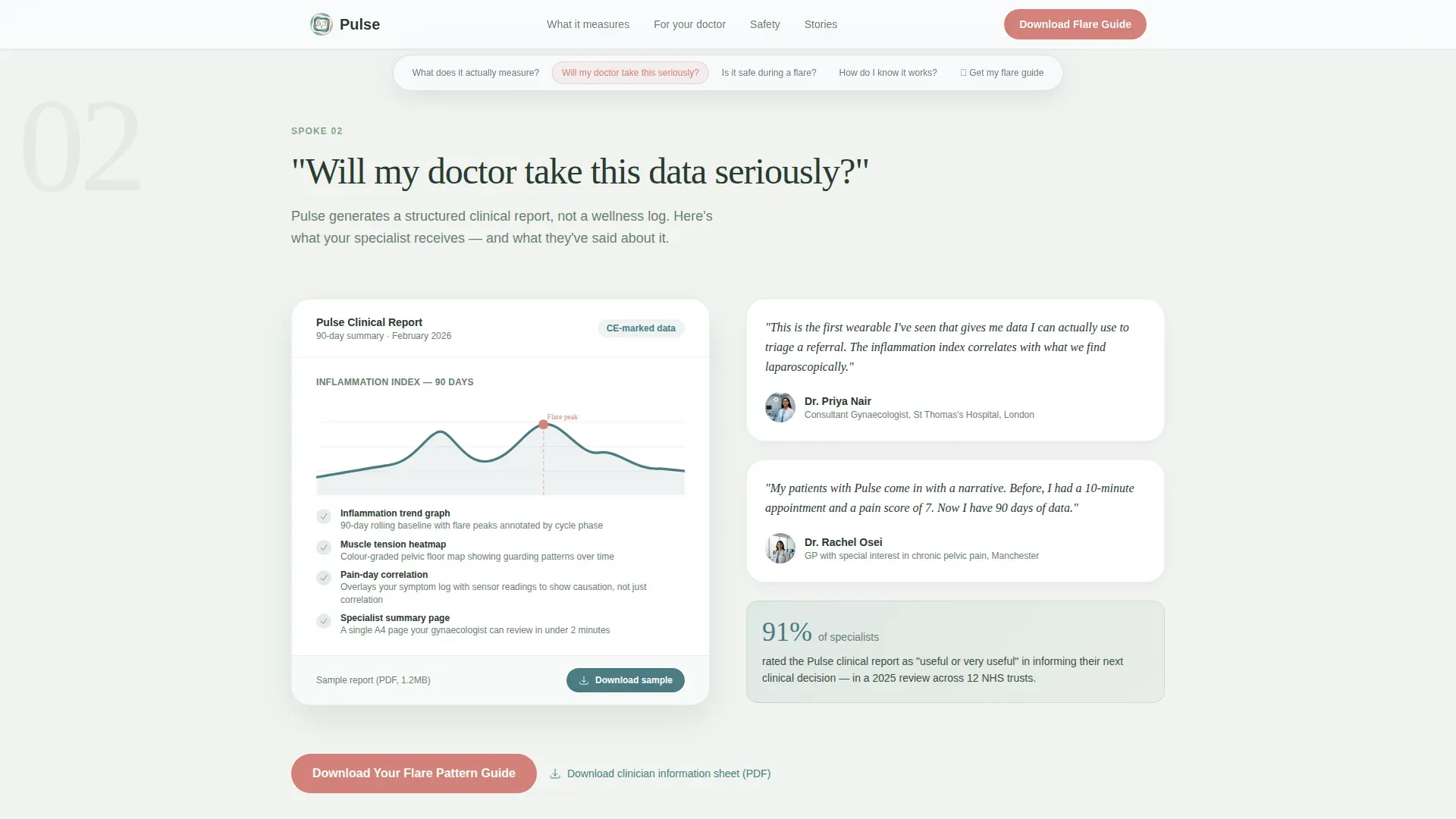
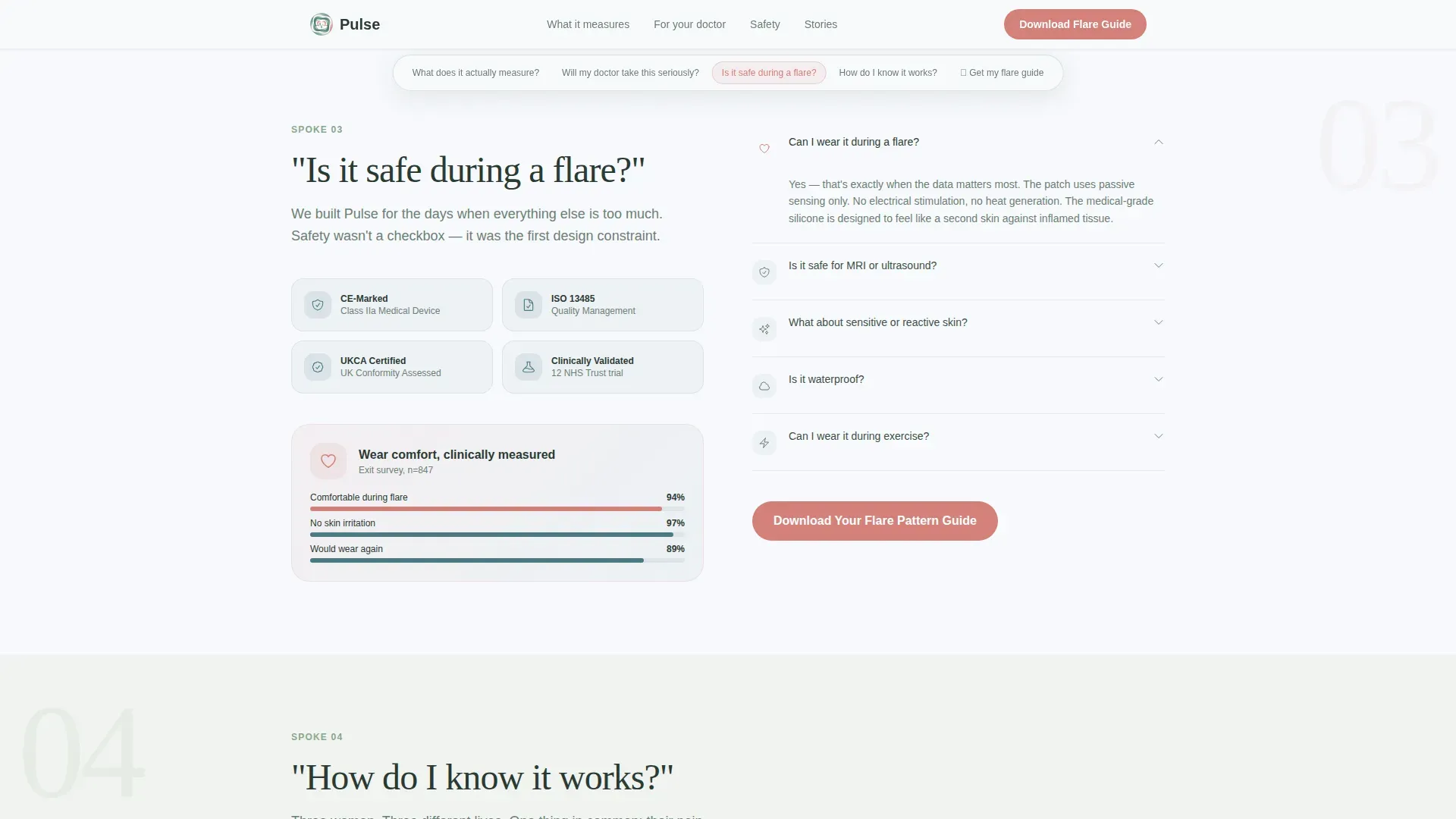
Each spoke section is structured around a question the target audience has already searched for. Sections cover what the sensor measures, whether a doctor will take the data seriously, safety during a flare, and evidence of real-world results. Every spoke includes a short answer paragraph, a contextual micro-animation of the sensor, and a downloadable PDF or short video.
Gated Resource Download with Low-Friction Form
The primary call to action, "Download Your Flare Pattern Guide," appears at hub level and repeats at the close of every spoke section. The resource gate asks only for a first name and an email address, with an optional checkbox to receive a symptom-tracking template. The form is designed to feel like a fair exchange rather than an obstacle.
Ungated Demo Video Path
A secondary conversion path offers "Watch the 3-Minute Sensor Demo" as an ungated video. It sits inside a video modal and is designed to build confidence before the download ask. Visitors can watch without giving any contact details, which lowers the barrier for first-time engagement.
Social Proof and Clinical Credibility Layer
Each spoke section can carry anonymised patient pattern stories, clinical advisor quotes, and a live counter showing how many women are currently tracking with the device. This combination of peer experience and professional endorsement addresses the medical dismissal many users have previously experienced.
Page sections overview
| Section | Purpose |
|---|---|
| Hero multi-step form | Opens with a three-step conversational form over animated organic waveforms |
| "What does it measure?" | Explains sensor science with an animated patch diagram |
| "Will doctors trust it?" | Builds clinical credibility with a downloadable PDF call to action |
| "Is it safe during flares?" | Addresses safety and comfort with a contextual micro-animation |
| "How do I know it works?" | Presents real pattern stories and testimonials as social proof |
| Linear single-row footer | Closes the page with a clean, minimal footer row |
Design & branding system
The visual identity follows an Organic Flow theme. It feels alive and warm without ever reading as clinical. Backgrounds alternate between snow-melt white and a faint sage wash. Body text sits in deep pine, which reads clearly without eye strain.
- Colour palette: snow-melt white (#F7F9FC), high-meadow sage (#88A68C), glacier-shadow teal (#4A7C82), soft rose-hip (#D4817A) for calls to action and active navigation states, and deep pine (#2B3A33) for body text
- Typography: DM Sans for body copy and user interface labels; Fraunces serif for display headlines, giving each section a warm, editorial quality
- Animations include breathing gradient waveforms in the header, scroll-triggered reveals using Intersection Observer, multi-step form transitions, and word-by-word text reveals across spoke sections
Mobile & speed optimization
This template is designed with a mobile-first priority. The target audience searches at night on a phone, often during a pain episode. Every interaction needs to feel effortless on a small screen.
- The body-map tap, pain slider, and anchor navigation are all built for touch interaction on mobile devices
- CSS animations are preferred over heavy JavaScript libraries, keeping the breathing gradients and scroll reveals lightweight by design
- Intersection Observer handles scroll-triggered reveals, activating animations only when elements enter the viewport rather than loading all at once
How this template helps you convert
The conversion strategy in this template is built on accumulation rather than pressure. Each spoke section removes one more reason to hesitate. By the time a visitor reaches the resource gate, they have already received genuine value.
- The three-step form delivers a personalised resource before asking for an email, establishing trust at the very first interaction
- The ungated demo video lets sceptical visitors build confidence on their own terms, lowering the threshold for the subsequent download request
- The repeated rose-hip call to action at each spoke close means every answered question is followed immediately by a natural, low-pressure next step
Other information about this template
This template is categorised under Health and Medical, with a specific focus on endometriosis care and chronic pelvic pain management. It is localised for both English (UK) and English (US) audiences, supporting GBP and USD currency formats and DD/MM/YYYY date formatting where relevant.
- The template style is Hub and Spoke with Anchor Navigation, and the creative direction is FAQ-Driven, making it well suited to any FemTech or D2C medical wearable product that needs to educate before it sells
- The header concept is a Multi-Step Form and the landing page direction is Content and Resource, meaning the primary goal is lead capture through high-value educational content rather than direct product purchase
- The colour system is Alpine Fresh and the visual theme is Organic Flow, both of which are available as part of this template's out-of-the-box design configuration
Theme
Organic Flow
Creative direction
FAQ-Driven
Color system
Alpine Fresh
Style
Hub & Spoke (Anchor Nav)
Direction
Content/Resource
Page Sections
Three-step Conversational Form Header
Anchor Nav Hub and Spoke Layout
Faq-driven Spoke Sections
Low-friction Resource Download Gate
Ungated Sensor Demo Video
Social Proof and Clinical Credibility Layer
Related questions
Can I change the questions used in the anchor navigation?
Does the three-step form require a developer to set up?
Can I add or remove spoke sections?
Is the demo video section mandatory?
What information does the resource download form collect?



