Epilepsy Care Specialist Professional Website Template
Pulse is a split-screen landing page template built for an epilepsy exercise program. It pairs a clinical photo hero with a five-question readiness assessment, five scrolling audit checkpoints, and a personalized readiness tier result. The design uses deep teal, charcoal, and warm amber to balance medical credibility with genuine warmth, helping adults with epilepsy feel confident enough to take the first step.
by Rocket studio
Quick summary
Pulse is a single-page template designed for a structured epilepsy exercise program. The layout opens with a 50/50 split-screen hero, then guides visitors through five clinical checkpoints before driving them toward an interactive five-question readiness assessment. Every design decision reinforces trust, from the teal-dominant color system to the amber call-to-action buttons that appear only where action is needed.
Who this template is for
This template serves a focused audience united by one shared concern: exercising safely while managing epilepsy. It is built for programs that need to speak to both patients and the professionals who guide them.
- Newly diagnosed adults in their thirties and forties who stopped exercising out of fear after their diagnosis
- Caregivers researching safe movement options for a spouse or parent living with epilepsy
- Epileptologists and neurologists looking for a credible, structured program they can confidently recommend to patients
What problem this template solves
Generic fitness templates carry none of the clinical weight this audience needs. A person managing epilepsy has specific concerns around seizure thresholds, medication timing, and heart-rate corridors that a standard gym sign-up page completely ignores. This template solves that credibility gap.
- Visitors arrive with fear and skepticism. The checklist-and-audit layout addresses each concern directly before asking for any commitment.
- The readiness assessment replaces vague promises with a personalized result, giving visitors a concrete reason to engage rather than bounce.
What you get with this template
The template delivers a complete, production-ready landing page with every section pre-built and purposefully ordered. All major layout blocks, interactions, and visual components are included.
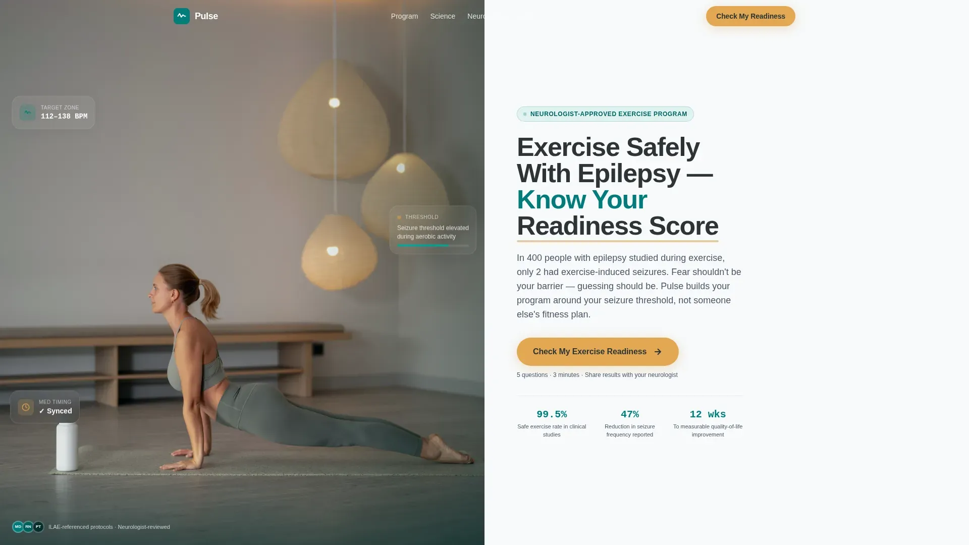
- A 50/50 split-screen hero with a clinical photo panel on the left and a headline, subheading, and amber call-to-action button on the right
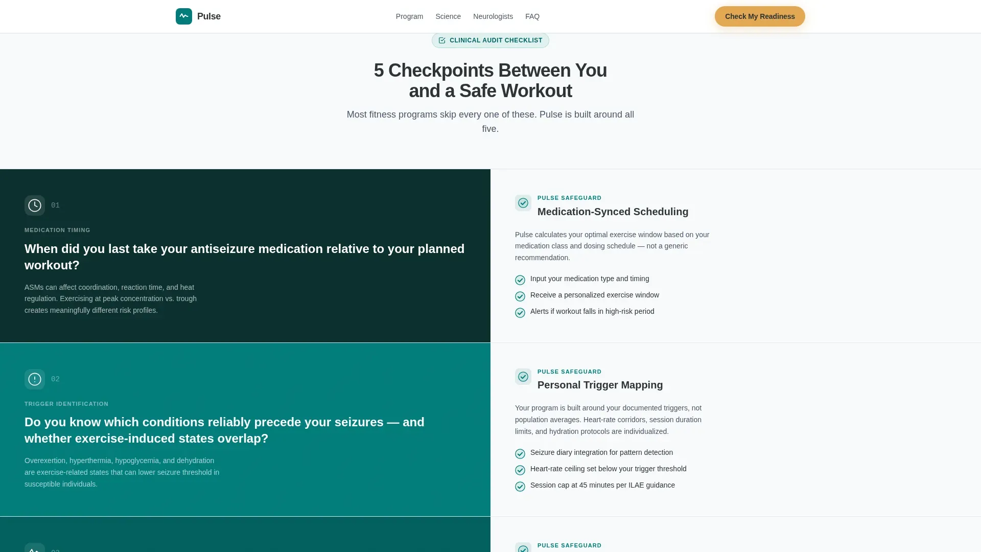
- Five alternating clinical checkpoint sections using scroll-triggered teal checkmark fill-in animations
- A five-question assessment modal with a dynamic teal progress ring, personalized readiness tiers in green, amber, or red, and a shareable PDF result for the visitor's neurologist
Feature list
This template is built around a small set of high-impact components. Each one earns its place by addressing a specific conversion or credibility need for this audience.
50/50 Split-Screen Hero
The header divides the viewport equally. The left panel holds a purposeful clinical photograph at chest height, complete with visible pulse oximeter, water bottle, and medication case. The right panel carries the headline "Exercise Safely With Epilepsy, Know Your Readiness Score" in charcoal on clean white, with a single amber call-to-action button directly below.
Five-Checkpoint Audit Scroll
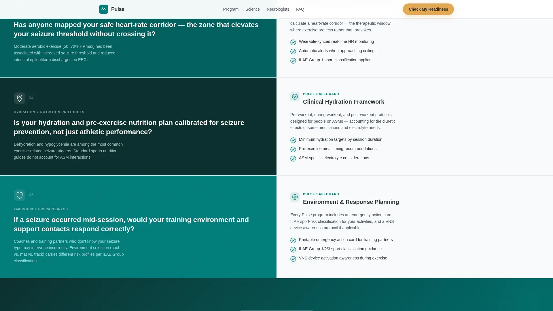
Five alternating left-right panels walk the visitor through one clinical checkpoint each: medication timing relative to exercise, seizure-trigger identification, heart-rate zone mapping, hydration protocols, and emergency-contact planning. Left panels present the audit question or risk factor; right panels reveal the program's corresponding safeguard. Teal checkmarks fill in progressively as the visitor scrolls.
Seizure Trigger Risk Cards
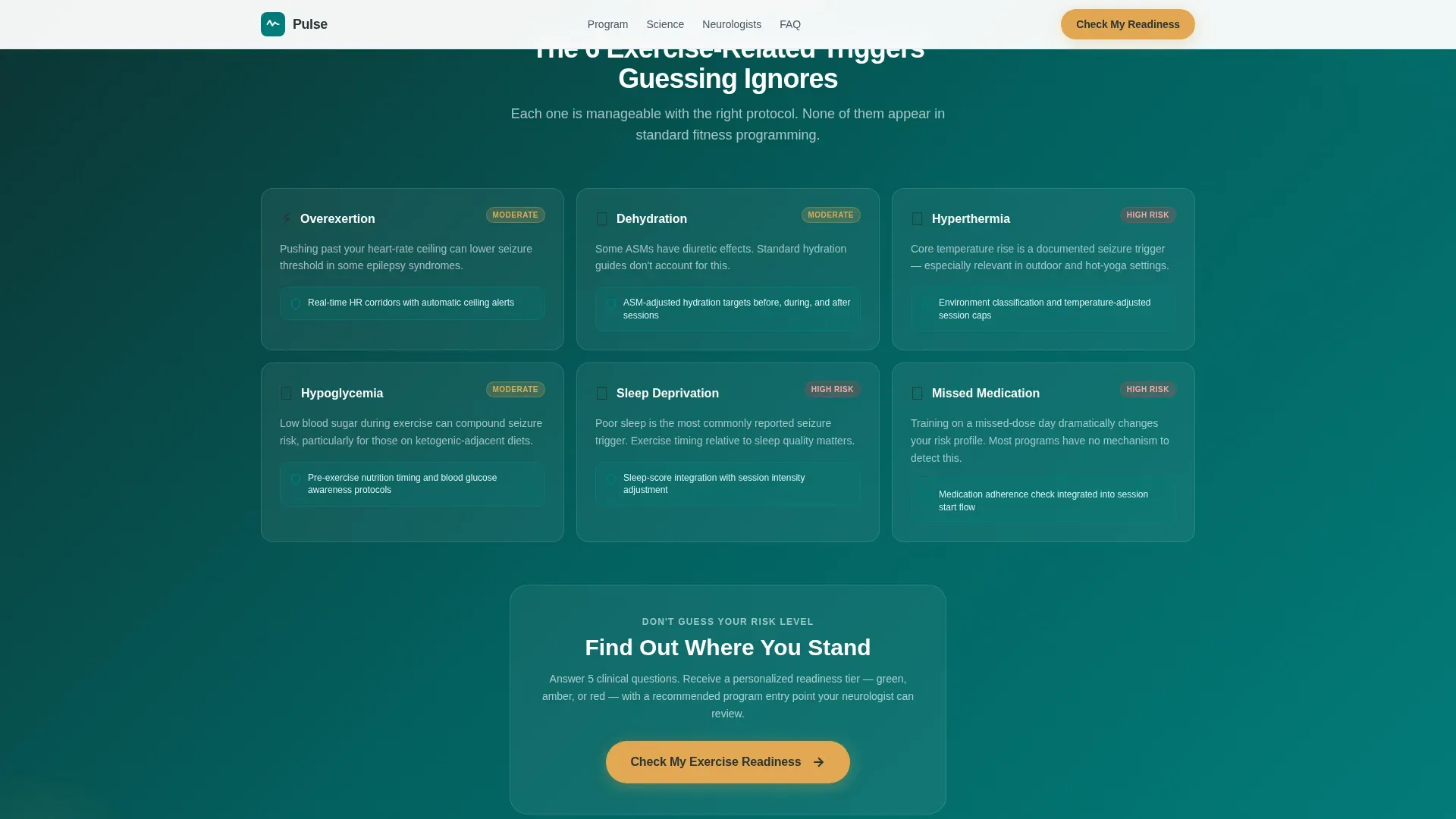
A dedicated section uses glassmorphism-style cards to present risk factors alongside their safeguards side by side. A midpoint call-to-action button appears here so visitors who are already convinced do not have to scroll back to the top.
Five-Question Readiness Assessment Modal
The primary interactive component opens as a modal overlay. Visitors answer five sequential questions covering seizure frequency, current medication class, last neurologist visit date, prior exercise history, and primary fitness goal. A teal progress ring advances with each answer. On completion, the visitor receives a personalized readiness tier and a recommended program entry point, with the option to export results as a shareable PDF.
Stacked Social Proof Section
Testimonial cards are stacked to display a neurologist endorsement quote alongside patient outcome statements. This section is positioned after the seizure-trigger risk cards to reinforce credibility at the moment visitors are evaluating whether to attempt the assessment.
Fixed Mobile Call-to-Action Bar
On smaller screens, a persistent bottom bar keeps the "Check My Exercise Readiness" call-to-action visible at all times. Visitors never need to scroll back up to find the primary action.
Page sections overview
| Section | Purpose |
|---|---|
| Split-Screen Hero | Establishes clinical credibility and surfaces the primary call-to-action immediately |
| Clinical Checkpoints | Walks visitors through five audit questions with scroll-triggered teal checkmark reveals |
| Seizure Trigger Risk | Presents risk-versus-safeguard cards with a midpoint call-to-action button |
| Social Proof Cards | Builds trust through a neurologist endorsement and patient outcome metrics |
| Readiness Assessment | Hosts the five-question modal with progress ring and personalized tier output |
| Single-Row Footer | Closes the page with a clean linear layout following Footer Pattern 1 |
Design & branding system
The visual identity follows a Corporate Precision theme. The palette is named Teal Catalyst, and every color has a designated role so the page never feels busy or off-brand.
- Deep medical teal (#007C7A) dominates section backgrounds and all iconography, including the checkmark fill-in animations and the progress ring
- Charcoal scrub gray (#2D3436) carries all body text and headings, while clinical white (#F7F9FA) creates breathing room between sections
- Warm amber (#E2A854) is reserved exclusively for buttons, progress indicators, and checkmarks where a visitor must take action, ensuring it always reads as a deliberate signal rather than decoration
Typography uses DM Sans for all headings and body text. Data points and statistics use JetBrains Mono to reinforce a clinical, precise feel. Scroll animations follow a slideInBlur reveal pattern at medium intensity to keep the diagnostic rhythm steady without feeling distracting.
Mobile & speed optimization
The template is designed desktop-first around the 50/50 split-screen hero, but it includes a considered mobile-responsive fallback so the experience holds at every screen size.
- On mobile, the split-screen hero stacks vertically so the clinical photograph and the headline each occupy full width without competing for space
- The fixed bottom call-to-action bar persists across all mobile scroll positions, keeping the primary assessment button reachable without requiring the visitor to scroll back up
- Static sections use server-side rendering, while the interactive quiz modal loads client-side to keep the initial page fast and the assessment experience smooth
How this template helps you convert
The conversion architecture is built around earning trust before asking for anything. Every element is sequenced to reduce fear and increase confidence in a specific order.
- The hero presents the readiness concept immediately, so visitors understand the value of the assessment within the first few seconds of landing on the page.
- The five clinical checkpoints use a diagnostic scroll rhythm to build a case section by section, showing visitors that guessing about safe exercise is genuinely risky and that a structured program is the logical next step.
- The personalized readiness tier output gives visitors something concrete and shareable at the end of the assessment, replacing a generic email opt-in with a result that has real utility for their neurologist conversation.
Other information about this template
This template is categorized under Health and Medical, specifically within the Epilepsy Care subcategory. It is designed for the epilepsy exercise program niche and carries a high intersection match score, reflecting strong alignment between the template's design direction and the content needs of this audience.
- The creative direction follows a Checklist and Audit cadence, a pattern well-suited to audiences who need systematic reassurance before committing to any health program
- The quiz and assessment landing-page direction is built into the core layout, not added as an afterthought; the five-question modal is the structural endpoint that every preceding section builds toward
- Localization defaults to English, United States dollar formatting, and United States date format, matching the primary intended market
- The template references International League Against Epilepsy statistics as a social proof anchor, lending the page an additional layer of clinical authority
Theme
Corporate Precision
Creative direction
Checklist & Audit
Color system
Teal Catalyst
Style
Split Screen (50/50)
Direction
Quiz/Assessment
Page Sections
50/50 Split-screen Hero Section
Five-checkpoint Audit Scroll
Glassmorphism Risk Versus. Safeguard Cards
Five-question Readiness Assessment Modal
Stacked Neurologist and Patient Testimonials
Fixed Mobile Call-to-action Bar
Related questions
Can I customize the checkpoint content for my specific program protocols?
How does the readiness assessment deliver personalized results?
Is this template suitable for a medical professional's referral page?
What typography and color settings does this template use?
Does the template include social proof sections?



