CGM Landing Page Template for Diabetes Wearables
Pulse is a continuous glucose monitor landing page template built for MedTech consumer wearable brands. It uses a Stats-First Impact layout with a zigzag alternating structure to lead every section with a stark, oversized data point. The result is a focused, click-through page that builds trust through precision before asking visitors to act.
by Rocket studio
Quick summary
Pulse is a single-page landing page template for a continuous glucose monitoring wearable. It opens with an animated stat counter inside a Stacked Type Tower hero, then builds evidence section by section through four zigzag alternating blocks. Every design decision serves one goal: move a visitor to click "Check My Coverage" after the data has earned their trust.
Who this template is for
This template is built for MedTech brands and direct-to-consumer health companies launching a continuous glucose monitor. It fits teams that need a high-converting landing page without a complex form flow.
- Startups and established brands in the diabetes care space launching a wearable device
- Healthcare marketing teams targeting Type 1 patients, gestational diabetes patients, and CDL-dependent commercial drivers
- Product teams that need a click-through landing page connecting to a separate eligibility quiz or coverage check
What problem this template solves
Selling a medical wearable online is hard. Visitors arrive skeptical, and generic product pages filled with feature lists rarely convert them. This template solves that gap by leading with clinical proof points before ever asking for a click.
- Visitors see stark, specific numbers first, reading speed, sensor depth, lifespan, and efficacy, before they read a single marketing claim
- The page removes friction by skipping on-page forms entirely and routing intent to a short eligibility quiz
- The alternating layout keeps scroll momentum natural, so visitors reach the primary call to action having already absorbed the evidence
What you get with this template
You get a fully structured, single-page landing page with five distinct layout sections, a fixed bottom call-to-action bar, and a complete Alpine Fresh color system applied throughout. Every section is ready to customize with your copy, stats, and imagery.
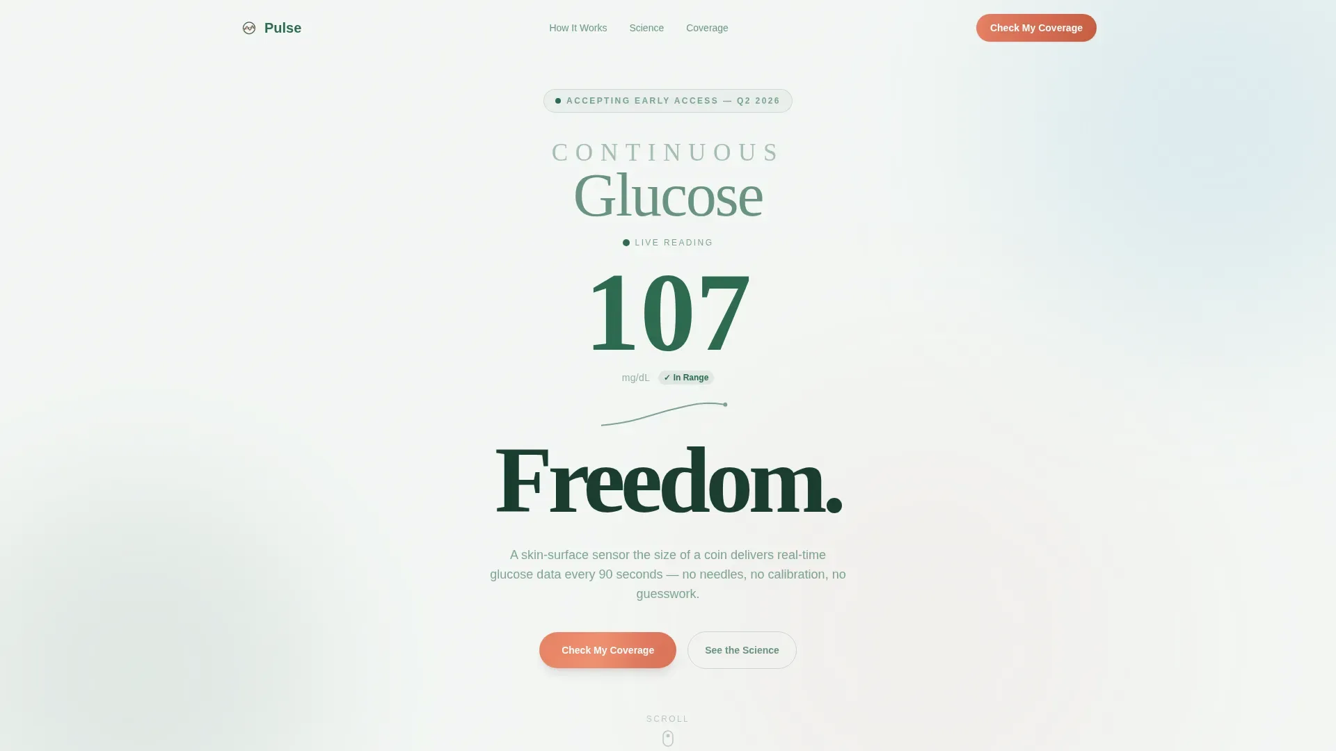
- Hero section with Stacked Type Tower typography and a live animated glucose counter ticking from 62 to 110 mg/dL
- Four zigzag alternating content sections, each anchored by an oversized stat and paired with contextual glucose curve animations or real-skin imagery placeholders
- A fixed bottom sticky bar carrying the primary "Check My Coverage" call to action after the second section, plus a ghost button linking to the clinical data section
Feature list
This template includes purpose-built components that reflect the Stats-First Impact creative direction from brief to build.
Stacked Type Tower Hero
The hero uses three stacked typographic lines at progressively larger weights, ultra-light, medium, and heavy black, that climb the viewport like an altimeter. An animated stat counter sits between the second and third lines, ticking from 62 to 110 mg/dL with color shifts from pine-shadow green for in-range values to wildflower coral for drifting values.
Zigzag Alternating Section Layout
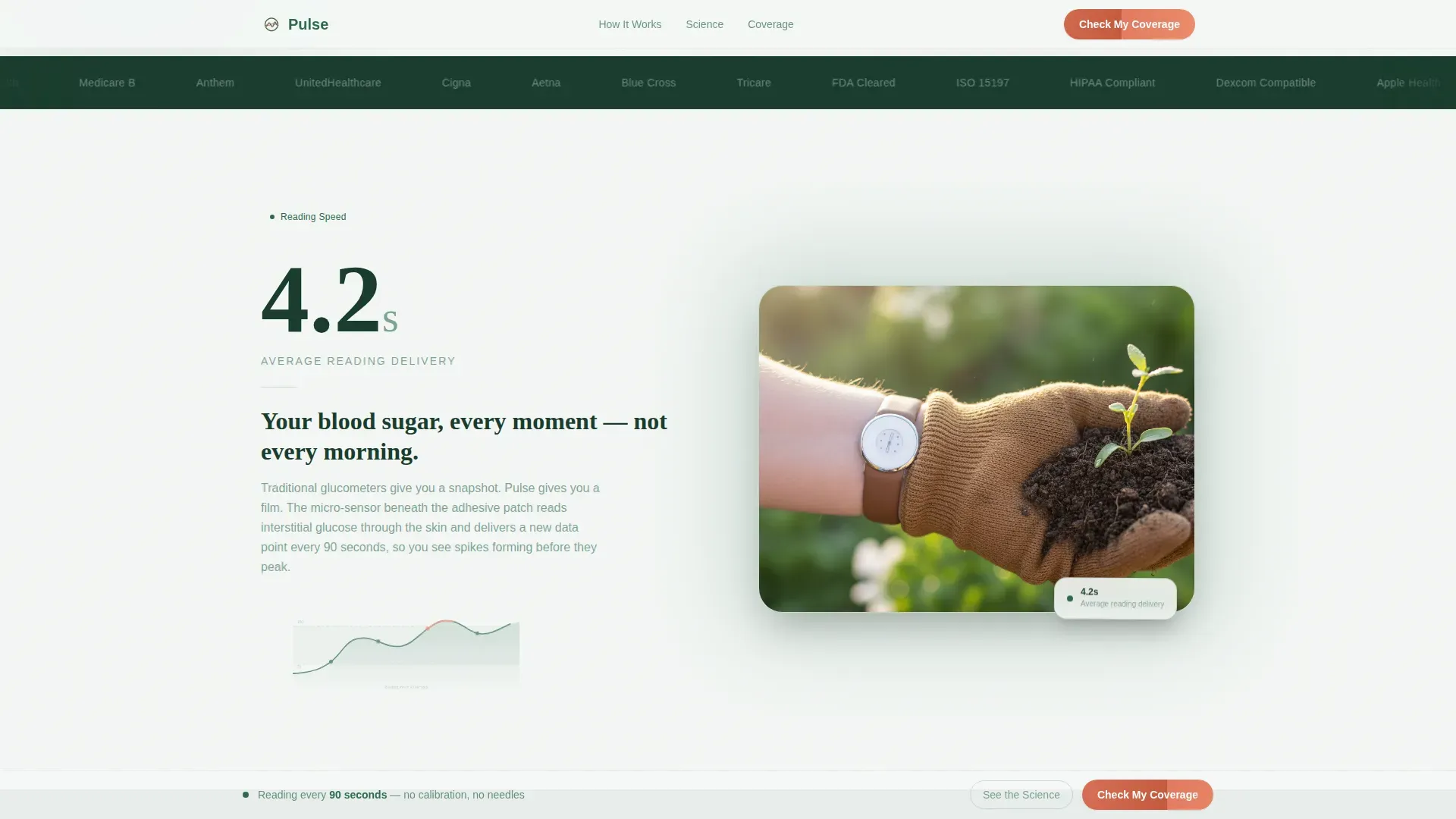
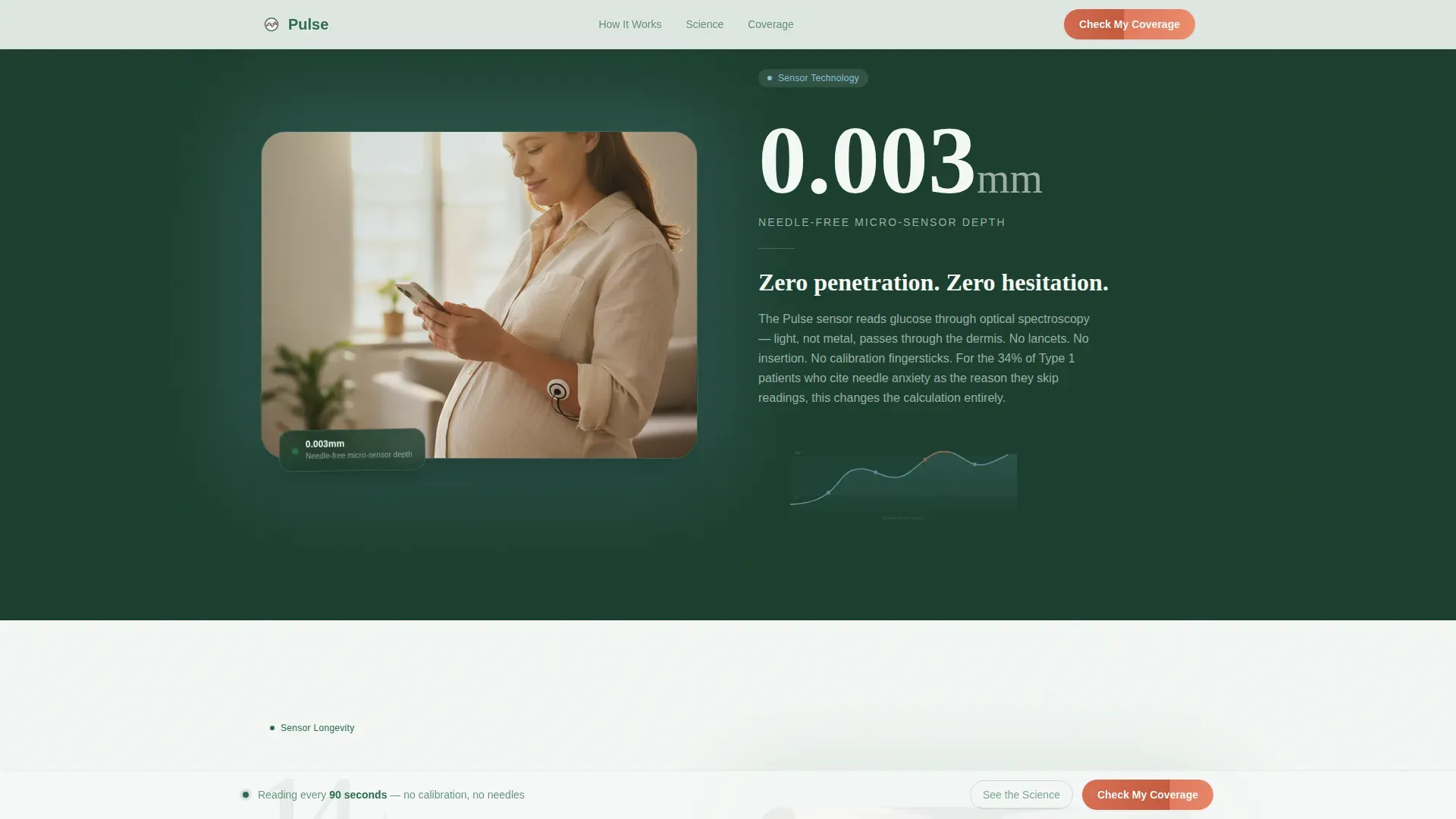
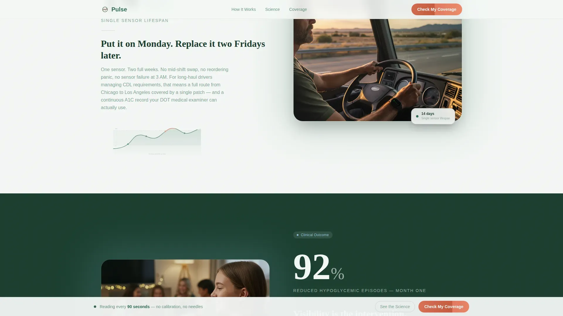
Four content sections alternate left and right alignment, each leading with a stark oversized stat: 4.2 seconds, 0.003 mm, 14 days, and 92%. Left-side sections pair the stat with a glucose curve SVG animation on a glacier mist background. Right-side sections pair the stat with contextual skin imagery slots on a pine-shadow background.
Scroll-Triggered Reveal Animations
Each zigzag section activates on scroll, so stats and supporting copy enter the viewport with purposeful motion. The scroll observer architecture keeps the experience smooth on both mobile and desktop without overwhelming the clinical tone.
Fixed Sticky Bottom Bar
After the second section, a slim fixed bar appears at the bottom of the viewport carrying the primary call to action in wildflower coral. It persists throughout the rest of the scroll, keeping the conversion path visible without interrupting the reading experience.
Alpine Fresh Color System
Backgrounds alternate between glacier mist white (#F4F7F5) and pine-shadow green (#2D6A4F), with text always placed in the contrasting tone. Wildflower coral (#E07A5F) appears exclusively on calls to action, alert states, and critical glucose threshold indicators, reserving its visual weight for the moments that matter most.
Dual Call-to-Action Architecture
The primary button, "Check My Coverage," appears first beneath the hero stat and again in the fixed bottom bar. A secondary ghost button, "See the Science," anchors visitors to the clinical data section for skeptics who need more evidence before they click.
Page sections overview
| Section | Purpose |
|---|---|
| Hero: Stacked Tower | Opens with animated live glucose counter inside Stacked Type Tower typography to prove device precision immediately |
| Section A: Speed Stat | Leads with "4.2 seconds" stat and glucose curve animation to demonstrate reading delivery speed |
| Section B: Needle-Free Stat | Leads with "0.003 mm" stat and contextual skin imagery to prove the sensor is needle-free |
| Section C: Lifespan Stat | Leads with "14 days" stat and use-case imagery of real wearers to communicate sensor longevity |
| Section D: Efficacy Stat | Leads with "92%" clinical stat and supporting data to close the evidence case before the call to action |
| Footer | Minimal horizontal flow footer carrying legal context and navigation links |
Design & branding system
The Organic Flow visual identity pairs medical-grade precision with natural warmth. The Alpine Fresh color system keeps backgrounds and text in high contrast while restricting the accent color to moments that demand immediate attention.
- Typography uses Fraunces for display headings and DM Sans for body copy, creating a pairing that feels authoritative without being cold
- Backgrounds alternate strictly between glacier mist (#F4F7F5) and pine-shadow green (#2D6A4F) section by section, with text color always inverting to maintain readability
- Wildflower coral (#E07A5F) is reserved exclusively for calls to action, alert states, and critical glucose threshold visual cues, it never appears as decoration
Mobile & speed optimization
The template is built mobile-first, reflecting the reality that wearable device audiences check health data on their phones. The layout adapts the zigzag structure gracefully to single-column stacking on smaller screens.
- The Stacked Type Tower hero scales across viewport widths so the animated counter remains the visual focus at every breakpoint
- Client-side animation components, the glucose counter tick, SVG curve, and scroll observer, are separated from static server-rendered sections to keep initial load lean
- The fixed bottom call-to-action bar is sized and positioned for thumb reach on mobile, keeping the primary conversion action always accessible
How this template helps you convert
The page is engineered as a click-through funnel. It never asks for information before it has delivered evidence. Each scroll step is a deliberate trust-building move.
- The animated glucose counter in the hero proves the device works in real time, creating immediate credibility before a visitor reads a single word of body copy.
- Each zigzag section stacks one new data point, reading speed, sensor depth, sensor lifespan, clinical efficacy, so by the time the visitor reaches the bottom, the evidence feels overwhelming rather than persuasive.
- The fixed sticky bar keeps "Check My Coverage" in view throughout the scroll, so the moment a visitor is convinced, the next step is one tap or click away without hunting for a button.
Other information about this template
This template is designed specifically for the diabetes wearable monitor category within the Health & Medical market. It is optimized for direct-to-consumer paths that include an insurance coverage or prescription eligibility step after the initial click.
- The page routes visitors to a separate eligibility quiz covering insurance provider, diagnosis type, and current monitoring method, no checkout or form appears on the landing page itself
- The template uses imperial units and USD context throughout, with design and copy framing suited to the United States market and FDA-adjacent product positioning
- The footer follows a minimal horizontal flow pattern, suitable for carrying legal disclaimers, privacy links, and brand navigation without distracting from the conversion path
- The animation system is high-fidelity, including a live glucose counter, glucose curve SVG, scroll-triggered section reveals, and a persistent sticky bottom bar
Theme
Organic Flow
Creative direction
Stats-First Impact
Color system
Alpine Fresh
Style
Zigzag/Alternating
Direction
Click-Through
Page Sections
Stacked Type Tower Hero with Live Counter
Zigzag Alternating Stat Sections
Scroll-triggered Section Reveals
Fixed Sticky Bottom Call-to-action Bar
Dual Call-to-action Button System
Alpine Fresh Color System
Related questions
What type of page is this template?
Can I adapt this template for a different medical wearable product?
How many sections does this template include?
Does the template include the eligibility quiz?
Is the animated glucose counter part of the template?



