Recruiting & Staffing Agency Specialist Careers Website Template
Pulse is a split-screen healthcare recruiting landing page built for talent acquisition directors, HR leads, and agency operations chiefs who cannot afford a vacant shift. The page opens with a hard-hitting time-to-fill stat, walks visitors through a live network effect story, and drives them into a five-question hiring health diagnostic that ends with a personalized staffing plan offer.
by Rocket studio
Quick summary
Pulse is a B2B healthcare recruiting landing page designed around one urgent truth: every day a registered nurse (RN) position stays open costs real money. The template pairs cinematic split-screen visuals with a data-led narrative and closes with an interactive hiring health quiz that turns anonymous visitors into qualified leads.
Who this template is for
This template is built for the people who feel vacancy costs before they see them on a spreadsheet. It speaks directly to healthcare talent leaders who are under pressure to fill critical clinical roles fast.
- Talent acquisition directors at regional health systems managing high-volume RN pipelines
- Human resources leads at rural critical-access hospitals with limited sourcing bandwidth
- Operations chiefs at traveling nurse agencies tracking revenue lost to unfilled positions
What problem this template solves
The national average time-to-fill for an RN position sits at 47 days. For a short-staffed floor running on agency travelers, that gap is a six-figure quarterly problem. A generic recruiting firm page cannot communicate that urgency. Pulse solves the credibility gap.
- Visitors leave standard recruiting pages without understanding the firm's speed advantage
- TA directors need proof of network depth before they engage a new staffing vendor
- Generic call-to-action buttons produce low-quality demo requests with no context
What you get with this template
You get a fully structured single-page layout with five purpose-built sections, a cinematic design system, and an interactive quiz component. Every section is designed to deepen trust and move the reader closer to a conversion.
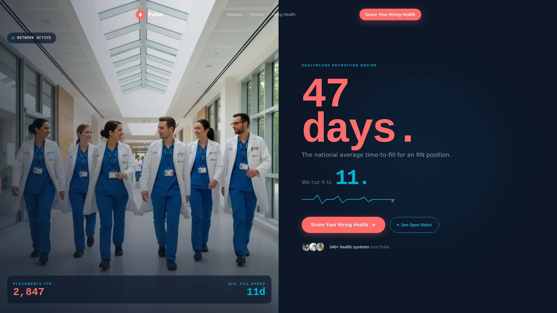
- A split-screen hero with a team photo frame on the left and a bold coral time-to-fill stat on the right
- A network effect scroll sequence showing placement growth from one hire to a full department
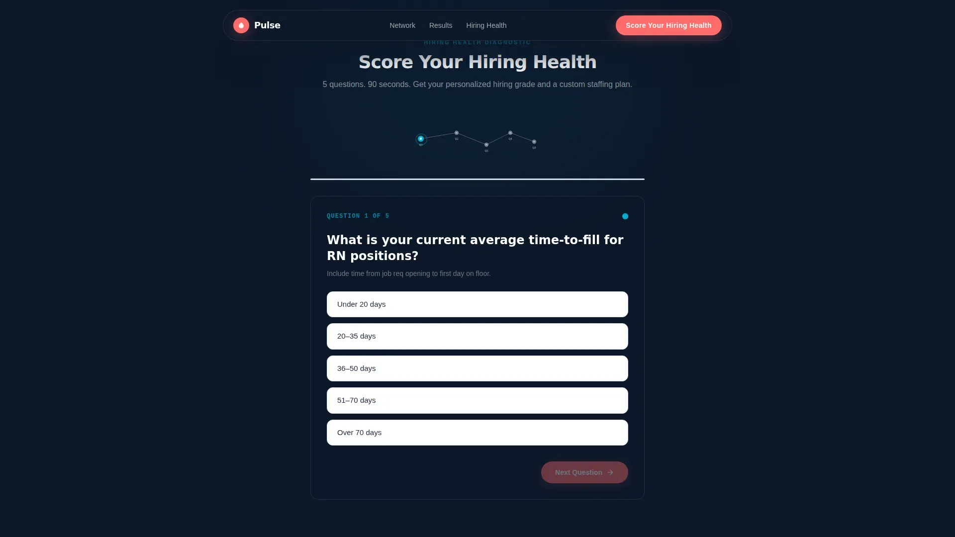
- A five-question hiring health quiz with node micro-animations and a personalized results output
Feature list
This template ships with purpose-built components tied directly to healthcare recruiting conversion goals.
Split-Screen Hero with Stat Typography
The hero divides the viewport evenly. The left panel holds a real-feeling team photo of six clinicians mid-stride through a hospital corridor. The right panel displays "47 days. The national average time-to-fill for an RN position." in oversized coral type, followed by the subline "We cut it to 11." The contrast stops the scroll immediately.
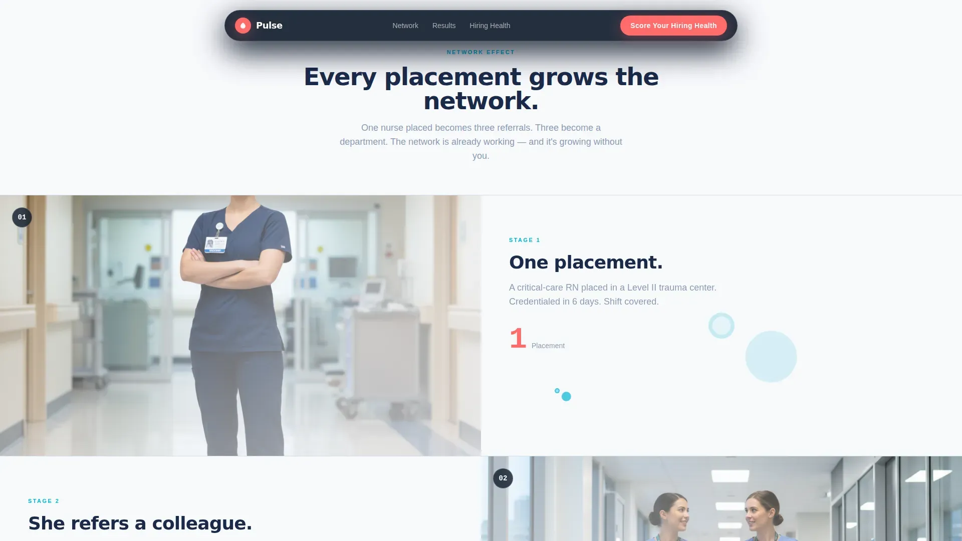
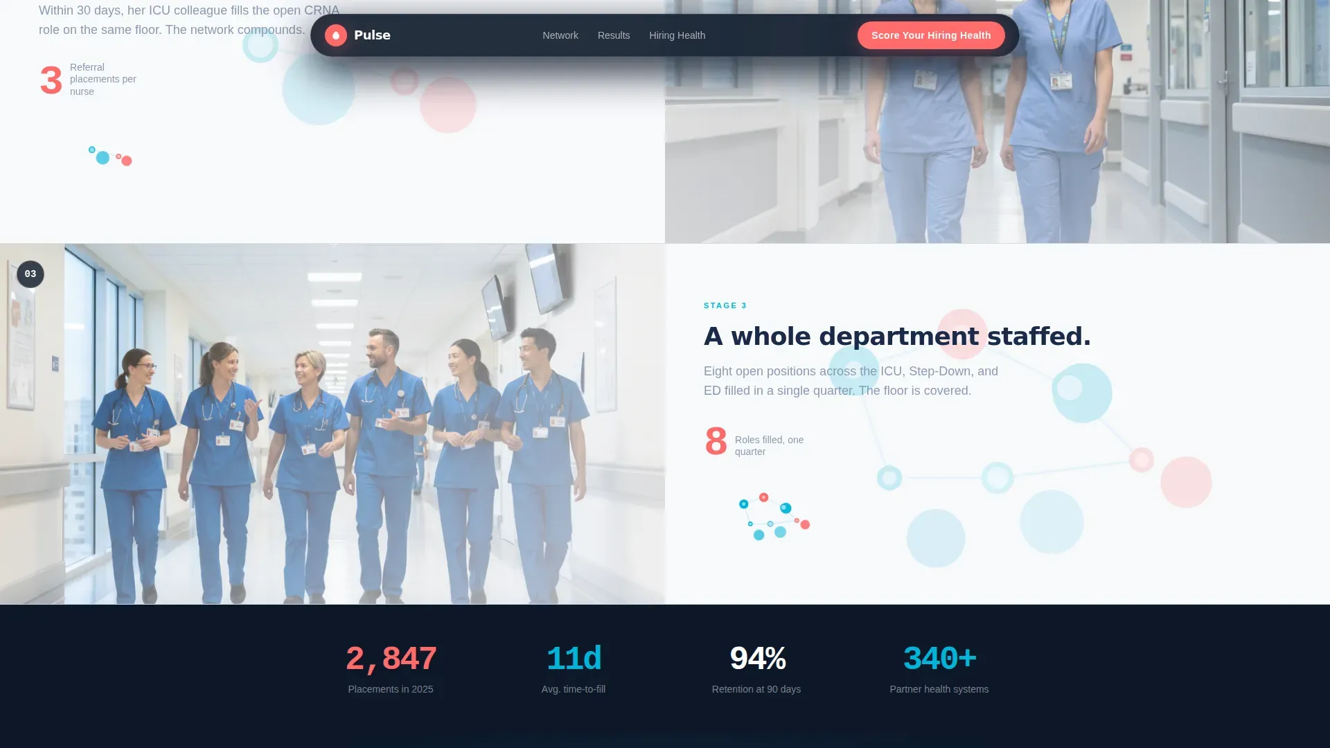
Network Effect Scroll Sequence
As the visitor scrolls, an expanding constellation of connected nodes appears. Each node represents a placed candidate, a partner hospital, or a specialty filled. The sequence moves from a single placement to a referral chain to a fully staffed department, building a visual argument that the network is already working.
Interactive Hiring Health Quiz
The primary call to action reads "Score Your Hiring Health." Clicking it launches a five-question diagnostic covering current time-to-fill, hardest-to-fill roles, annual turnover rate, agency traveler usage, and the visitor's biggest bottleneck. Each answer triggers a micro-animation: a node lights up and a connection line draws across the screen.
Personalized Results and Secondary Call to Action
After the five questions, the quiz delivers a hiring health grade unique to that visitor's answers. The results page then presents a secondary call to action: "See Your Custom Staffing Plan." This earns the click by showing the reader their own gap before offering a solution.
Social Proof Marquee
A scrolling testimonial section features quotes from talent acquisition directors alongside specific fill-rate metrics and named health systems. The marquee format keeps the section lively and lets multiple data points share the same visual space without crowding the layout.
Footer with Linear Single-Row Pattern
The footer uses a clean single-row linear layout. It keeps the page anchored without adding visual noise, consistent with the clinical calm of the overall design system.
Page sections overview
| Section | Purpose |
|---|---|
| Hero Split Screen | Introduce stat contrast and brand promise |
| Network Effect Scroll | Show placement growth through node animation |
| Hiring Health Quiz | Capture lead context through five diagnostic questions |
| Social Proof Marquee | Build trust with real metrics and testimonials |
| Custom Plan Call to Action | Close with a personalized next step |
| Linear Single-Row Footer | Anchor the page with minimal distraction |
Design & branding system
The design language is Corporate Precision expressed through a Dopamine Pop color system. The palette behaves like a vitals monitor: mostly calm until a single line spikes and demands attention.
- Clinical navy (#1B2A4A) anchors backgrounds; scrub teal (#00B4D8) highlights interactive nodes and hover states; adrenaline coral (#FF6B6B) fires on calls to action and key metrics; sterile white (#F8F9FC) holds the negative space
- Typography uses Manrope for bold headings, DM Sans for body copy, and IBM Plex Mono for stats and data points
- The creative direction follows a Network Effect visual metaphor, with SVG node constellation animations reinforcing the idea of a growing, connected candidate pool
Mobile & speed optimization
The template is built desktop-first, reflecting how talent acquisition directors typically review vendor proposals at a workstation. A solid mobile fallback is included so the page holds up across all devices.
- Static sections use server-rendered components to keep initial load fast
- Interactive elements including the quiz and node animations use client-side components to isolate interactivity
- The split-screen layout adapts to a stacked single-column flow on smaller viewports
How this template helps you convert
The page is structured as a progressive commitment sequence. Each section asks for a little more attention and delivers a little more value before the final conversion moment.
- The hero creates immediate pattern interruption with the 47-to-11 stat, earning the scroll
- The network effect sequence builds social proof visually before any testimonial appears, so trust grows before it is stated
- The quiz replaces a passive demo request with an active diagnostic, so every lead arrives with context and the visitor already understands their own gap
Other information about this template
This template is a strong fit for healthcare staffing firms and recruiting agencies that want to position their speed and network depth as measurable advantages rather than general claims.
- The page uses USA healthcare industry terminology throughout, including RN (registered nurse), CRNA (certified registered nurse anesthetist), ICU (intensive care unit), credentialing, and PRN (as-needed shift coverage)
- Animation intensity is high by design: cinematic entrance effects, SVG node constellation sequences, quiz micro-interactions, and a scrolling testimonial marquee all contribute to a page that feels alive
- The quiz flow is intentionally diagnostic rather than promotional, which reduces friction and increases lead quality by the time a sales conversation begins
Theme
Corporate Precision
Creative direction
Network Effect
Color system
Dopamine Pop
Style
Split Screen (50/50)
Direction
Quiz/Assessment
Page Sections
Split-screen Hero with Bold Stat Block
Network Effect Scroll Sequence
Five-question Hiring Health Quiz
Personalized Hiring Health Results
Social Proof Marquee
Related questions
Who is this landing page template designed for?
What does the hiring health quiz include?
Can I update the stat typography in the hero section?
Does the template include the node animation assets?
Is this template optimized for desktop users?


