Fitness Studio Expert Booking Website Template
Pulse is a single-page fitness studio landing page template built around a glassmorphic dark aesthetic and a Problem-to-Solution scroll structure. It pairs stark social-proof metrics, a three-column comparison table, and a fixed app-download call to action to turn skeptical visitors into booked members and app installs.
by Rocket studio
Quick summary
Pulse is a high-intensity fitness studio landing page template with a dark glassmorphic visual identity. It guides visitors through a Problem-to-Solution arc, presenting real pain points before revealing a comparison table and studio portfolio cards. The primary goal is driving app downloads and class bookings from burned-out, hard-to-retain clients.
Who this template is for
This template suits fitness studios and gym operators who want a page that converts skeptical, digitally fatigued visitors. It works especially well for studios running strength, HIIT, and mobility programming under one roof.
- Studio owners targeting burned-out professionals and remote workers
- Fitness brands that use a mobile app as their primary booking and onboarding channel
- Operators who want to replace a generic gym website with a proof-led, conversion-focused page
What problem this template solves
Most fitness studio pages look the same: a hero photo, a pricing table, and a sign-up button. That format does not speak to people who have already tried apps and quit. Pulse addresses the real barrier, which is trust and accountability, before asking for a click.
- Visitors arrive skeptical after failed fitness attempts; the pain-point section validates that experience directly
- Generic pages bury the differentiators; the comparison table makes them impossible to ignore
- Booking friction kills conversions; the single-field form and fixed download button remove unnecessary steps
What you get with this template
You get a fully structured, single-page layout that walks visitors from doubt to decision. Every section is designed with purpose, and the visual system is consistent from header to footer.
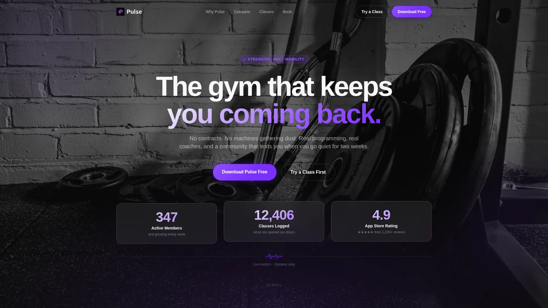
- A dark glass header with three floating metric panels and a pulsing violet accent line
- A structured Problem-to-Solution scroll flow including pain-point cards, a comparison table, and studio portfolio cards
- A fixed viewport-bottom app download button and a minimal phone-number booking form as a secondary conversion path
Feature list
This template includes purpose-built components drawn directly from the source brief. Each one serves a specific role in the conversion flow.
Dark Glass Panel Header
Three frosted-glass rectangles float over a slow-motion studio background, each showing a single bold metric. A subtle parallax effect shifts the panels as the cursor moves, and a thin violet line pulses beneath them like a heartbeat monitor.
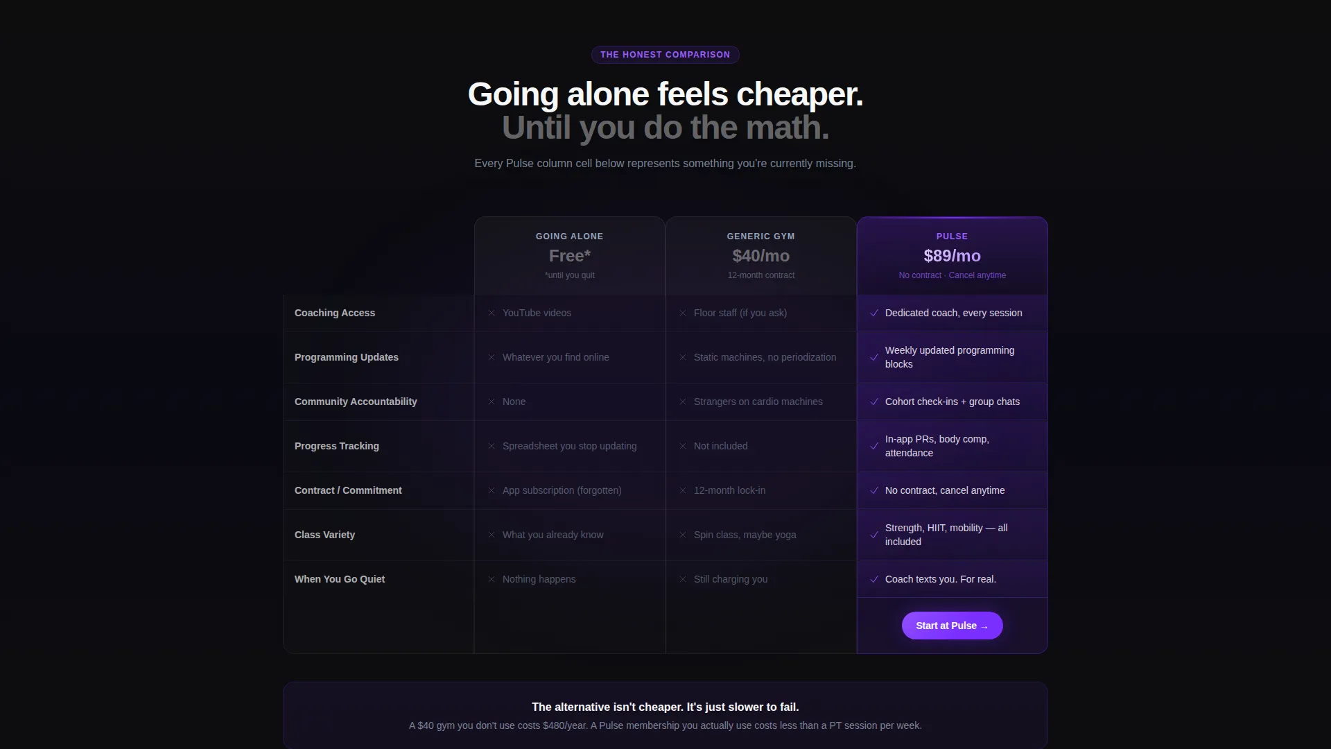
Three-Column Comparison Table
The table compares "Going Alone," "Generic Gym," and "Pulse" across rows covering coaching access, programming updates, community accountability, and progress tracking. Every Pulse column cell is highlighted in electric violet, making the choice visually clear before the reader finishes the row.
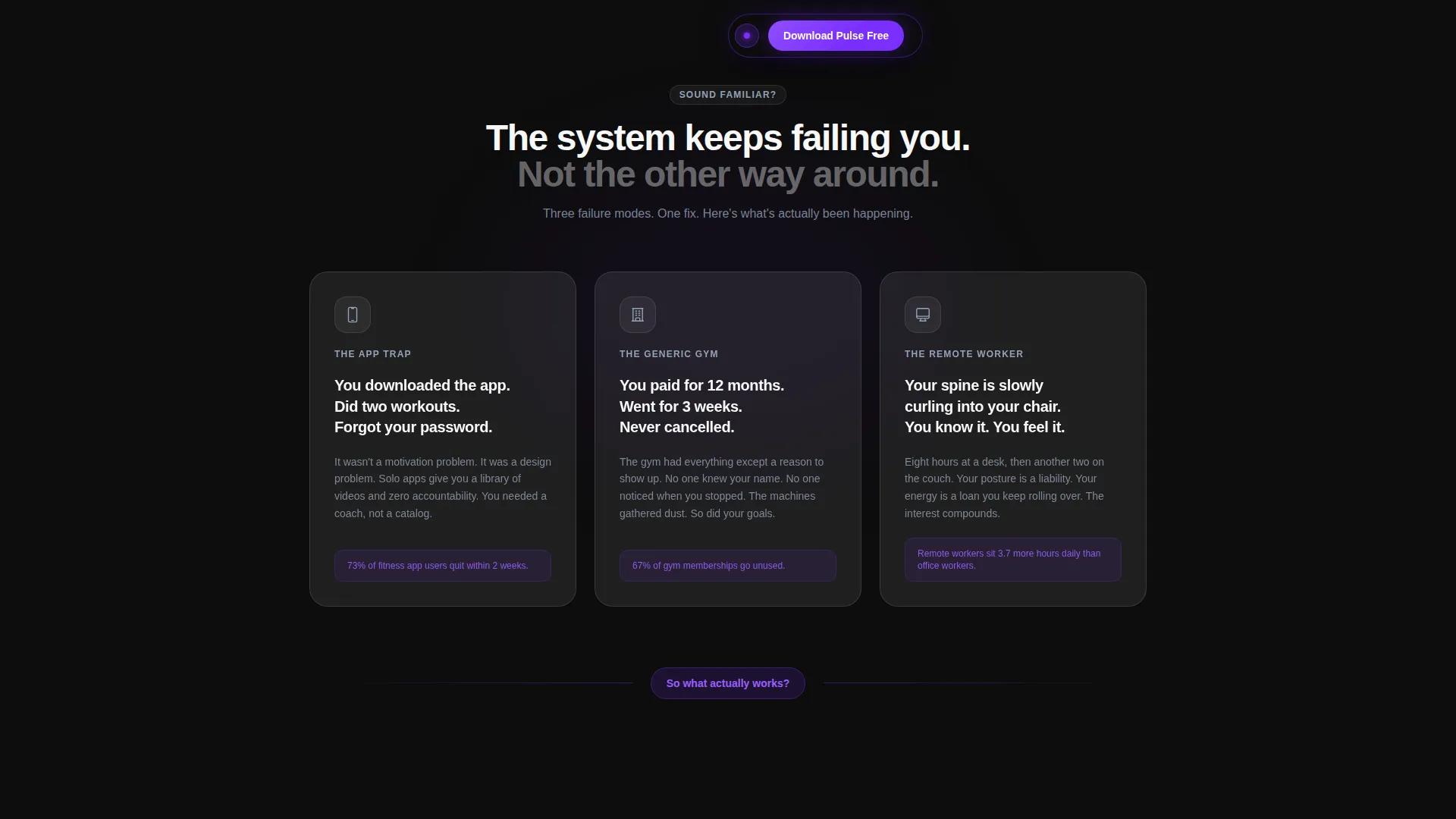
Pain-Point Glass Cards
Three frosted cards open the body content with blunt second-person copy and muted icons. They name the exact experiences that cause people to quit, creating the tension the comparison table then resolves.
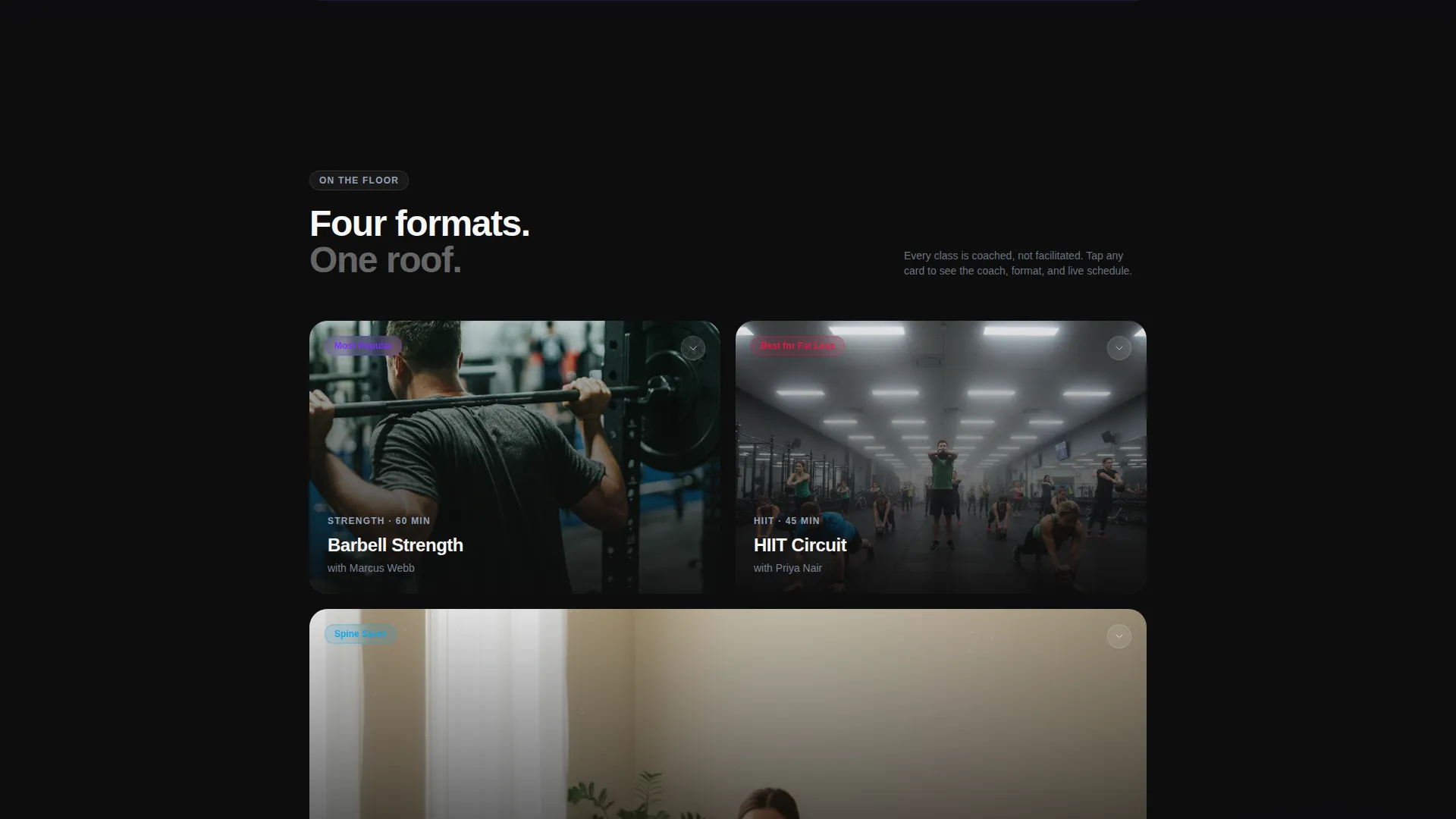
Studio Portfolio Cards
Real class footage thumbnails sit behind frosted overlays. Each card is expandable to reveal the coach, the class format, and a live schedule snippet, giving visitors concrete proof before they commit.
Fixed App Download Button
A violet glass button stays anchored to the bottom of the viewport after the first scroll. It detects the visitor's operating system and routes to the correct app store, keeping the primary call to action always one tap away.
Single-Field Booking Form
A secondary conversion path offers "Try a Class First" linked to a minimal form that asks only for a phone number. The app sends the booking confirmation, which seeds the install naturally without extra friction.
Page sections overview
| Section | Purpose |
|---|---|
| Metric Panel Header | Establishes credibility with three stark social-proof numbers |
| Pain Point Cards | Validates visitor frustration before offering any solution |
| Glass Divider Break | Marks the visual transition from problem to solution |
| Comparison Table | Differentiates Pulse from solo training and generic gyms |
| Studio Portfolio Cards | Shows real class formats, coaches, and schedule snippets |
| Fixed Download call to action | Keeps the app download action visible throughout the scroll |
| Phone Booking Form | Offers a lower-commitment path that still seeds the app install |
Design & branding system
The visual identity is built on a Glassmorphic color system that feels like viewing a lit screen in a dark room. Color appears only where the eye needs to land, and every surface either absorbs or refracts light.
- Deep obsidian (#0D0D0D) as the primary background, frosted translucent white (#FFFFFF at 8% opacity) for glass card surfaces, and electric violet (#7B2FFF) for calls to action and active indicators
- Cool slate (#94A3B8) for secondary text and divider lines, keeping supporting information readable without competing with the violet accents
- The Startup Velocity theme drives the overall feel: edges blur, panels float, and light catches glass corners to create depth without photography
Mobile & speed optimization
The layout is designed to perform on small screens where the fixed bottom button and single-field form carry the most conversion weight. The template's structure keeps heavy visual elements purposeful rather than decorative.
- The fixed viewport-bottom download button is always reachable with a thumb, regardless of scroll position
- The single-field booking form reduces tap friction to a minimum on mobile devices
- Frosted glass panels and parallax elements are scoped to their sections so they do not create visual noise on smaller viewports
How this template helps you convert
The page is built around a deliberate psychological arc that earns each click rather than demanding it. Visitors move from recognition to resolution before the primary call to action ever asks for commitment.
- The pain-point cards name the visitor's exact experience, creating immediate recognition and lowering resistance before any offer is made.
- The comparison table turns the decision into a visual exercise; the violet-lit Pulse column makes the right choice obvious without a single sentence of persuasion.
- The fixed download button and the phone-number booking form give visitors two clear exits at any moment, removing the paralysis of "I'll come back later."
Other information about this template
This template is categorized under Fitness Studio Website Templates and is designed specifically for the fitness studio portfolio page niche. It sits within the Technology category, reflecting its app-first conversion strategy and digital-native audience.
- The template style is a Comparison Table layout, which is rare in the fitness space and makes Pulse stand out from standard coach or studio pages
- The creative direction follows a Problem-to-Solution Arc, a proven structure for audiences who are skeptical of fitness marketing
- The header concept is Dark Glass Panels, a component type that delivers social proof without relying on stock photography or hero images
- The landing page direction targets App Download as the primary outcome, with class booking as a deliberate secondary path that reinforces the install
Theme
Startup Velocity
Creative direction
Problem→Solution Arc
Color system
Glassmorphic
Style
Comparison Table
Direction
App Download
Page Sections
Dark Glass Panel Header with Parallax
Three-column Comparison Table
Pain-point Glass Cards
Expandable Studio Portfolio Cards
Fixed Viewport-bottom Call to Action Button
Minimal Single-field Booking Form
Related questions
Is this template suitable for a studio without a mobile app?
Can I edit the comparison table rows to match my studio's offerings?
Does the page support multiple class types or just one format?
How does the phone-number booking form connect to the app download goal?
Who is the ideal visitor this page is designed to persuade?