Fitness Studio Advanced Professional Website Template
Pulse is a high-tech fitness studio landing page template built on a hub-and-spoke anchor navigation structure. It guides visitors through a Problem-to-Solution scroll flow, from relatable burnout stories to live class capacity and a frictionless two-step sign-up modal. The dark Tech Glass visual identity and electric cyan accents make every section feel urgent, immersive, and ready to convert.
by Rocket studio
Quick summary
Pulse is a single-page fitness studio landing page template with anchor navigation and a cinematic Tech Glass design. It leads visitors through four spoke sections, The Rut, The Method, The Proof, and The Schedule, each building toward one clear action: claiming a free first class. The layout is built for studios that want to look premium and convert immediately.
Who this template is for
This template is designed for fitness studios that want to stand out from generic gym websites. It works especially well for spaces that blend performance culture with a strong visual identity.
- Boutique fitness studios targeting tech-savvy or urban professional audiences
- Studio owners who want a polished lead-generation page without a complex multi-page build
- Coaches or operators launching a new concept and needing one strong page to capture interest fast
What problem this template solves
Most fitness studio pages feel interchangeable. They lead with a logo, a stock photo, and a pricing table that tells a visitor nothing about the experience inside. Potential members bounce before they feel anything.
- Visitors arrive without context and leave without converting, because the page never builds an emotional case
- Generic layouts fail to communicate what makes a studio's programming or atmosphere different
- Sign-up forms placed too early create friction before trust has been established
What you get with this template
You get a complete, scroll-driven landing page layout with a structured visual arc that earns conversions before it asks for them. Every section has a defined role in moving the visitor toward the primary call to action.
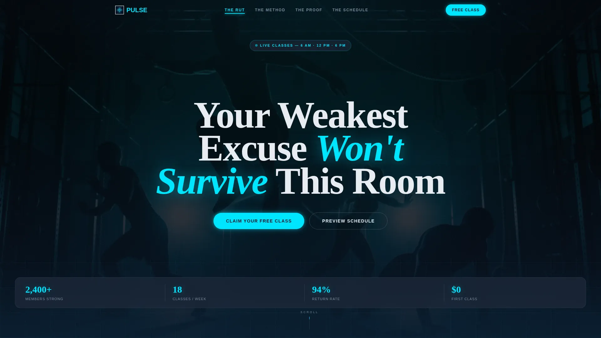
- A full-bleed cinematic header with a headline, a softly pulsing cyan call-to-action button, and a frosted-glass anchor navigation bar that pins on scroll
- Four content spoke sections with distinct purposes: problem framing, method reveal, social proof, and interactive scheduling
- A two-step glass modal lead capture form that reduces friction by asking for minimal information upfront
Feature list
This template packages several purpose-built layout components into a single cohesive page flow. Each feature below reflects a specific design or structural element described in the brief.
Frosted-Glass Anchor Navigation
A thin frosted-glass navigation bar sits above the fold and pins to the top when the visitor scrolls. Each spoke label glows cyan on hover, giving the page a clear map without interrupting the immersive dark atmosphere.
Two-Step Lead Capture Modal
The sign-up modal opens as a glass overlay with two stages. Step one asks only for a first name and preferred class time, morning, midday, or evening. Step two, revealed after a brief calendar animation, collects email and phone number. The split keeps early friction very low.
Interactive Weekly Class Grid
The fourth spoke section contains a filterable weekly schedule grid. Class filters light up in cyan when selected, letting visitors explore timing options before they commit. A secondary conversion path allows schedule browsing with an email gate triggered only when a specific class is tapped to reserve.
Parallax Section Transitions
Each spoke transition uses a subtle parallax shift paired with a self-drawing glow-line divider that pulls across the full viewport width. The pacing mirrors interval training, tension, release, and escalation, so the scroll never feels flat.
Social Proof and Scarcity Display
The Proof spoke combines transformation timelines, member-recorded video clips, and live class-capacity counters. The counters create genuine scarcity signals by showing available spots in real time, reinforcing urgency without manufactured pressure.
Sticky Mobile Call-to-Action Bar
On mobile viewports, a persistent bottom bar keeps the primary call to action, "Claim Your Free Class", visible at all times. The call to action is also repeated at the close of each spoke section on all screen sizes.
Page sections overview
| Section | Purpose |
|---|---|
| Full-Bleed Header | Sets the cinematic atmosphere and presents the primary headline and pulsing call to action button |
| Anchor Nav Bar | Pins on scroll and lets visitors jump directly to any spoke section |
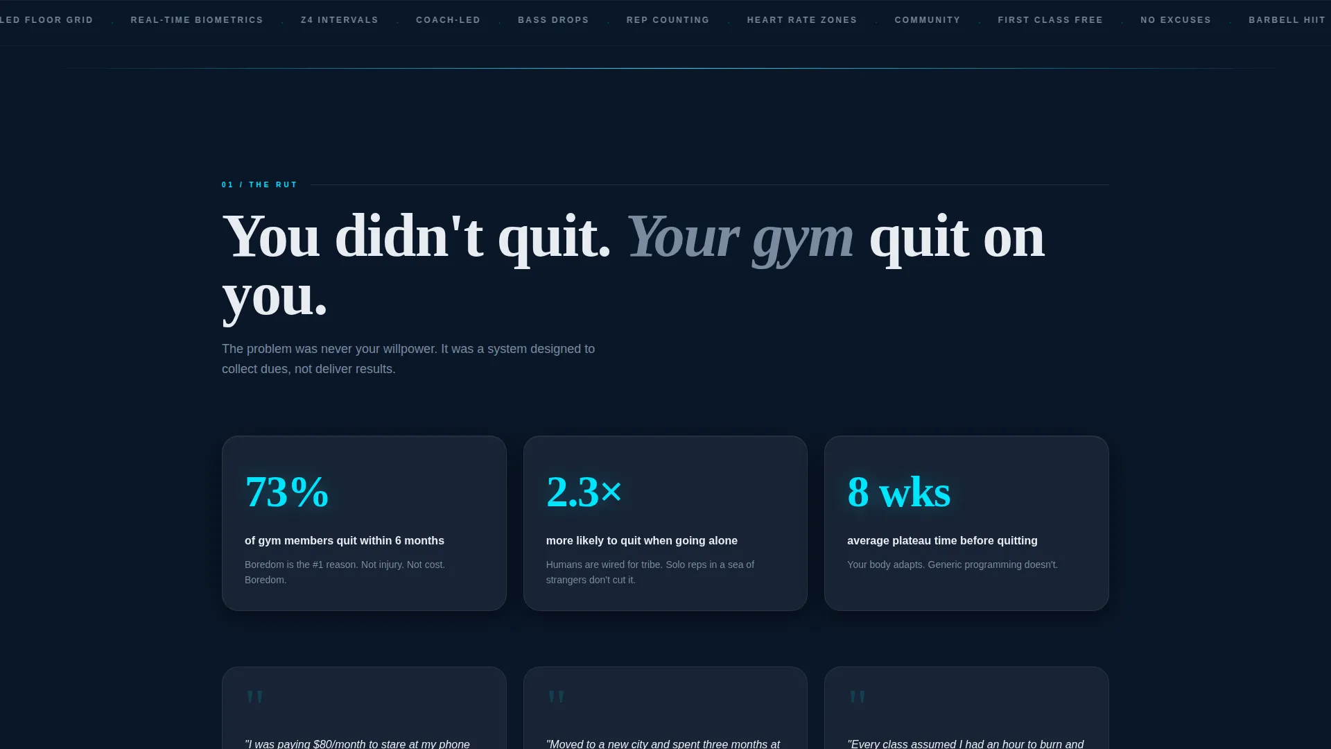
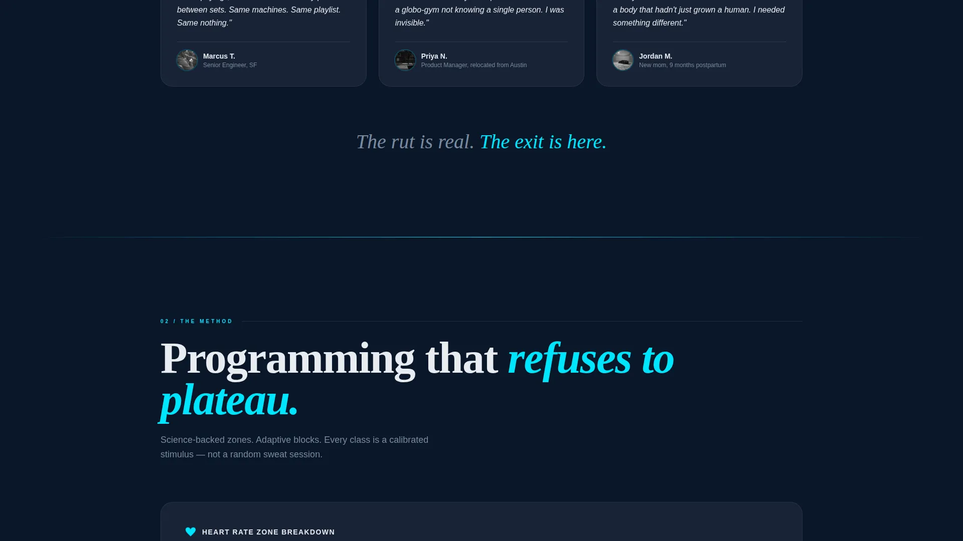
| The Rut | Frames the problem using stats and micro-stories about plateau, boredom, and quitting |
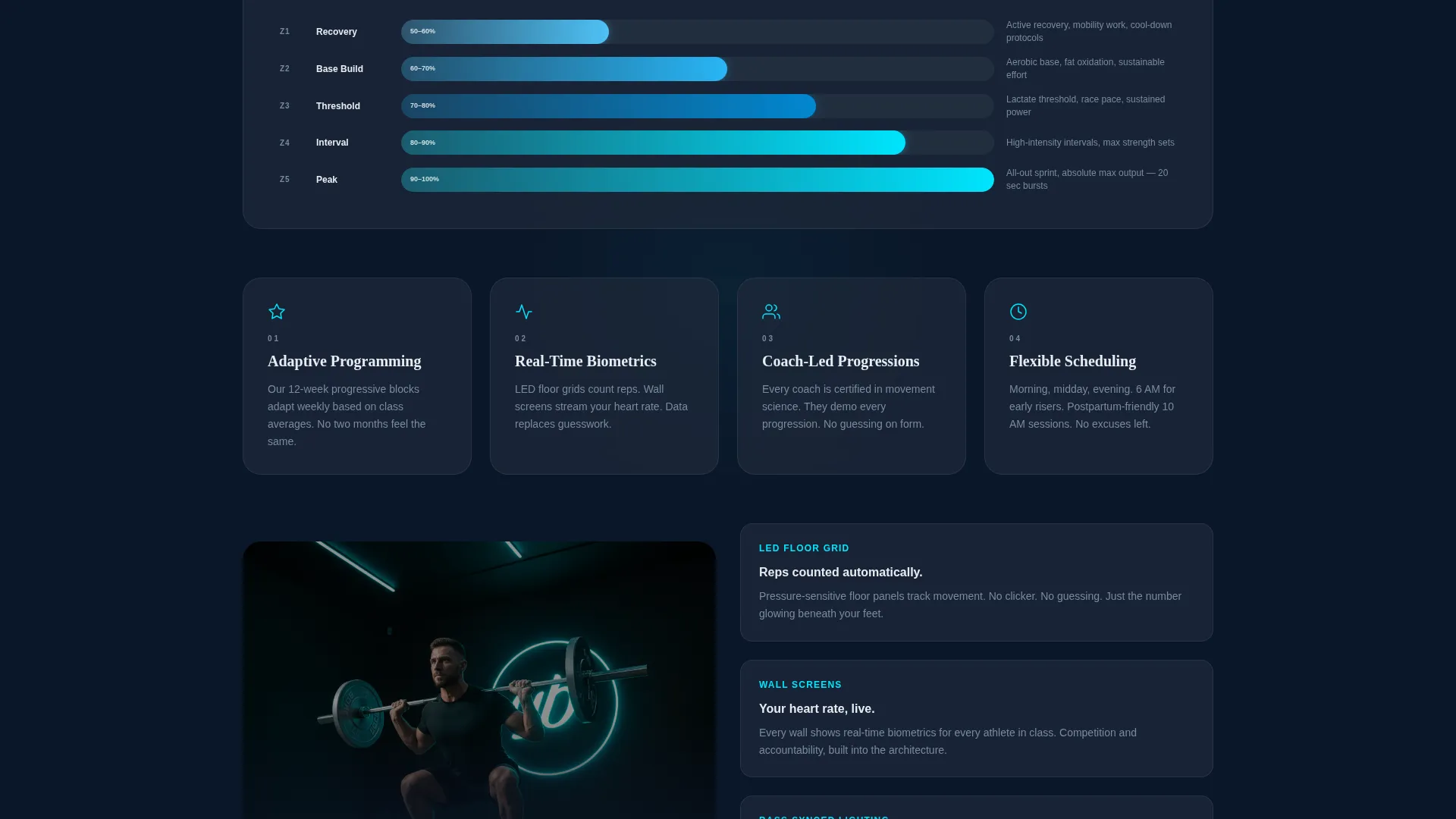
| The Method | Reveals the studio's programming through animated diagrams and coach video clips |
| The Proof | Builds trust with transformation timelines, member clips, and live capacity counters |
| The Schedule | Shows the interactive weekly class grid with filterable time slots |
| Lead Capture Modal | Two-step glass overlay form that collects name, class preference, email, and phone |
| Sticky Mobile Bar | Keeps the primary call to action accessible on smaller screens throughout the full scroll |
Design & branding system
The visual identity uses a Tech Glass theme built on a Midnight Blue color system. The palette is cold, precise, and intentionally immersive, it feels like a phone screen glowing face-up on a gym bench before dawn.
- Core colors: abyssal navy (#0A1628) for full-bleed backgrounds, tempered glass gray (#1E2A3A) for card surfaces and section dividers, electric cyan (#00E5FF) for call to action borders, progress rings, hover states, and icon strokes, and chalk white (#E8ECF1) for body text
- The cyan accent never floods the layout; it pulses on interactive elements only, so every lit control reads with clarity against the dark backgrounds
- Typography uses a single clean sans-serif face; the hero headline appears in chalk white at large scale, while body copy floats at a comfortable reading weight against the navy void
Mobile & speed optimization
The template is structured to deliver a consistent, focused experience across screen sizes. The layout decisions prioritize legibility and conversion on smaller viewports without degrading the cinematic feel.
- The sticky bottom bar on mobile keeps the primary call to action visible throughout the entire scroll, removing the need to hunt for a sign-up trigger
- The two-step modal form is designed with minimal fields at each stage, which reduces input fatigue on touch keyboards and keeps mobile completion rates practical
- Parallax and glow animations are applied at a subtle intensity so they support the visual story without overwhelming devices with lower rendering budgets
How this template helps you convert
The entire page is structured as a persuasion arc. Each spoke earns the next click before asking for a commitment.
- The problem-first scroll sequence builds genuine identification with the visitor's frustration before introducing the studio's solution, so the offer lands with context rather than noise.
- The frictionless two-step modal separates the moment of intent from the moment of full information collection, which means more visitors complete step one and more completions carry through to step two.
- The live class-capacity counters and the secondary "Preview This Week's Schedule" path give hesitant visitors a low-commitment way to stay engaged, capturing an email only when they tap to reserve a specific class.
Other information about this template
This template is built as a hub-and-spoke single-page layout, meaning all navigation links anchor to sections within the same page rather than routing to separate pages. It is well suited to fitness studio homepage use cases where a single strong impression is more valuable than a broad site map.
- The header image concept uses a floor-level perspective shot inside the studio, with bodies silhouetted against an overhead light rig and cyan rim light; no faces are visible, keeping the focus on movement and atmosphere
- The template style is Hub and Spoke with Anchor Navigation, categorized under Fitness Studio Website Templates within the Technology category
- The creative direction follows a Problem-to-Solution Arc, a structure that mirrors the way a good coach builds a session, establishing stakes before revealing the plan
Theme
Tech Glass
Creative direction
Problem→Solution Arc
Color system
Midnight Blue
Style
Hub & Spoke (Anchor Nav)
Direction
Lead Generation
Page Sections
Frosted-glass Anchor Navigation Bar
Two-step Glass Modal Form
Interactive Weekly Class Grid
Parallax Glow-line Transitions
Live Class Capacity Counters
Sticky Mobile Call-to-action Bar
Related questions
How many sections does this landing page template include?
What does the two-step modal form collect from visitors?
Can this template work for a new studio without existing social proof?
Is this template designed as a homepage or a short promotional page?
How does the secondary conversion path work for hesitant visitors?