Hypertension Therapy App Landing Page Template
Pulse is a split-screen landing page template built for hypertension digital therapy apps. It pairs a fixed "before" panel with a scrolling solution column, guiding visitors from diagnosis anxiety to clinical confidence. The Soft Mist color system, editorial typography, and a three-step eligibility quiz work together to turn passive readers into engaged, high-intent leads.
by Rocket studio
Quick summary
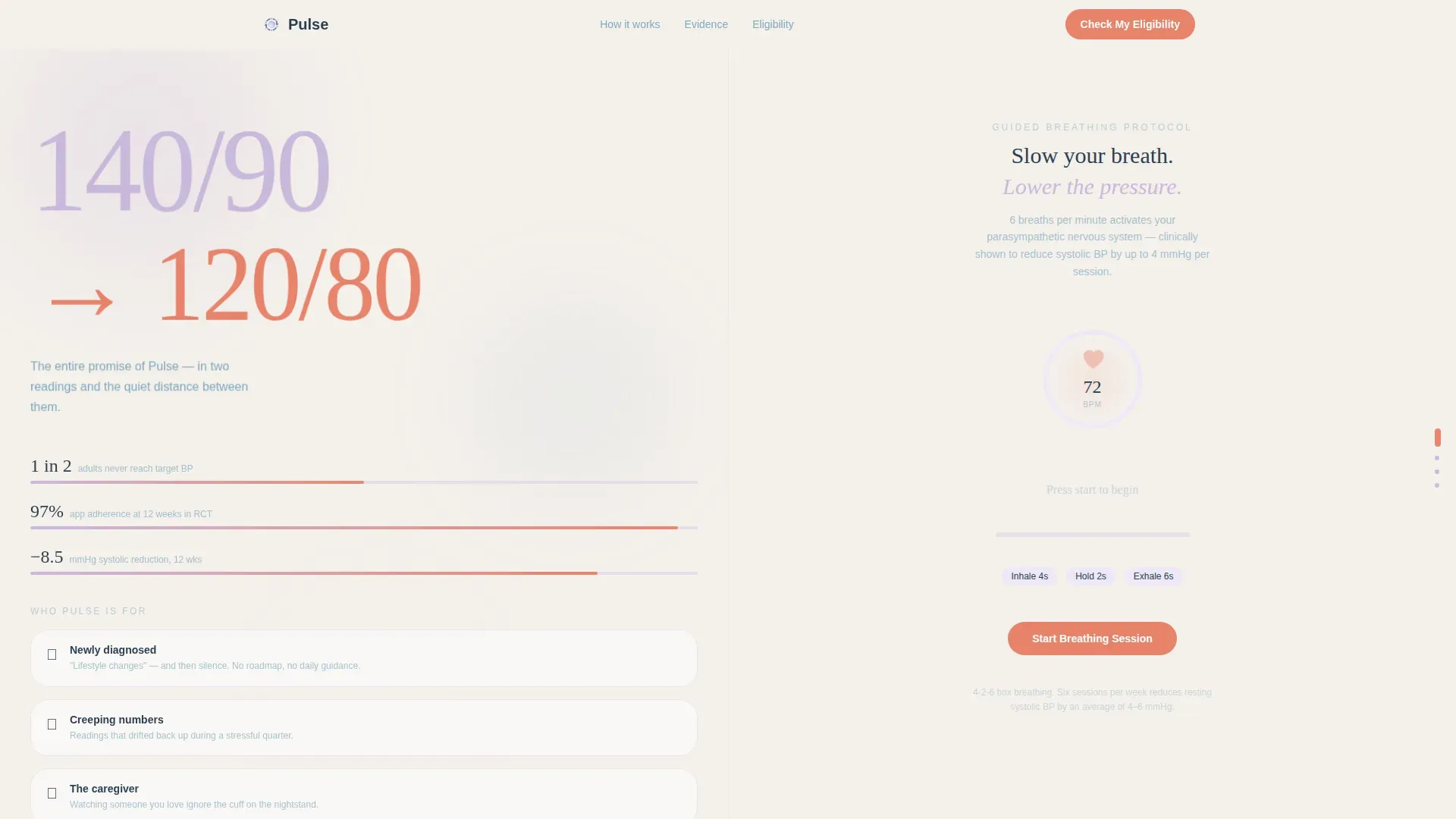
Pulse is a 50/50 split-screen landing page template designed for hypertension digital therapy apps. The left panel holds a fixed "before" state showing statistics and the quiet weight of self-managing a silent condition. The right panel scrolls through guided breathing, sodium tracking, and clinical outcome data. A three-step eligibility quiz captures leads once trust is established.
Who this template is for
This template is built for health technology teams launching or promoting a digital hypertension therapy product. It speaks directly to the patient and caregiver, not to a general wellness audience.
- Founders and product teams behind hypertension digital therapy apps targeting adults aged 35 to 60
- Clinical marketers who need a lead generation page that earns trust before asking for a commitment
- Caregiving spouses or patient advocates looking for a starting point to share with someone they love
What problem this template solves
Managing high blood pressure without a clear daily protocol is isolating. Patients leave the clinic with vague lifestyle guidance and no structured path forward. This template addresses exactly that gap with a design that mirrors the emotional journey from diagnosis to control.
- It replaces the anxiety of a blank prescription pad with a visual, step-by-step presentation of real tools
- It handles the trust problem by anchoring evidence, including clinical outcome graphs and adherence data, before the call to action ever appears
- It gives visitors two paths: commit through the eligibility quiz or take a lower-stakes first step by downloading the blood pressure starter guide
What you get with this template
This template delivers a fully structured, single-page layout built around a Problem-to-Solution arc. Every section is purpose-designed for a hypertension digital therapy context.
- A hero viewport with the "140/90 to 120/80" stacked type tower, a breathing mist animation, and a split-screen viewport that sets the emotional tone immediately
- Three right-panel scroll steps covering guided breathing with a live beats-per-minute ring animation, a sodium tracker and medication reminder interface mockup, and a clinical outcomes graph with randomized controlled trial data
- A three-step micro-quiz for lead generation, a secondary download path for softer opt-ins, and a minimal horizontal footer
Feature list
This template includes six core built-in capabilities drawn directly from the design brief.
Split-Screen Fixed-Scroll Layout
The left panel stays fixed as a "before" column while the right panel scrolls independently through solution steps. CSS scroll-snapping drives smooth panel transitions, keeping the tension between problem and answer present throughout the entire page experience.
Stacked Type Tower Hero
The hero opens with "140/90" set large in lavender type and "120/80" directly beneath it in coral. No imagery is used. The two readings and the space between them carry the entire opening promise, creating an immediate emotional connection for anyone who recognizes those numbers from their own chart.
Breathing Ring Animation
The first right-panel solution features a live beats-per-minute ring animation rendered in SVG. The breathing ring expands and contracts to guide a real-time paced breathing session, giving visitors a taste of the app experience directly on the page.
Three-Step Eligibility Quiz
The lead generation form appears after the third solution panel. It walks visitors through a blood pressure slider for their current systolic range, a yes or no medication toggle, and an email address field. Progressive disclosure keeps the form feeling approachable rather than clinical.
Secondary Download Path
Visitors who are not ready to complete the eligibility quiz are offered a "Download the BP Starter Guide" option. This path captures email through a value exchange rather than a commitment, widening the top of the funnel without pressuring undecided visitors.
Clinical Outcomes Panel
The third right-panel step presents a clinical outcomes graph alongside randomized controlled trial data, including a reduction of 8.5 mmHg systolic and a 97.2 percent adherence rate. This panel establishes evidence-based credibility before the call to action is shown.
Page sections overview
| Section | Purpose |
|---|---|
| Hero viewport | Opens with stacked blood pressure readings and breathing mist animation |
| Left fixed panel | Holds statistics and the emotional weight of self-managing hypertension |
| Breathing session panel | Shows guided breathing with live beats-per-minute ring animation |
| Sodium tracker panel | Displays sodium tracking and medication reminder interface mockup |
| Clinical outcomes panel | Presents randomized controlled trial graph and eligibility quiz call to action |
| Minimal footer | Closes with horizontal flow and secondary navigation |
Design & branding system
The visual identity is built around the Soft Mist color system, chosen to feel hushed and clinically trustworthy without sacrificing warmth. Typography pairs Fraunces serif headlines with DM Sans body text for an editorial, readable contrast.
- Color palette: fog white (#F4F0EB) for backgrounds, shallow-breath lavender (#C9B8DB) for accents, resting-heart-rate blue (#7EA8BE) for body text and navigation, and pulse-point coral (#E8836B) reserved exclusively for calls to action and live data accents
- Typography: Fraunces handles display headlines and the stacked type tower; DM Sans handles all body copy, form labels, and navigational elements
- Visual tone: no illustrations or photography; layout relies on type scale, gradient mist drift, and the SVG breathing ring animation to carry the emotional and clinical feel
Mobile & speed optimization
The split-screen layout is designed desktop-first, but the template includes a mobile stack fallback so the full content experience remains accessible on smaller screens.
- On mobile, the fixed left panel and scrolling right panel collapse into a single vertical stack, preserving section order and readability
- Intersection Observer drives panel transition triggers, replacing scroll-linked animations with lightweight viewport detection on mobile
- CSS scroll-snapping is used for the right panel on desktop to keep transitions crisp and prevent unintended scroll drift between steps
How this template helps you convert
The conversion architecture is deliberate. Trust is built before any commitment is requested, and two distinct paths are available depending on visitor readiness.
- The Problem-to-Solution arc builds clinical credibility across three scroll steps before the eligibility quiz appears, so visitors arrive at the call to action already persuaded by evidence rather than pressure
- The three-step micro-quiz uses progressive disclosure, a slider, a toggle, and a single email field, reducing form friction and making the qualification process feel like a personal health check rather than a lead capture form
- The secondary "Download the BP Starter Guide" path ensures that visitors who hesitate on the primary call to action still enter the funnel through a low-commitment value exchange
Other information about this template
This template is category-matched to Health and Medical, specifically the Hypertension Care subcategory, and carries an intersection match score of 13 for hypertension digital therapy app use cases. The design brief targets adults aged 35 to 60 in a United States English context with USD pricing and US date formatting built into the layout logic.
- Localization defaults: English language, USD currency, and US date format
- Animation intensity is set to high, covering the breathing ring SVG, the mist gradient drift, and the BPM pulse accent
- Interactivity level is high, with the three-step eligibility quiz, the systolic range slider, and the medication toggle all included as built-in interactive components
- The footer follows a minimal horizontal flow pattern, keeping the close of the page clean and uncluttered


Theme
Soft Gradient
Creative direction
Problem→Solution Arc
Color system
Soft Mist
Style
Split Screen (50/50)
Direction
Lead Generation
Page Sections
Split-screen Fixed-scroll Layout
Stacked Type Tower Hero
Live Breathing Ring Animation
Three-step Eligibility Micro-quiz
Secondary Download Path
Clinical Outcomes Evidence Panel
Related questions
Who is this landing page template designed for?
What does the three-step eligibility quiz include?
Does the template include a fallback for mobile users?
Can visitors opt in without completing the eligibility quiz?
What clinical data is built into the template?



