Hypertension Support Group Landing Page Template
Pulse is a lead generation landing page built for hypertension support groups. It uses a Problem-to-Solution structure, a side-by-side comparison table, and a Forest Trust color system to convert recently diagnosed adults, long-term patients, and caregivers into support group members. The design is calm, clinically grounded, and built to make blood pressure numbers feel manageable, not frightening.
by Rocket studio
Quick summary
Pulse is a single-page template for a hypertension support group. It opens with a stats wall of three oversized figures, walks visitors through a raw problem arc, and delivers a five-row comparison table that contrasts managing alone with managing with support. Two conversion paths capture both ready-to-join visitors and those who need a softer first step.
Who this template is for
This template is built for health educators, community organizers, and clinicians who run, or want to launch, a structured hypertension support group. It speaks directly to three distinct audiences and handles all of them on a single page.
- Recently diagnosed adults who are confused by home monitor readings and unsure what their numbers mean
- Long-term hypertension patients whose medication regimens keep changing and who feel isolated between appointments
- Caregivers who track blood pressure readings for aging parents and need reliable guidance they can act on remotely
What problem this template solves
People living with high blood pressure often face the same core problem: they are managing a serious, chronic condition largely alone. A confusing number on a home monitor, a medication name they cannot pronounce, a dietary change they are not sure matters, these stack up between appointments until a doctor's visit feels like a test they did not study for.
- No clear explanation of what readings like 140/90 actually mean in daily life
- No structured support between clinic visits for medication adherence or dietary decisions
- No community to normalize the emotional weight of a long-term diagnosis
What you get with this template
This template delivers a fully structured, single-page layout designed for lead generation in the hypertension education space. Every section builds on the last, guiding visitors from raw problem recognition to a confident decision to join.
- A sequential stats hero, a three-card problem arc, a five-row comparison table, member testimonials, and a programming preview with a 90-day outcomes snapshot
- Two conversion paths: a primary "Join the Next Support Circle" call to action and a secondary PDF lead magnet for visitors not yet ready to commit
- A sticky bottom bar that appears after 60 percent scroll depth, a three-field sign-up form, and scroll-triggered section reveals
Feature list
The following built-in capabilities are what make this template work as a lead generation tool for a hypertension support community.
Sequential Stats Hero Wall
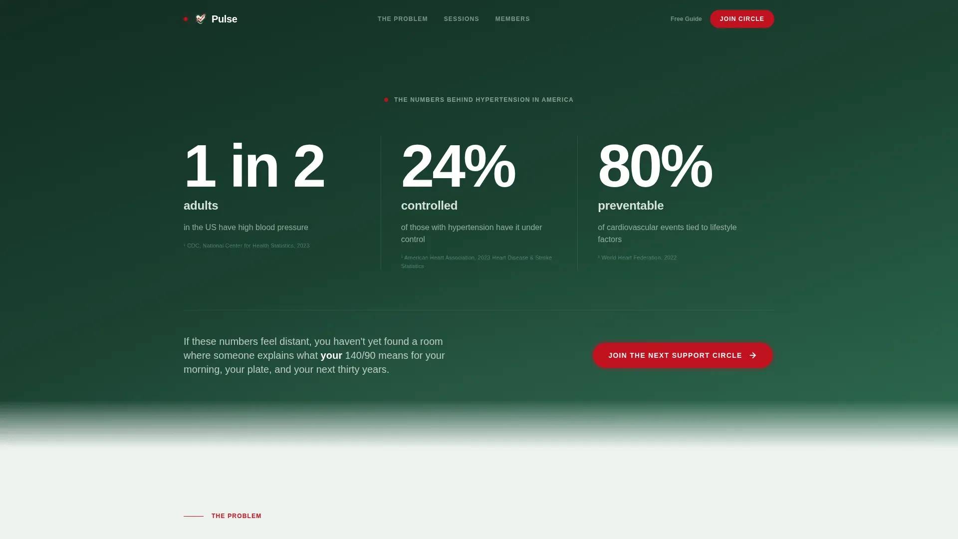
Three oversized statistics fade in one by one against a deep evergreen background. Each figure is set in a clean display-scale sans-serif with a sourced footnote beneath it in soft moss text. The effect is clinical and immediate, like vital signs on a monitor demanding attention.
Five-Row Comparison Table
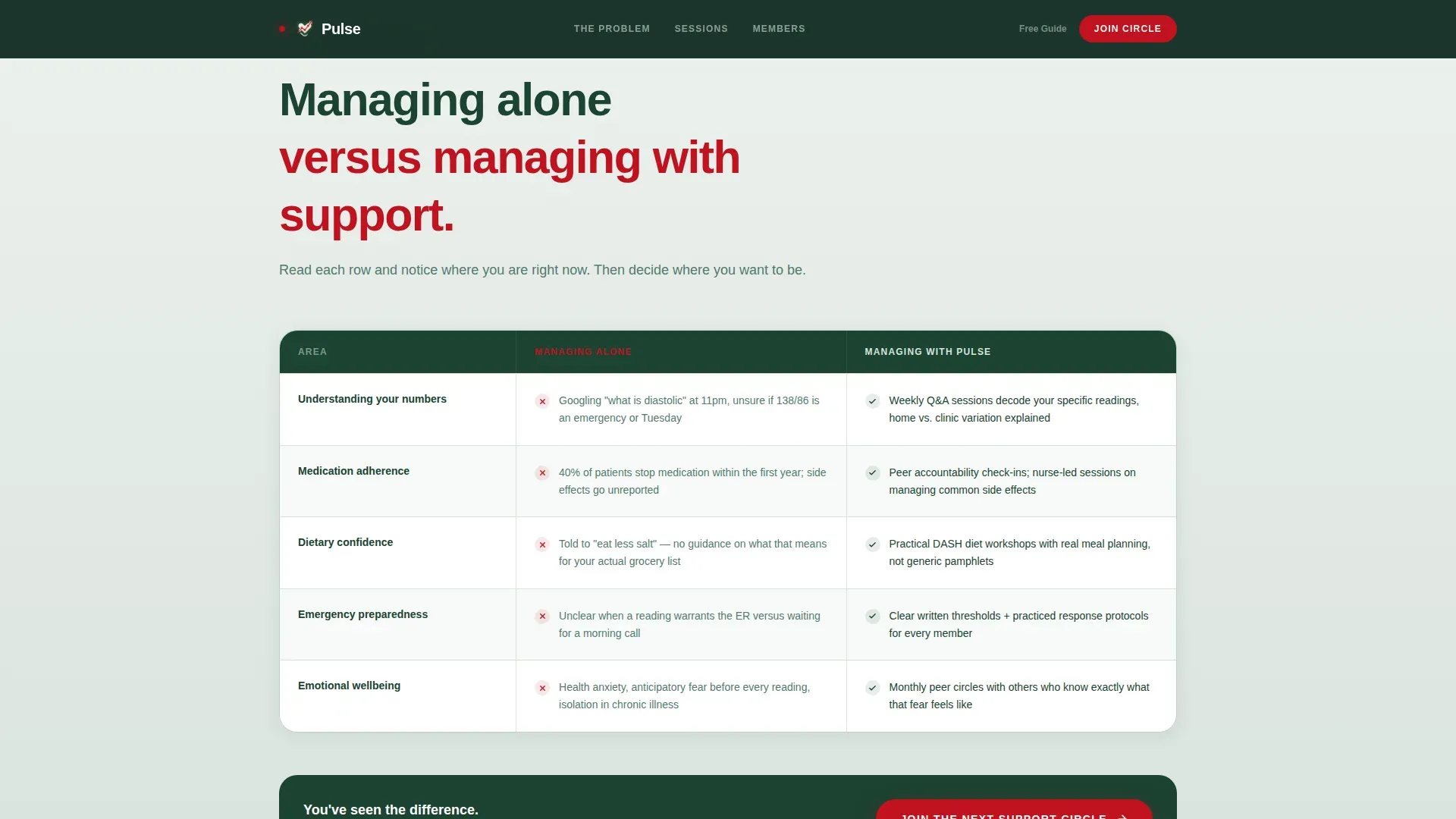
The centerpiece of the page is a two-column table: "Managing Alone" on the left, "Managing With Support" on the right. Five rows cover knowledge gaps, medication adherence, dietary confidence, emergency preparedness, and emotional wellbeing. Each row is built to prompt quiet recognition, visitors see their own situation reflected before they reach the call to action.
Dual Conversion Path System
The primary call to action collects first name, diagnosis status, and email through a three-field form. A secondary path offers a downloadable Home Monitoring Guide as a PDF lead magnet, capturing email only for visitors who are not yet ready to join. Both paths are placed intentionally to reduce friction.
Sticky Bottom Call-to-Action Bar
After a visitor scrolls past 60 percent of the page, a persistent bottom bar appears carrying the primary call to action in heartbeat-red. It stays visible without interrupting reading, keeping the conversion option accessible through testimonials and programming previews.
Testimonials and 90-Day Outcomes Block
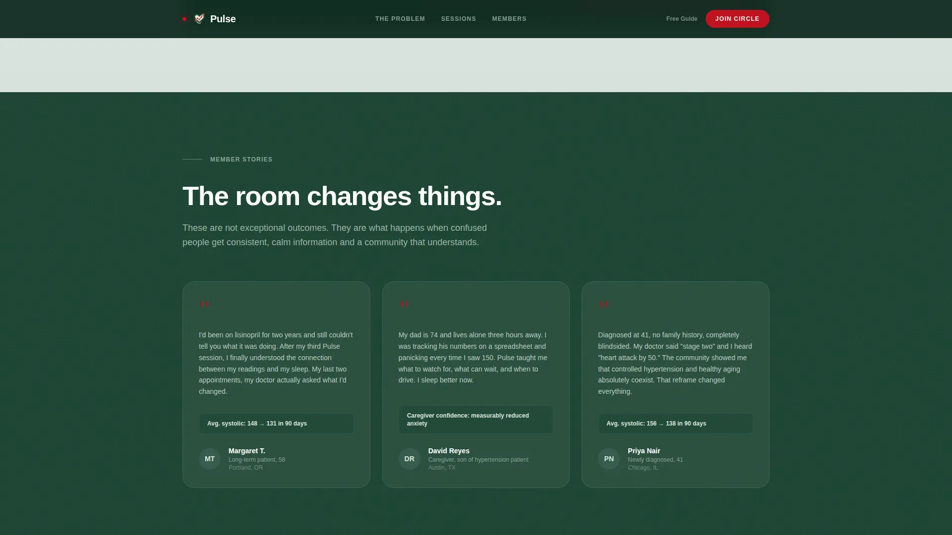
Three member testimonials are paired with a bento-style grid showing weekly programming previews and a 90-day outcomes snapshot. The outcomes section displays average systolic reduction figures among active participants, giving social proof a specific, clinical weight.
Scroll-Triggered Section Reveals
Each major section fades or slides into view as the visitor scrolls. This pacing creates a deliberate, unhurried reading experience that matches the calm authority the content is designed to project.
Page sections overview
| Section | Purpose |
|---|---|
| Stats Hero Wall | Opens with three sequential oversized figures to establish clinical credibility immediately |
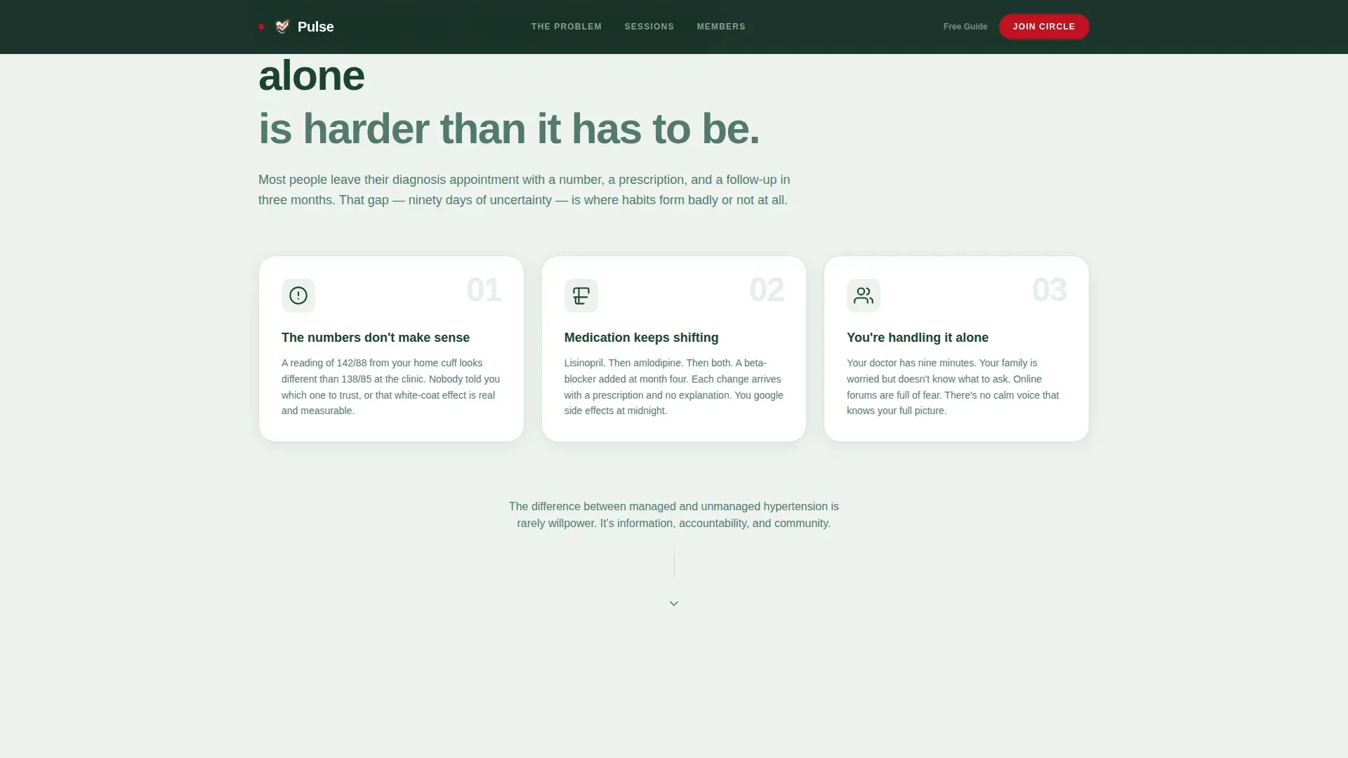
| Problem Arc Cards | Three pain cards frame the raw problem: uncontrolled numbers, confusing medications, isolation |
| Comparison Table | Side-by-side five-row table contrasts managing alone with managing with community support |
| Member Testimonials | Three stories with diagnosis context provide specific, human social proof |
| Programming and Outcomes | Bento grid previews weekly sessions and shows a 90-day systolic reduction snapshot |
| Footer | Single linear row with essential links and secondary navigation |
Design & branding system
The visual identity follows an Educational Guide theme using the Forest Trust color system. The palette is grounded, oxygen-rich, and deliberately unhurried, designed to reduce anxiety rather than trigger it.
- Deep evergreen (#1B4332) anchors headers and navigation; soft moss (#52796F) carries body backgrounds and card surfaces; warm birch (#D8E2DC) creates breathing room between content blocks
- Heartbeat-red (#C1121F) appears only on critical statistics and primary call-to-action buttons, so every appearance carries the weight of an alert worth reading
- Typography uses DM Sans at display scale for statistics and clean body sizes throughout, keeping the page clinical without feeling cold
Mobile & speed optimization
The template is built desktop-first with full mobile responsiveness. This matters because a significant share of the target audience, particularly caregivers, access health content on mobile devices.
- The comparison table collapses cleanly on small screens so both columns remain readable without horizontal scrolling
- Scroll-triggered reveals and the sticky call-to-action bar are handled through client-side components, while static sections use server-side rendering for faster initial load
- The three-field sign-up form includes validation, making it functional and low-friction on touch screens
How this template helps you convert
The entire page architecture is built around a single strategic arc: show the visitor their current situation, then show them a better one. Every design and copy decision serves that movement.
- The comparison table does the heaviest conversion work. By the time a visitor reaches the primary call to action, they have already read five rows that describe their own experience in the left column. The emotional case for joining is already made before any button appears.
- Two conversion paths mean fewer lost visitors. The PDF lead magnet captures email from readers who are interested but hesitant, keeping them in the funnel even if they are not ready to join the support circle today.
Other information about this template
This template is a strong fit for health education communities that operate in the hypertension care space and need a structured, credible digital presence to attract members.
- The page is designed around US-centric health context with English-language copy and implied USD pricing, making it straightforward to adapt for American health organizations
- No stock photography or illustrations are used in the hero section; the design relies entirely on data typography, which keeps the visual tone serious and trustworthy
- The footer follows a linear single-row pattern, keeping the page exit clean and uncluttered
- The template is well-suited for use by community health programs, cardiology group practices, patient advocacy organizations, and independent health coaches working in the hypertension support niche
Theme
Educational Guide
Creative direction
Problem→Solution Arc
Color system
Forest Trust
Style
Comparison Table
Direction
Lead Generation
Page Sections
Sequential Stats Hero Wall
Five-row Comparison Table
Dual Conversion Path System
Sticky Bottom Call-to-action Bar
Testimonials and Outcomes Block
Scroll-triggered Section Reveals
Related questions
Who is the primary audience this template targets?
What does the comparison table actually compare?
Can this template support both free and paid membership models?
Does the page include any proof of member outcomes?
Is the sign-up form designed to feel approachable for health-sensitive visitors?



