Hypertension Trials Landing Page Template
A sidebar companion landing page built for hypertension clinical trial matching. Visitors answer seven structured qualification checkpoints and get matched to nearby active trials. The design follows a Corporate Precision style with a calm, exam-room feel. A sticky sidebar tracks real-time progress, and a scheduling overlay captures only a name, phone number, and preferred callback window.
by Rocket studio
Quick summary
This landing page guides adults with uncontrolled blood pressure through a seven-checkpoint self-screening flow. A sticky sidebar companion tracks progress in real time. On completion, visitors schedule a 15-minute phone screening or generate a shareable eligibility summary for their physician. The design is clean, clinical, and deliberately unhurried.
Who this template is for
This template is built for healthcare organizations, clinical research sites, and patient recruitment teams running active hypertension trials. It also serves digital health agencies building enrollment tools for pharma sponsors.
- Adults aged 45 to 70 on two or more blood pressure medications whose readings remain above target
- Caregivers researching trial options for a parent or family member with climbing blood pressure readings
- Referring physicians looking for trial slots that match specific patient profiles
What problem this template solves
Most clinical trial pages drop visitors into a wall of eligibility text and ask for contact information before demonstrating fit. That approach drives abandonment. This template reverses the sequence entirely.
- Visitors complete structured qualification steps before any contact details are requested
- The progressive checklist builds confidence and investment checkpoint by checkpoint
- Two distinct conversion paths serve both direct patients and physician referral workflows
What you get with this template
You get a fully structured, single-page screening experience designed around a seven-step qualification flow. Every section has a defined purpose, from the opening headline to the scheduling overlay.
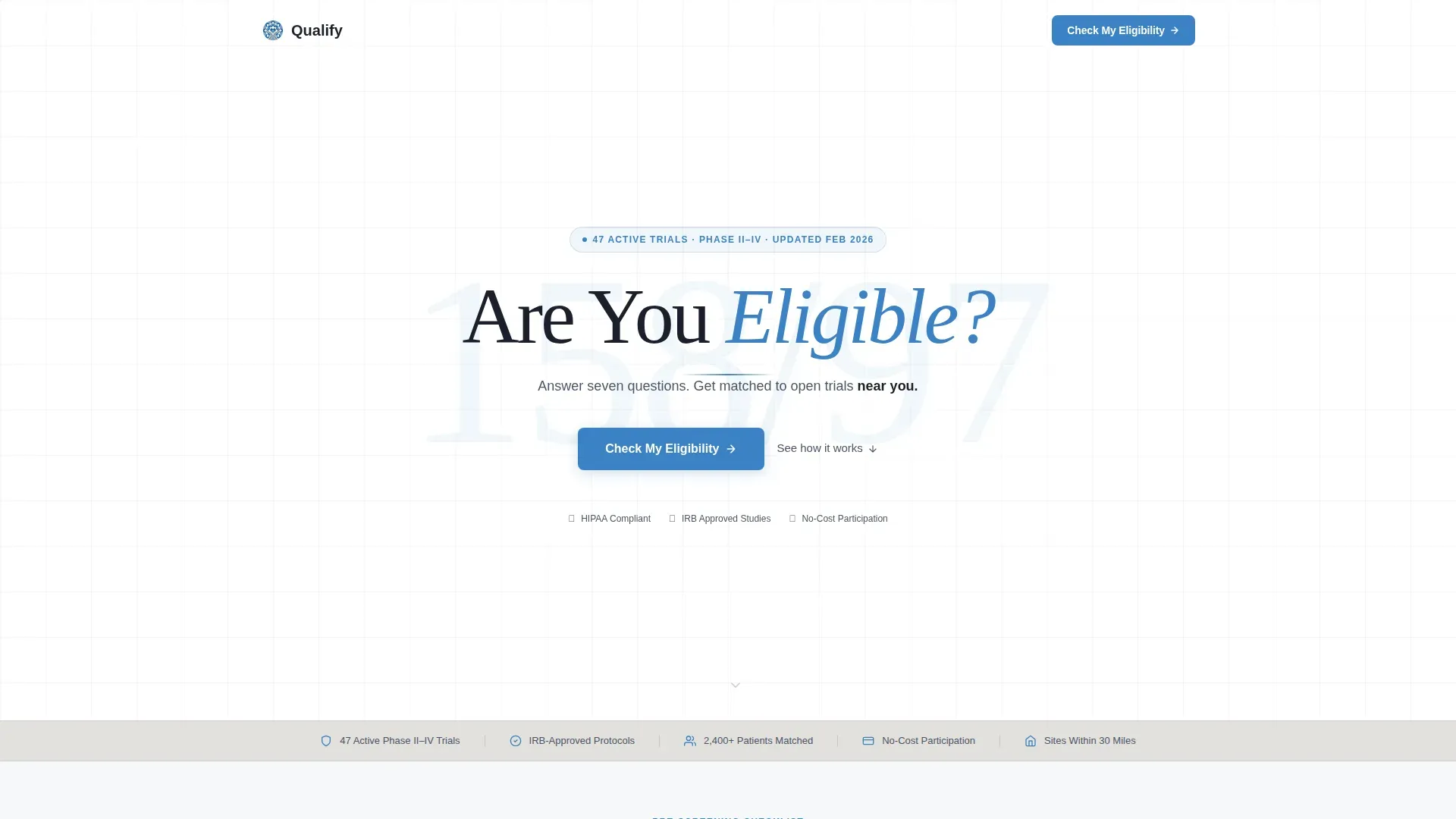
- A giant centered headline hero with a soft cerulean blood pressure watermark and a one-line subhead
- A trust bar displaying trial phase range, oversight credentials, participation cost status, and active study count
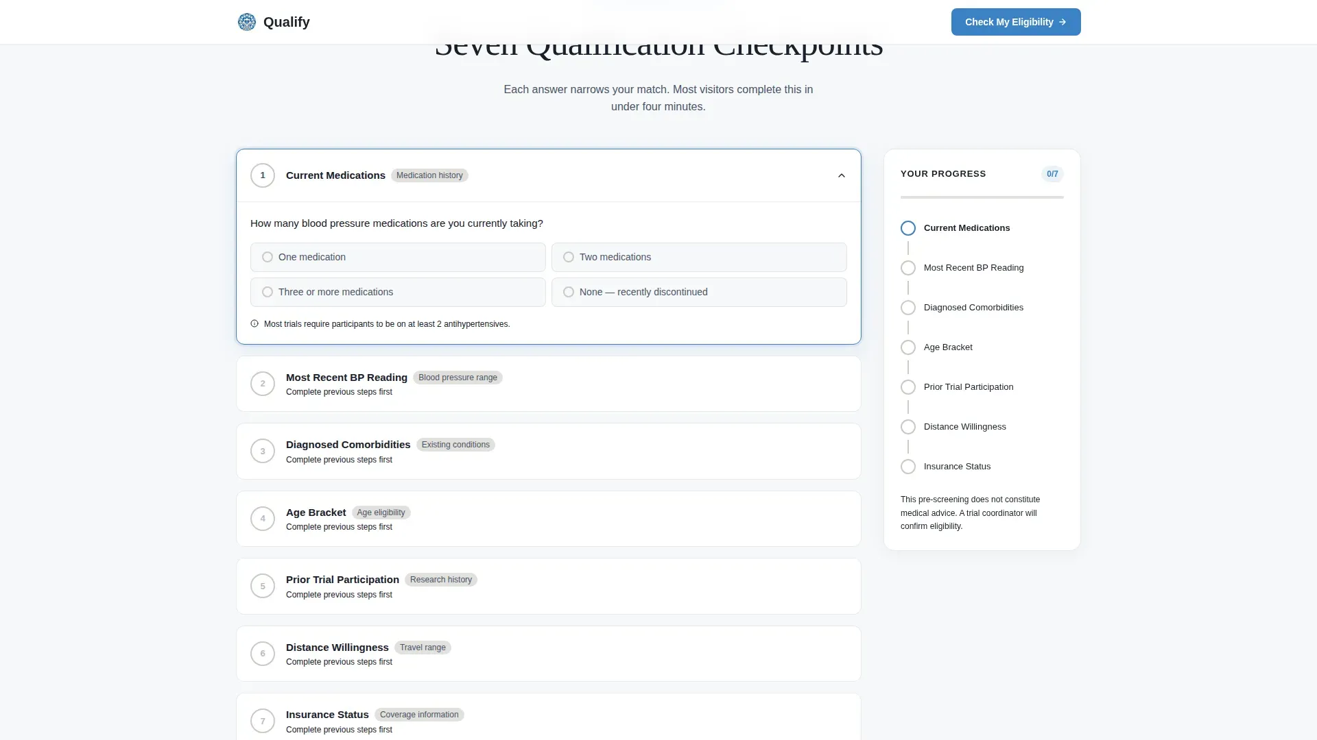
- Seven expandable qualification checkpoint cards with a sticky real-time progress sidebar
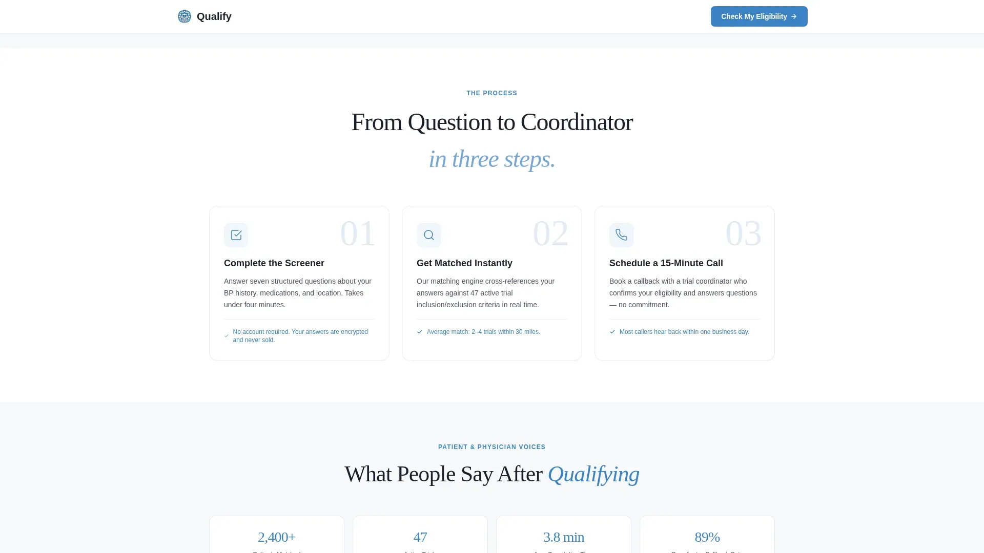
- A three-step illustrated process section explaining Screen, Match, and Schedule
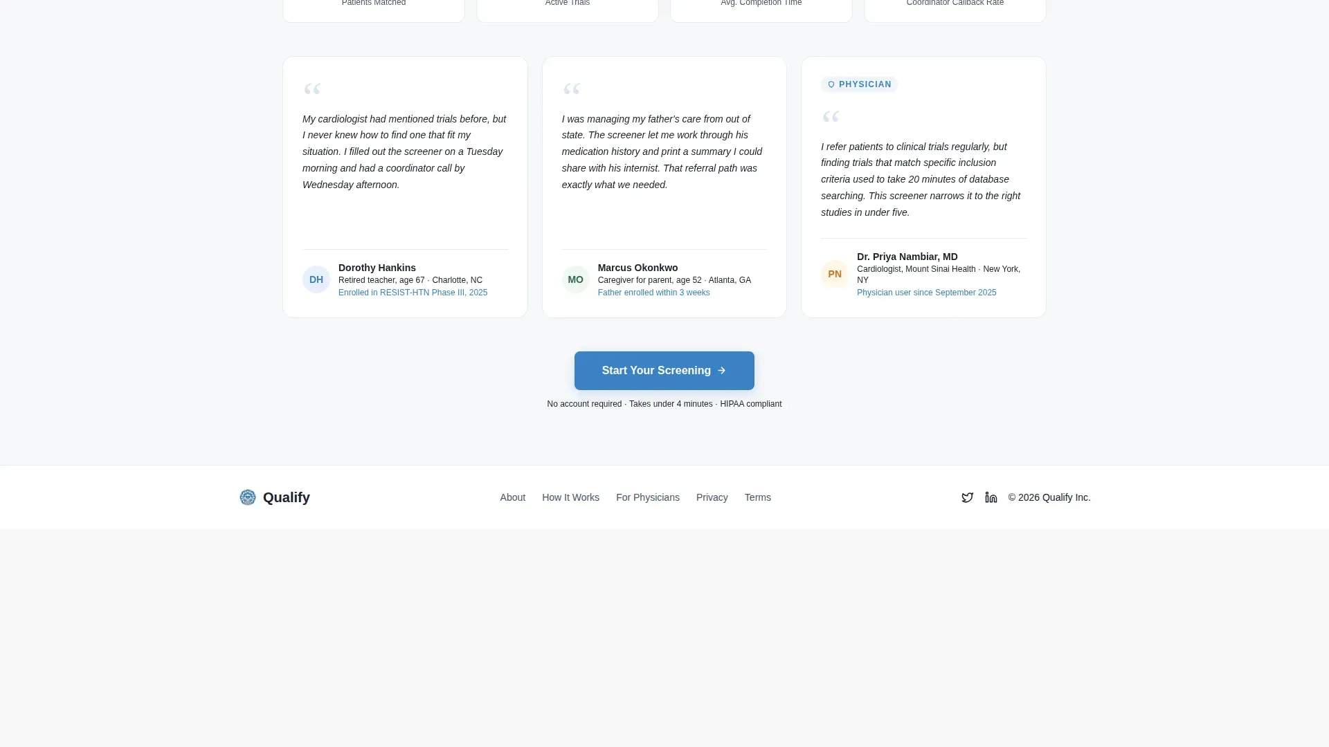
- A social proof section with participant testimonials and physician endorsement quotes
- A scheduling overlay collecting first name, phone number, and preferred callback window
- A secondary path that generates a shareable eligibility summary for physician referral
Feature list
This template ships with several purpose-built components tied directly to clinical trial patient matching.
Seven-Checkpoint Qualification Flow
Each checkpoint covers a distinct eligibility dimension: current medications, most recent blood pressure reading range, diagnosed comorbidities, age bracket, prior trial participation, distance willingness, and insurance status. Cards are expandable, and the sequence moves from low-commitment questions to more specific clinical details to build psychological investment.
Sticky Sidebar Progress Tracker
The sidebar companion stays visible as the visitor scrolls. Empty circles fill with cerulean check marks as each checkpoint is completed. A progress bar advances in real time, and a persistent call-to-action button appears once four of the seven checkpoints are done.
Scheduling Overlay with Minimal Fields
Completing the checklist flow opens a scheduling overlay. Visitors choose a 15-minute phone screening slot with a trial coordinator. The form captures only first name, phone number, and preferred callback window, keeping friction as low as possible at the moment of conversion.
Physician Referral PDF Path
A secondary conversion route labeled "Send My Results to My Doctor" generates a shareable eligibility summary. It captures the physician's email address and creates a warm referral loop without requiring the visitor to start over.
Trust Bar and Social Proof Section
A dedicated trust bar communicates trial phase range (Phase II through Phase IV), oversight credentials, no-cost participation status, and the count of active studies. A separate social proof section surfaces participant testimonials and physician endorsement quotes to reinforce credibility before the final call to action.
Micro-Interaction Reward System
Completing each checkpoint triggers a subtle pulse animation and advances the progress indicator. Built with GSAP scroll reveals and checklist micro-interactions, the motion design is intentionally restrained so it feels clinical rather than flashy.
Page sections overview
| Section | Purpose |
|---|---|
| Hero Headline | Frames eligibility question with a blood pressure watermark and subhead |
| Trust Signal Bar | Displays trial phases, oversight, cost status, and active study count |
| Checklist Flow | Seven expandable qualification checkpoints with sidebar progress tracking |
| How It Works | Three-step illustrated process: Screen, Match, Schedule |
| Social Proof | Participant testimonials and physician endorsement quotes |
| Footer | Linear single-row footer pattern |
Design & branding system
The visual identity follows a Corporate Precision theme using a Cloud Canvas color palette. The overall feel is sterile but breathable, like a freshly printed lab report in a quiet exam room.
- Background fields use soft clinical white (#F7F8FA), card surfaces sit on warm gray (#E2E0DC), and body text runs in measured slate (#4A5568)
- Cerulean (#3B82C6) drives primary buttons, progress indicators, check marks, and the decorative rule beneath the hero headline
- Typography pairs Fraunces display serif for headlines with DM Sans for body text, creating an authoritative yet approachable reading experience
Mobile & speed optimization
The layout is designed desktop-first to support the sidebar companion structure. On smaller screens, the sidebar collapses into an inline progress indicator so the checklist flow remains fully usable.
- Static page sections use Server Components to keep the initial load lean
- Interactive checklist cards and the real-time sidebar are handled by Client Components to isolate interactivity
- GSAP animations are medium-weight and scoped to scroll reveals and micro-interactions, keeping motion purposeful
How this template helps you convert
The conversion strategy is built on earned trust. Visitors prove eligibility to themselves before they are ever asked for contact information.
- The checklist sequence escalates from simple questions to specific clinical details, so by checkpoint five the visitor has already invested enough effort that continuing feels more natural than leaving.
- The sticky sidebar makes progress visible at all times, reinforcing momentum and reducing the sense of an open-ended form.
- Two distinct exit paths, direct scheduling and physician referral PDF, capture both patient-driven and clinician-driven conversions without forcing every visitor through the same funnel.
Other information about this template
This template is suited for organizations running Phase II, Phase III, or Phase IV hypertension trials in the United States. It uses US zip code-based proximity logic, English-language copy, and date formatting in the MM/DD/YYYY convention.
- Localization is set for English, US dollar references, US zip codes, and standard US date formatting
- The header concept is Giant Headline Centered, placing the question "Are You Eligible?" in enormous tracked-out sans-serif type against unbroken white
- The creative direction is Checklist and Audit, turning the scroll into a self-administered pre-screening session
- The landing page direction is Booking and Scheduling, with the primary call to action reading "Check My Eligibility"
- The template style is Sidebar Companion, with a two-column desktop layout where the pale sidebar tracks qualification progress alongside the main content column
Theme
Corporate Precision
Creative direction
Checklist & Audit
Color system
Cloud Canvas
Style
Sidebar Companion
Direction
Booking/Scheduling
Page Sections
Seven-checkpoint Qualification Flow
Sticky Sidebar Progress Tracker
Scheduling Overlay with Minimal Fields
Physician Referral PDF Path
Trust Bar and Social Proof
GSAP Micro-interaction System
Related questions
Who is this landing page designed to serve?
How does the seven-checkpoint qualification flow work?
What information does the scheduling form collect?
Can a visitor share results with a doctor instead of scheduling directly?
Does the template work on mobile devices?



