Hypertension Wearable Monitor Landing Page Template
Pulse is a hypertension wearable monitor landing page template built around comparison tables, clinical social proof, and a content-first conversion flow. It combines a testimonial mosaic layout with scroll-reveal comparison rows, an animated blood pressure curve, and a handbook download call to action, all styled in the calming Alpine Fresh color system.
by Rocket studio
Quick summary
Pulse is a single-page landing page template for a continuous blood pressure wearable. It leads with a real-person testimonial card, builds trust through clinical voices and scroll-reveal comparison tables, and converts visitors through a free handbook download and an interactive monitoring quiz. The Organic Flow design feels steady and human, never clinical or cold.
Who this template is for
This template is built for health and medical brands that need to earn trust before they earn a lead. It suits teams launching or marketing a hypertension wearable monitor to an audience that is cautious, informed, and needs to feel confident before handing over their email address.
- Direct-to-consumer health technology brands positioning a wearable blood pressure device
- Medical marketing teams who need clinical credibility woven into a content-driven page
- Health-focused founders building early audience lists through educational lead magnets
What problem this template solves
Most health technology landing pages either feel too clinical or too promotional. Neither builds the quiet confidence that someone managing hypertension actually needs. This template solves that by sequencing information the way a trusted conversation unfolds, human story first, data second, ask third.
- Visitors leave pages that lead with product specs before building personal relevance
- A single call to action misses people who are curious but not yet ready to buy
- Comparison tables without context feel cold; this template wraps each table in a real voice
What you get with this template
You get a fully structured, single-page layout with every section pre-planned and ready to populate. The template handles the hard design decisions, visual hierarchy, pacing, color contrast, and conversion sequencing, so you focus on your message.
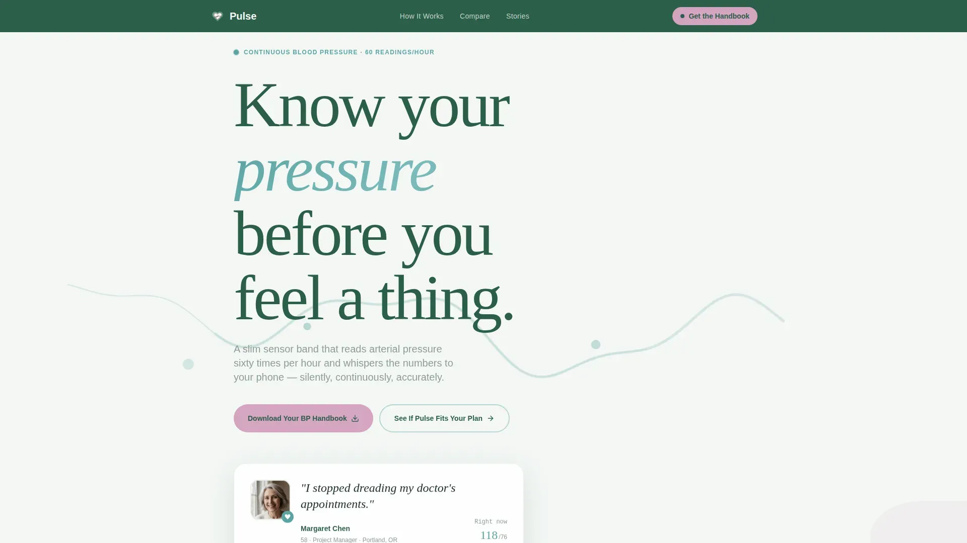
- An animated hero section with a sine wave blood pressure curve and oversized testimonial card
- Three scroll-reveal comparison table sections covering cuff, clinic, and competitor comparisons
- A testimonial mosaic with varied tile formats including video thumbnails, pull quotes, and handwritten-style excerpts
- A content conversion section with email capture form, handbook download call to action, and a secondary quiz path
Feature list
A paragraph introduces the feature set: every component below is included in the template and directly tied to a section or interaction defined in the source brief.
Animated Sine Wave Hero
The header section renders a softly animated SVG sine wave tracing a 24-hour blood pressure curve in glacial teal. The product is absent above the fold, a close-cropped testimonial card with a real name, age, and serif quote lands first, creating immediate emotional connection.
Scroll-Reveal Comparison Tables
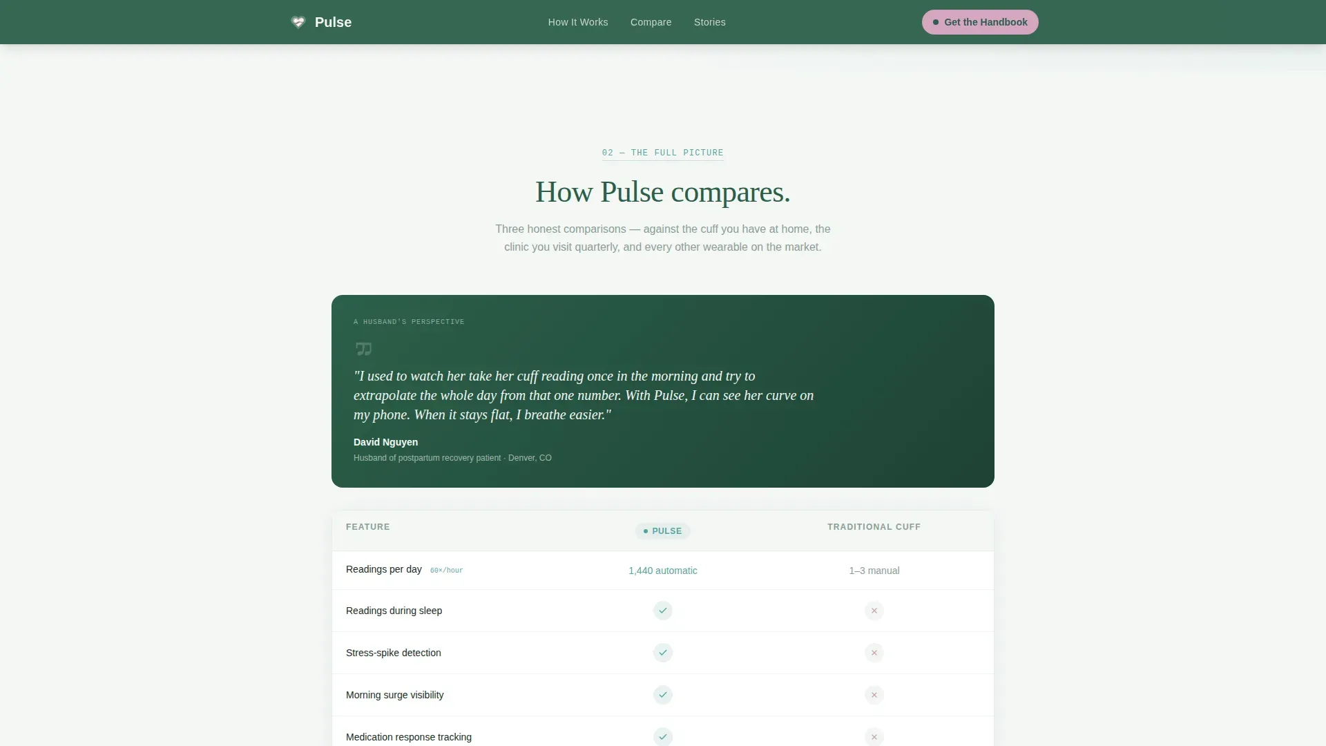
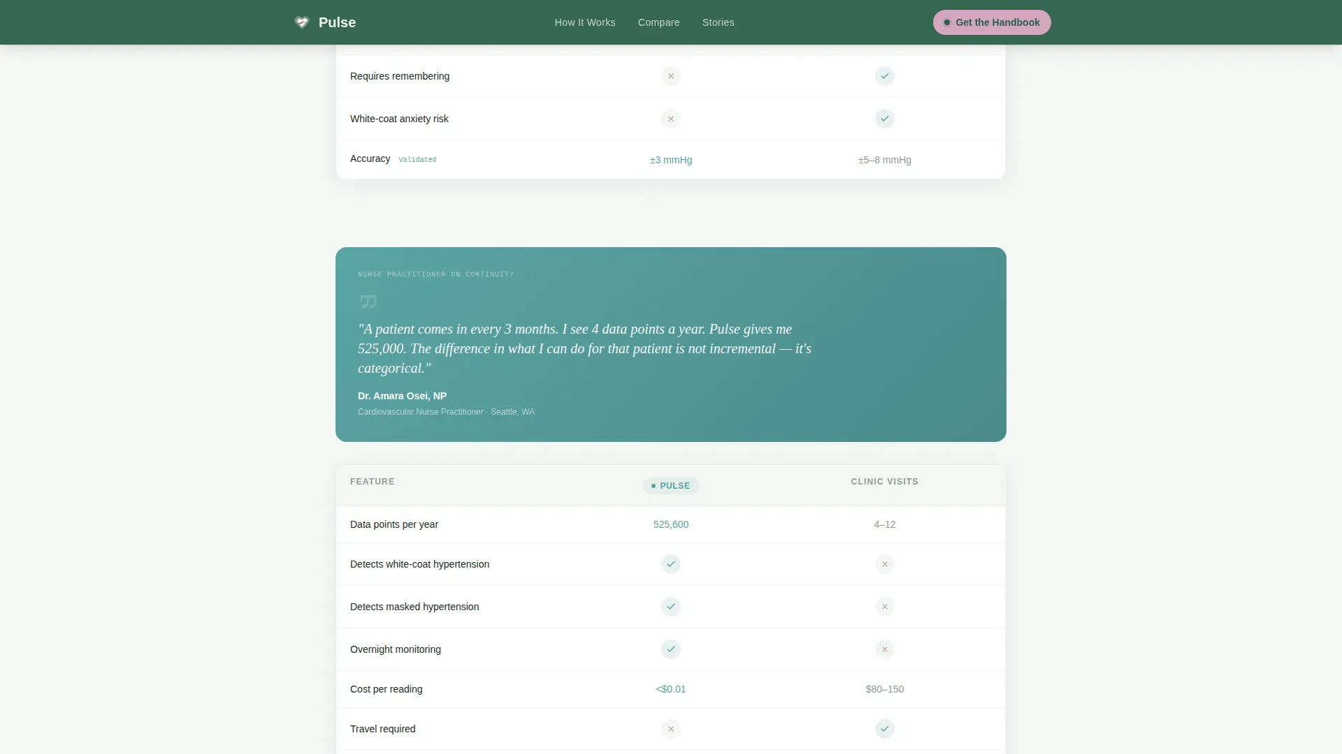
Three distinct comparison table sections appear as visitors scroll: Pulse versus a traditional cuff, Pulse versus clinic visits, and Pulse versus competing wearables. Each row fades in with a staggered reveal powered by GSAP scroll animations, keeping the data digestible rather than overwhelming.
Testimonial Mosaic Layout
The testimonial section tiles shift in size and emphasis across the page. Some tiles are video thumbnails, some are pull quotes set over soft alpine photography, and some use a handwritten-style treatment. Three distinct personas anchor the mosaic, a nurse practitioner, a husband describing his wife's recovery, and a cardiologist citing clinical validation data.
Handbook Download Form
The primary conversion section captures a first name and email address. The form pre-checks an opt-in for a weekly reading-insights digest, and the call to action reads "Download Your Blood Pressure Handbook." The ask is framed as a natural next step after the comparison tables deliver real value.
Interactive Monitoring Quiz Path
A secondary call to action labeled "See If Pulse Fits Your Plan" links to an interactive quiz. The quiz matches a visitor's specific health situation to the right monitoring tier, giving people who are not yet ready to convert a meaningful next step that still moves them forward.
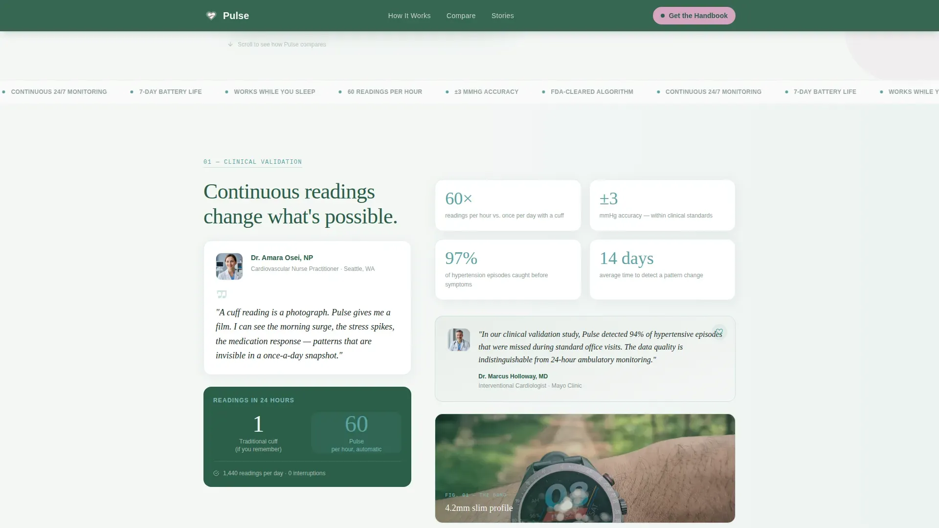
Clinical Validation Section
A dedicated section pairs a nurse practitioner voice with continuous-versus-cuff proof points. A cardiologist quote accompanies the accuracy specification rows in the comparison tables. This section builds clinical credibility without relying on product claims alone.
Page sections overview
| Section | Purpose |
|---|---|
| Hero Testimonial Card | Opens with a real person's story and an animated blood pressure curve to create immediate human connection |
| Clinical Validation Block | Pairs nurse practitioner voice with continuous monitoring proof points to establish medical credibility |
| Cuff Comparison Table | Contrasts Pulse with traditional arm-cuff readings row by row with scroll-triggered fade reveals |
| Clinic Visit Comparison | Shows how continuous at-home monitoring differs from periodic clinic-based blood pressure checks |
| Competitor Comparison Table | Side-by-side feature rows comparing Pulse against other wearable blood pressure monitors |
| Testimonial Mosaic | Tiles three distinct personas in varied formats to sustain trust across the full scroll journey |
| Handbook Download Form | Captures first name and email in exchange for the free blood pressure handbook resource |
| Quiz Secondary Path | Routes visitors to an interactive quiz matching their health situation to the right monitoring tier |
| Linear Footer Row | Single-row footer with navigation links and brand anchor in pine-shadow green |
Design & branding system
The visual identity follows an Organic Flow theme. The palette is drawn from the Alpine Fresh color system, built to feel like a mountain meadow at altitude, cool, clean, and alive without tipping into clinical sterility.
- Morning-fog white (#F4F7F5) dominates all backgrounds, keeping the page open and uncluttered
- Glacial stream teal (#5BA4A4) carries headings, data visualizations, and the animated BP curve
- Pine-shadow green (#2C5F4A) anchors the navigation and footer for grounded visual weight
- Soft heather (#D4A5C0) is reserved for interactive highlights, active states, and every tappable call-to-action element
- Typography pairs Fraunces serif for headlines with Manrope for body text and interface labels
Mobile & speed optimization
The template is built mobile-first because the target audience monitors their health on their phones throughout the day. Every layout decision prioritizes the small-screen experience before scaling up to desktop.
- Accordion-style comparison table rows reduce visual clutter on narrow screens without hiding key data
- The testimonial mosaic reflows into a single-column slider on mobile, preserving rhythm without horizontal overflow
- Server Components handle all static content sections, while Client Components are reserved for animations and the interactive form
How this template helps you convert
The conversion strategy is built on a simple principle: give value before making an ask. Visitors arrive uncertain and leave informed, which makes the handbook feel like a reward rather than a toll gate.
- The comparison tables and clinical voices deliver enough knowledge that visitors feel equipped to make a decision, lowering the resistance to submitting an email address
- Two separate conversion paths, the handbook download and the monitoring quiz, mean visitors at different stages of readiness each have a natural next step that keeps them engaged
Other information about this template
This template is designed specifically for the hypertension care subcategory within the broader health and medical space. It reflects the real needs of people managing borderline or diagnosed high blood pressure, from the newly flagged patient to the data-driven retired athlete.
- The page uses imperial units throughout, with blood pressure values expressed in millimeters of mercury (mmHg) and pricing in United States dollars
- The Organic Flow design style is a deliberate editorial choice, rejecting the cold, white-room aesthetic common in health technology in favor of natural alpine warmth
- The Testimonial Mosaic creative direction ensures the page never flatlines rhythmically; scroll-stop variety prevents the visual monotony that causes drop-off on long-form health pages
- The Testimonial Card header concept is intentional: the human face and voice appear before the product, building the emotional case that makes the clinical data feel personally relevant
- Animation uses GSAP for scroll reveals and SVG for the sine wave curve; the testimonial section includes a slider for the mosaic tiles
Theme
Organic Flow
Creative direction
Testimonial Mosaic
Color system
Alpine Fresh
Style
Comparison Table
Direction
Content/Resource
Page Sections
Animated Blood Pressure Hero
Scroll-reveal Comparison Tables
Testimonial Mosaic with Varied Tile Formats
Handbook Download with Pre-checked Opt-in
Interactive Health Quiz Path
Clinical Validation Section
Related questions
Who is the primary target audience for this template?
What conversion actions does this template support?
How does the scroll-reveal comparison table section work?
Does the template include social proof beyond standard testimonials?
Can this template be adapted for a different health monitoring product?



