Marketing Professionals Forum Landing Page Template
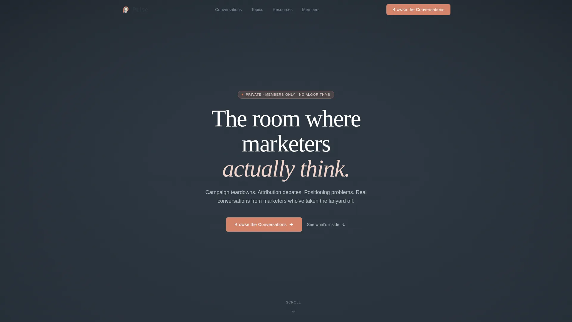
Pulse is a masonry-style landing page template built for marketing professionals forums and discussion communities. It combines a full-screen video hero, staggered pain-point card grids, threaded discussion previews, and a gated email signup into one scroll-driven, editorial layout. The Soft Mist color system and serif-plus-sans typography give it a calm, credible feel that earns trust before asking for a single click.
by Rocket studio
Quick summary
Pulse is a single-page landing page template designed for marketing professionals forums and private discussion communities. It uses a masonry card layout, scroll-linked animations, and a content-first structure to move visitors from skepticism to signup. The Soft Mist palette and editorial typography make it feel genuinely human, not like another SaaS funnel.
Who this template is for
This template is built for community builders and platform operators who serve working marketing professionals. It fits anyone launching or growing a discussion board, peer forum, or private knowledge community in the marketing industry.
- Founders building a paid or free-tier marketing professionals forum
- Community managers growing a discussion board for brand, performance, or content marketers
- Consultants or agencies creating a resource hub with gated access for marketing strategists
What problem this template solves
Marketing communities often lose potential members at the landing page. The page either looks too corporate or too casual, and it rarely shows the actual value inside before asking for a signup. Pulse solves that trust gap by leading with real discussion content and emotional resonance.
- Visitors leave without signing up because the page never proves the community is worth joining
- Generic community templates fail to reflect the specific culture of a marketing professionals forum
- Most landing pages ask for commitment before demonstrating value, which kills conversions for niche communities
What you get with this template
You get a fully structured, single-page layout with every section pre-built and ready to customize. The template handles the entire visitor journey from first impression to email capture without requiring extra pages or complex flows.
- A full-screen video hero section with headline overlay and vignette treatment
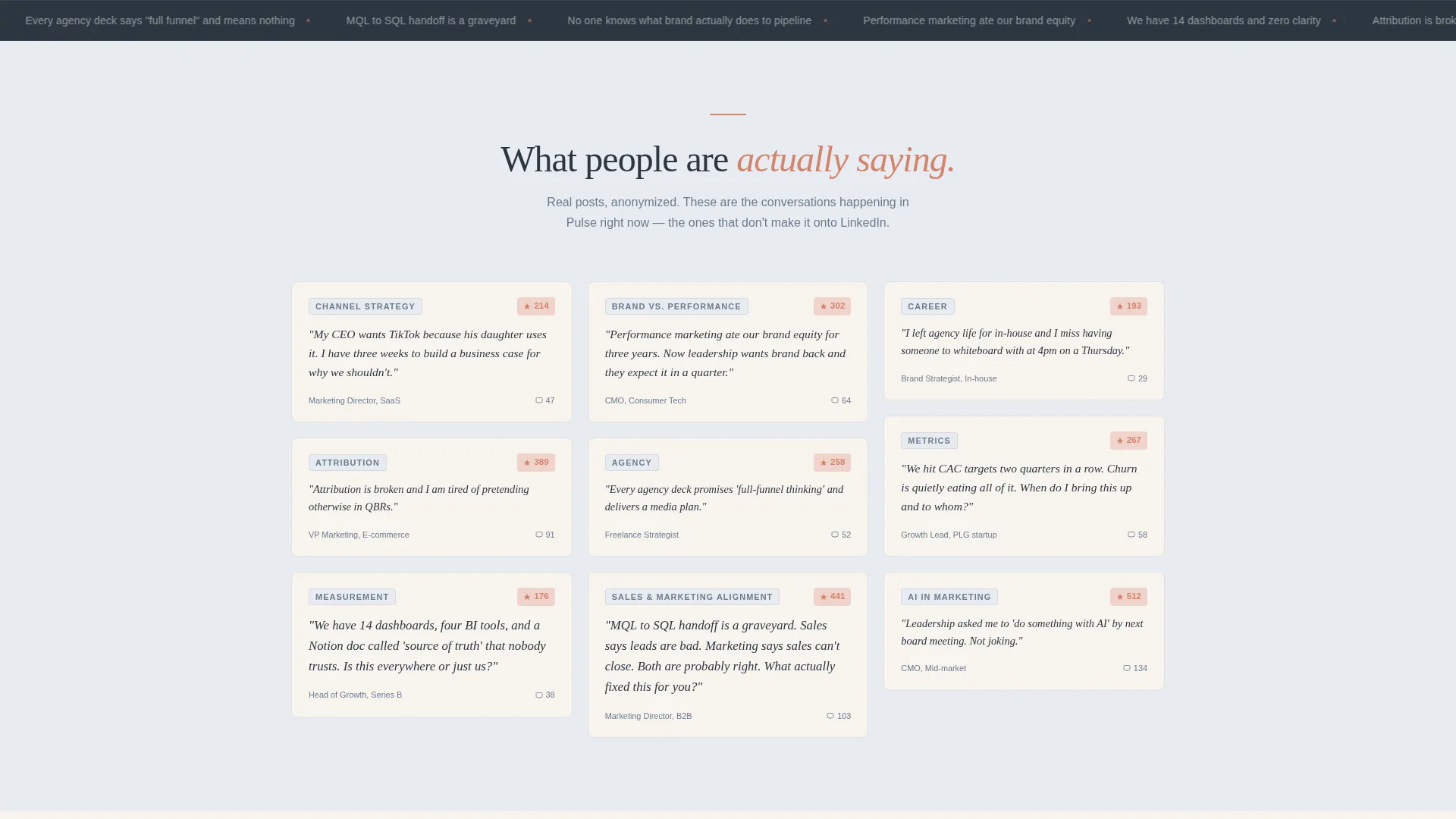
- A masonry pain-point grid, threaded discussion arc, and animated member counter
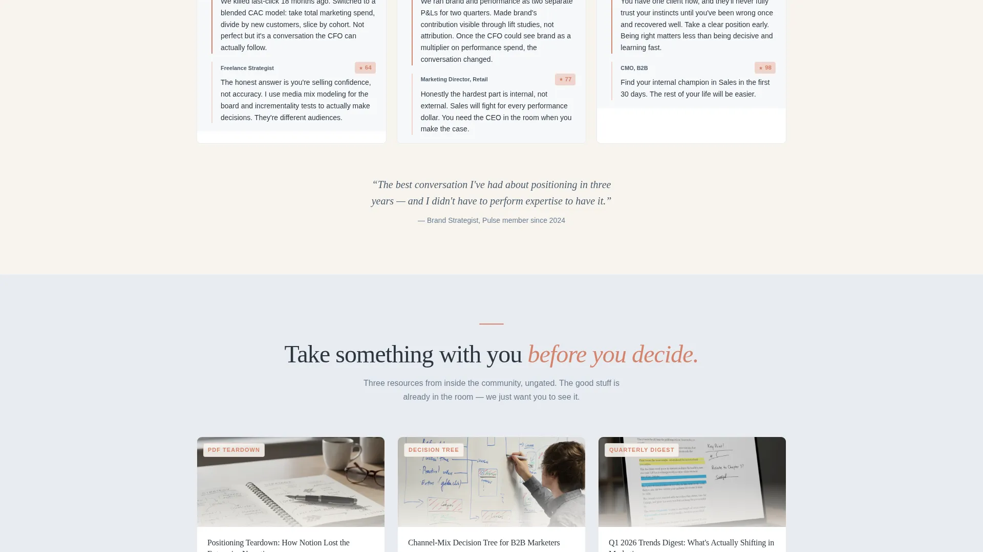
- An integrated email signup form with a marketing focus dropdown and three resource preview cards with secondary download calls to action
Feature list
This template includes six core feature areas, each built around the specific needs of a marketing professionals community landing page.
Full-Screen Video Background Hero
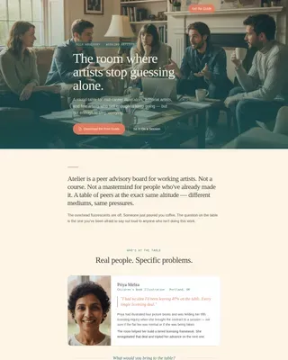
The hero section plays slow, desaturated footage of real working moments at 70 percent speed. A soft vignette frames the center, and a single headline fades in over the footage. No faces or stock imagery appear, keeping the tone grounded and editorial.
Masonry Pain-Point Card Grid
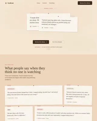
A staggered masonry grid surfaces anonymized forum post excerpts as pinned cards. Cards vary in size and are offset to feel like a real corkboard. This section runs before any feature reveal, letting visitors feel understood before they see a pitch.
Scroll-Linked Discussion Arc
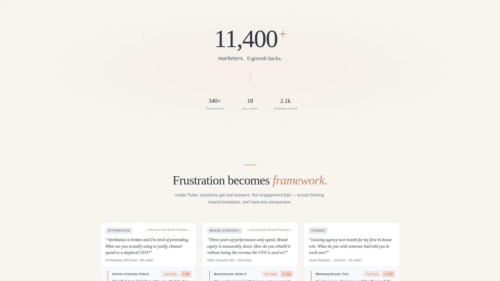
Below the pain grid, threaded conversation cards reorganize to show the progression from frustration to clarity to contribution. Each scroll step reveals upvoted replies, shared frameworks, and discussion excerpts. The arc is driven by scroll-linked reveal animations.
Animated Member Counter
A lone stat sits on a parchment background between the pain grid and the discussion arc. The counter animates on scroll entry. The copy reads "11,400 marketers. 0 growth hacks." and acts as a quiet social proof moment without breaking the editorial flow.
Gated Email Signup with Focus Dropdown
The primary conversion section includes a single email field and a dropdown asking for the visitor's marketing focus, with options for brand, performance, product, content, and leadership. The form is minimal and intentional, reducing friction while capturing useful segmentation data.
Ungated Resource Preview Cards
Three resource cards sit below the primary signup. Each previews a real asset: a positioning teardown in document format, a channel-mix decision tree, and a quarterly trends digest. Every card has its own secondary call to action that triggers the same email capture, giving visitors multiple low-pressure entry points.
Page sections overview
| Section | Purpose |
|---|---|
| Video Hero | Sets emotional tone and introduces the community headline |
| Pain Point Grid | Surfaces real forum frustrations via masonry card layout |
| Member Counter | Delivers quiet social proof with an animated stat |
| Discussion Arc | Shows the frustration-to-clarity emotional journey |
| Resource Previews | Provides ungated asset teasers with secondary signup triggers |
| Email Signup Form | Captures email and marketing focus with minimal friction |
| Footer | Provides linear single-row navigation and legal links |
Design & branding system
The template uses a Soft Mist color system built for long reading sessions. Every color choice is intentional, with coral reserved strictly for interactive moments so the eye always knows where to go.
- Four-color palette: morning fog gray (#E8ECF1), warm parchment (#F7F4EF), muted slate (#6B7B8D) for body text, and dusty coral (#D4836B) for calls to action, notification badges, and interactive elements only
- Typography pairing: Fraunces serif for headlines to add editorial weight, DM Sans for body copy to keep text clean and readable at length
- Backgrounds alternate between fog gray and parchment across sections, creating visual rhythm without introducing new colors
Mobile & speed optimization
The template is built desktop-first to match the primary audience of marketing directors working at their desks. A mobile-responsive fallback ensures the layout holds on smaller screens without breaking the masonry structure.
- Server Components handle all static sections for fast initial load, while Client Components manage animations and interactive elements separately
- Scroll-linked reveals, stagger animations, and the spotlight card hover effect are scoped to client-side rendering to avoid blocking page paint
- The masonry layout adapts responsively, and the email form remains functional and accessible on all viewport sizes
How this template helps you convert
The page is structured as a content destination, not a feature list. Every section earns the next scroll before asking for anything in return.
- The pain grid and discussion arc show real community value before the email form appears, so visitors arrive at the signup already convinced the room is worth entering.
- Three ungated resource preview cards give hesitant visitors a second, lower-pressure reason to share their email, expanding the total number of conversion entry points on a single page.
Other information about this template
This template is categorized under Community and Nonprofit, with a specific fit for the Marketing Professionals Community subcategory. It is well-suited for discussion board platforms, peer learning communities, and private forum products targeting mid-career marketing practitioners.
- The creative direction follows a Movement and Cause structure, meaning the page reveals the why before the what, building emotional investment through scroll progression
- The Educational Guide theme shapes the overall visual tone, positioning the community as a place of genuine knowledge exchange rather than promotional content
- The template style is Masonry and Pinterest-inspired, giving the pain grid and discussion cards a tactile, editorial feel distinct from standard SaaS landing page grids
- The header concept is a Full-Screen Video Background, which requires the community operator to supply short, desaturated footage of real marketing work moments
- The landing page direction is Content and Resource, meaning the page earns signups by demonstrating content quality upfront rather than relying on feature lists or testimonial carousels
Theme
Educational Guide
Creative direction
Movement & Cause
Color system
Soft Mist
Style
Masonry/Pinterest
Direction
Content/Resource
Page Sections
Full-screen Video Background Hero
Masonry Pain-point Card Grid
Animated Member Counter Block
Threaded Discussion Arc
Gated Email Signup with Dropdown
Ungated Resource Preview Cards
Related questions
What kind of community is this template designed for?
Do visitors need to sign up before seeing any content?
Can I customize the forum post excerpts and resource preview cards?
What does the email signup form collect from visitors?
Is this template suitable for a free-tier community model?