Iridescent Healthcare Agency Landing Page Template
Pulse is a healthcare content marketing agency landing page template built on a layered, translucent design system. It combines a full-screen video header, scroll-activated overlapping card sections, and a progressive waitlist form. Designed for medtech, pharma, and health system marketers, it turns clinical complexity into a compelling, conversion-focused first impression.
by Rocket studio
Quick summary
Pulse is a single-page, waitlist-focused landing page template for a healthcare content marketing agency. It uses a Tech Glass visual system with iridescent accents, a full-screen video header, and scroll-driven overlapping card sections. Each interaction peels back a new layer of content, guiding visitors toward a scarcity-driven strategy slot reservation form.
Who this template is for
This template is built for healthcare-adjacent agencies and consultancies that need a high-impact digital presence. It speaks directly to sophisticated buyers who evaluate credibility before they ever fill out a form.
- VP-level marketers at regional health systems managing compliance-heavy content workflows
- Series B medtech founders seeking thought leadership that resonates with both clinical and investor audiences
- Pharma brand managers launching into competitive therapeutic categories
What problem this template solves
Healthcare content agencies often struggle to communicate their strategic value on a single page. Generic agency templates feel wrong for an audience that demands precision, credibility, and proof. This template solves that gap head-on.
- It replaces flat, brochure-style layouts with a layered interactive structure that signals sophisticated thinking
- It frames regulatory complexity and clinical nuance as strengths, not disclaimers
- It channels visitor curiosity into a clear conversion action without overwhelming them with information
What you get with this template
You get a fully structured, one-page agency landing page built around a waitlist flow. Every component is designed to work together, from the opening video header to the final slot-reservation form.
- A full-screen abstract video background header with a timed headline reveal at the four-second mark
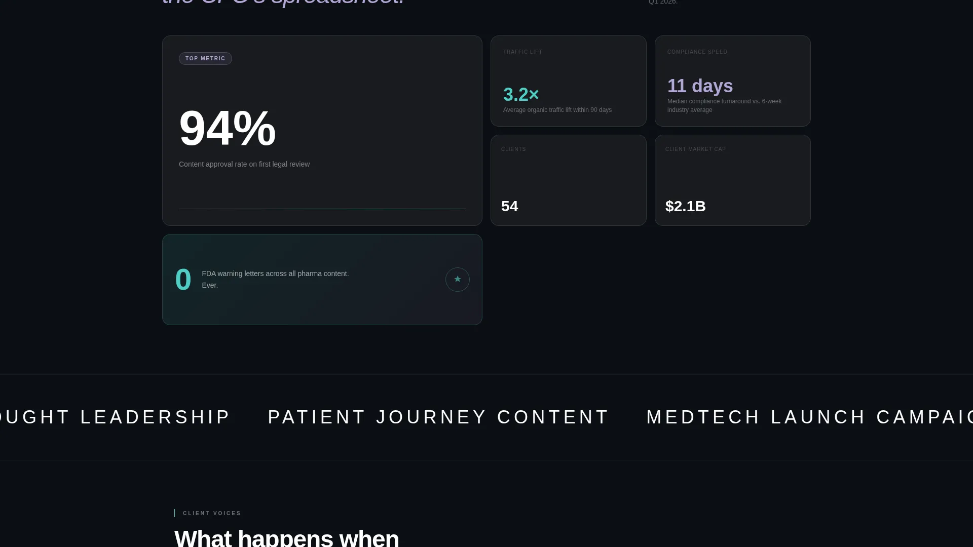
- Scroll-activated overlapping card sections with three expandable capability areas and animated before/after content metrics
- A two-step progressive waitlist form with a live slot counter showing real-time scarcity
Feature list
This template includes six purpose-built components that work as a cohesive system.
Full-Screen Video Header
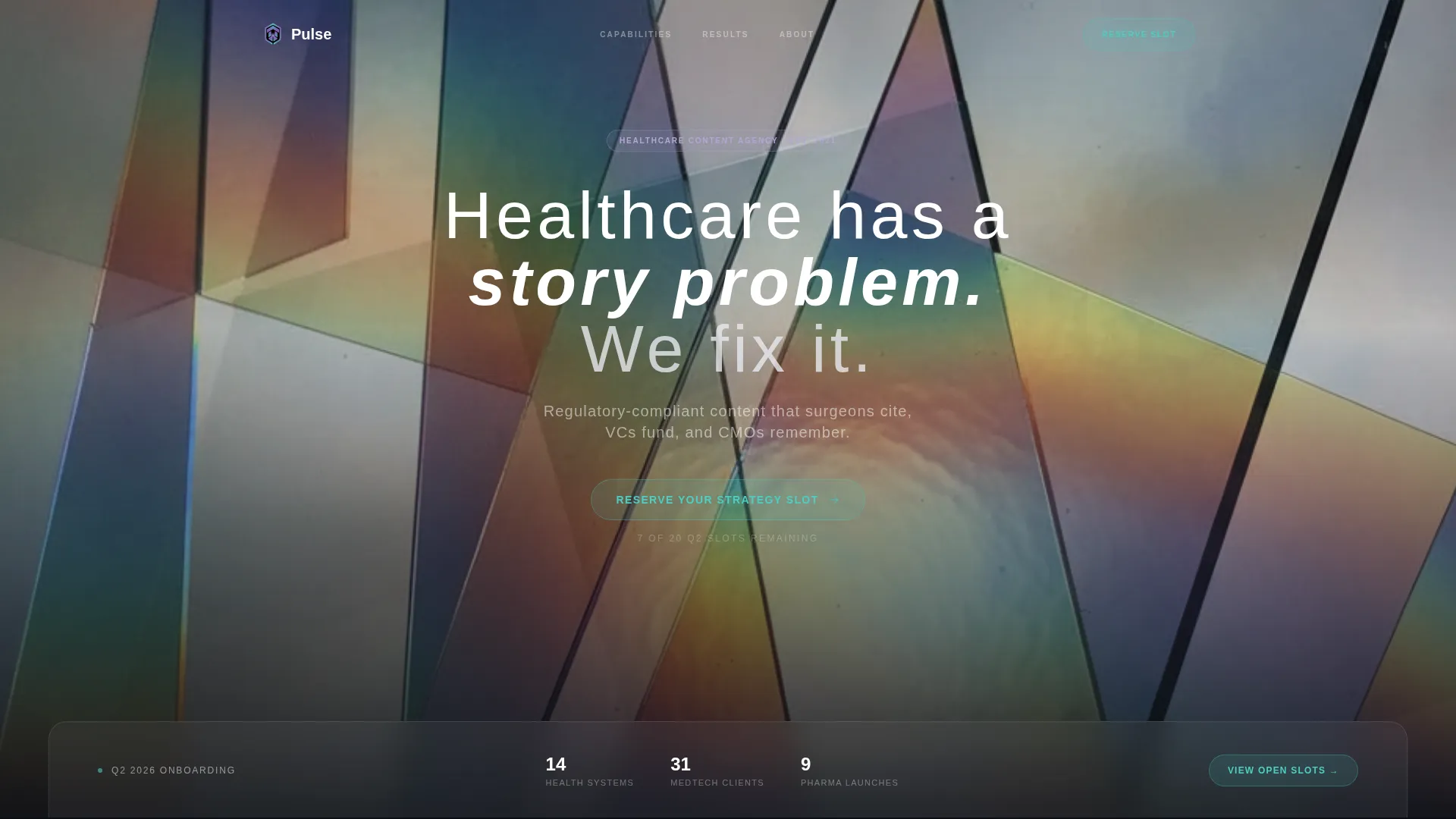
A slow macro shot of light passing through layered glass panels opens the page. The camera drifts forward through tinted panes, and at second four a headline resolves in thin, wide-tracked sans-serif type: "Healthcare has a story problem. We fix it." A frosted-glass card overlaps the lower third, bridging the header and the first scroll section.
Scroll-Activated Layered Cards
Each content section is a translucent card that slides up and slightly forward as the user scrolls, mimicking the stacking of medical imaging slices into a three-dimensional model. The visual depth rewards exploration and reinforces the agency's positioning as a layered, systematic thinker.
Expandable Capability Micro-Case-Studies
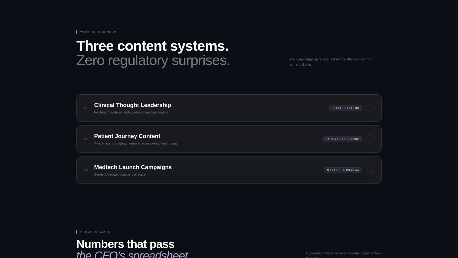
Three capability areas, Clinical Thought Leadership, Patient Journey Content, and Medtech Launch Campaigns, are clickable cards. Each expands into a compact case study with before-and-after content metrics that animate on hover, giving visitors proof points without requiring them to leave the page.
Progressive Two-Step Waitlist Form
The form opens by asking only for a work email address. After submission, a second screen asks for organization type and a single open-text field about the visitor's biggest content challenge. This low-friction entry increases completion rates while gathering useful qualification data.
Live Scarcity Slot Counter
A visible counter displays remaining onboarding slots in real time, for example "7 of 20 spots open." A single line above the form reinforces the constraint: "We take 20 clients per quarter. No exceptions." The scarcity mechanism feels confident, not desperate.
Iridescent Interactive Accent System
Buttons, cards, and section dividers respond to interaction with iridescent teal highlights and subtle gradient animations. Accents appear only on hover or scroll, keeping the base design clean and clinical while rewarding engaged visitors with unexpected color shifts.
Page sections overview
| Section | Purpose |
|---|---|
| Video Header | Opens with abstract glass macro footage and a timed headline reveal |
| Frosted Glass Card | Bridges the header and first scroll section with a layered overlap |
| Capability Explorer | Three clickable cards expand into micro-case-studies with animated metrics |
| Layered Content Sections | Scroll-activated cards stack forward, deepening the narrative with each interaction |
| Agency Positioning Block | States the client focus and quarterly capacity constraint in plain, confident language |
| Waitlist Form | Two-step progressive form with live slot counter and primary call to action |
Design & branding system
The visual identity follows a Tech Glass theme powered by an AI Iridescent color system. The palette feels like light refracting through a prism inside a clinical environment, layering sterility with unexpected chromatic depth.
- Base colors: deep surgical black (#0B0E13) and translucent frost (#E8EAF0) stack in semi-transparent layers; body text lives in clean white
- Accent colors: holographic lilac (#B4A7D6) for structural highlights; iridescent teal (#4ECDC4) reserved exclusively for hover states, interactive buttons, and gradient divider animations
- Typography: thin, wide-tracked sans-serif for headlines; the tracking and weight signal precision without feeling cold
Mobile & speed optimization
The template is structured to translate its layered desktop experience into a clean, readable mobile layout. Overlapping card effects adapt gracefully to narrower viewports without losing the depth metaphor.
- Semi-transparent layer stacking and translucent card styles are optimized for smooth rendering across screen sizes
- Video header includes a fallback state so the section remains impactful on devices where autoplay is restricted
- The progressive form flow works as a simple two-screen sequence on mobile, keeping tap targets clear and the input sequence frictionless
How this template helps you convert
The entire page is engineered as a single conversion funnel. Every visual and structural decision guides a skeptical, high-value buyer toward one action: reserving a strategy slot.
- The interactive explorer model rewards curiosity before asking for commitment, letting visitors self-qualify through capability cards and case-study metrics before they see the form
- The live slot counter and the "20 clients per quarter" constraint create authentic scarcity, shifting the visitor's mental frame from "should I contact them" to "can I still get in"
- The two-step form reduces perceived friction at entry by asking only for an email first, then gathering qualification context after the visitor has already committed
Other information about this template
This template is categorized under Portfolio and Agency, specifically within the Healthcare Marketing and Agency subcategory. It is designed for the healthcare content marketing agency niche, where intersection match scoring rewards a tight overlap between visual sophistication and clinical audience trust.
- The Overlap/Layered template style and Interactive Explorer creative direction work together to create a page that feels like a product experience, not a brochure
- The Waitlist/Coming Soon landing-page direction makes this template suitable for agencies in a controlled launch phase, opening limited onboarding slots rather than unlimited inbound
- The AI Iridescent color system and Tech Glass theme are paired intentionally: the iridescent palette signals innovation while the glass aesthetic signals precision, a combination that positions the agency as both creative and rigorous
Theme
Tech Glass
Creative direction
Interactive Explorer
Color system
AI Iridescent
Style
Overlap/Layered
Direction
Waitlist/Coming Soon
Page Sections
Full-screen Video Header with Timed Headline
Scroll-activated Overlapping Card Sections
Expandable Capability Explorer Cards
Progressive Two-step Waitlist Form
Live Scarcity Slot Counter
Iridescent Hover and Interaction Accents
Related questions
Can I customize the headline and video background in the header?
How does the live slot counter work?
Is the two-step form logic included in the template?
Who is this landing page best suited for?
Can I update the capability cards with my own case study content?



