Medical Equipment & Supply Professional Website Template
Pulse is a sidebar companion landing page built for medical device companies selling precision surgical instruments and diagnostic devices to hospitals. It leads with animated clinical statistics, keeps a fixed sidebar table of contents active throughout the scroll, and drives high-intent visitors toward a single click-through call to action to request a product evaluation.
by Rocket studio
Quick summary
Pulse is a single-page template designed for medical device companies that need to convert serious B2B buyers. Every section opens with a large animated statistic before any narrative copy appears. A fixed sidebar companion updates in real time as visitors scroll, surfacing the key metric for each section and anchoring the primary call to action once the visitor passes the midpoint.
Who this template is for
This template was built for companies that manufacture or supply precision surgical instruments and diagnostic devices to clinical environments. The audience is not general consumers. These are professionals who evaluate evidence before they engage.
- Hospital procurement directors who compare spec sheets and need regulatory proof fast
- Biomedical engineers validating device compatibility with existing hospital systems
- Surgeons who make decisions based on documented clinical outcomes and failure history
What problem this template solves
Most medical device landing pages lead with brand narrative and bury the clinical proof. That approach loses procurement directors and surgeons the moment they land. Pulse inverts this order entirely.
- Key statistics like first-pass success rates and procedure time reductions appear before any explanatory copy
- Regulatory clearance and compatibility data are presented in dedicated structured sections, not scattered through paragraphs
- The fixed sidebar keeps high-intent visitors oriented and removes friction from the path to an evaluation request
What you get with this template
You get a fully structured, single-page layout built around five content sections, a fixed sidebar companion, and two distinct conversion paths. Every design decision reflects an operating room standard of clarity.
- A portrait-centered hero with a fixed sidebar showing a live active section highlight and the headline clinical metric
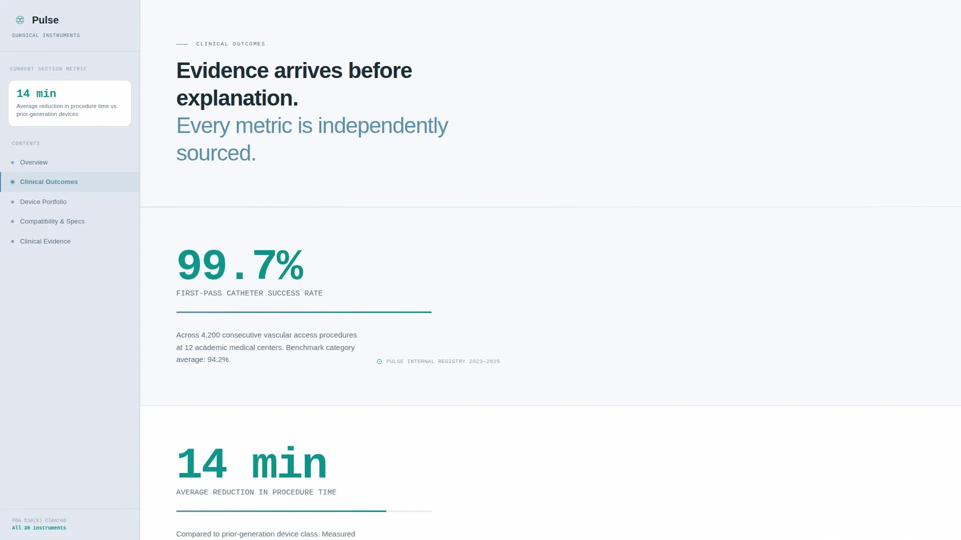
- A Stats-First Impact scroll sequence with animated statistic counters that trigger before explanatory paragraphs
- A primary click-through call to action to an evaluation request portal and a secondary gated PDF download link for visitors not yet ready to commit
Feature list
A paragraph introduces the features: each component in Pulse was chosen to earn trust from technically literate buyers before asking them to act.
Fixed Sidebar Table of Contents
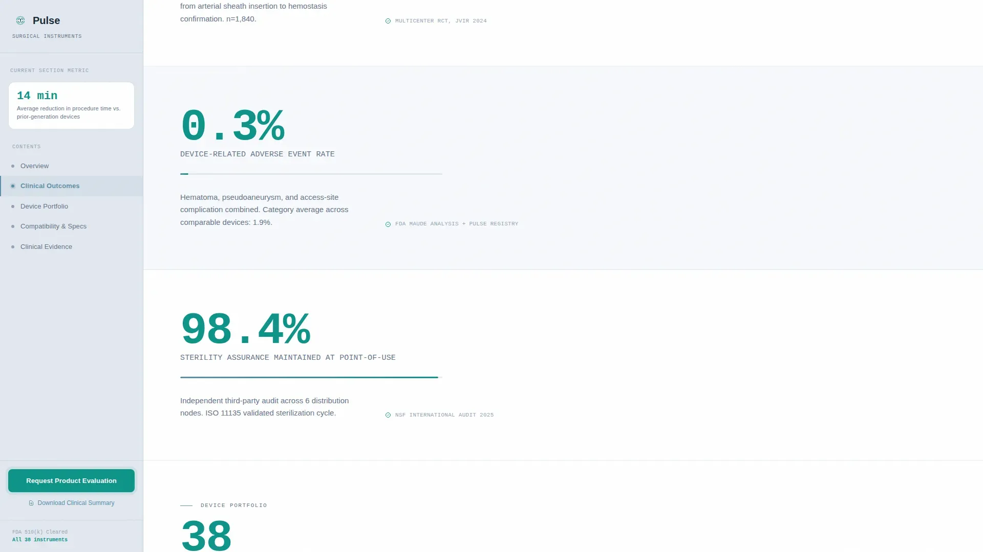
The sidebar panel stays in place as the visitor scrolls. It updates its highlighted entry to match the current section and displays the key metric tied to that section. Once the visitor scrolls past the midpoint, the primary call to action appears as a fixed sidebar element and remains visible for the rest of the session.
Stats-First Scroll Sequence
Each major section opens with a large, scroll-triggered animated counter. The statistic lands first. Explanatory copy follows only after the number has registered. This sequence is applied consistently: "99.7% first-pass success rate" before catheter design detail, "14-minute average reduction in procedure time" before the case study.
Portrait-Centered Hero Layout
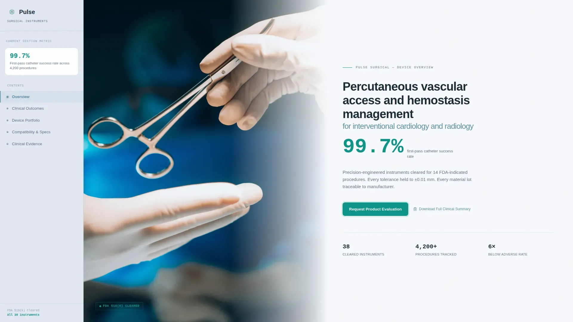
The hero uses a tight portrait composition of gloved hands holding the featured device at chest height. Shallow depth of field dissolves the background. A single-line headline states the device's FDA clearance indication beside the portrait. One clinical outcome number appears in bold teal directly beneath it.
Asymmetric Device Portfolio Grid
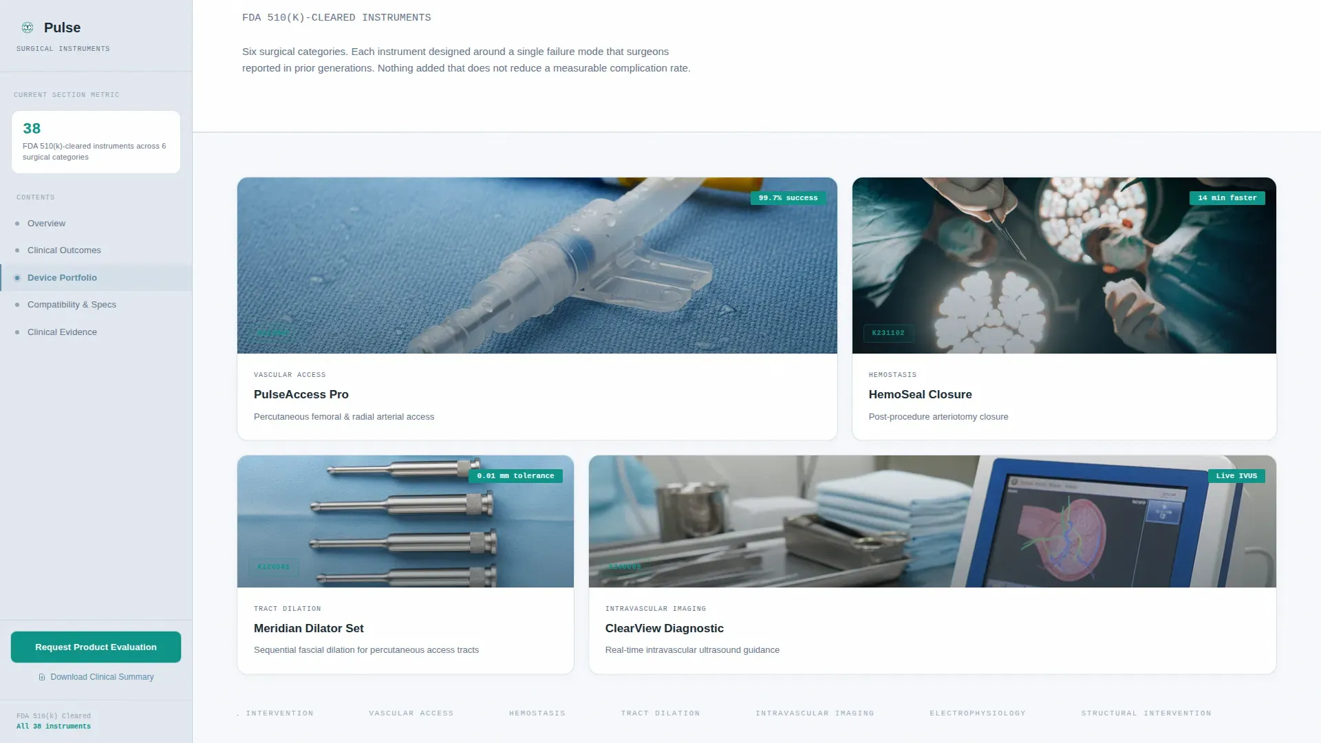
The device portfolio section uses a bento-style asymmetric grid layout to present multiple instruments side by side. Visitors can scan the full range without leaving the page or scrolling through a traditional carousel.
Dual Conversion Path Design
The primary call to action, "Request a Product Evaluation," links to a dedicated portal pre-populated with the device category the visitor explored. The secondary text link, "Download Full Clinical Summary," gates a PDF behind a single email field. No form lives on the page itself.
Compatibility and Regulatory Section
A dedicated section presents FDA clearance data and compatibility specifications in a structured format. This gives biomedical engineers the technical detail they need to validate the device against existing hospital systems without hunting through general marketing copy.
Page sections overview
| Section | Purpose |
|---|---|
| Hero Portrait Split | Introduces device and headline clinical stat with fixed sidebar |
| Clinical Outcomes Wall | Delivers animated statistics before narrative copy |
| Device Portfolio Grid | Presents the instrument range in an asymmetric bento layout |
| Compatibility & Regulatory | Surfaces FDA clearance data and system compatibility specs |
| Clinical Evidence Case Study | Builds narrative proof through overlapping asymmetric layout |
| Footer Single Row | Provides minimal navigation and closing links |
Design & branding system
The visual identity follows a Healing Space theme built on the Cloud Canvas color system. Every color choice references the calm of a world-class recovery ward at dawn, where light is diffused and color appears only where attention is earned.
- Clinical white (#F7F9FC) covers the dominant page ground; soft vapor gray (#E2E8F0) fills the sidebar panel; muted cerulean (#5B8FA8) handles headlines and interactive states
- Confident teal (#0D9488) is reserved exclusively for call to action elements and data highlights, keeping the conversion signal visually distinct at all times
- Typography pairs DM Sans for body copy and interface text with JetBrains Mono for all statistics and data numbers, giving clinical data a distinct, readable voice
Mobile & speed optimization
The template is designed desktop-first, reflecting the reality that hospital procurement directors compare spec sheets on large monitors, often late at night. The layout prioritizes clarity and density on wide screens.
- Scroll-triggered animations and sidebar active-state updates are handled through client-side interactions, keeping static content fast to load
- The fixed sidebar companion and counter animations are built to function smoothly across modern desktop browsers without degrading the reading experience
How this template helps you convert
Pulse is structured so that trust is built through data before persuasion through narrative ever begins. This sequencing is deliberate and consistent from the first section to the last.
- Animated statistics land before explanatory copy in every major section, so a procurement director scanning quickly gets the proof point first and the context second
- The fixed sidebar call to action appears after the second stat section and stays visible past the midpoint, reducing the number of decisions a high-intent visitor needs to make to reach the evaluation portal
- The secondary PDF download link captures visitors who are still in research mode, gating the clinical summary behind only a single email field to keep the barrier low
Other information about this template
This template is a strong fit for medical equipment and supply companies entering hospital procurement cycles where trust and regulatory proof are evaluated before any commercial conversation begins. The Pulse template was built on a foundation of clinical precision, matching the expectations of buyers who are used to reading FDA submission documents and compatibility matrices.
- The template style is Sidebar Companion, a layout format where the fixed panel acts as both a navigation aid and a persistent conversion surface
- The Healing Space theme and Cloud Canvas color system are designed to signal clinical credibility without cold sterility
- The Stats-First Impact creative direction is particularly well suited to medical device companies that already have documented clinical outcome data they want to lead with
- The Click-Through landing page direction means no form processing is required on the page itself, simplifying deployment for teams without back-end development resources
Theme
Healing Space
Creative direction
Stats-First Impact
Color system
Cloud Canvas
Style
Sidebar Companion
Direction
Click-Through
Page Sections
Fixed Sidebar Table of Contents
Stats-first Scroll Animations
Portrait-centered Hero Layout
Asymmetric Device Portfolio Grid
Dual Click-through Conversion Paths
Compatibility and Regulatory Section
Related questions
Does this template include a form or require back-end setup?
Can I use this template with more than one product line?
Who is this template best suited for?
How does the secondary conversion path work?



