Menopause Care Cost Calculator Website Template
Pulse is a zigzag landing page template built for a menopause wearable monitor. It opens with an interactive symptom-frequency estimator, then walks visitors through three alternating step sections covering wear, read, and prepare. The Soft Mist color system and warm gradient transitions create a calm, clinical-feeling experience designed to convert perimenopause and menopause sufferers into confident buyers.
by Rocket studio
Quick summary
Pulse is a single-page, click-through landing page template for a menopause wearable monitor. It leads with a live symptom estimator, then guides visitors through three zigzag steps that show exactly how the wristband captures, reads, and acts on biometric data. The design is warm, breathable, and built for mobile-first browsing.
Who this template is for
This template is built for direct-to-consumer health and wellness brands launching a wearable device aimed at women experiencing perimenopause or menopause symptoms. It also works for founders and product teams who need to earn trust with a clinician-minded audience before asking for a purchase click.
- Women's health tech brands selling a biometric wearable monitor
- Consumer health startups targeting the perimenopause and menopause market
- Product teams who need a conversion page that quantifies user pain before pitching the solution
What problem this template solves
Many health product pages lead with the product. Pulse flips that order. Visitors arrive carrying an invisible, often dismissed symptom burden, and the page meets them there before the wristband is ever shown. The estimator makes the problem feel real and personal, so the product feels necessary, not optional.
- Hot flashes, sleep disruption, and heart-rate variability changes are hard to explain to others and easy to dismiss
- Visitors need to feel seen before they will trust a new device with their body and their money
- A generic hero image and a bullet list of specs will not convert a skeptical, exhausted woman at 3 a.m.
What you get with this template
You get a fully structured, single-page layout with a high-interactivity estimator header, three alternating zigzag content sections, a science and trust section, and a linear footer. Every section has a defined purpose, a matching visual treatment, and a clear call-to-action placement.
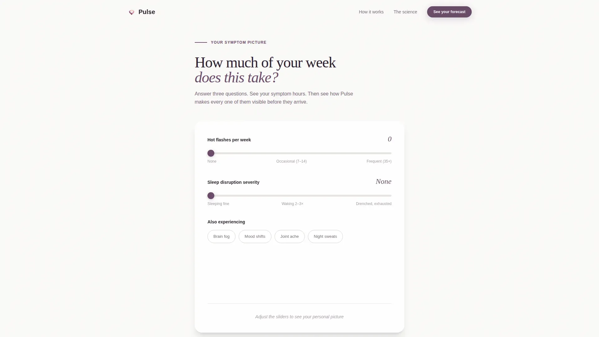
- Interactive symptom-frequency calculator with live radial gradient output and a personalized result sentence
- Three zigzag step sections (Wear, Read, Prepare) with alternating image-text layout and a call-to-action button after each
- Science and trust section near the footer for clinician-minded visitors, plus a secondary text link anchor
Feature list
This template is built around five core capabilities drawn directly from the brief. Each one serves a specific conversion role.
Interactive Symptom Estimator
Visitors tap their weekly hot-flash frequency, rate sleep disruption on a slider, and check boxes for brain fog, mood shifts, and joint ache. As they interact, a soft radial gradient builds behind the results panel. A single personalized sentence appears, showing estimated symptomatic hours per week. This creates investment before the product is introduced.
Zigzag Step-by-Step Layout
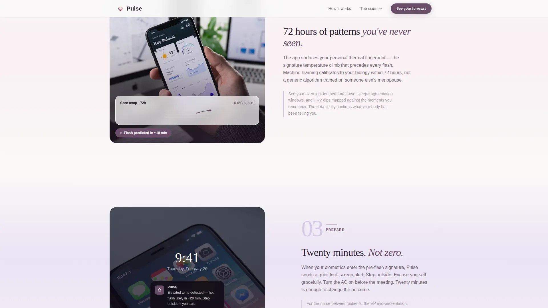
Three alternating sections walk visitors through the Pulse experience in sequence: Wear (band on wrist, continuous biometric capture), Read (app dashboard, 72-hour temperature curve, pattern recognition), and Prepare (lock-screen alert, actionable flash prediction). The left-right-left rhythm keeps the eye moving at a calm, unhurried pace.
Continuous Biometric Data Display
The template is structured to showcase five-minute interval tracking of core temperature shifts, sleep fragmentation, and heart-rate variability. Each zigzag section highlights a different data layer, building a complete picture of what the wristband captures around the clock.
Click-Through Call-to-Action System
The primary call-to-action button, "See Your Symptom Forecast," appears first beneath the estimator results and repeats after each zigzag step. There are no form fields on this page. The estimator already creates personal investment, so each call-to-action click routes a primed visitor to the product detail and purchase page.
Science and Trust Section
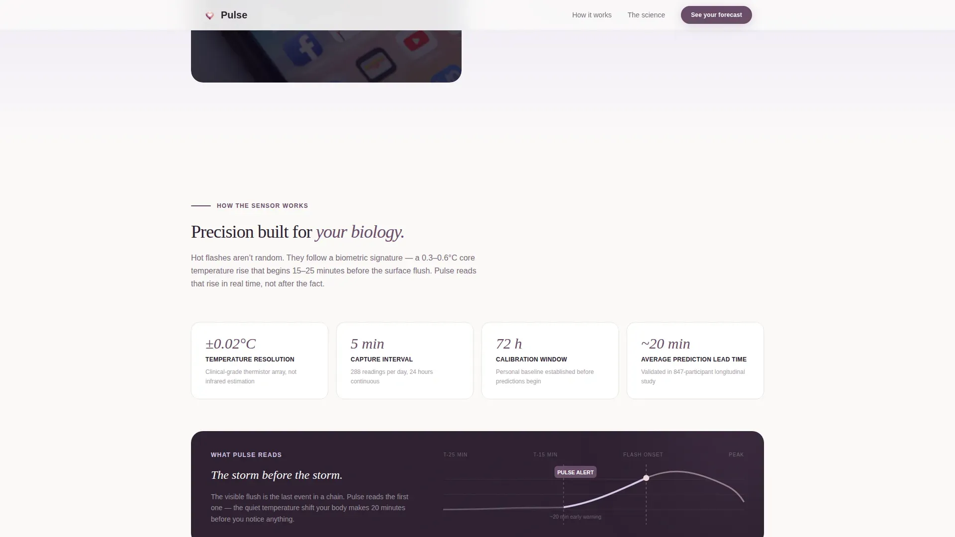
A dedicated section near the footer speaks to skeptical, clinician-minded visitors, including nurses, doctors, and researchers. It provides a brief sensor credibility overview and is reachable via a secondary text link labeled "How the sensor works," anchored from the main page flow.
Soft Mist Visual System
The design uses a four-color palette of dawn lavender, pale rose quartz, morning fog gray, and a single grounding plum reserved for calls-to-action and data highlights. Backgrounds alternate between fog gray and near-white. A lavender-to-rose gradient traces section transitions. Typography combines Fraunces serif headlines with DM Sans body and interface text.
Page sections overview
| Section | Purpose |
|---|---|
| Hero Symptom Estimator | Quantifies visitor's symptom burden with live interactive output |
| Zigzag Step: Wear | Shows the band in use and explains continuous biometric capture |
| Zigzag Step: Read | Displays the app dashboard and introduces pattern recognition |
| Zigzag Step: Prepare | Presents the lock-screen alert and explains predictive foresight |
| Science Trust Section | Provides sensor credibility for skeptical, clinician-minded visitors |
| Linear Footer | Closes the page with single-row navigation and supporting links |
Design & branding system
The visual identity is built on a Soft Mist color system. Every surface feels warm without being clinical, and the palette shifts gently across sections like early morning light through sheer curtains. No stock photography or lifestyle models appear on this page; the visitor's own data is the visual centerpiece.
- Four-color Soft Mist palette: dawn lavender (#D5C7E8), pale rose quartz (#F2D4DC), morning fog gray (#E8E4E1), and grounding plum (#6B4C6A) for calls-to-action and data highlights
- Typography pairing: Fraunces serif for headlines, DM Sans for body copy and interface elements
- Lavender-to-rose gradient traces section transitions; backgrounds alternate between fog gray and near-white throughout the scroll
Mobile & speed optimization
This template is designed mobile-first. The target visitor is a woman checking the page on her phone between meetings or in the early hours of the morning when symptoms have woken her. Every interaction and layout decision reflects that context.
- The estimator uses touch-friendly sliders and tap-able checkboxes sized for one-handed mobile use
- Static sections are structured for server rendering, while the estimator runs as a client component to keep interactions fast
- Scroll reveals and staggered animations are set to medium intensity, keeping the experience smooth without overloading a mobile connection
How this template helps you convert
The conversion architecture works by making the visitor's problem feel quantifiable and real before the product is ever introduced. By the time the wristband appears, the visitor has already admitted she needs it.
- The estimator anchors visitors in their own symptom data first, creating personal relevance and emotional investment before any product claim is made.
- The three zigzag steps deepen the promise in sequence, moving from passive data capture to active predictive foresight, so each call-to-action click feels earned rather than pushed.
- The science section handles late-stage skepticism without interrupting the main conversion flow, giving clinician-minded visitors the credibility detail they need to click through with confidence.
Other information about this template
This template is part of the Health and Medical category, specifically built for the Menopause Care subcategory and the Menopause Wearable Monitor niche. It is designed for the US market, priced and localized in English and USD. The zigzag alternating layout style and Step-by-Step Guide creative direction are intentional choices that support the progressive disclosure structure.
- Template style: Zigzag/Alternating with Step-by-Step Guide creative direction
- Header concept: Calculator/Estimator with live radial gradient visualization
- Page direction: Click-Through, routing to a separate product detail and purchase page
- Animations are set to medium intensity with scroll reveals and stagger effects on key sections
Theme
Soft Gradient
Creative direction
Step-by-Step Guide
Color system
Soft Mist
Style
Zigzag/Alternating
Direction
Click-Through
Page Sections
Interactive Symptom Estimator
Zigzag Step-by-step Sections
Predictive Alert Showcase
Click-through Call-to-action System
Science and Trust Section
Soft Mist Color and Typography System
Related questions
Who is this landing page template designed for?
Does this template include form fields or email capture?
Can I customize the estimator inputs and the result sentence?
What makes the zigzag layout effective for this product category?
Is the science section easy to find for skeptical visitors?



