Multiple Sclerosis Care Professional Website Template
Pulse is a split-screen landing page template built for a multiple sclerosis wearable monitor. It guides patients and neurologists through what the device measures, how to set it up, and how to read real symptom data. The step-by-step layout earns visitor trust before presenting a downloadable MS monitoring guide as the primary call to action.
by Rocket studio
Quick summary
Pulse is a single-page, split-screen (50/50) landing page template designed for a wrist-worn multiple sclerosis monitoring device. It uses a calm, Nordic-inspired visual style to walk patients and neurologists through tremor tracking, gait symmetry, and fatigue data. The page teaches first, then converts visitors through a tailored guide download.
Who this template is for
This template is built for teams launching a medical wearable product in the multiple sclerosis care space. It speaks equally to the people wearing the device and the clinicians reviewing the data.
- Newly diagnosed MS patients who are still learning their own symptom vocabulary
- Long-term patients titrating medications who need objective, day-by-day evidence
- MS-specialist neurologists who need longitudinal data beyond six-month clinic snapshots
What problem this template solves
MS symptoms are invisible between appointments. Patients struggle to describe what they feel, and neurologists make decisions based on brief, infrequent check-ins. This template addresses that gap directly by teaching visitors how continuous wrist-worn monitoring turns subjective experience into readable data.
- The page replaces vague symptom memory with a structured, visual explanation of tremor frequency, gait symmetry, and fatigue signatures
- It removes the barrier of unfamiliar medical concepts by walking visitors through each metric before asking them to act
- It gives clinicians a clear narrative about how longitudinal trends support more informed treatment decisions
What you get with this template
You get a fully structured, scroll-driven landing page with five distinct content sections, each following a 50/50 split-screen layout. Every section pairs a line-art illustration on the left with plain-language content on the right.
- Animated SVG hero header, four paired split-screen sections, a midpoint call-to-action form, and a footer row
- A primary download form with first name, email, and a single radio selector that tailors the delivered guide to patient, caregiver, or clinician
- A secondary inline video path that opens a 90-second walkthrough without navigating away from the page
Feature list
This template is built on a small set of purposeful components. Each one earns its place by serving the visitor's learning journey.
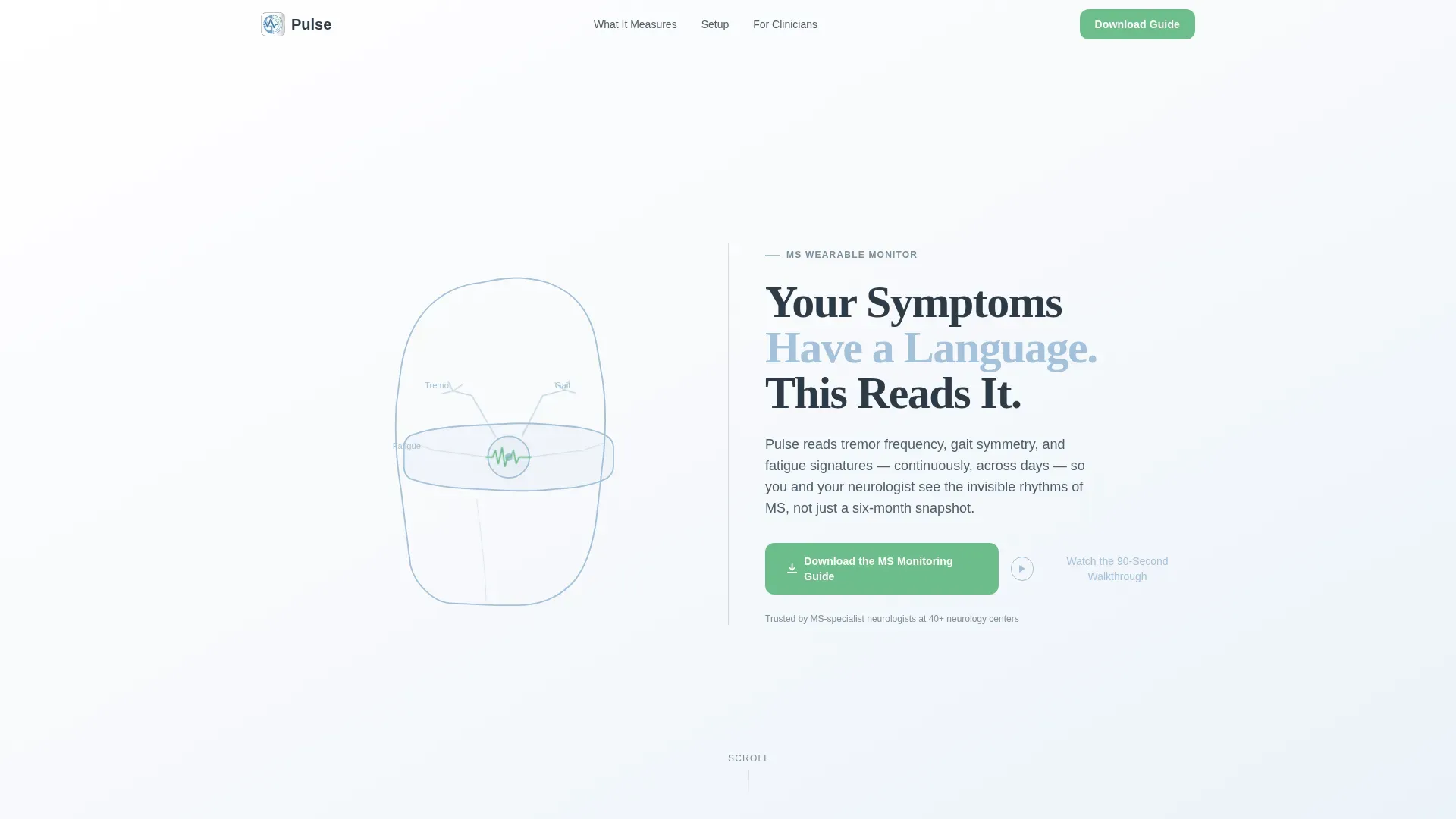
Animated SVG Wrist Illustration Header
A full-viewport line-art animation draws a continuous stroke tracing a human wrist and device in real time over two seconds. The animation uses SVG stroke-dashoffset technique to feel like an invisible hand sketching the body's own circuitry. It sets the page's tone before a single word is read.
Scroll-Triggered Split-Screen Sections
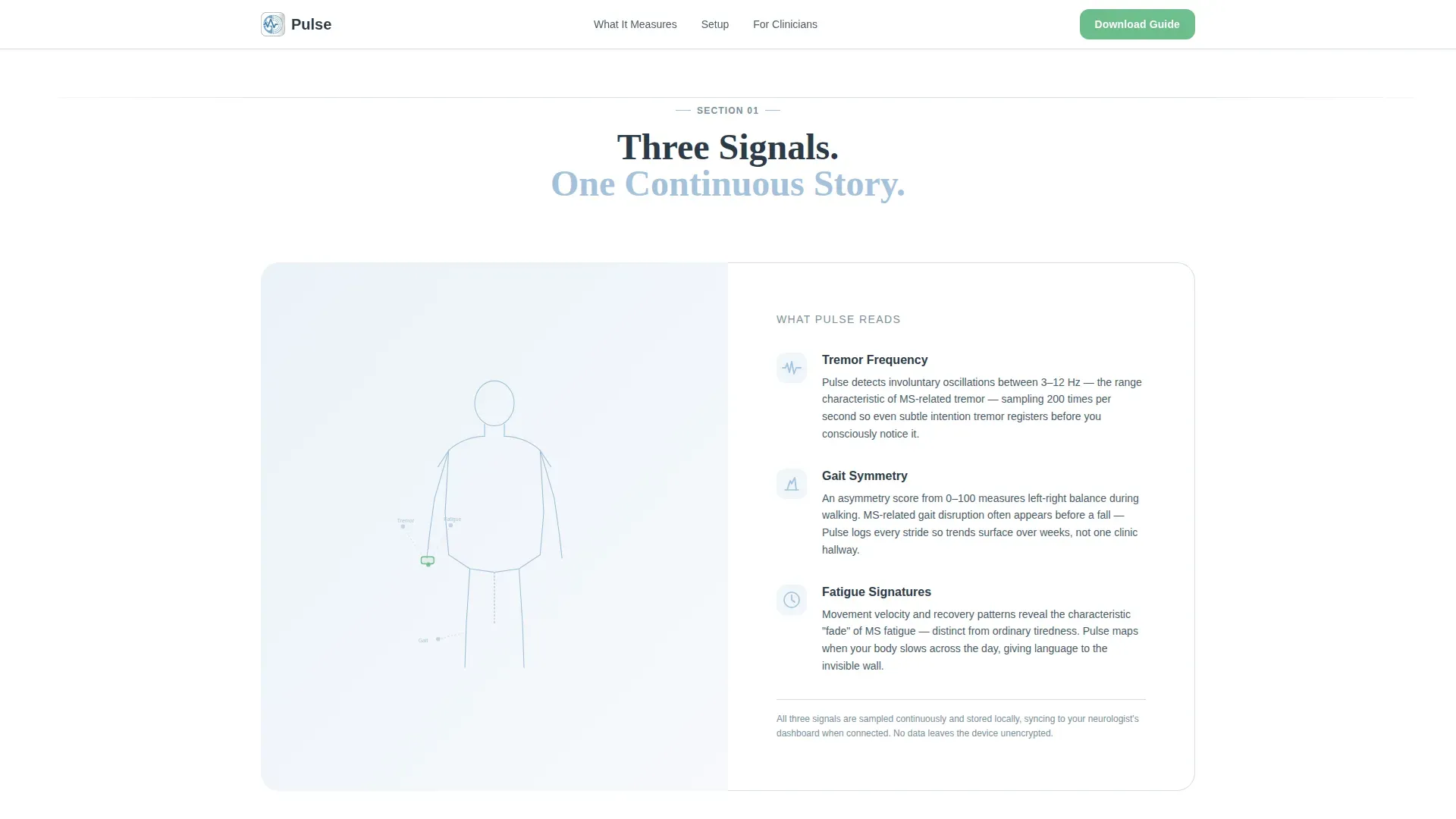
Each of the four main content sections uses a gentle vertical wipe transition as the visitor scrolls. The left panel holds illustrations and data visuals; the right panel holds plain-language copy. Transitions feel like turning a page in a well-designed medical booklet.
Interactive Dashboard Walkthrough
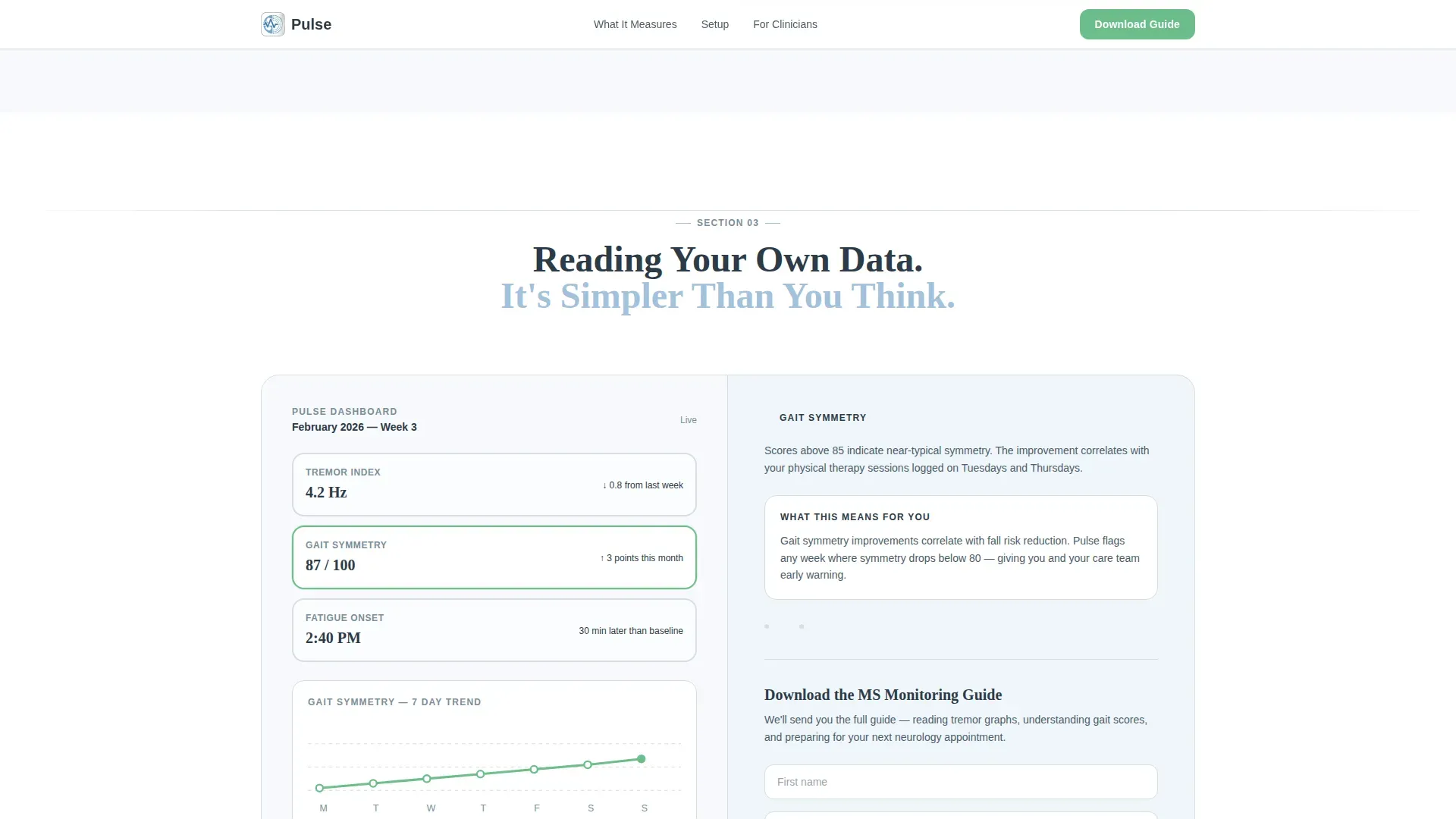
Section three displays a sample tremor and fatigue dashboard on the left panel. As the visitor scrolls, each metric is highlighted in sequence on the right, teaching them to read gait symmetry scores and tremor graphs before they ever see a call to action.
Tailored Guide Download Form
The midpoint call-to-action collects first name, email, and a radio selection identifying the visitor as a patient, caregiver, or clinician. This single field allows the delivered PDF guide to be matched to the visitor's perspective without adding friction.
Inline Video Modal
A secondary call-to-action text link labeled "Watch the 90-Second Walkthrough" opens a video directly within the page. No redirect, no new tab. Visitors stay inside the learning experience throughout.
FAQ Accordion Component
An interactive FAQ accordion lets visitors expand answers to common questions without leaving the page. It keeps the layout clean while making supporting information available on demand.
Page sections overview
| Section | Purpose |
|---|---|
| Hero Header | Animated wrist SVG and headline introduction |
| What It Measures | Body silhouette paired with plain-language metric explanation |
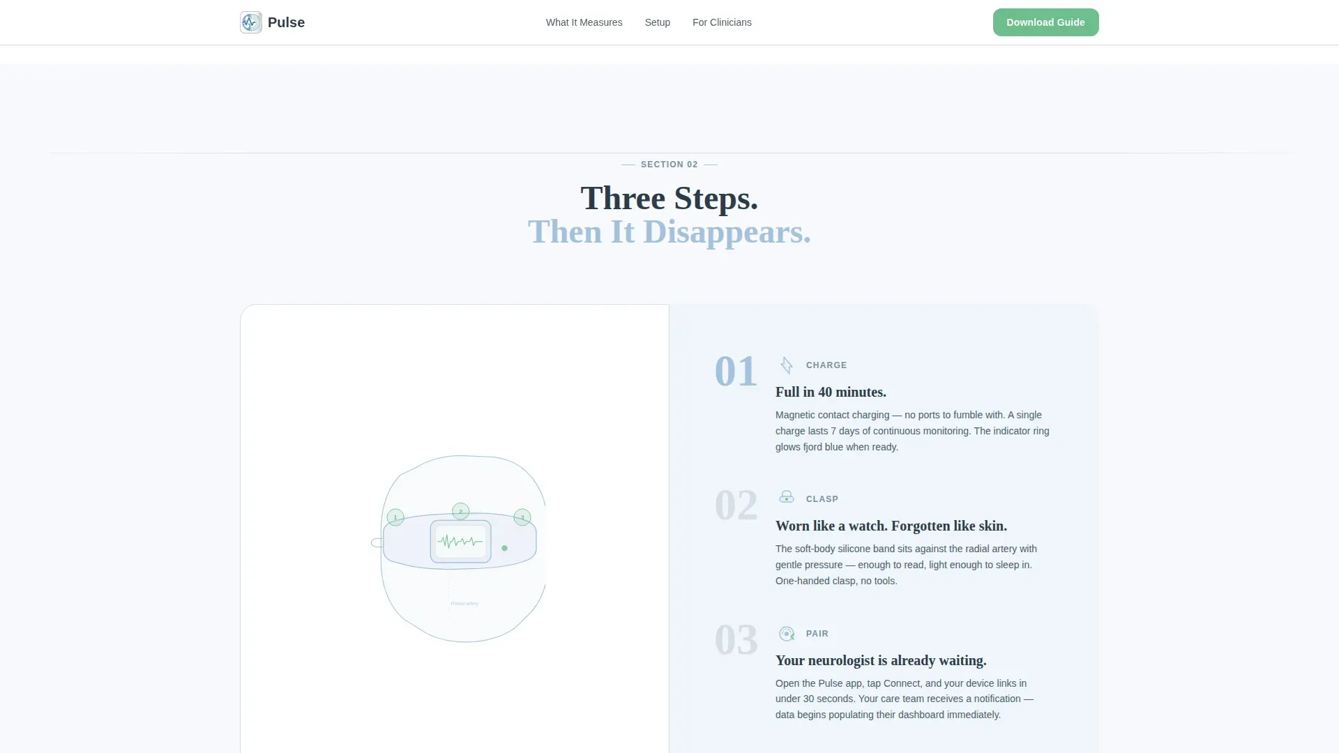
| Setup Steps | Wrist close-up illustration with three-step charge, clasp, and pair instructions |
| Dashboard Walkthrough | Sample dashboard with scroll-triggered metric highlights and primary call to action |
| Neurologist View | Month timeline illustration paired with longitudinal treatment narrative |
| Footer Row | Linear single-row pattern with repeated guide download call to action |
Design & branding system
The visual identity follows an Organic Flow theme rooted in Nordic minimalism and medical clarity. White dominates every background, giving the content room to breathe at its own pace.
- Color palette: glacier white (#F7F9FC) for backgrounds, soft permafrost gray (#D6DDE5) for body text and dividers, pale fjord blue (#A3C1DA) for data visualizations and illustration strokes, and living green (#6DBE8B) reserved exclusively for interactive elements and call-to-action surfaces
- Typography: Fraunces serif for headlines to bring warmth, DM Sans for body text and interface elements to maintain readability
- Illustration style: line art only, no photography and no product renders, keeping the visual language pure and focused on human anatomy and data flow
Mobile & speed optimization
The template is designed desktop-first, reflecting the neurologist review context where data density matters. Full mobile support is included so patients can explore the page on any device.
- Server components handle all static content sections, keeping client-side JavaScript minimal and the page lightweight
- Scroll-triggered animations and the SVG drawing sequence are built to perform smoothly across screen sizes without heavy dependencies
- The split-screen layout stacks vertically on smaller screens, preserving the left-illustration, right-copy reading order throughout
How this template helps you convert
The page earns its conversion by teaching visitors something real before asking for anything. By the time the call-to-action appears, visitors already understand what tremor frequency means and how gait symmetry is scored.
- The step-by-step scroll structure builds familiarity with the device and its data across four sections, so the guide download feels like a natural continuation rather than a gated offer
- The radio selector on the form personalizes the delivered guide without adding form fields, reducing friction while increasing perceived relevance for patients, caregivers, and clinicians alike
- The inline video option gives hesitant visitors a low-commitment next step, keeping them engaged within the page rather than losing them to a redirect
Other information about this template
This template is suited for health and medical product teams operating in the multiple sclerosis care niche. It is built as a content and resource destination, meaning its primary goal is education that leads naturally to a conversion event.
- The localization is English (US) with no currency display, making it appropriate for informational medical launches and patient education campaigns
- Clinician credential badges and metric callouts such as tremor readings and gait scores are included as social proof elements within the layout
- The template style is Split Screen (50/50) and the creative direction follows a Step-by-Step Guide format, making it adaptable for other medical wearable or patient education contexts with similar structures
- The header concept uses Line Art exclusively, consistent with the Organic Flow theme and the Arctic White color system
Theme
Organic Flow
Creative direction
Step-by-Step Guide
Color system
Arctic White
Style
Split Screen (50/50)
Direction
Content/Resource
Page Sections
Animated SVG Wrist Drawing Header
Scroll-triggered Split-screen Layout
Interactive Dashboard Walkthrough
Personalized Guide Download Form
Inline Video Modal
FAQ Accordion Component
Related questions
Who is this landing page template designed for?
What sections are included in this template?
Can visitors choose what type of guide they receive?
What animations and interactive elements does the template include?
Is this template suitable for mobile users?



